'%3e%3cpath%20fill-rule='evenodd'%20clip-rule='evenodd'%20d='M51.1303%2019.2492C50.7278%2019.913%2050.1346%2020.4426%2049.3508%2020.838C48.5669%2021.2335%2047.6172%2021.4312%2046.5014%2021.4312C44.8208%2021.4312%2043.4367%2021.0216%2042.3492%2020.2025C41.2617%2019.3833%2040.6686%2018.2394%2040.5697%2016.7706H44.4253C44.4818%2017.3355%2044.6831%2017.7804%2045.0291%2018.1052C45.3751%2018.43%2045.8164%2018.5924%2046.3531%2018.5924C46.8192%2018.5924%2047.1864%2018.4653%2047.4547%2018.2111C47.7231%2017.9569%2047.8572%2017.618%2047.8572%2017.1943C47.8572%2016.8129%2047.7337%2016.4952%2047.4865%2016.241C47.2393%2015.9867%2046.9322%2015.7784%2046.565%2015.616C46.1978%2015.4536%2045.6893%2015.2594%2045.0397%2015.0334C44.0934%2014.7086%2043.3202%2014.3944%2042.72%2014.0907C42.1197%2013.7871%2041.6042%2013.3351%2041.1735%2012.7349C40.7427%2012.1347%2040.5273%2011.3544%2040.5273%2010.394C40.5273%209.50418%2040.7533%208.73448%2041.2053%208.08481C41.6572%207.43515%2042.2821%206.93731%2043.0801%206.5913C43.8781%206.24528%2044.7925%206.07227%2045.8235%206.07227C47.49%206.07227%2048.8141%206.46771%2049.7956%207.25861C50.7772%208.04951%2051.3315%209.13698%2051.4586%2010.5211H47.5395C47.4689%2010.0268%2047.2888%209.63483%2046.9993%209.3453C46.7097%209.05578%2046.3178%208.91102%2045.8235%208.91102C45.3998%208.91102%2045.0573%209.024%2044.7961%209.24997C44.5348%209.47594%2044.4041%209.80783%2044.4041%2010.2457C44.4041%2010.5988%2044.5207%2010.8989%2044.7537%2011.146C44.9867%2011.3932%2045.2798%2011.5944%2045.6328%2011.7498C45.9859%2011.9052%2046.4944%2012.1029%2047.1581%2012.343C48.1185%2012.6678%2048.9023%2012.9891%2049.5096%2013.3069C50.1169%2013.6246%2050.6395%2014.0872%2051.0773%2014.6945C51.5151%2015.3018%2051.734%2016.0927%2051.734%2017.0672C51.734%2017.8581%2051.5328%2018.5854%2051.1303%2019.2492ZM59.0242%206.3053V21.2829H55.4016V6.3053H59.0242ZM73.9409%206.3053V9.18642H69.8734V21.2829H66.2296V9.18642H62.2046V6.3053H73.9409ZM80.7438%209.18642V12.3218H85.8069V15.0546H80.7438V18.3806H86.4425V21.2829H77.1212V6.3053H86.4425V9.18642H80.7438ZM99.667%2016.0291V21.2829H96.0444V6.3053H101.913C103.692%206.3053%20105.048%206.74665%20105.98%207.62934C106.912%208.51204%20107.378%209.7019%20107.378%2011.199C107.378%2012.1311%20107.17%2012.9609%20106.753%2013.6882C106.337%2014.4155%20105.719%2014.9875%20104.9%2015.4042C104.08%2015.8208%20103.085%2016.0291%20101.913%2016.0291H99.667ZM103.692%2011.199C103.692%209.8855%20102.965%209.22879%20101.51%209.22879H99.667V13.1268H101.51C102.965%2013.1268%20103.692%2012.4842%20103.692%2011.199ZM120.092%2018.5501H114.478L113.546%2021.2829H109.732L115.219%206.41123H119.393L124.879%2021.2829H121.024L120.092%2018.5501ZM119.16%2015.7961L117.295%2010.2881L115.41%2015.7961H119.16ZM131.555%2018.5077H136.385V21.2829H127.933V6.3053H131.555V18.5077ZM143.337%209.18642V12.3218H148.4V15.0546H143.337V18.3806H149.035V21.2829H139.714V6.3053H149.035V9.18642H143.337ZM163.507%206.3053V9.18642H159.44V21.2829H155.796V9.18642H151.771V6.3053H163.507ZM177.449%206.3053V9.18642H173.382V21.2829H169.738V9.18642H165.713V6.3053H177.449ZM184.252%209.18642V12.3218H189.315V15.0546H184.252V18.3806H189.951V21.2829H180.629V6.3053H189.951V9.18642H184.252Z'%20fill='%23EEF0ED'/%3e%3cmask%20id='mask0_3101_7327'%20style='mask-type:alpha'%20maskUnits='userSpaceOnUse'%20x='0'%20y='0'%20width='27'%20height='28'%3e%3cpath%20d='M23.8328%200.759766H2.64808C1.18559%200.759766%200%201.94535%200%203.40785V24.5925C0%2026.055%201.18559%2027.2406%202.64808%2027.2406H23.8328C25.2952%2027.2406%2026.4808%2026.055%2026.4808%2024.5925V3.40785C26.4808%201.94535%2025.2952%200.759766%2023.8328%200.759766Z'%20fill='white'/%3e%3c/mask%3e%3cg%20mask='url(%23mask0_3101_7327)'%3e%3cpath%20d='M23.8328%200.759766H2.64808C1.18559%200.759766%200%201.94535%200%203.40785V24.5925C0%2026.055%201.18559%2027.2406%202.64808%2027.2406H23.8328C25.2952%2027.2406%2026.4808%2026.055%2026.4808%2024.5925V3.40785C26.4808%201.94535%2025.2952%200.759766%2023.8328%200.759766Z'%20fill='%23D8D8D8'/%3e%3cpath%20d='M13.2404%200.759766H0V14.0001H13.2404V0.759766Z'%20fill='%238C61FF'/%3e%3cpath%20d='M13.2404%2014H0V27.2404H13.2404V14Z'%20fill='%2336C3FE'/%3e%3cpath%20d='M26.4806%2014H13.2402V27.2404H26.4806V14Z'%20fill='%236592FE'/%3e%3cpath%20d='M26.4806%200.759766H13.2402V14.0002H26.4806V0.759766Z'%20fill='%236059F7'/%3e%3c/g%3e%3c/g%3e%3cdefs%3e%3cclipPath%20id='clip0_3101_7327'%3e%3crect%20width='190'%20height='28'%20fill='white'/%3e%3c/clipPath%3e%3c/defs%3e%3c/svg%3e)
'%3e%3cpath%20d='M23.8328%200.759521H2.64808C1.18559%200.759521%200%201.94511%200%203.40761V24.5923C0%2026.0548%201.18559%2027.2404%202.64808%2027.2404H23.8328C25.2952%2027.2404%2026.4808%2026.0548%2026.4808%2024.5923V3.40761C26.4808%201.94511%2025.2952%200.759521%2023.8328%200.759521Z'%20fill='%23D8D8D8'/%3e%3cpath%20d='M13.2404%200.759521H0V13.9999H13.2404V0.759521Z'%20fill='%238C61FF'/%3e%3cpath%20d='M13.2404%2013.9998H0V27.2402H13.2404V13.9998Z'%20fill='%2336C3FE'/%3e%3cpath%20d='M26.4809%2013.9998H13.2405V27.2402H26.4809V13.9998Z'%20fill='%236592FE'/%3e%3cpath%20d='M26.4809%200.759277H13.2405V13.9997H26.4809V0.759277Z'%20fill='%236059F7'/%3e%3c/g%3e%3c/svg%3e)
Black and Blue Color Palette for High-Stakes Dashboard UX
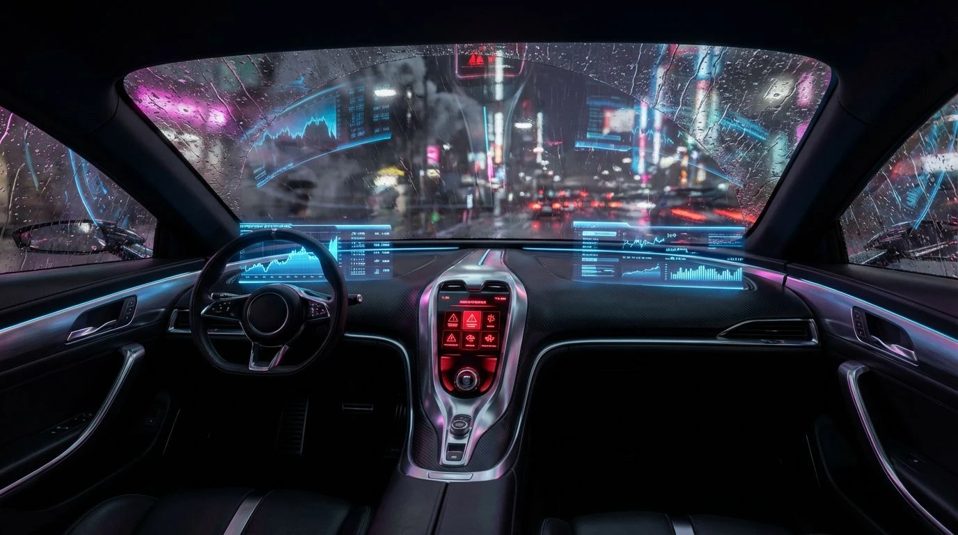
· 5 min readConsider the optical phenomenon experienced inside a high-performance vehicle during a heavy evening downpour. The driver's peripheral vision is obscured by darkness, forcing the fovea to lock onto luminous instruments and the rhythmic flash of external lights reflecting off wet surfaces. This natural reduction of visual stimuli is exactly what high-frequency trading environments require when managing volatile streams of information. By mimicking the contrast ratios found in a rainy metropolis at night, designers can reduce cognitive load significantly. The brain processes high-luminance data points against a void-like background faster than it can parse information on a bustling, white canvas. This approach creates a paradoxical state known as 'sophisticated energy,' where the urgency of real-time data transmission meets the physiological calm induced by low-light environments.
Neon Doppler Shift 🏎️
The interplay between Void Horizon and Argon Plasma here mimics the physics of light waves compressing and stretching as objects move at velocity. In a user interface, this extreme contrast serves a specific biological function: it keeps the iris dilated, allowing more light to enter while focusing attention strictly on the emitted signals of data. The inclusion of Brake Light Crimson introduces a critical variable. Just as tail lights warn of deceleration or obstruction on a highway, this hue acts as an immediate, visceral stop-signal in a financial context, triggering a 'fight or flight' risk assessment in the viewer. The surrounding greys, particularly Tarmac Graphite, provide a neutral substrate that prevents the vibrant hues from causing afterimage burn-in, ensuring that the analyst's gaze can remain fixed on the screen without fatigue for extended periods.
Chromium Rainfall 🌧️
This arrangement explores the concept of specularity—the way light reflects off smooth, wet surfaces. The dominance of achromatic tones, ranging from the deep Obsidian Monitor to the reflective Titanium Mist, simulates an industrial environment stripped of distraction. Here, color is a scarce resource. By limiting the chromatic spectrum to a single, piercing Electric Raindrop blue, the palette forces the brain to prioritize this specific wavelength above all else. It functions similarly to a solitary LED on a dark server rack; its presence confirms operation essential functionality. For a dashboard, this restraint means that any data highlighted in blue is perceived as absolute truth, distinct from the structural noise of the interface. It is an exercise in minimalism that relies on the absence of color to create value.
Shinjuku Circuit 🌃
Visualizing complex datasets often requires distinguishing between multiple fluctuating variables, much like tracking distinct neon signs in a crowded district. The relationship between Cyan Laser and Ultraviolet Signal exploits the eye's sensitivity to short wavelengths. These colors sit at the higher energy end of the visible spectrum, appearing to float above the receding depths of Midnight Asphalt. This separation creates a pseudo-3D effect, often referred to as chromostereopsis, which can be useful for layering information. The lighter tones, such as Aluminum Reflection, act as the metallic framework holding these neon gases in place. This combination suggests a futuristic, synthetic intelligence, suitable for systems that rely on algorithmic predictions rather than human intuition.
Deep Quant 📉
Physics dictates that true black is the absence of light, representing a state of rest. Absolute Zero anchors this palette, approximating the 'off' state of an OLED pixel, which saves energy and eliminates light bleed. Against this profound darkness, the graduated blues of Ionized Sky and Deep Ocean Data create a sense of submarine pressure or atmospheric depth. Human psychology associates these cool, non-spectral transitions with stability and logic. There is no urgency in these hues, only steady calculation. This reduction in visual temperature helps lower the user's heart rate, a necessary countermeasure during high-stakes trading. The interaction between the darkest greys (Carbon Fiber) and the luminous blues creates a 'glassy' interface feel, reminiscent of looking through a head-up display.
Algorithmic Traffic 🚥
Binary decision-making creates the foundation of this scheme. The contrast between Logic Gate Blue and Warning Sensor creates a semantic dichotomy—safe versus unsafe, buy versus sell, active versus dormant. This is the language of traffic controls applied to market movements. The background tones, particularly Matte Obsidienne and Industrial Smoke, serve as the technological housing for these signals, much like the matte plastic casing of a piece of precision hardware. Unlike the other palettes, which lean heavily into atmosphere, this grouping prioritizes legibility and categorization. The stark difference in brightness between the Fiber Optic white and the dark background ensures that text remains crisp, adhering to the highest standards of accessibility while maintaining the sleek, energetic aesthetic of a modern digital cockpit.
Transitioning financial interfaces toward these high-contrast, midnight-inspired schematics offers more than just aesthetic gratification; it aligns the digital workspace with the biological preferences of the human eye during periods of intense focus. The glossy, lacquered interactions of light and dark seen in these arrangements suggest a material quality—a sense of premium industrial design—that helps establish trust in the underlying technology. Whether through the warning flash of a crimson indicator or the steady glow of a cyan trend line, these colors function as a navigational language. They strip away the extraneous noise of the outside world, leaving the user in a controlled cockpit of pure information. In this way, the chaotic beauty of a storm-swept city becomes a disciplined instrument for clarity and decision-making.