'%3e%3cpath%20fill-rule='evenodd'%20clip-rule='evenodd'%20d='M51.1303%2019.2492C50.7278%2019.913%2050.1346%2020.4426%2049.3508%2020.838C48.5669%2021.2335%2047.6172%2021.4312%2046.5014%2021.4312C44.8208%2021.4312%2043.4367%2021.0216%2042.3492%2020.2025C41.2617%2019.3833%2040.6686%2018.2394%2040.5697%2016.7706H44.4253C44.4818%2017.3355%2044.6831%2017.7804%2045.0291%2018.1052C45.3751%2018.43%2045.8164%2018.5924%2046.3531%2018.5924C46.8192%2018.5924%2047.1864%2018.4653%2047.4547%2018.2111C47.7231%2017.9569%2047.8572%2017.618%2047.8572%2017.1943C47.8572%2016.8129%2047.7337%2016.4952%2047.4865%2016.241C47.2393%2015.9867%2046.9322%2015.7784%2046.565%2015.616C46.1978%2015.4536%2045.6893%2015.2594%2045.0397%2015.0334C44.0934%2014.7086%2043.3202%2014.3944%2042.72%2014.0907C42.1197%2013.7871%2041.6042%2013.3351%2041.1735%2012.7349C40.7427%2012.1347%2040.5273%2011.3544%2040.5273%2010.394C40.5273%209.50418%2040.7533%208.73448%2041.2053%208.08481C41.6572%207.43515%2042.2821%206.93731%2043.0801%206.5913C43.8781%206.24528%2044.7925%206.07227%2045.8235%206.07227C47.49%206.07227%2048.8141%206.46771%2049.7956%207.25861C50.7772%208.04951%2051.3315%209.13698%2051.4586%2010.5211H47.5395C47.4689%2010.0268%2047.2888%209.63483%2046.9993%209.3453C46.7097%209.05578%2046.3178%208.91102%2045.8235%208.91102C45.3998%208.91102%2045.0573%209.024%2044.7961%209.24997C44.5348%209.47594%2044.4041%209.80783%2044.4041%2010.2457C44.4041%2010.5988%2044.5207%2010.8989%2044.7537%2011.146C44.9867%2011.3932%2045.2798%2011.5944%2045.6328%2011.7498C45.9859%2011.9052%2046.4944%2012.1029%2047.1581%2012.343C48.1185%2012.6678%2048.9023%2012.9891%2049.5096%2013.3069C50.1169%2013.6246%2050.6395%2014.0872%2051.0773%2014.6945C51.5151%2015.3018%2051.734%2016.0927%2051.734%2017.0672C51.734%2017.8581%2051.5328%2018.5854%2051.1303%2019.2492ZM59.0242%206.3053V21.2829H55.4016V6.3053H59.0242ZM73.9409%206.3053V9.18642H69.8734V21.2829H66.2296V9.18642H62.2046V6.3053H73.9409ZM80.7438%209.18642V12.3218H85.8069V15.0546H80.7438V18.3806H86.4425V21.2829H77.1212V6.3053H86.4425V9.18642H80.7438ZM99.667%2016.0291V21.2829H96.0444V6.3053H101.913C103.692%206.3053%20105.048%206.74665%20105.98%207.62934C106.912%208.51204%20107.378%209.7019%20107.378%2011.199C107.378%2012.1311%20107.17%2012.9609%20106.753%2013.6882C106.337%2014.4155%20105.719%2014.9875%20104.9%2015.4042C104.08%2015.8208%20103.085%2016.0291%20101.913%2016.0291H99.667ZM103.692%2011.199C103.692%209.8855%20102.965%209.22879%20101.51%209.22879H99.667V13.1268H101.51C102.965%2013.1268%20103.692%2012.4842%20103.692%2011.199ZM120.092%2018.5501H114.478L113.546%2021.2829H109.732L115.219%206.41123H119.393L124.879%2021.2829H121.024L120.092%2018.5501ZM119.16%2015.7961L117.295%2010.2881L115.41%2015.7961H119.16ZM131.555%2018.5077H136.385V21.2829H127.933V6.3053H131.555V18.5077ZM143.337%209.18642V12.3218H148.4V15.0546H143.337V18.3806H149.035V21.2829H139.714V6.3053H149.035V9.18642H143.337ZM163.507%206.3053V9.18642H159.44V21.2829H155.796V9.18642H151.771V6.3053H163.507ZM177.449%206.3053V9.18642H173.382V21.2829H169.738V9.18642H165.713V6.3053H177.449ZM184.252%209.18642V12.3218H189.315V15.0546H184.252V18.3806H189.951V21.2829H180.629V6.3053H189.951V9.18642H184.252Z'%20fill='%23EEF0ED'/%3e%3cmask%20id='mask0_3101_7327'%20style='mask-type:alpha'%20maskUnits='userSpaceOnUse'%20x='0'%20y='0'%20width='27'%20height='28'%3e%3cpath%20d='M23.8328%200.759766H2.64808C1.18559%200.759766%200%201.94535%200%203.40785V24.5925C0%2026.055%201.18559%2027.2406%202.64808%2027.2406H23.8328C25.2952%2027.2406%2026.4808%2026.055%2026.4808%2024.5925V3.40785C26.4808%201.94535%2025.2952%200.759766%2023.8328%200.759766Z'%20fill='white'/%3e%3c/mask%3e%3cg%20mask='url(%23mask0_3101_7327)'%3e%3cpath%20d='M23.8328%200.759766H2.64808C1.18559%200.759766%200%201.94535%200%203.40785V24.5925C0%2026.055%201.18559%2027.2406%202.64808%2027.2406H23.8328C25.2952%2027.2406%2026.4808%2026.055%2026.4808%2024.5925V3.40785C26.4808%201.94535%2025.2952%200.759766%2023.8328%200.759766Z'%20fill='%23D8D8D8'/%3e%3cpath%20d='M13.2404%200.759766H0V14.0001H13.2404V0.759766Z'%20fill='%238C61FF'/%3e%3cpath%20d='M13.2404%2014H0V27.2404H13.2404V14Z'%20fill='%2336C3FE'/%3e%3cpath%20d='M26.4806%2014H13.2402V27.2404H26.4806V14Z'%20fill='%236592FE'/%3e%3cpath%20d='M26.4806%200.759766H13.2402V14.0002H26.4806V0.759766Z'%20fill='%236059F7'/%3e%3c/g%3e%3c/g%3e%3cdefs%3e%3cclipPath%20id='clip0_3101_7327'%3e%3crect%20width='190'%20height='28'%20fill='white'/%3e%3c/clipPath%3e%3c/defs%3e%3c/svg%3e)
'%3e%3cpath%20d='M23.8328%200.759521H2.64808C1.18559%200.759521%200%201.94511%200%203.40761V24.5923C0%2026.0548%201.18559%2027.2404%202.64808%2027.2404H23.8328C25.2952%2027.2404%2026.4808%2026.0548%2026.4808%2024.5923V3.40761C26.4808%201.94511%2025.2952%200.759521%2023.8328%200.759521Z'%20fill='%23D8D8D8'/%3e%3cpath%20d='M13.2404%200.759521H0V13.9999H13.2404V0.759521Z'%20fill='%238C61FF'/%3e%3cpath%20d='M13.2404%2013.9998H0V27.2402H13.2404V13.9998Z'%20fill='%2336C3FE'/%3e%3cpath%20d='M26.4809%2013.9998H13.2405V27.2402H26.4809V13.9998Z'%20fill='%236592FE'/%3e%3cpath%20d='M26.4809%200.759277H13.2405V13.9997H26.4809V0.759277Z'%20fill='%236059F7'/%3e%3c/g%3e%3c/svg%3e)
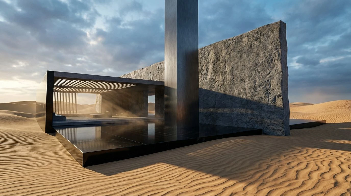
Fintech Branding: Warm Desert Color Palettes for Trust
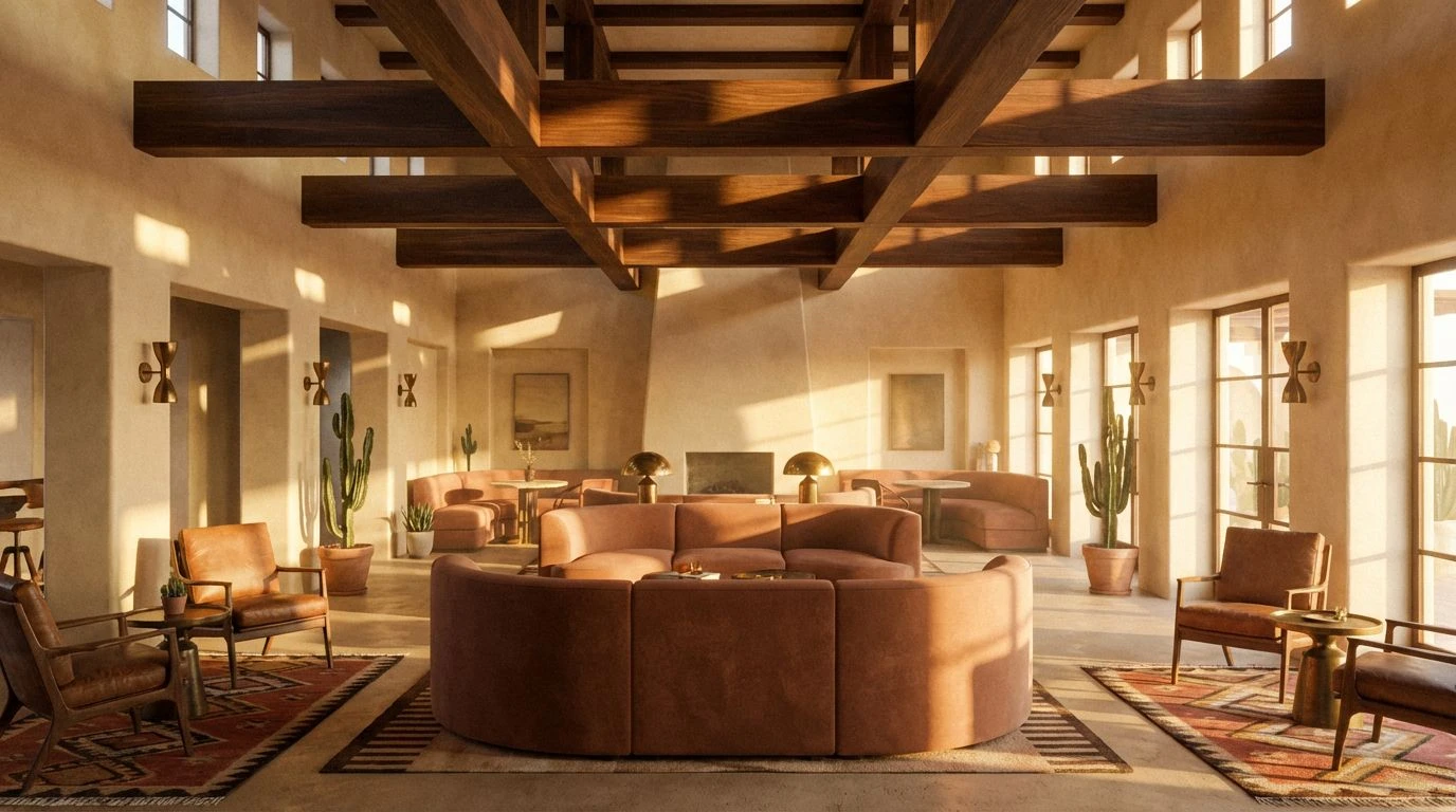
· 5 min readThere is a distinct, metallic scent to money in the modern world, often reeking of antiseptic office corridors and over-conditioned air. We have grown accustomed to the sterile safety of navy blazers and steel skyscrapers, believing that substantial wealth requires a visual language devoid of heat or pulsating life. But cast your gaze south, toward the sweeping warmth of North Africa, where commerce has thrived for millennia under an unrelenting sun. Imagine a ledger kept not in binary code but on parchment warmed by the desert afternoon, where trust is built over slow tea rather than rapid algorithms. By trading the predictable chill of corporate branding for the grounded, sun-baked trueness of the desert, we discover that financial stability feels more authentic when it retains a little grit. The following collections explore how the ancient dust of the dunes can bring a human, tactile sense of security to the digital wallet.
Tangier Terrace 🌅
This arrangement feels like standing on a high balcony in a coastal city, looking out where the Atlantic meets the Mediterranean. You have the grounding warmth of Ancient Stone and Sahara Gold, reminding you of the earth beneath your feet, while the sweeping currents of Aegean Deep and Mediterranean Sky invite you to look toward the horizon. It captures the exact moment a dusty trade route meets the clarity of the sea. For a financial entity, using Tangier Terrace suggests a heritage that understands the value of commodities—gold, grain, land—while possessing the technological clarity of that piercing blue water. It moves the user from a windowless server room to an open terrace, suggesting that their wealth is being managed with both historic wisdom and crystalline foresight, balancing the organic chaos of the market with the calm of the tide.
Urban Fog 🌫️
Here we find the early morning light over a sleepless city, perhaps the departure lounge before flying south, where the fog has yet to lift. It is crisp, efficient, and undeniably sleek. While the Obsidian Glass and Steel Skyscraper tones provide that familiar armor of traditional banking, the inclusion of Morning Haze adds a touch of softness, like the reflection of a screen on a rainy window. It speaks to a user interface that values precision above all else. However, in the context of our journey to the desert, this group serves as a reminder of what we are leaving behind—the clean, cool lines of contemporary minimalism. It is trustworthy, yes, but it lacks the tactile heat of human connection, offering instead the quiet reliability of a well-oiled machine operating in a temperature-controlled vault.
Riad Garden 🌿
The heat of the sun requires the shelter of the shade, and this selection transports us to a quiet courtyard sheltered from the bustling medina. The verdant interplay of Spring Shoots and Mint Leaf offers a restorative breath, cutting through the dryness of the financial landscape. Paired with the seriousness of Deep Atlantic, the mood shifts from purely monetary to something centered on growth and accumulation in a natural sense. It feels like an investment that bears fruit rather than just interest. Using Riad Garden implies a banking experience that is nurturing, one that waters the seeds of a portfolio. It is the color of life thriving in arid places, promising the user that their assets are being tended to with the care of a gardener cultivating a rare patch of green within the stone walls of the city.
Atlas Crossroads 🐫
Sudden intensity strikes the senses here, recalling the vibrant chaos and rich textures of a marketplace at high noon. The jarring yet beautiful collision of Marigold Spice against the electric shock of Majorelle Blue captures the energy of exchange—the clamor of voices, the clinking of coins, the raw vitality of trade. It is bold, unapologetic, and deeply historical, drawing on the pigments found in woven rugs and ceramic tiles. Atlas Crossroads does not whisper; it declares. A brand adopting this array signals that they are not merely a passive vault for savings but an active participant in global commerce. It bridges the gap between the chaotic energy of the souk and the disciplined authority of Indigo Night, creating a user experience that feels adventurous yet securely anchored in the serious business of trade.
Lemon & Limestone 🍋
As evening approaches and the shadows lengthen, the light softens into something comfortable and worn. This is the texture of Weathered Rock and the rustle of dry leaves in a Cypress Shade. There is no pretense here, only the honest simplicity of Unbleached Cotton and the faint, cheery acidity of Citrus Zest. It brings to mind a rustic sufficiency, the feeling of having exactly what you need and nothing more. In a digital wallet or banking app, Lemon & Limestone strips away the complex jargon and high-frequency trading anxiety. It presents finance as a daily essential, as humble and necessary as bread and oil. It tells the customer that their security is natural, foundational, and completely free of the artificial additives that clutter the modern banking experience.
Stepping away from the unending sea of corporate blue requires a willingness to feel the texture of the world again. We find that the dryness of sand and the intensity of the sun do not signify risk, but rather endurance; these are the colors of landscapes that have survived eons of wind and weather. By allowing the warmth of ochre and the groundedness of stone to enter the financial lexicon, we invite a beating heart back into the transaction. Money is, after all, a tool for living, and its visual representation should reflect the vibrant, dusty, sun-drenched reality of life itself, not just the cold vacuum of a spreadsheet. When the screen glows with the light of a Sahara morning, the numbers on it seem less like data points and more like the harvest of a life well-lived.