'%3e%3cpath%20fill-rule='evenodd'%20clip-rule='evenodd'%20d='M51.1303%2019.2492C50.7278%2019.913%2050.1346%2020.4426%2049.3508%2020.838C48.5669%2021.2335%2047.6172%2021.4312%2046.5014%2021.4312C44.8208%2021.4312%2043.4367%2021.0216%2042.3492%2020.2025C41.2617%2019.3833%2040.6686%2018.2394%2040.5697%2016.7706H44.4253C44.4818%2017.3355%2044.6831%2017.7804%2045.0291%2018.1052C45.3751%2018.43%2045.8164%2018.5924%2046.3531%2018.5924C46.8192%2018.5924%2047.1864%2018.4653%2047.4547%2018.2111C47.7231%2017.9569%2047.8572%2017.618%2047.8572%2017.1943C47.8572%2016.8129%2047.7337%2016.4952%2047.4865%2016.241C47.2393%2015.9867%2046.9322%2015.7784%2046.565%2015.616C46.1978%2015.4536%2045.6893%2015.2594%2045.0397%2015.0334C44.0934%2014.7086%2043.3202%2014.3944%2042.72%2014.0907C42.1197%2013.7871%2041.6042%2013.3351%2041.1735%2012.7349C40.7427%2012.1347%2040.5273%2011.3544%2040.5273%2010.394C40.5273%209.50418%2040.7533%208.73448%2041.2053%208.08481C41.6572%207.43515%2042.2821%206.93731%2043.0801%206.5913C43.8781%206.24528%2044.7925%206.07227%2045.8235%206.07227C47.49%206.07227%2048.8141%206.46771%2049.7956%207.25861C50.7772%208.04951%2051.3315%209.13698%2051.4586%2010.5211H47.5395C47.4689%2010.0268%2047.2888%209.63483%2046.9993%209.3453C46.7097%209.05578%2046.3178%208.91102%2045.8235%208.91102C45.3998%208.91102%2045.0573%209.024%2044.7961%209.24997C44.5348%209.47594%2044.4041%209.80783%2044.4041%2010.2457C44.4041%2010.5988%2044.5207%2010.8989%2044.7537%2011.146C44.9867%2011.3932%2045.2798%2011.5944%2045.6328%2011.7498C45.9859%2011.9052%2046.4944%2012.1029%2047.1581%2012.343C48.1185%2012.6678%2048.9023%2012.9891%2049.5096%2013.3069C50.1169%2013.6246%2050.6395%2014.0872%2051.0773%2014.6945C51.5151%2015.3018%2051.734%2016.0927%2051.734%2017.0672C51.734%2017.8581%2051.5328%2018.5854%2051.1303%2019.2492ZM59.0242%206.3053V21.2829H55.4016V6.3053H59.0242ZM73.9409%206.3053V9.18642H69.8734V21.2829H66.2296V9.18642H62.2046V6.3053H73.9409ZM80.7438%209.18642V12.3218H85.8069V15.0546H80.7438V18.3806H86.4425V21.2829H77.1212V6.3053H86.4425V9.18642H80.7438ZM99.667%2016.0291V21.2829H96.0444V6.3053H101.913C103.692%206.3053%20105.048%206.74665%20105.98%207.62934C106.912%208.51204%20107.378%209.7019%20107.378%2011.199C107.378%2012.1311%20107.17%2012.9609%20106.753%2013.6882C106.337%2014.4155%20105.719%2014.9875%20104.9%2015.4042C104.08%2015.8208%20103.085%2016.0291%20101.913%2016.0291H99.667ZM103.692%2011.199C103.692%209.8855%20102.965%209.22879%20101.51%209.22879H99.667V13.1268H101.51C102.965%2013.1268%20103.692%2012.4842%20103.692%2011.199ZM120.092%2018.5501H114.478L113.546%2021.2829H109.732L115.219%206.41123H119.393L124.879%2021.2829H121.024L120.092%2018.5501ZM119.16%2015.7961L117.295%2010.2881L115.41%2015.7961H119.16ZM131.555%2018.5077H136.385V21.2829H127.933V6.3053H131.555V18.5077ZM143.337%209.18642V12.3218H148.4V15.0546H143.337V18.3806H149.035V21.2829H139.714V6.3053H149.035V9.18642H143.337ZM163.507%206.3053V9.18642H159.44V21.2829H155.796V9.18642H151.771V6.3053H163.507ZM177.449%206.3053V9.18642H173.382V21.2829H169.738V9.18642H165.713V6.3053H177.449ZM184.252%209.18642V12.3218H189.315V15.0546H184.252V18.3806H189.951V21.2829H180.629V6.3053H189.951V9.18642H184.252Z'%20fill='%23EEF0ED'/%3e%3cmask%20id='mask0_3101_7327'%20style='mask-type:alpha'%20maskUnits='userSpaceOnUse'%20x='0'%20y='0'%20width='27'%20height='28'%3e%3cpath%20d='M23.8328%200.759766H2.64808C1.18559%200.759766%200%201.94535%200%203.40785V24.5925C0%2026.055%201.18559%2027.2406%202.64808%2027.2406H23.8328C25.2952%2027.2406%2026.4808%2026.055%2026.4808%2024.5925V3.40785C26.4808%201.94535%2025.2952%200.759766%2023.8328%200.759766Z'%20fill='white'/%3e%3c/mask%3e%3cg%20mask='url(%23mask0_3101_7327)'%3e%3cpath%20d='M23.8328%200.759766H2.64808C1.18559%200.759766%200%201.94535%200%203.40785V24.5925C0%2026.055%201.18559%2027.2406%202.64808%2027.2406H23.8328C25.2952%2027.2406%2026.4808%2026.055%2026.4808%2024.5925V3.40785C26.4808%201.94535%2025.2952%200.759766%2023.8328%200.759766Z'%20fill='%23D8D8D8'/%3e%3cpath%20d='M13.2404%200.759766H0V14.0001H13.2404V0.759766Z'%20fill='%238C61FF'/%3e%3cpath%20d='M13.2404%2014H0V27.2404H13.2404V14Z'%20fill='%2336C3FE'/%3e%3cpath%20d='M26.4806%2014H13.2402V27.2404H26.4806V14Z'%20fill='%236592FE'/%3e%3cpath%20d='M26.4806%200.759766H13.2402V14.0002H26.4806V0.759766Z'%20fill='%236059F7'/%3e%3c/g%3e%3c/g%3e%3cdefs%3e%3cclipPath%20id='clip0_3101_7327'%3e%3crect%20width='190'%20height='28'%20fill='white'/%3e%3c/clipPath%3e%3c/defs%3e%3c/svg%3e)
'%3e%3cpath%20d='M23.8328%200.759521H2.64808C1.18559%200.759521%200%201.94511%200%203.40761V24.5923C0%2026.0548%201.18559%2027.2404%202.64808%2027.2404H23.8328C25.2952%2027.2404%2026.4808%2026.0548%2026.4808%2024.5923V3.40761C26.4808%201.94511%2025.2952%200.759521%2023.8328%200.759521Z'%20fill='%23D8D8D8'/%3e%3cpath%20d='M13.2404%200.759521H0V13.9999H13.2404V0.759521Z'%20fill='%238C61FF'/%3e%3cpath%20d='M13.2404%2013.9998H0V27.2402H13.2404V13.9998Z'%20fill='%2336C3FE'/%3e%3cpath%20d='M26.4809%2013.9998H13.2405V27.2402H26.4809V13.9998Z'%20fill='%236592FE'/%3e%3cpath%20d='M26.4809%200.759277H13.2405V13.9997H26.4809V0.759277Z'%20fill='%236059F7'/%3e%3c/g%3e%3c/svg%3e)
Muted Coral Color Palettes: Abandon Sterile White Space
· 6 min readWe have been conditioned to believe that emptiness equals sophistication, that the absence of hue is the only path to clarity in our digital lives. This is a deception of the glass screen. A monitor washed in blinding clinical frost offers no rest for the weary optical nerve; it merely demands attention without offering hospitality or comfort. Consider instead the muted heat of a Coachella Valley afternoon in 1928, where the air hangs thick with dust and possibility. Here, the concept of negative space is not a void, but a presence—a textured expanse of sun-baked earth and stucco walls that have drunk in the light for decades. By looking to the dusty glamour of a desert social club, we find interfaces that do not shout, but rather hum with the confident quiet of old money and older landscapes. It is a shift from the sterile operating room to the velvet armchair, proving that warmth carries more authority than the cold ever could. To design with these colors is to invite the user into a room that has already been warmed by the sun.
The Architect's Linen Suit 🎞️
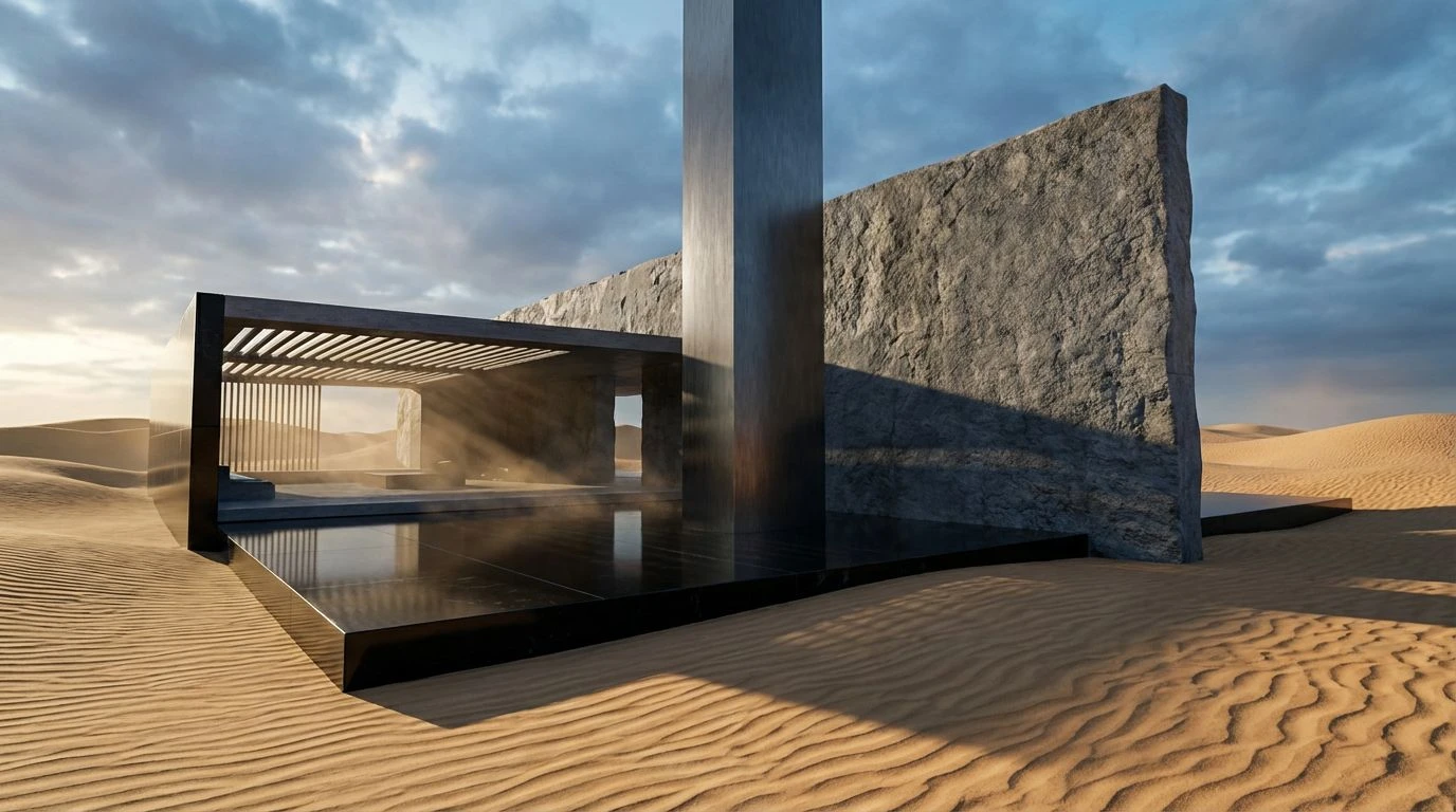
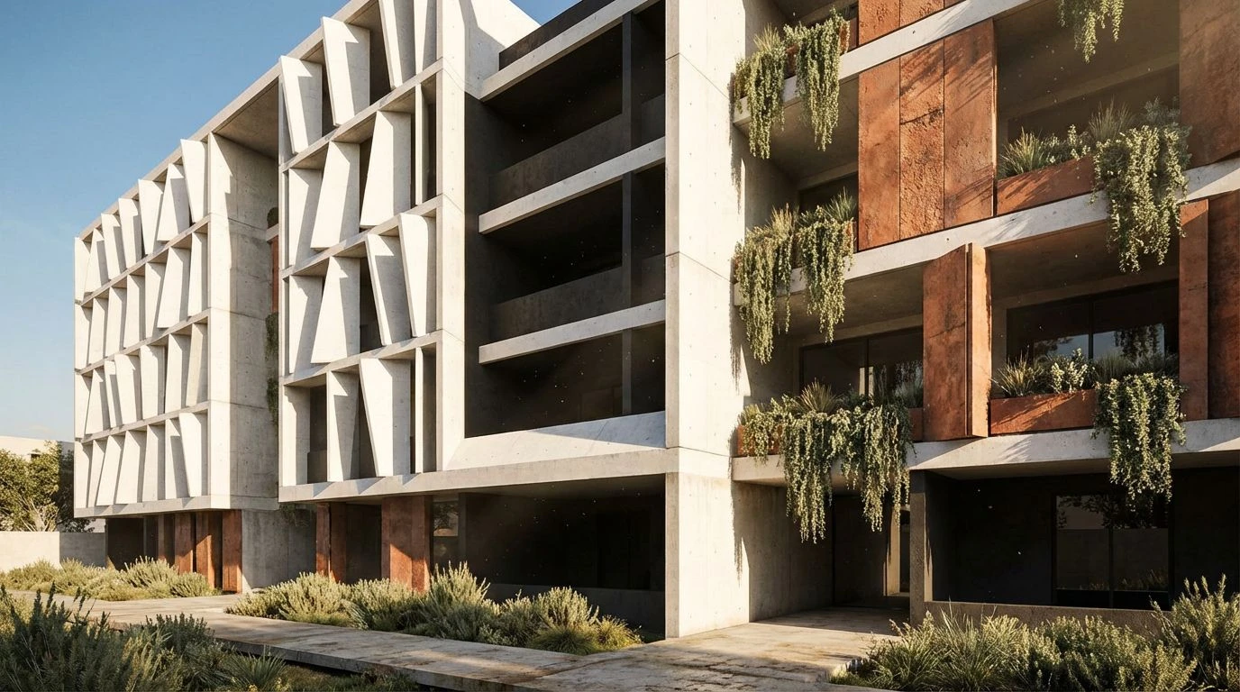
This grouping refuses the stark binary of black ink on white paper, offering instead the tactile reality of physical archives. The dominance of Morning Stucco acts as the canvas, not as a hole in the universe, but as a surface with grain and history, waiting for the heavy strike of a typewriter key. When Espresso Leather anchors the bottom of the view, it grounds the floating elements, giving weight to digital interactions that usually feel ephemeral. The interplay between Silver Travertine and Gunmetal Shadow suggests a structure built to outlast the trends of the season, reminiscent of concrete cooling after a long day in the sun. It is the color of foundations, of sketches drawn in charcoal, of the quiet moments before the guests arrive. Use this when the goal is to establish trust without raising a voice, asserting that the content is carved from stone rather than painted on glass.
Poolside Aperitif 🍹
Here lies the vibration of a Saturday afternoon where the heat ripples off the pavement and the only relief is the sudden, artificial shock of Chlorine Blue. The landscape is dominated by the scorched earth tones of Spiced Terracotta and Sun-Warmed Apricot, capturing that specific golden quality of light that flattens distance and makes everything feel immediate. Splashed against the Midnight Velvet, the brighter hues—particularly the acids of Prickly Pear—take on a rebellious energy, like a neon sign flickering to life as dusk approaches. It captures the tension between the arid environment and the lush, irrigated fantasy of the resort. This is not a timid arrangement; it demands a layout that is willing to be decorative, to treat buttons and headers like jewelry worn to a party. It speaks of leisure that is active, a scene where the conversation is fast, the drinks are strong, and the design refuses to apologize for its own opulence.
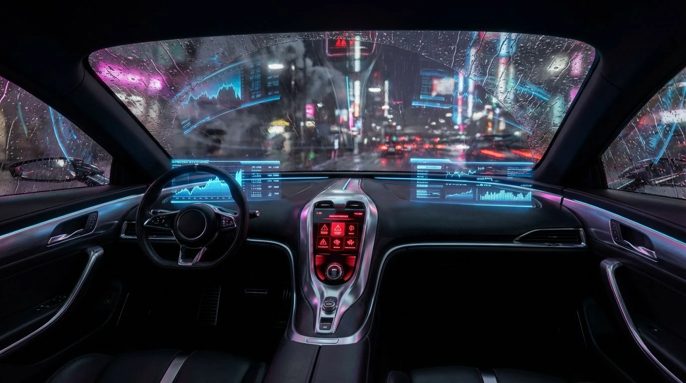
Midnight at The Sands 🎲
As the sun dips below the San Jacinto mountains, the light dies, and the mood shifts from the open patio to the exclusive interior. Obsidian Tuxedo dictates the atmosphere, swallowing the light to create a private, enclosed world where secrets are currency. The sudden violence of Rouge Lipstick against the darkness cuts through the haze, directing the eye with the precision of a spotlight on a stage singer. This is the aesthetic of the high roller, where Cognac Leather chairs absorb the sound and Champagne Bubble highlights catch the glint of crystal glass. It feels dangerous in the way that high stakes are dangerous—thrilling, seductive, and undeniably adult. Rather than the airy openness of modern tech design, this scheme closes the curtains to create intimacy. It fits experiences that require focus and drama, turning the user interaction into a cinematic event where every click feels like placing a chip on the green felt table.
Mid-Century Mirage 🏊
Water in the desert is the ultimate symbol of prestige; it is the conquest of nature by will and wealth. This selection revolves around that impossible, shimmering hydration. The Deep Dive and Azure Sky are not merely blue; they are the colors of a swimming pool viewed through polarized lenses, hyper-real and cool to the touch. Contrasted against the baking heat of Wet Sand and the blinding reflection of Solar Flare, these aquatics offer a visual quenching of thirst. The inclusion of Mint Julep adds a retro slightness, a nod to the pastel Cadillacs and mid-century appliances that defined an era of optimistic futurism. It feels synthetic in the most charming way, rejecting the organic for the constructed paradise. Applying this to a screen creates a sense of air-conditioned relief. It is buoyant and loud, perfect for interfaces that want to strip away the seriousness of the boardroom and replace it with the splash of a diver breaking the surface.
Golden Hour Estate 🕌
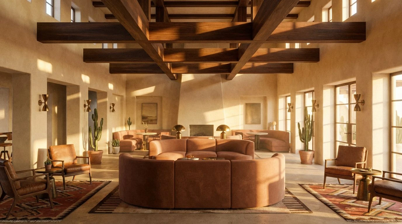
Time stands still in the desert, preserved in the amber glow of the setting sun. This collection captures that heavy, metallic light that turns ordinary dust into Trophy Gold. The spectrum here is narrow but deep, moving from the profound darkness of Oiled Walnut into the blinding high notes of bright yellows, skipping the middle ground of neutrals entirely. It mimics the effect of light hitting a metal surface, shifting from glare to deep shadow in an instant. Desert Clay and Ancient Bronze provide a historical weight, suggesting that the interface is an heirloom rather than a utility. It feels expensive, not through flashiness, but through density. There is a slowness to it, a request for the user to linger rather than rush. The design implications involve heavy typography and borders that feel gilded, creating a user experience that mimics walking through a hall where the artifacts are behind glass, lit by a single, dramatic beam.
Expanding the visual language beyond the safe harbor of empty white space forces a confrontation with texture, mood, and history. The desert aesthetic of a bygone era teaches us that clarity does not require sterility; a message can be legible even when written in gold dust and shadow. These palettes offer a reprieve from the glowing void of modern software, inviting the user into spaces that feel constructed, curated, and vibrantly alive. By embracing the rust, the teal, and the deep lacquer blacks, we acknowledge that digital spaces are still spaces—environments that human beings inhabit with their eyes and minds. We move from being administrators of data to guests in a grand hotel, where the walls are warm, the shadows are cool, and the interface treats us with the deference due to a patron of the arts. The screen ceases to be a tool and becomes a destination.