Industrial Color Palettes for Modern Lifestyle Design
· 5 min readThe modern digital landscape often demands a relentless cheerfulness, awash in pastel hues and frictionless interfaces that promise an effortless domestic existence. Yet, true comfort rarely emerges from a vacuum of perfectly sanitized aesthetics. There is a profound, quiet security to be found in the utilitarian realism of industrial spaces. A concrete factory, with its heavy shadows, oxidized metals, and unyielding architecture, offers a different vocabulary for lifestyle design. By translating the harsh, greyscale reality of industrial production into a digital environment, one can construct spaces that feel structurally sound and deeply protective. It is an approach that abandons the artificial sweetness of contemporary lifestyle branding in favor of raw materials, treating the domestic sphere not as a fragile retreat, but as a durable foundation capable of withstanding the weight of actual living.
Brutalist Hearth 🏭
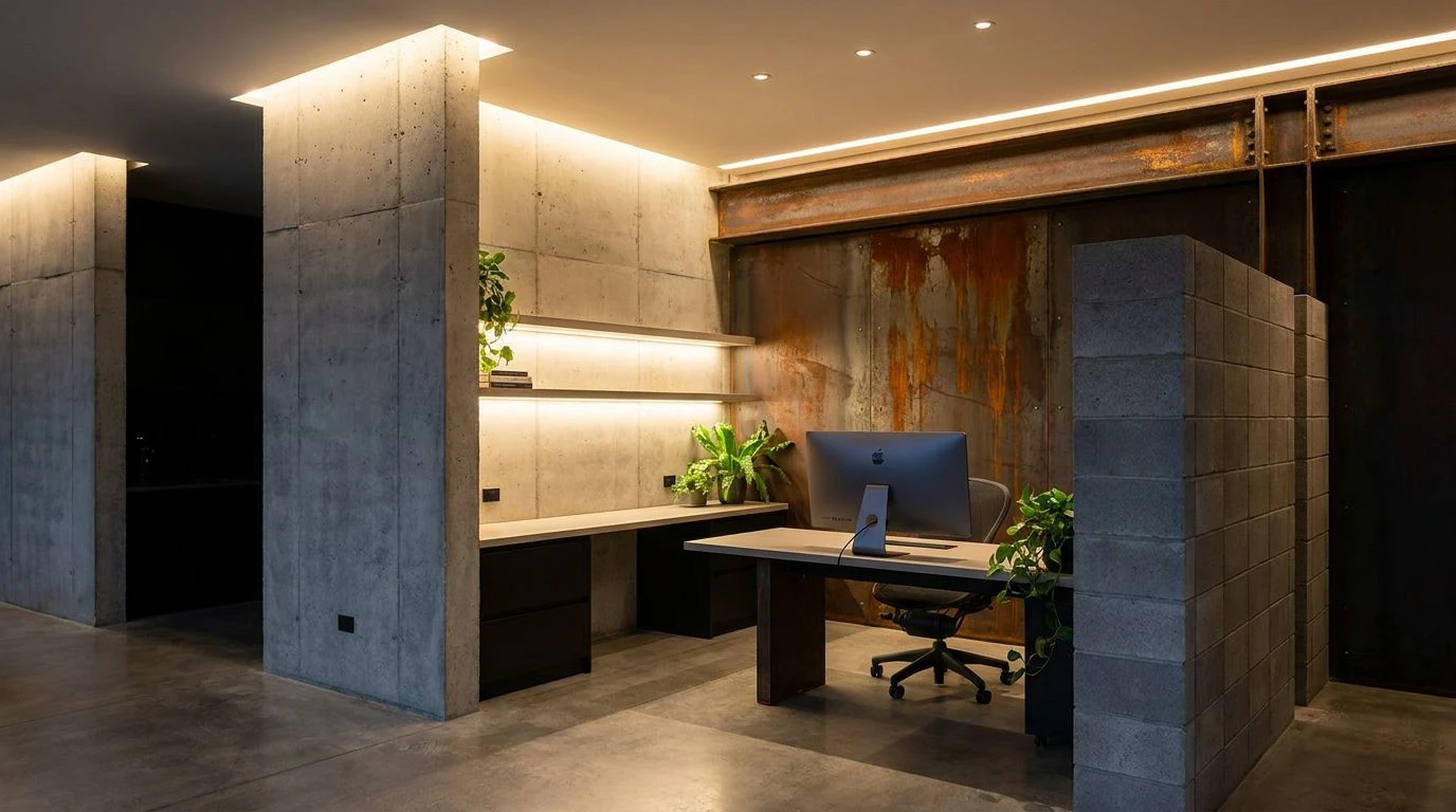
The Brutalist Hearth collection challenges the assumption that warmth requires softness. By anchoring digital spaces in the uncompromising starkness of Alabaster Lime and Soot, this palette mimics the structural honesty of a poured foundation. Cast Concrete and Weathered Steel introduce the visual weight of raw architecture, grounding the reader in a space that feels permanent and secure. The unexpected comfort emerges from the accents: Oxidized Iron brings the slow decay of exposed metal, a reminder of time passing, while Industrial Patina offers a flash of chemical brightness, like copper resting in damp air. In a lifestyle blog, this combination rejects the fragile artifice of domestic perfection. Instead, Cinder Block shadows offer a quietly protective environment, suggesting that true comfort is found in structures strong enough to weather reality.
Kiln Fired 🧱
Kiln Fired turns toward the thermal memory of industrial production, finding shelter in the tones of baked earth and extinguished furnaces. The foundation relies on Plaster and Pitch, creating a high-contrast environment that demands attention. Yet, the emotional center shifts toward the deep, grounded reds of Fired Clay and Crushed Terracotta. These colors recall the brickwork of abandoned textile mills and pottery kilns, carrying an implied heat that warms the otherwise austere digital page. The addition of Slag Ash and Winter Mortar provides a cooling counterbalance, mimicking the dusty, quiet corners of a workshop at rest. Applying these colors to lifestyle writing transforms everyday routines into rituals of endurance. The palette insists that the domestic sphere is not a delicate retreat, but a working studio where life is actively shaped and forged.
Factory Floor 🚧
Navigating the Factory Floor collection is an exercise in managing attention through utilitarian signals. The dominant backdrop consists of Machine Oil and Smelting Iron, deep and unforgiving grays that absorb distraction and focus the eye on the content. Steel Grate serves as a neutral bridge, a walkway over the heavier shadows. The brilliance of this palette lies in its deliberate use of industrial warning signs as domestic highlights. Safety Orange and Rusted Gear interrupt the monochrome expanse with the urgency of a caution stripe, directing the reader toward essential information or intimate personal reflections. Molten Glow softens the harshness slightly, while Fluorescent Marker acts as a synthetic jolt of life, akin to a neon safety vest left on a workbench. For a digital publication, this arrangement borrows the visual language of physical labor, suggesting that curating a life requires deliberate, attentive work.
Assembly Line ⚙️
The Assembly Line spectrum captures the precise intersection between mechanical routine and unexpected human intervention. Porcelain Ceramic and Carbon Dust establish a sterile, clean perimeter, establishing a layout that feels systematic and highly organized. Within this rigid framework, Milled Aluminum and Galvanized Zinc operate as the structural supports, offering a cool, reflective surface that gives the page a spacious, echoing quality similar to an empty warehouse. The atmosphere shifts dramatically with the introduction of Hot Solder and Brass Fitting, which inject flashes of energetic warmth into the machinery. These tones resemble the sparks of a welder's torch against cold metal. Exhaust Pipe deepens the shadows, while Factory Skylight breaks through the heavy atmosphere with the clarity of a winter morning seen through wire-mesh glass. This palette allows lifestyle content to feel both methodical and surprisingly intimate, treating daily habits as a carefully engineered mechanism.
Cement Mixer 🏗️
The Cement Mixer selection is an exercise in profound restraint, stripping away the superfluous to reveal the quiet dignity of basic materials. The composition builds upward from Coal Tar, an abyssal foundation that provides serious, unwavering support. Wet Pavement and Portland Dust act as the primary textural elements, their muted mid-tones mimicking the granular surface of drying concrete. This deliberate lack of saturation forces the reader to slow down and notice the subtle variations in the text. Bone Ash provides a muted, chalky light that prevents the design from feeling claustrophobic, acting as the negative space in an architectural blueprint. The solitary source of organic comfort is Exposed Brick, a faded, earthy red that draws the eye like a solitary hearth in a vast, unfinished loft. Using this scheme for a lifestyle blog communicates an intense, uncompromising focus on the fundamentals of living, finding beauty in raw, unfinished states.
Adopting the austere vocabulary of heavy industry transforms the trivialities of lifestyle writing into a matter of architectural permanence. These collections demonstrate that warmth does not require bright colors, nor does security depend on softness. By observing the weathering of steel, the pouring of foundation, and the heat of a kiln, designers can build digital environments that offer genuine shelter from the exhausting hyper-stimulation of the internet. The result is an uncompromising aesthetic that values durability over decoration. Recognizing the beauty in raw, unfinished materials allows for a more honest representation of daily life. It proves that the most comforting spaces are often those constructed with the stern, unapologetic materials of a working factory, standing resolute against the changing tides of fleeting design trends.