Modern Pop Art Color Palettes for Commercial Food Design
· 6 min readThe human visual system is exquisitely tuned to detect ripe, calorie-dense foods against the backdrop of a noisy environment. Millennia of evolutionary pressure shaped our photoreceptors to respond powerfully to intense visual stimuli like bright oranges and vivid yellows, which historically signaled sweetness or immediate nutritional value. Today, modern graphic design adopts these same physiological triggers through striking pop-art color schemes to revitalize the food industry. By surrounding these intense, appetite-stimulating hues with stark neutrals or unexpected, electrifying tones, designers create visual environments that command immediate attention. These vibrant palettes do not merely decorate a space; they actively engage the nervous system, prompting an anticipatory dopamine release often associated with a playful vibe. This careful manipulation of visual stimuli directs the consumer's gaze, turning a simple commercial food template into a potent sensory experience.
Electric Appétit ⚡
The arrangement in Electric Appétit presents a fascinating study in optical perception, where opposing colors intensify each other when placed side by side. The searing heat of Radium Pepper strikes the retina with high-energy waves, traditionally associated with spice and urgency in human food psychology. This intense stimulus is immediately cooled by the wavelength of Electric Cyan and its softer counterpart, Mint Glaze, producing an oscillating visual effect that keeps the eye moving actively across the layout. To prevent sensory fatigue, grounded earthy tones like Wheat Chaff and Roasted Cacao provide a perceptual resting place. These muted, familiar colors ground the aggressive pop-art brights in the recognizable reality of baked goods and roasted coffee. Vantablack anchors the entire visual field, creating sharp boundaries that define graphical elements with precision. This combination activates the psychological triggers of novelty and craving, making the graphical interface feel both highly modern and deeply appetizing to the observer.
Citrus Contrast 🍊
A direct application of the energetic orange and cream aesthetic, Citrus Contrast plays on the psychology of visual weight and temperature. Tangelo Burst acts as the primary dominant wavelength, a color historically linked to the stimulation of the parasympathetic nervous system, which regulates digestion and appetite. When placed against the stark neutrality of Pure Glaze and the light-absorbing Obsidian Plate, this orange creates an optical pop-art effect reminiscent of mid-century advertising, yet calibrated perfectly for modern digital screens. The softer Cream Foam smooths the transition between the extreme light and dark areas, offering a visual softness that suggests dairy or gentle sweetness. Mustard Seed introduces a secondary warm stimulus, broadening the psychological association to savory and tangy flavor profiles. Meanwhile, Ash Shadow acts as a spatial separator, allowing designers to map information logically without introducing competing chromatic noise. The overall impact is a highly legible, physiologically arousing layout that directs user behavior through calculated retinal stimulation.
Kinetic Diner 🚀
Breaking away from traditional warm-toned culinary conventions, Kinetic Diner relies on the element of surprise to capture visual attention. The intense light energy of Lemon Voltage acts as a beacon, rapidly processed by the fovea to signal energy and acidity. This intense focal point is structurally supported by Carbon Void, a deep expanse of black that functions as a framing device, maximizing the perceived intensity of the surrounding colors. What sets this arrangement apart is the introduction of cool wavelengths, from the refreshing Minted Chlorophyll to the deep penetration of Cobalt Extract and Isotope Blue. In food marketing, these cool colors are relatively rare in natural foods, meaning their presence in a digital template creates an immediate sense of artificial novelty and modern pop-art styling. This unexpected chromatic environment stimulates curiosity rather than direct hunger, making it highly effective for disruptive food tech brands or delivery platforms aiming to distinguish themselves. The eye is drawn to the stark borders where the bright yellow meets the deep blue, creating a vibrant edge that holds the user's focus precisely where the designer intends.
Thermal Citrus 🍳
The visual strategy of Thermal Citrus relies heavily on the sharp difference between achromatic grays and intense warm hues. The visual cortex processes the neutral tones of Graphite Dust, Iron Grate, and Silver Spoon with minimal metabolic effort, establishing a quiet background environment. Against this industrial slate, the sudden introduction of Thermal Orange and Solar Yolk creates a powerful visual jolt. These specific wavelengths are deeply ingrained in human perception as indicators of heat and high-calorie nutrition, triggering an almost reflexive association with freshly cooked food. By restricting the active colors to these intense warm tones surrounded by grayscale, the design strictly controls the user's focal points. The eye naturally leaps from Bleached Sugar backgrounds directly to the orange and yellow elements, making them perfect vehicles for critical actions like ordering or browsing menus. This calculated restriction of color mimics the selective attention required to forage for ripe fruit against dull foliage, utilizing our oldest sensory processing habits to navigate contemporary digital environments with speed and precision.
Botanical Blaze 🌶️
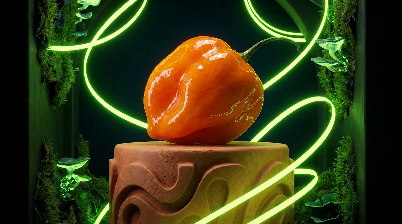
Botanical Blaze investigates the intersection of highly stimulating warm tones and the grounding properties of organic greens. Habanero Flash delivers an immediate rush of visual energy, a wavelength that prompts the brain to anticipate bold, pungent, or spicy flavors. This aggressive stimulus is tempered by the softer Clay Hearth, providing a perceptual stepping stone that prevents the contrast from becoming overly harsh on the eye. The true scientific intrigue of this arrangement lies in the opposing cool tones. Acid Lime introduces a sharp, high-frequency signal often associated with sourness or extreme freshness, interacting dramatically with the deep, light-absorbing Midnight Pitch. Forest Canopy adds a deeper, more resting green, simulating the natural background of leafy vegetation. The interaction between the intense, spicy orange and the vibrant, acidic green creates a dynamic tension that mimics the complex flavor profiles of modern gastronomy. When applied to a commercial interface, this combination communicates intense, layered culinary experiences, using the biological language of color to prepare the user's palate before a single physical bite is taken.
The strategic application of high-energy pop-art colors in commercial templates demonstrates a profound understanding of human visual biology. By isolating the specific wavelengths that trigger appetite, curiosity, and attention, creators can craft interfaces that provoke measurable physiological responses. The sharp juxtapositions of intense oranges, bright yellows, and electric cyan against deep blacks and clinical whites manipulate the optic nerve, guiding human behavior through carefully plotted digital spaces. Far from simple aesthetic choices, these vibrant arrangements act as precise optical tools. They communicate flavor, temperature, and brand identity in fractions of a second, relying on the hardwired connections between the human eye and the digestive system. Understanding these perceptual mechanics allows creators to build environments that visually nourish the viewer, turning everyday navigation into an engaging sensory event.