Rustic Color Palettes for Warm and Engaging UX Design
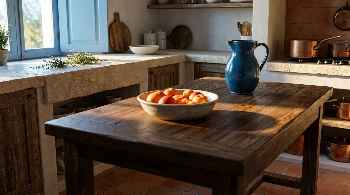
· 6 min readData does not have to live in a white, sterile room. When we share the discoveries of user research, we often default to clinical charts and breathless, sterilized prose, treating human behavior as something to be examined under a fluorescent bulb. Yet, human experience is wonderfully messy, rich, and deeply textured. Imagine inviting your readers into a space that feels like a sunlit kitchen on the Mediterranean coast. By trading the cold operating table for a worn wooden dining table, we invite readers to sit down, break bread, and digest our findings with genuine warmth. Color serves as the mortar holding these stories together, transforming dry statistics into a lively feast. A palette drawn from sun-baked earth and heavy green foliage speaks to the soul long before the brain processes a single percentage, turning an analytical report into a welcoming hearth.
Orchard Feast 🍋
In Orchard Feast, the vivid energy of a midday harvest spills directly onto the screen. Sunbaked Clay and Roasted Pepper ground the reading experience in earthy familiarity, drawing the eye toward profound user insights the way a hearth draws a family. These fiery tones are cooled and balanced by Adriatic Blue, a shade that offers a moment of intellectual pause, much like a breeze coming off the sea through an open window. When you guide readers through a dense ethnographic study, Crushed Olive and Lemon Zest act as lively punctuation marks, waking up the senses and keeping the narrative brisk. Dark Fig Leaf anchors the lighter accents, while Weathered Stone provides a restful background, letting the bolder shades speak without shouting. This collection of hues tells a story of vitality and nourishment, asking the reader to linger over the findings rather than skim past them, treating every user quotation as a carefully prepared dish shared among friends.
Midnight Courtyard 🌙
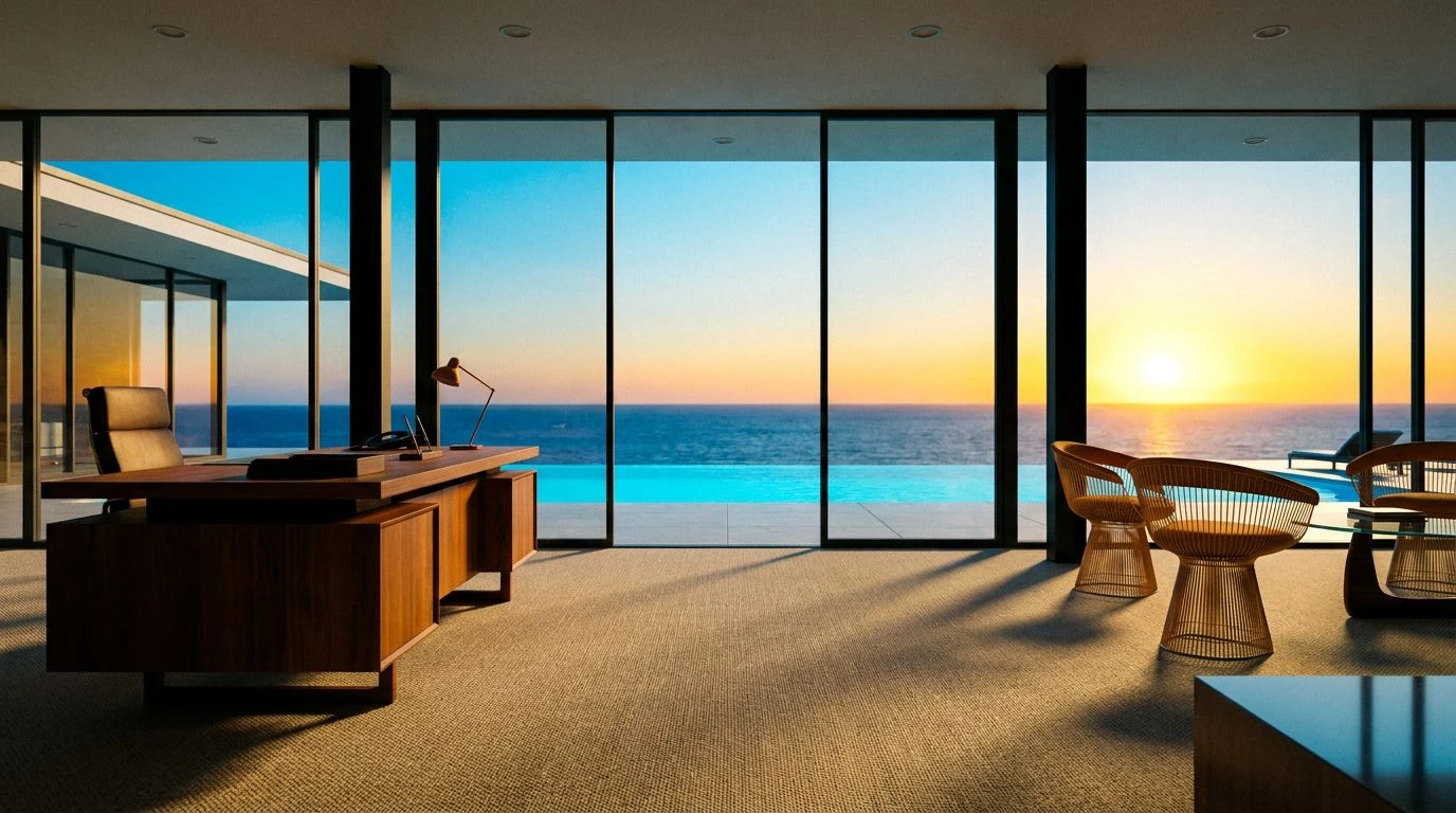
Midnight Courtyard steps away from the blinding midday sun and settles into the quiet intimacy of late evening. Here, Chalk Wash offers a clean but soft expanse, acting as a quiet canvas for the stark authority of Cast Iron typography. Sharing research in this palette feels like speaking across a shadowed table, where Hearth Ash provides gentle transitions between complex data sets, smoothing out the rough edges of statistical tables. The quiet star of this gathering is Terracotta Dust, a warm, muted orange that highlights key takeaways with a gentle, glowing persistence rather than a glaring alarm. Supported by the grounding presence of Faded Linen, the overall atmosphere is one of hushed reverence for the user’s voice. This is a visual language for deep, reflective reading, where case studies are absorbed in comfort, free from the exhaustion of over-designed interfaces. It turns a digital screen into a quiet alcove, demanding focus through sheer, understated warmth.
Coastal Foraging 🌿
The exuberance of a coastal garden in full bloom defines Coastal Foraging. Whitewashed Plaster and Alabaster create a breezy, open environment, ensuring that the interface never feels suffocating or cluttered, even when housing extensive methodologies. Against this airy backdrop, Dusty Brick and Spiced Clove build a foundation of rustic warmth, recalling old brick ovens radiating heat long after the fire has died down. These earthy reds turn pull-quotes and sidebars into inviting nooks of information. The true surprise lies in the verdant spark of Spring Basil and the cooling undertone of Faded Seaweed. These greens breathe life into the architecture of the page, acting as natural navigational markers that guide the eye organically through qualitative interviews and quantitative charts. Presenting findings within this botanical and earthen frame reminds the audience that the data belongs to living, breathing people, offering a sense of organic growth and continual discovery.
Hillside Terrace 🏺
Hillside Terrace captures the expansive feeling of looking out over an ancient valley. Crushed Apricot delivers an immediate, joyful burst of energy, perfect for drawing attention to groundbreaking user insights or moments of delight discovered during testing. This vibrant warmth is stabilized by Limestone and Olive Wood, neutral tones that construct a sturdy, reliable structure for long-form reading, echoing the ageless masonry of rural estates. Wild Thyme introduces a deep, grounding greenery that suggests rootedness and tradition, offering an excellent counterweight to the heated oranges. Above it all, Deep Cerulean and Morning Sky open the design upward, offering visual breathing room reminiscent of a cloudless horizon. When UX research is wrapped in these colors, the narrative feels expansive and optimistic. It tells the reader that every problem identified is merely an opportunity waiting to be explored, framed by the comfort of a sun-drenched, open-air pavilion.
Morning Cafe ☕
Morning Cafe relies on rich, comforting depths to draw the reader into a state of relaxed contemplation. Fresh Milk provides the necessary blank canvas, keeping the layout legible and crisp, while Roasted Coffee offers a profound, dark contrast for text that is infinitely softer on the eyes than pure digital black. This is a palette that smells of morning rituals. Weathered Teak serves as a sturdy bridge between light and dark, giving structure to complex navigation menus or data graphs without feeling mechanical. The soul of this arrangement is Dried Persimmon, an amber-orange that glows like a hearth fire, warming the cooler tones and highlighting critical user feedback with a gentle touch. Cured Clay softly fills in the background gaps, wrapping the entire layout in a soothing, tactile quality. Engaging with research through this visual lens feels less like reviewing a corporate document and more like sitting down with a mentor over an espresso, dissecting human behavior in an atmosphere of absolute trust and ease.
Stepping away from the clinical detachment of standard corporate design requires a willingness to welcome the tactile, the warm, and the deeply human. By treating a research blog as a gathering place rather than a filing cabinet, you fundamentally change how people receive your work. Earthy reds, cooling blues, and grounded greens do much more than decorate a screen; they communicate that the findings within are nourished by real lives and genuine emotions. When we dress our insights in the familiar comforts of a sun-drenched kitchen or a shadowed courtyard, we break down the walls of defensive reading. We ask our colleagues to pull up a chair, pour a drink, and interact with our discoveries openly, trusting that the most profound lessons about human behavior are best absorbed in spaces that feel like a welcoming home.