High-Tech Cyber Color Palettes for Digital Design Focus
· 5 min readHuman visual perception is tightly coupled with our emotional state and cognitive arousal. For decades, software interfaces have been designed under the assumption that neutral grays and stark whites minimize distraction. Yet, prolonged exposure to these desaturated environments often leads to sensory habituation, a phenomenon where the brain simply stops registering predictable stimuli. The result is a profound sense of boredom and fatigue when staring at a standard content management system. Rebelliously injecting high-contrast cybernetic colors, such as electric reds against pitch darkness, directly counters this visual fatigue. It shocks the optic nerve, triggering mild autonomic arousal that we register as excitement and focus. Choosing to paint a digital workspace in these aggressive, high-tech wavelengths is not merely an aesthetic preference but a perceptual recalibration, designed to hack our own neurobiology and make the act of writing and coding feel vividly alive again.
Neural Overdrive 🧠
When the visual cortex encounters the extreme contrast between Vantablack Void and Synaptic Flare, it immediately flags the stimulus as high-priority. This palette mimics the intense luminosity of early cathode-ray tube monitors and modern neon streetscapes, environments known to elevate physiological alertness. By replacing the drab background of a text editor with deep shadows, the aggressive reds and Phosphor Yellow highlights appear to float, creating an artificial depth of field. This spatial illusion tricks the eye into perceiving the interface not as a flat plane of chores, but as a three-dimensional terminal of possibilities. Glacial Data and Cyan Optic provide a cooling perceptual counterweight to the heated reds, preventing visual exhaustion while maintaining the high-energy cybernetic atmosphere. Working within this spectrum transforms the routine act of typing into an engaging sensory event, ensuring the user remains alert and emotionally connected to their technological environment.
Bioluminescent Terminal 🦠
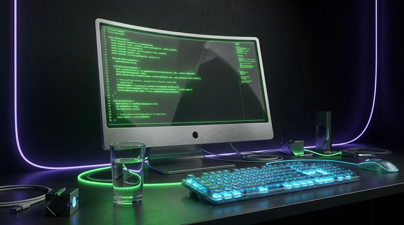
Human eyes are highly sensitive to green wavelengths, a trait shaped by our evolutionary history of scanning foliage. Radium Glow and Chlorophyll Code hijack this biological sensitivity, delivering a massive dose of luminance directly against the crushing darkness of Obsidium. In a content management system, utilizing these highly saturated greens for active cursors or command lines generates an immediate sense of growth and computational power. The addition of Ultraviolet Wash introduces a frequency rarely found in nature, signaling to the brain that this space is strictly artificial and governed by logic. Titanium Chassis and Absolute Zero act as structural barriers, offering visual resting places so the neon elements do not overwhelm the macula. This specific spectral arrangement makes the digital environment feel like a living organism, turning mundane data entry into an interaction with a breathing, reactive machine.
Silicon Canopy 🌿
Not all high-tech environments rely on absolute darkness to stimulate the senses. This selection operates on the principle of unexpected luminance within a high-albedo environment. The expansive use of Bleached Silica creates a brightly lit laboratory setting, while Carbon Fiber grounds the text with sharp readability. The psychological shift occurs with the introduction of Electric Pollen and Synthetix Green. These hyper-pigmented markers act as visual caffeine, pulling the user out of the stupor induced by standard monochromatic fields. The presence of Oxidized Copper adds a stabilizing earthly weight, grounding the otherwise frantic energy of the neon greens. Applying these colors to a digital workspace creates a perception of accelerated organic growth, perfect for users who want the sensation of rapid technological advancement without retreating into a lightless cybernetic cave. It makes the act of creation feel rapid, fresh, and chemically potent.
Dopamine Surge ⚡
The optic nerve detects edges and boundaries through stark differences in brightness. By placing Reactor Yellow and Lemon Isotope directly adjacent to Void Black and Basalt Shadow, this color set maximizes edge contrast, forcing the brain into a state of heightened attention. Yellow is processed rapidly by our visual system, often associated with caution, speed, and electricity. When applied to interface elements like save buttons or error logs, these radioactive yellows trigger micro-doses of dopamine, rewarding the user for navigating the digital architecture. Aluminium Plate serves as a transitional zone, smoothing the harsh mathematical jumps between pure white and pure black. Transforming a standard editor with this high-alert configuration obliterates complacency. The user is constantly reminded of the kinetic energy behind their keystrokes, making every line of code or paragraph feel like a critical command in a high-stakes mainframe.
Oceanic Subroutine 🌊
There is a distinct psychological difference between the alerting mechanism of warm neons and the focused flow state encouraged by cool neons. Plunging the visual field into the crushing depths of Abyssal Trench forces the pupils to dilate, allowing the piercing emissions of Biolume Sprite and Acid Kelp to dominate perception. These electric greens and Fiber Optic Blue wavelengths are situated at the peak of scotopic vision, meaning they appear exceptionally bright to the dark-adapted eye. This phenomenon reduces the overall light emission required from the monitor, minimizing eye strain while simultaneously providing a rich, saturated aesthetic. Slate Node offers a muted surface for passive reading, ensuring the glowing elements retain their special status as interactive triggers. This aquatic, cybernetic spectrum isolates the user from their physical surroundings, generating a deep, immersive concentration that feels like interfacing directly with a raw data stream.
Modifying the colors of our digital tools is a potent method for manipulating our own cognitive states. By rejecting the habitual grays of standard software and adopting aggressive, highly saturated neon wavelengths, we can actively prevent sensory adaptation. High-contrast environments stimulate the visual cortex, transforming passive screen time into a highly engaging physiological experience. Whether through the warning signals of radioactive yellows or the immersive depth of abyssal darks, these spectrums prove that functional design does not require sensory deprivation. Reclaiming the visual output of our machines allows us to engineer our own focus, proving that aesthetics in software are not superficial, but deeply tied to how our brains process and react to the digital world.