Neo-Noir Color Palette Ideas for Premium Logistics Design
· 5 min readThe logistics sector has long suffered from a visual identity crisis, typically relying on uninspired images of smiling men in high-vis jackets standing triumphantly next to cardboard boxes. It is an aesthetic of forced cheerfulness that entirely misses the point. Moving goods across continents is not a lighthearted romp; it is a serious, shadowy, and highly engineered operation. Borrowing the visual language of neo-noir cinema offers an immediate and desperately needed corrective. By swapping sterile white warehouse lighting for the moody, high-contrast shadows and deep ink blues of a seventies detective thriller, supply chain brands can finally communicate authority. It turns mundane freight forwarding into a cinematic operation governed by calculated precision, giving a traditionally beige industry a sharp, premium edge.
Night Shift Metropolis 🌃
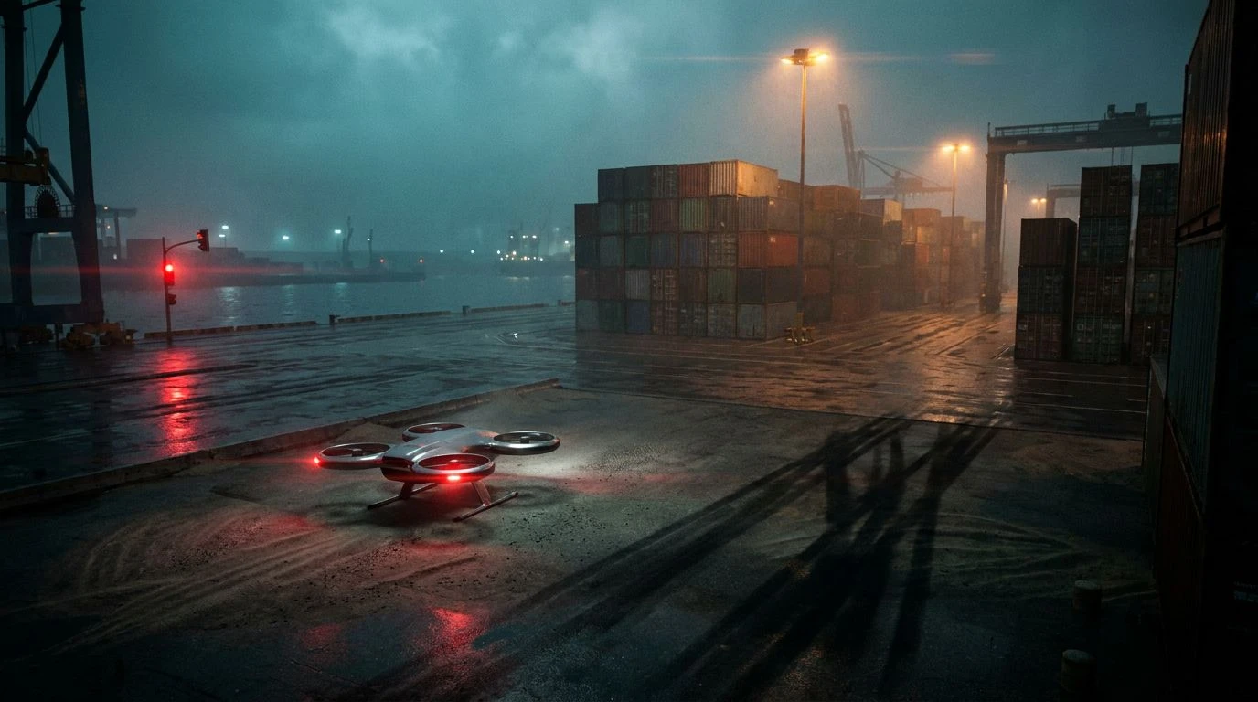
When transforming a brand from dull and utilitarian to cinematic, lighting is everything. Night Shift Metropolis captures the exact feeling of an urban port at three in the morning, where heavy machinery hums under artificial glare. The deep, imposing Midnight Harbor anchors the arrangement, suggesting vast shipping yards and quiet authority. Against this heavy charcoal and navy backdrop, Sodium Streetlight acts as a practical warning signal, mimicking the flash of a crane operator's cabin in the rain. Acid Rain Haze and Traffic Light Glow provide an unexpected toxicity that feels entirely appropriate for industrial settings, cutting through the shadows with mechanical urgency. By adopting these tones, a logistics firm sheds its corporate innocence. It stops pretending to be your friendly local delivery service and positions itself as a formidable architectural force that moves global markets while the rest of the city sleeps.
Monochrome Cargo 🎬
There is a distinct confidence in stripping a visual identity down to its barest components. Monochrome Cargo is an unapologetic study in grayscale, offering a brutalist take on the neo-noir genre. Pitch Black Ocean serves as a suffocatingly dark foundation, the kind of endless charcoal tone you might find in a classic private eye film just before the rain starts. It is sharp, serious, and entirely devoid of forced corporate cheer. Galvanized Steel and Wet Tarmac introduce the necessary mid-tones, recalling endless stretches of highway and cold warehouse shutters pulled tight against the elements. Fog Warning adds a stark, piercing contrast that forces the eye to focus exactly where it needs to. A supply chain business utilizing this strictly disciplined palette immediately communicates a no-nonsense professionalism. It tells clients that their operations are handled with clinical, almost frightening exactitude, leaving absolutely no room for error.
Midnight Freight 🚢
Neo-noir thrives on a particular shade of blue, the kind that feels cold to the touch and suggests secrets exchanged on rain-slicked docks. Midnight Freight leans heavily into this exact cinematic trope, offering a masterclass in industrial tension. Void Space and Storm Front Navy provide the heavy, oppressive darkness required to make an operation look like a premium, high-stakes endeavor rather than a routine parcel drop. Deep Water Cobalt strikes through the gloom like a police siren reflecting off a wet windshield, adding a sudden jolt of electricity to an otherwise somber lineup. The supporting cast of Machined Gunmetal and Pier Floodlight grounds the dramatic blues in stark reality, mirroring the physical materials of the trade like shipping containers and crane cables. Implementing these colors completely overhauls a dated logistics brand, transforming everyday transit into an atmospheric thriller where every shipment feels like a highly guarded asset.
Contraband Routes 🔦
Sometimes, building a premium aesthetic means embracing the gritty, unpolished realities of the physical world. Contraband Routes introduces an earthy, almost uncomfortable realism to the classic neo-noir spectrum. Midnight Detective and Precinct Ink supply the mandatory shadows, building a heavy corporate foundation that feels appropriately guarded. But it is the strange, narrative additions like Murky Riverbank and Trenchcoat Khaki that make this collection so compelling. They recall the damp interiors of loading docks and the worn leather of a driver's jacket, making the brand feel lived-in and battle-tested rather than fresh out of a sterile design agency. The sudden violence of Tail-light Red acts exactly like its namesake, a solitary brake light vanishing into the fog. It provides a brilliant accent for critical data points on a logistics dashboard or tracking interface, ensuring that the stark industrialism never completely loses its cinematic tension.
Neon Logistics 🚨
If the previous arrangements lean into the quiet suspense of a vintage thriller, Neon Logistics belongs in a hyper-modern, neon-soaked reboot. It understands that you can only push charcoal and dark navy so far before they simply look like a void. Midnight Asphalt and Cast Iron provide that necessary weight, laying down a foundation of impenetrable professionalism. Yet, it is the electric shock of Ultraviolet Glare and Brake Light Crimson that elevates the entire operation. These are the colors of rain-soaked neon signs vibrating in a dark alleyway, bringing an unexpected and highly engineered slickness to the supply chain. Dried Blood grounds the brighter tones, adding a heavy dose of gravity to ensure the brand never looks like an arcade game. By using these intense, artificial pops of color against a strictly corporate background, a logistics company immediately looks less like a trucking firm and more like an elite data running syndicate.
The visual vocabulary of the global supply chain is desperately overdue for a rewrite. For decades, the industry has equated professionalism with a kind of sterile, aggressively bright boredom. Stepping into the shadows of neo-noir cinema changes the entire narrative. By embracing heavy charcoals, ink blues, and sudden, striking accents, logistics firms can stop apologizing for the grit of their work and start owning it. These dark, atmospheric tones do not just look more sophisticated; they communicate a quiet, imposing capability. They reframe the movement of cargo as a highly calculated, dramatic operation that happens while the rest of the world is looking the other way. It is a bold visual strategy, but one that finally gives the sector the cinematic gravity it deserves.