Nordic Design Color Palettes: Sahara Meets Stockholm UI
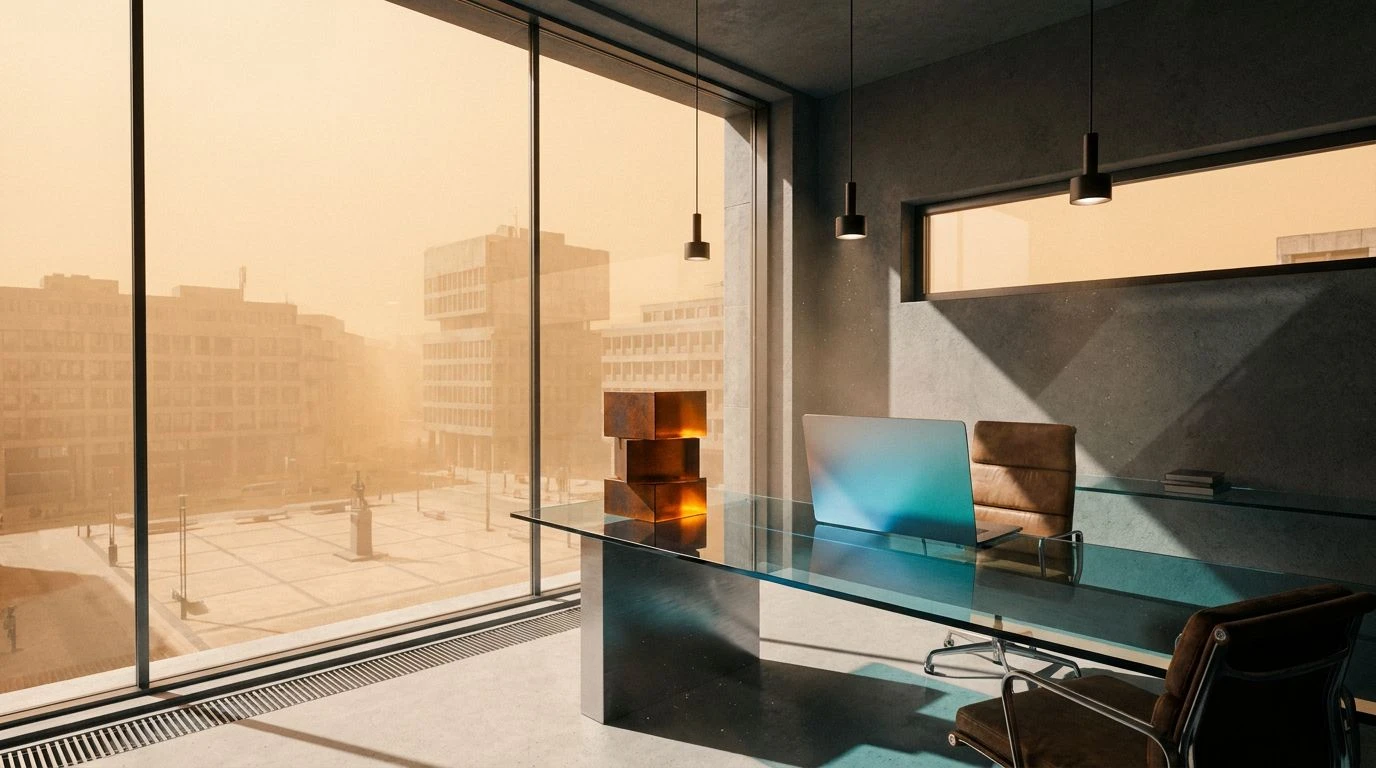
· 5 min readWhen meteorological extremes collide in the visual field, the human brain processes a sudden, captivating contradiction. Imagine the atmospheric particulate of a Saharan sandstorm settling over the strict, grid-like precision of a Stockholm financial district. This theoretical intersection produces a visual language where blistering thermal energy meets cold, sterile logic. In digital interfaces, managing cognitive load requires deliberate control of environmental stimuli. Introducing earth orange and honey yellow into an otherwise stark, neutral grey ecosystem forces the optic nerve to reconcile organic heat with calculated restraint. Such a color system communicates intellectual rigor while remaining firmly grounded in the physical world. The resulting aesthetic calculates risk and reward through the psychology of color, using warmth to guide attention and glacial greys to maintain structural discipline.
Meteorological Contrast 🌪️
The visual cortex interprets extreme temperature differences as a signal of both urgency and environmental depth. Meteorological Contrast presents a strict study in this thermal opposition. The piercing intensity of Thermal Orange and Oxidized Iron mimics the suspended dust of a desert wind, scattering long-wavelength light across the interface. This aggressive warmth is immediately countered by the clinical precision of Concrete Dust and Bone Ash, providing the neutral grey foundation necessary for a sophisticated financial application. The introduction of Glacial Melt and Fjord Water acts as a perceptual coolant. When placed alongside the heavy earth tones, these cool cyan frequencies recede, creating optical distance and establishing an intellectual hierarchy of information. Obsidian Shadow anchors the layout, ensuring that the high-energy elements do not overwhelm the user. The brain registers this environment as highly structured yet energized, a space where calculated Nordic minimalism controls the wild, atmospheric heat.
Atmospheric Refraction 🌤️
Light behaving within a suspended particle cloud creates specific optical phenomena, altering how colors are perceived against a clear sky. Atmospheric Refraction captures this exact environmental interaction. Desert Honey dominates the visual field, pushing high-visibility wavelengths forward to draw immediate attention, acting much like a critical alert in a financial dashboard. This intense focal point is stabilized by the muted presence of Lichen Spore and Silica Haze, which serve as grounded, low-stimulus zones for processing complex numerical data. The cognitive relief comes from the unexpected cool bands of Stratosphere Blue and Atmospheric Steel. These wavelengths simulate the clear, unobstructed Nordic sky piercing through the dust, offering visual oxygen to the user. The human eye relies on such thermal contrasts to navigate dense information architectures without fatigue. This specific interaction between organic heat and sterile, mathematical blue establishes a setting of professional sophistication, where every visual stimulus is carefully metered.
Thermal Strata 🏜️
To achieve a grounded, intellectual aesthetic, an interface must manage how the eye moves between active and passive regions. Thermal Strata organizes these regions by mimicking geological layering. The sterile, highly reflective properties of Absolute White and Winter Fog provide the vast, uninterrupted space characteristic of Scandinavian design, lowering the overall ambient visual noise. Against this stark canvas, the progression from Amber Yield to Solar Flare and Iron Oxide introduces sudden bursts of kinetic energy. These earth orange and honey yellow frequencies advance rapidly toward the viewer, making them highly effective for driving user actions or highlighting financial growth metrics. Nordic Stone acts as the critical stabilizing agent. By offering a true neutral grey, it absorbs the excess luminosity of the warmer tones, preventing sensory overload. The resulting visual environment feels both meticulously calculated and distinctly organic, mirroring the physical reality of hot desert sand blowing across frozen pavement.
Perceptual Gradient 🧭
The psychology of human vision dictates that cool, desaturated colors calm the nervous system, while warm, earthy tones provide a sense of physical security. Perceptual Gradient investigates this biological response by contrasting the sterile logic of winter against the tactile reality of earth. Snow Crust and Frost Glaze establish a clinical, highly legible baseline, perfectly suited for the rigorous data processing required by a Stockholm financial platform. When Windblown Sand and Cured Leather are introduced into this cold environment, they do not shout for attention. Instead, they provide a sophisticated, grounded counterweight. The eye reads these muted browns and tans as reliable and enduring. Deep Boreal acts as the authoritative anchor, a dark aquatic frequency that sharpens the boundaries between the soft sand tones and the bright whites. This careful calibration of light and temperature creates a deeply intellectual space, encouraging prolonged focus while entirely avoiding the visual monotony typical of purely greyscale interfaces.
Geologic Time 🕰️
Designing for an intellectual, grounded experience often requires referencing the natural world, specifically the permanent and unyielding materials found in geology. Geologic Time constructs a high-contrast environment rooted in earth orange and neutral grey. Granite Dust offers a muted, low-reflectance background that minimizes eye strain, essential for prolonged analytical tasks. Against this quiet foundation, Crystallized Honey and Dune Avalanche project distinct thermal signatures. These wavelengths are highly active, simulating the sudden arrival of Saharan heat, yet they are restrained by the heavy, absorbing presence of Peat Soil. The inclusion of Tundra Moss introduces a subtle biological variable, a low-frequency green that bridges the gap between the scorched oranges and the stony greys. In a financial application, this arrangement directs human attention effortlessly, using the bright, organic colors to highlight shifting variables while relying on the dark, heavy earth tones to establish permanence, security, and institutional weight.
The biological mechanics of human vision allow us to perceive temperature and structure long before we process text or numerical data. By colliding the high-energy wavelengths of a Saharan storm with the low-stimulus environments typical of Nordic architecture, these color systems construct a fascinating perceptual dichotomy. The optical friction between earth orange, honey yellow, and neutral grey forces the brain into a state of alert focus, tempered by calm structural boundaries. Such visual strategies move beyond mere decoration, operating as functional psychological tools that organize complex information. They prove that sophisticated, intellectual interfaces need not rely entirely on clinical sterility. Instead, introducing carefully calibrated thermal disruptions can ground a digital experience in physical reality, keeping the human mind engaged, oriented, and entirely in control of the surrounding data landscape.