Honey and Slate Color Palettes: A New Era of Design Trust
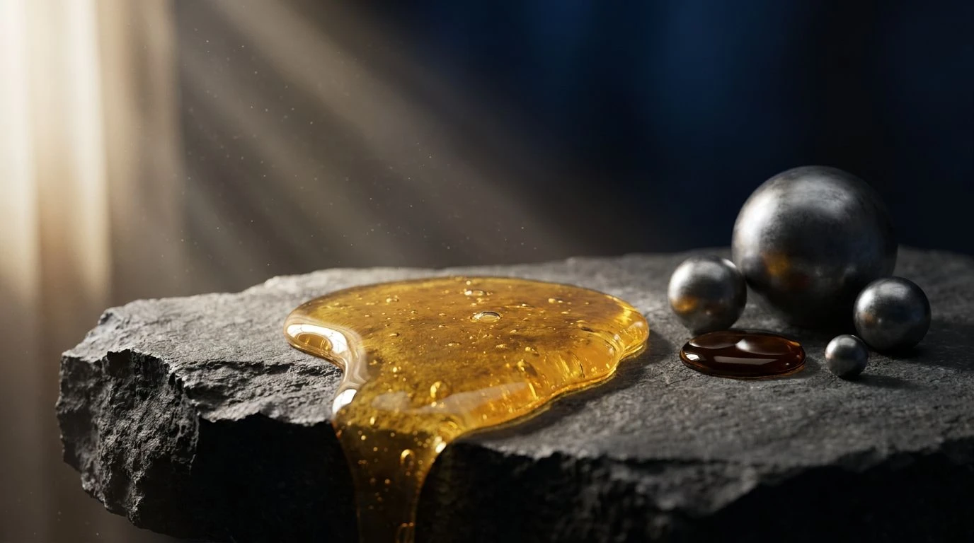
· 6 min readThere was a time when the visual language of authority relied solely on a cold, unyielding wall of navy blue. Today, the modern eye seeks something far more tactile and alive. We are drawn toward the magnetic pull of contrasts, where the luscious, dripping warmth of organic amber meets the cool, grounding presence of slate. This aesthetic pivot replaces the sterile boardroom with the undeniable texture of the earth itself. It is a visual conversation between the sweetness of wild nectar and the quiet endurance of ancient stone. By pairing these opposing elements, brands are crafting a visual signature that feels both undeniably professional and remarkably human. The viewer is invited to feel the weight of the rock and the slow, golden flow of the honey, creating an immediate sense of reliability rooted in the sensory world.
Nectar and Riverstone 🍯
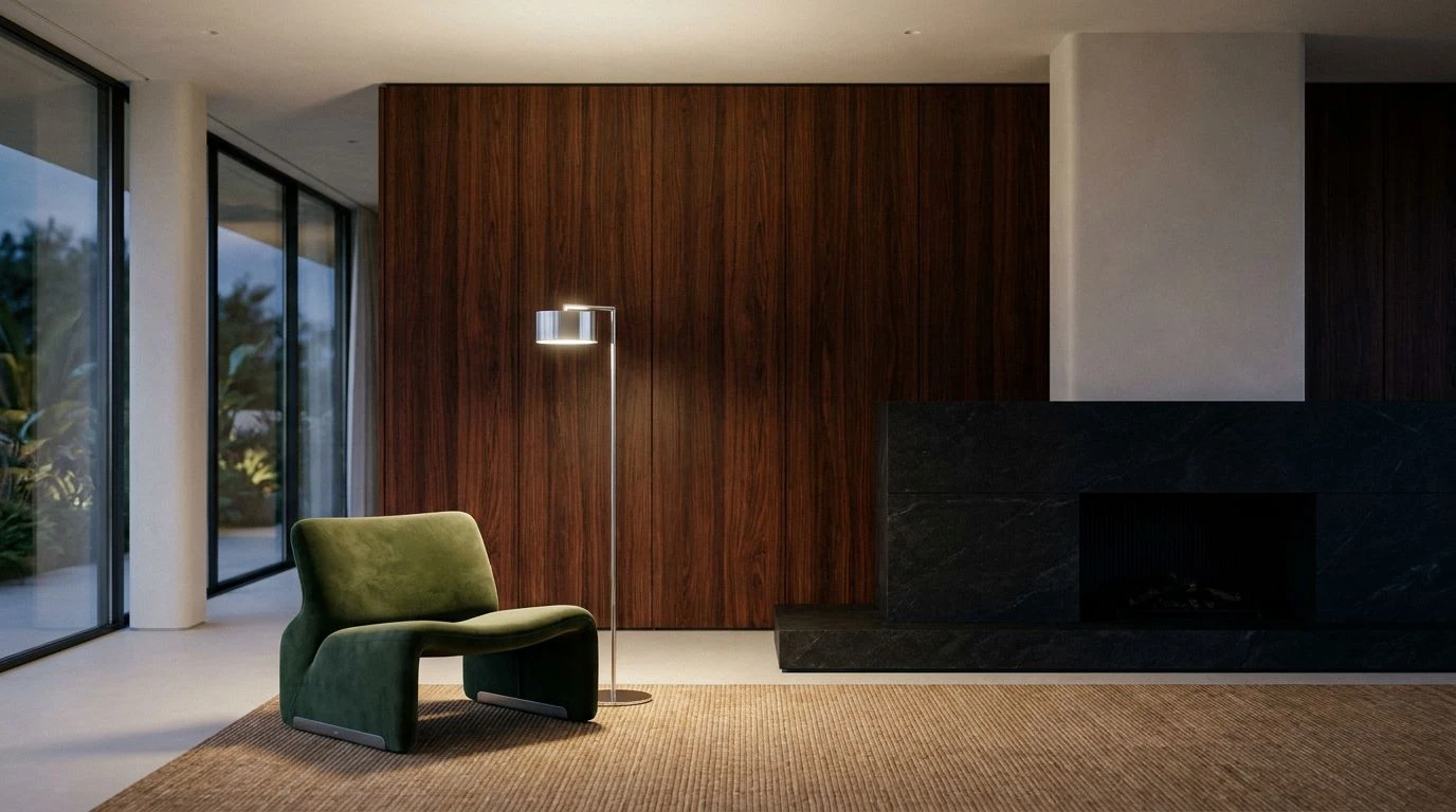
Within the collection known as Nectar and Riverstone, a delicate tension plays out across the spectrum. Scorched Earth provides a deeply rooted, almost ancestral grounding, securing the eye before it travels upward to the soft, inviting flush of Spiced Clay. This is where the human touch lives, a shade so soft and familiar it acts as a quiet welcome. The eye then rests on Milk Glass, providing a breath of empty, clean space. It is the perfect, quiet canvas for the sudden drop in temperature brought by Morning Fog and Riverstone Blue. These cooler tones sweep in like a sudden coastal breeze, bringing the crisp, composed authority of polished minerals. Together, they construct a visual atmosphere that speaks of approachability wrapped in cool composure. The viewer feels guided through a landscape that is at once intimately inviting and stoically secure, making it a brilliant visual strategy for establishing deep, tactile credibility.
Midnight Amber 🌘
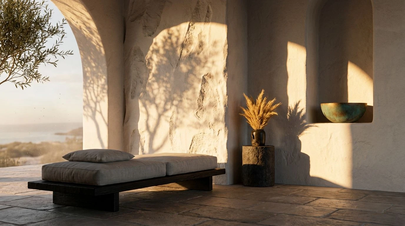
Midnight Amber reads like a photograph captured just as the sun disappears behind a mountain range. Pitch forms an absolute void, a shadow so complete it makes every other hue sing with desperate vitality. Against this dark expanse, Wild Apricot and Burnished Amber glow with the quiet intensity of an open fire, offering a magnetic, golden comfort that draws the eye inward. It feels like stepping from the cold night into a deeply heated room. But the emotional temperature drops beautifully once again as we encounter Obsidian Blue, Frosted Shale, and Winter Sea. These frosty, geological tones offer a stunning counterpoint to the heat, bringing a calculated, architectural stillness to the composition. The resulting mood is powerfully cinematic, pairing the raw, untamed allure of molten sap with the calculated, unmovable presence of dark ocean water and wet stone. It builds a narrative of absolute security kissed by sudden, brilliant warmth.
Gilded Slate ✨
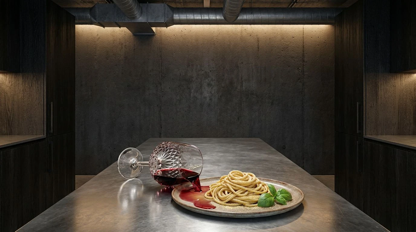
Walking through the visual landscape of Gilded Slate is akin to trailing a hand across cold marble before catching a sudden ray of late afternoon sunlight. Polished Pewter lays down a quiet, almost whispering foundation, completely unbothered and cool to the touch. Suddenly, Dripping Honey erupts onto the scene, a burst of joyful, unfiltered sweetness that completely alters the emotional temperature. It is rich, decadent, and unapologetically alive. Clotted Cream bridges the gap between these extremes, a luxurious neutral that softens the transition into the deeper, shadowed reaches of Antique Brass. Finally, Muted Fjord washes over the senses, a shade reminiscent of deep, quiet waters trapped in a rocky gorge. This visual journey captures a beautiful friction between liquid gold and cold stone, offering a modern aesthetic that feels entirely luxurious yet grounded in natural reality. It constructs an atmosphere of quiet, assured capability wrapped in golden light.
Raw Comb and Cobalt 🐝
The sheer visual impact of Raw Comb and Cobalt lies in its refusal to be ignored. Onyx anchors the grouping with a heavy, unapologetic weight, setting a serious, almost theatrical stage. From this darkness springs the electric jolt of Wildflower Nectar, a shade so vivid and thick it practically drips from the canvas. Clove Oil and Sunlit Silk stretch this golden narrative, offering varying depths of sweet, natural brightness that feel both ancient and entirely fresh. Weathered Zinc and Basalt Rock then step in to construct a serious, architectural framework, cooling the wild sweetness with the unyielding stoicism of hard earth. The unexpected finish arrives with Corporate Cobalt, a nod to traditional authority that feels suddenly transformed when placed against such organic warmth. This collection creates a dialogue between the untamed bounty of the hive and the rigid, mathematical certainty of modern architecture, resulting in a wildly compelling visual identity.
Alabaster and Azure 🌊
Alabaster and Azure takes a vastly different, deeply restrained approach to the tension between the organic and the structural. Crushed Pearl and Dove Wing drift through the composition like weightless clouds, offering an atmosphere of immaculate, unbroken silence. This airy quality slowly descends into the quiet, dusty shadows of Smoked Quartz and the deep, roasted depths of Espresso Bean. These tones are grounding, earthly, and deeply familiar, reminiscent of crushed earth and quiet forests. Against this muted, incredibly soft background, Striking Azure shatters the calm like a pane of bright glass. The shock of this vivid, aquatic tone against the powdery, organic neutrals is nothing short of breathtaking. It completely bypasses traditional expectations, offering a visual experience that is both remarkably clean and earth-bound. The viewer is left with a profound sense of clarity and purpose, anchored by the soil and uplifted by an endless, flawless sky.
The movement away from an entirely cool, distant aesthetic marks a profound shift in how visual authority is constructed. By placing the rich, golden textures of wild nectar against the unyielding, quiet strength of carved stone, a new language of credibility emerges. It is a language that respects the human desire for warmth and approachability while maintaining an unbreakable sense of composure and structural grace. These compositions prove that true professionalism no longer needs to feel remote or untouched by the natural world. Instead, it can embrace the glorious friction between the softest organic elements and the hardest minerals. Moving forward, the most compelling visual identities will be those that master this beautiful contradiction, inviting the eye to linger on the warmth before resting assured in the cool, unshakable foundation beneath it.