Warm Modern Color Palettes to Soften Industrial Design
· 5 min readThe modern workspace often defaults to a sterile aesthetic of brushed aluminum, matte black, and severe glass partitions. It is an environment designed for efficiency but frequently stripped of human comfort. To counter this chilling effect, contemporary designers are looking toward a completely different setting for inspiration: the artisanal bakery. By introducing the soft, tactile colors of a baker's bench into strict industrial spaces, interior and digital environments alike become instantly more inviting. Thick cream, dusted flour white, and baked terracotta cut through the harshness of steel blue and charcoal. This approach creates a professional atmosphere that feels distinctly nurturing, offering the precision of a laboratory with the comforting warmth of a kitchen.
Industrial Oven 🥖
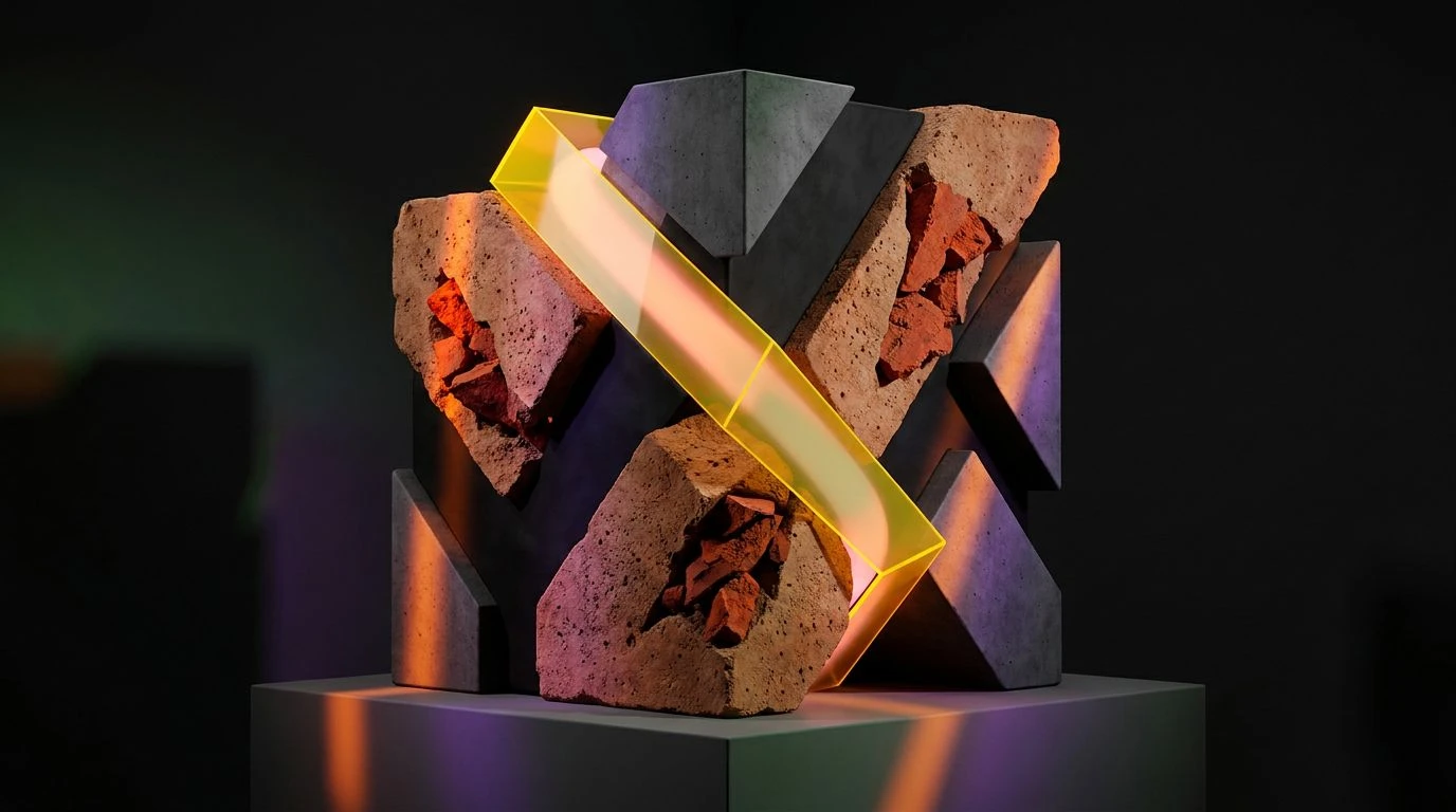
Industrial spaces often rely heavily on stark contrasts, yet the Industrial Oven palette softens this rigid structure by introducing an unexpected organic warmth. The deep weight of Cast Iron and the cool touch of Aluminum provide a strong, reliable foundation typical of high-end espresso machines or precision tech hardware. However, it is the addition of Flour Dust and Baked Crust that entirely shifts the atmosphere. These warmer tones break up the visual coldness, bringing to mind fresh loaves resting on a metal cooling rack. When applied to spatial design or a brand identity, this palette communicates a sense of exactness softened by human hands. It works exceptionally well in modern offices or boutique roasteries where exposed pipes and concrete floors need a counterweight of organic comfort. The resulting aesthetic feels both strictly professional and comfortably lived-in, proving that heavy metals and soft baked tones can coexist beautifully.
Morning Prep 🥐
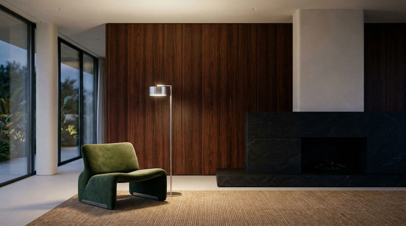
The Morning Prep palette captures the exact moment the lights flick on in a commercial kitchen before dawn. Midnight Apron and Kitchen Tile offer that familiar, cool industrial shadow, while Prep Table Gray maintains a steady, practical work surface visual. Yet the atmosphere is immediately warmed by the introduction of Proving Dough and Glazed Apricot. These lighter, appetizing shades act as a natural counterbalance to the cooler blues and grays. In modern interface design or workplace interiors, using this combination prevents the space from feeling too much like a server room. The softer, creamy whites act as a gentle backdrop, allowing the bright orange to pop with a sense of energy and welcome. This interaction between strict, reliable blues and soft, edible warm tones creates an environment that supports focus while remaining highly approachable. It perfectly captures a professional setting that cares for its occupants.
Patisserie Workshop 🥣
Patisserie Workshop introduces a sophisticated balance between clinical precision and artisanal craft. The heavier elements of Stove Black and Steel Whisk provide the undeniable structure of an industrial setting, much like the heavy workstations found in modern manufacturing or tech hubs. To prevent the environment from feeling isolated, the palette introduces Wooden Spoon and Tempered Sugar, shades that instantly bring to mind well-worn pastry boards and golden baked goods. The inclusion of Soft Teal Ceramic and Cobalt Enamel adds a layer of vintage kitchenware charm, bridging the gap between heavy industry and domestic comfort. When applied to architectural finishes or digital platforms, this set of colors transforms a rigid layout into something inviting. The visual temperature remains balanced, ensuring the space feels efficient enough for serious work but entirely welcoming for collaboration and creative thought.
Gaslight Bakery 🍞
At first glance, the Gaslight Bakery palette leans heavily into a highly technical, almost nautical aesthetic with its deep range of blues. Deep Indigo and Factory Blue immediately establish a serious, analytical tone that dominates many corporate spaces and tech interfaces. The sudden flash of Gas Flame adds high visibility, typical of emergency dials or digital notification badges. What rescues this selection from becoming overly clinical is the crucial addition of Golden Rye. This singular, earthy yellow tone acts as a beacon of warmth against the cool Muted Galvanized background. It mimics the color of a perfect crust emerging from a commercial oven, shifting the entire narrative of the palette. By placing this organic, tactile shade next to strict, disciplined blues, designers can craft spaces that feel both highly engineered and deeply human. The contrast creates a visual tension that is thoroughly engaging and reassuringly grounded.
Artisan Roaster ☕
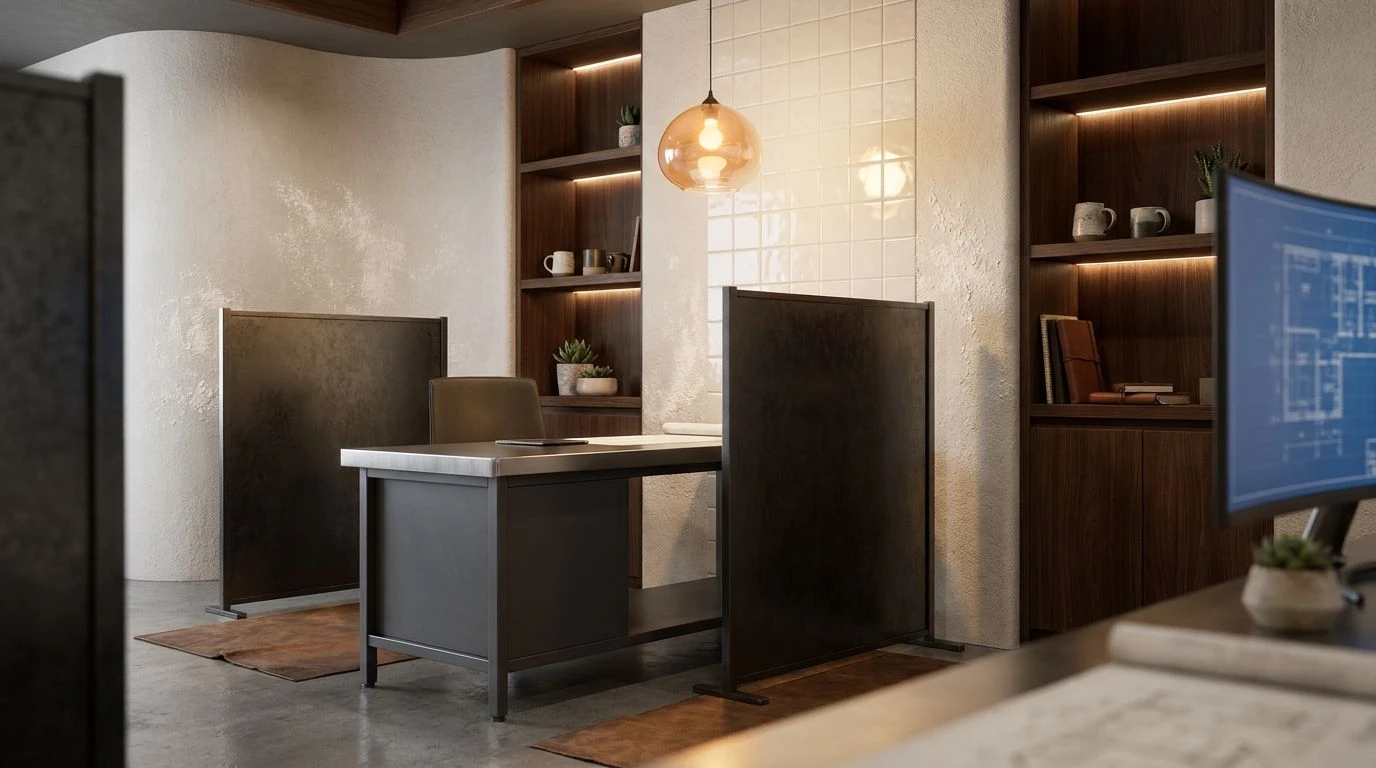
Artisan Roaster relies entirely on the tactile relationship between raw building materials and soft culinary finishes. The dominance of Carbon Steel and Matte Black sets a firmly urban, industrial tone, reminiscent of exposed ductwork and heavy machinery in converted warehouse spaces. However, the mood softens dramatically with the introduction of Greige Linen and Whipped Cream. These expansive, breathable shades wash over the heavy darks, providing a sense of calm and cleanliness akin to a freshly dusted baker's apron. The anchoring warmth of Brick Oven prevents the grays from becoming monotonous, adding a rustic edge that feels grounded and familiar. In practice, this palette offers an incredibly sophisticated approach to interior styling or product packaging. It allows for the sleek, minimalist appeal of modern design while ensuring the final result feels comforting, tactile, and highly nurturing for daily use.
The intersection of heavy industry and the culinary arts offers a fresh perspective for modern design practices. By carefully measuring out tones of dough, cream, and baked crust against backgrounds of heavy charcoal and cold steel blue, spaces and products easily shed their sterile reputations. This approach proves that technical precision does not require a sacrifice of human comfort. Environments designed with these palettes feel exacting yet deeply approachable, striking a delicate balance between a high-functioning workspace and a welcoming neighborhood kitchen. The result is a visual language that respects strict utility while prioritizing the daily emotional experience of its users.