Neon Green Color Palettes for Victorian Interior Design
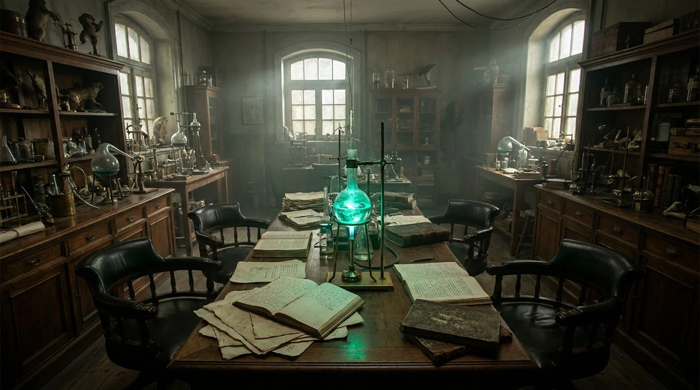
· 6 min readVisualizing a space where 19th-century rigor meets hyper-modern synthetics creates a thrilling visual friction. Picture heavy, dust-motes-in-the-air studies stacked with mahogany bookcases and worn leather seating, suddenly interrupted by glowing vials of radioactive isotopes. This specific intersection of eras relies on high contrast. Rich, time-worn woods provide a grounding warmth, setting a deeply professional and serious stage. Against this heavy historical backdrop, sudden shocks of engineered, laboratory-grade color feel almost dangerous. The eye expects candlelight but gets a blast of ultraviolet or toxic fluorescent pigment. It is a styling choice that completely upends the traditional heritage interior, turning a dusty archive into a space of active, erratic experimentation. By putting these contradictory visual languages in the same room, we create an environment that feels both academically rigorous and totally unpredictable.
Radioactive Archive 🧪
The Radioactive Archive palette sets heavy, historical neutrals against a dizzying array of synthetic shocks. Oxidized Walnut and Vellum Parchment lay down a quiet, traditional foundation, acting as the visual equivalent of an old wooden apothecary cabinet. This serious base is abruptly torn apart by Isotope Green and Cobalt Voltage. The effect mimics staring at a glowing chemical spill across a very expensive, antique desk. Throwing Fuchsia Reagent and Sulfur Yellow into the mix makes the space feel highly experimental, leaning into an eccentric aesthetic that refuses to stay quiet. Using these tones in a physical space requires a deliberate hand. You might specify traditional wainscoting painted in the quieter taupe and brown tones, only to interrupt them with custom neon lighting fixtures or poured resin tables in blinding magenta and cyan. It creates a room that feels historically grounded until the modern lights click on, revealing a hidden, high-tech laboratory operating in the shadows of a gentlemen's club.
Botanical Specimen 🌿
Botanical Specimen takes the idea of scientific observation and gives it a highly charged, contemporary spin. Clinical White and Obsidian form a high-contrast, sterile framework, much like a clean modern laboratory surface. Warmed by Varnished Oak, the scheme nods directly to 19th-century specimen boxes and brass-fitted microscopes. But it is the Copper Sulfate Green and Bioluminescent Mint that completely change the narrative, bringing an artificial, almost glowing toxicity to the natural wood tones. Amethyst Gas paired with Slate Cyan adds a moody, atmospheric shadow to the mix, recalling glowing fumes trapped in antique bell jars. In interior applications, this translates beautifully to spaces that demand both focus and shock value. A moody study finished in dark woods can feature seating upholstered in striking purple, grounded by vivid, acidic green desk accessories. The result is an environment that balances the meticulous cataloging of plant life with the jarring, manufactured reality of modern chemistry.
Galvanic Cell 🔋
Galvanic Cell leans heavily into the industrial textures of early Victorian science, replacing vivid synthetics with deeper, metallic-driven jolts. Tarnished Silver and Matte Soot provide a somber, industrial backdrop, similar to cast iron machinery or slate workbenches. Oxidized Brass and Brass Terminal add a dull, historical warmth, pulling the mind toward early electrical components and brass dials. The unexpected punch comes from Malachite Extract, a vivid jewel tone that feels like raw, energized copper snapping into a circuit. Cobalt Wash and Plum Tincture round out the scheme with deep, inky shadows, reminiscent of spilled ink or aged velvet. For a workspace aiming for an eclectic yet highly professional atmosphere, this scheme works wonders. You can keep the architectural bones dark and heavy, relying on these deep greens and bruised purples through accent lighting or highly polished glazed ceramics. It produces an atmosphere that feels studious, slightly dangerous, and entirely focused on explosive discovery.
Phosphorus Reagent 🥽
Phosphorus Reagent strips the laboratory concept down to its absolute bare bones, relying on a single, aggressive pop of color to do all the heavy lifting. The combination of Bleached Paper, Carbon Black, and Dust Mote creates an incredibly stark, serious environment, perfectly capturing the monochrome aesthetic of early scientific journals and ledger books. Antique Walnut warms up this ascetic canvas, introducing the tactile familiarity of historical furniture and library shelving. Then, Radium Teal strikes. It is an unnaturally vivid, synthetic tone that looks like liquid light against the dry, historical wood. By restricting the vibrant color to just one channel, the visual impact is maximized. This scheme thrives in modern commercial interiors where serious, focused work meets creative disruption. A completely traditional room with heavy wooden panelling can be dramatically updated by placing a single, hyper-modern stool or lighting installation completely drenched in this blazing, chemical green.
Electric Apothecary ⚡
Electric Apothecary pushes the historical narrative into wildly experimental territory by bringing intense, saturated purples and blues into the mahogany workspace. Zinc Countertop and Damp Earth set a utilitarian, slightly gritty stage, acting as the architectural shell of an old pharmacy or workshop. Lacquered Mahogany provides the crucial historical anchor, a rich, reddish timber tone that feels expensive and permanent. Suddenly, Ultramarine Arc and Carmine Elixir tear through the muted surroundings. These are high-frequency, highly engineered colors that belong on neon signs or digital screens, not in a 19th-century study. The addition of Static Lilac softens the transition slightly, offering a strange, cool-toned glow. Using this palette involves playing with material finishes. The classic woods should stay matte and deeply textured, while the blues and pinks should arrive through high-gloss plastics, tinted glass, or glowing LEDs. It makes for a room that feels simultaneously historic and terrifyingly futuristic.
Taking historical, wood-heavy color palettes and injecting them with laboratory-grade synthetics proves that contrasting eras can sit beautifully in the same room. The trick relies on the tension between organic warmth and jarring, engineered glare. When dark, serious tones like walnut, oxidized oak, and soot meet radioactive greens and striking purples, the resulting spaces demand attention. They break away from predictable period-accurate styling rules, opting instead for a narrative of restless experimentation and high-tech disruption. By treating modern fluorescent hues as sudden, sharp interruptions against incredibly traditional backgrounds, designers can craft environments that feel both anchored in history and charged with a dangerous, modern energy. The final result is a workspace that looks intelligent, highly curated, and totally unafraid of breaking the rules.