Zen Color Palettes for Calming UI and Interface Design
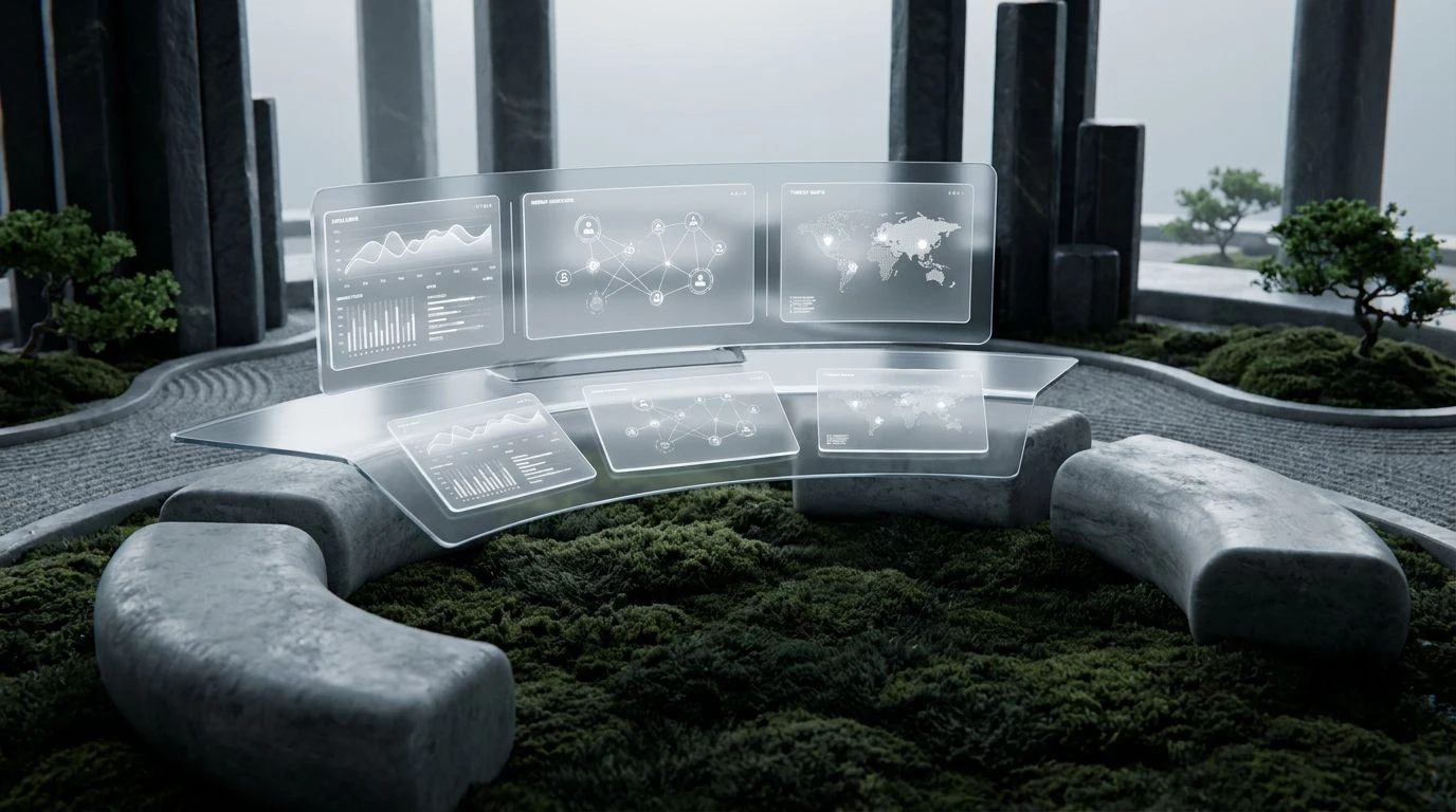
· 5 min readFor decades, the standard visual language of digital security has relied on the physiological triggers of danger. Flashing reds, stark blacks, and high-contrast yellows dominate screens, forcing the human nervous system into a state of constant, low-level alarm. This approach stems from a basic understanding of visual perception: bright, warm colors capture immediate attention. However, prolonged exposure to these alarm-based visual cues leads to cognitive fatigue and decision fatigue. By examining the visual principles of traditional Japanese landscape design, specifically the tranquil spaces of a Kyoto moss garden, we can rethink how critical information is displayed. Natural environments use muted greens, deep blues, and textured grays to signal permanence. Translating these organic visual schemas into interface design allows security professionals to maintain focus without the biological toll of perpetual stress, creating a digital environment that supports sustained analytical thinking.
Raked Sand and Midnight 🎋
When constructing a visual layout for network monitoring, the eye requires clear signals that do not overwhelm the optic nerve. The Raked Sand and Midnight collection addresses this by replacing traditional neon warnings with grounded, earthy indicators. Against the vast, dark expanse of Midnight Ink, a warning colored in Ginkgo Leaf yellow draws the eye naturally, functioning similarly to a focal point in a physical landscape. The brain registers this contrast rapidly but without the cortisol spike associated with aggressive red alerts. Weathered Cedar provides a secondary layer of information, acting as a warm, stabilizing presence that anchors the display. Surrounding these active zones, the neutral tones of Paper White, Stone Lantern, and Morning Fog create necessary negative space, giving the visual cortex time to rest and process complex data streams. This layout mimics the deliberate, spaced arrangement of stones in a dry landscape garden, offering clarity and calm.
Copper Pavilion Security ⛩️
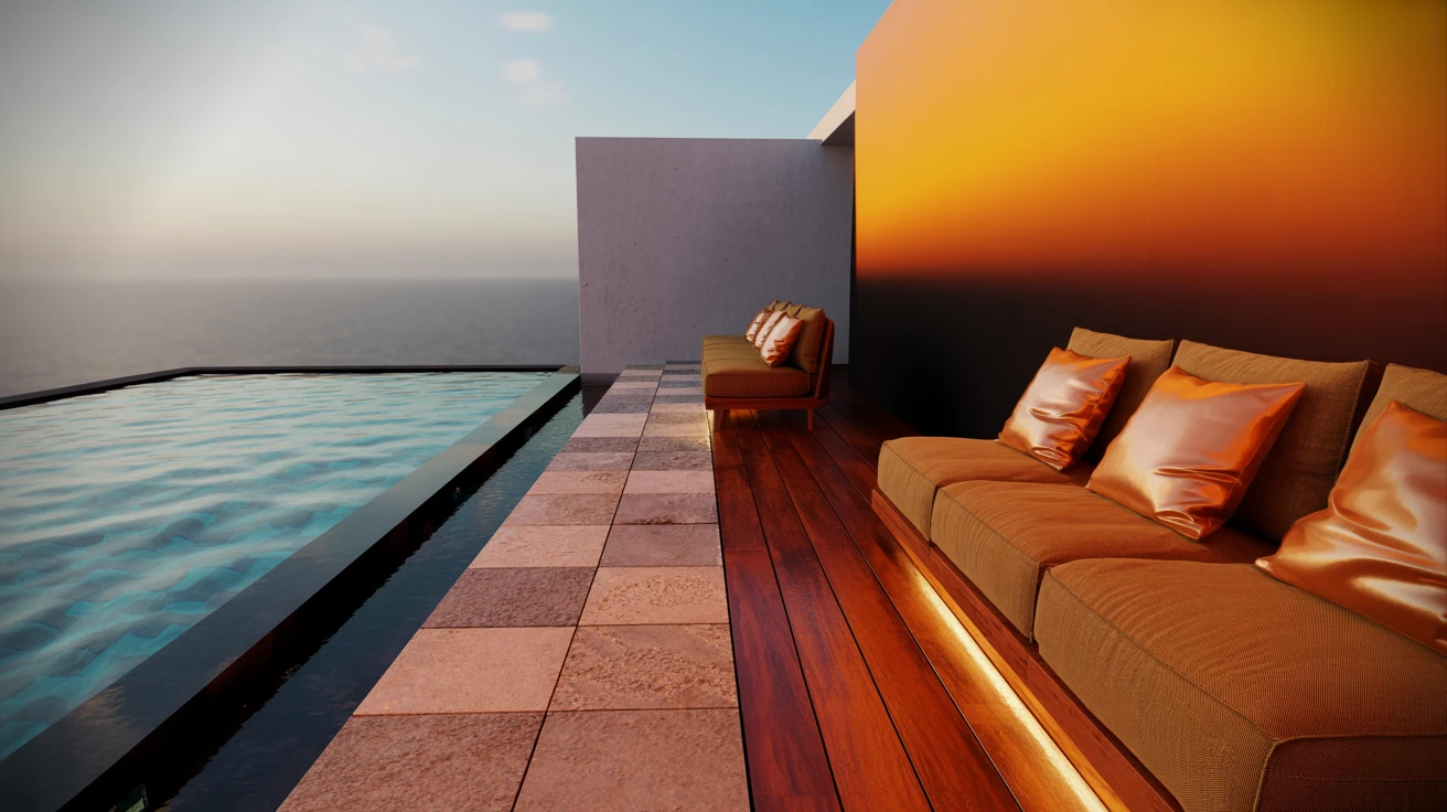
The perception of weight and physical structure translates directly from physical environments to digital screens through color temperature and value. The Copper Pavilion Security arrangement utilizes deep, shadowed tones to create an architecture of reliability. Deep Water Navy serves as a profound backdrop, absorbing excess light and reducing the glare that typically causes eye strain during long shifts. Against this dark ground, Burnished Bronze acts as a primary orienting signal, directing attention with the quiet authority of aging metal rather than the panic of a siren. Granite Pathway and River Rock provide structural borders and framing, giving the interface a sensation of grounded physical reality. Touches of Shoji Screen white offer sharp, crisp contrast for essential text, ensuring readability. The resulting visual experience lowers the user heart rate, transforming a high-stakes monitoring station into a place of quiet, methodical observation.
Wabi-Sabi Threat Defense 🍵
Human color perception is deeply tied to the materials our ancestors encountered. The Wabi-Sabi Threat Defense selection uses this biological wiring to lower psychological temperature in stressful situations. Rather than stark, artificial colors, this group relies on the warming, organic presence of Roasted Tea and Fired Clay to indicate activity or changing system states. These earthy reds and browns register as natural and safe, allowing an operator to notice a change without triggering an immediate fight-or-flight response. Indigo Dye and Winter Sky offer cooling counterpoints, pushing non-critical background information back in the visual field and giving the eye a place to rest. The off-white Tatami Mat tone prevents the harsh contrast that pure white creates against darker colors. By simulating the muted, weathered materials found in traditional tea houses, this interface strategy promotes a state of relaxed alertness necessary for complex problem solving.
Kyoto Moss Garden 🌿
The physiological response to the color green is distinct among human visual processing capabilities. The Kyoto Moss Garden collection places Shadowed Moss in the primary visual field, utilizing the specific wavelengths of light that the human eye focuses on most easily. In biological history, dense, thriving vegetation signals safety, water, and life. By dominating the screen with this deep green, alongside the structural grays of Stepping Stone and Basalt, the interface actively suppresses the nervous system stress responses. Operators viewing these tones experience a measurable drop in visual fatigue, while still remaining highly attentive. Frost provides just enough luminosity to draw attention to critical nodes or shifting network perimeters. This translates the profound quiet of an ancient, walled garden into a digital dashboard, allowing analysts to monitor threats from a position of absolute psychological security and uninterrupted focus.
Bamboo and Blue Water 🪨
Water and vegetation form the foundational signals of a thriving ecosystem, a concept that translates seamlessly into a reliable digital infrastructure. The Bamboo and Blue Water sequence combines the crisp vitality of Bamboo Stalk green with the profound depths of Deep Ocean navy. This combination creates a stereoscopic effect where the bright yellow-green advances toward the viewer, signaling safe, active processes, while the heavy navy blue recedes, establishing a boundless container for data. Glacial Melt offers a transitional, icy blue that can indicate routine automated actions, keeping the operator informed without demanding immediate action. Charred Wood acts as the structural foundation, absorbing light and anchoring the layout, while Cloud provides clean, legible highlights. The physiological result is an interface that breathes, using organic color relationships to maintain operator vigilance through steady, rhythmic visual cues rather than sudden, jarring alarms.
Rethinking the visual design of high-stakes digital environments requires looking beyond conventional alarms and understanding how the human nervous system processes light and color. By adopting the principles of Japanese landscape architecture, we shift the psychological impact of a screen from a source of perpetual anxiety to a space of methodical focus. Deep blues, structural grays, and vital greens communicate permanence and safety, allowing the brain to allocate its resources toward analytical thinking rather than managing stress. A carefully calibrated interface protects the mental stamina of the operator. When the digital tools we rely on mirror the tranquility and enduring predictability of an ancient moss garden, we create a more sustainable, effective approach to monitoring complex informational landscapes.