Deep Purple Color Palette Ethics in AI Branding Design
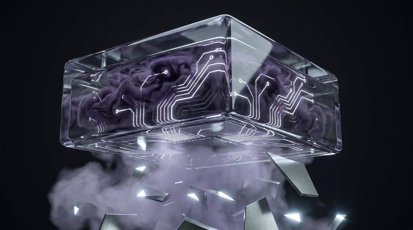
· 5 min readArtificial intelligence occupies an increasingly central and contentious space in modern society, prompting intense scrutiny over how these systems are presented to the public. As companies attempt to build trust, the visual language they employ becomes a matter of ethical debate. Historically associated with royalty, magic, and the unknowable, deep purple frequently appears in the branding of sophisticated algorithms and neural networks. This choice is rarely accidental. By cloaking their creations in colors of mystery, corporations project an aura of omniscience while simultaneously obscuring the mechanical, heavily engineered realities of their products. A public increasingly starved for transparency finds itself looking at interfaces designed to suggest magic rather than mathematics, raising profound questions about whether such design choices manipulate user expectations or simply reflect the genuinely inscrutable nature of advanced computational models.
Synthetic Royalty 🔮
The Synthetic Royalty palette captures the precise tension between corporate sanitization and engineered mystique. When companies deploy Electric Amethyst against a background of Snow Blindness, they create a visual hierarchy that positions artificial intelligence as an elevated, almost sovereign entity. The stark contrast provided by Slate Ash and Obsidian Void grounds the brighter tones, preventing the design from appearing entirely untethered from reality. Yet, it is the Lavender Haze that softens the technological edge, presenting an approachable interface that masks complex data processing. By framing algorithms within this royal color scheme, developers subtly encourage users to view artificial intelligence not as a tool constructed by fallible humans, but as an infallible oracle. This specific visual strategy distracts from critical issues regarding algorithmic bias and data privacy, wrapping opaque systems in a visually arresting sheen that commands deference rather than critical inquiry.
Algorithmic Twilight 🌌
Examining the Algorithmic Twilight arrangement reveals a calculated progression from industrial realism to digital fantasy. The foundations of Midnight Iron and Concrete Fog suggest server racks, hardware, and physical infrastructure—the tangible components of computing. However, as the eye moves toward Glacier Blue and Imperial Velvet, the narrative shifts entirely away from grounded reality. The sudden introduction of Neon Orchid acts as a visual disruptor, signaling sudden inspiration or machine consciousness. This progression is highly effective for branding that wishes to acknowledge its technical roots while primarily selling a vision of future transcendence. Deploying these specific shades raises concerns about consumer manipulation, as the transition from sterile greys to vibrant purples implies a system that has transcended its programming. It constructs a narrative of artificial intelligence as an independent, creative force, effectively minimizing the role of human engineers and the ethical responsibility they hold over the product's outputs.
Oracle Protocol 👁️
Within the Oracle Protocol collection, the psychological weight of color takes on a distinctly historical dimension. The inclusion of Tarnished Brass introduces an element of antiquity and established wealth, which, when paired with the technological sharpness of Cyan Current, bridges the gap between ancient authority and modern capability. The dominant Ultraviolet Signal and deeply recessive Abyssal Purple work together to suggest unfathomable depth. Against the neutral backdrop of Sterling Mist, these bolder colors demand total attention. Branding that utilizes this scheme positions its artificial intelligence as a modern seer, possessing wisdom that users cannot independently verify. The ethical friction arises precisely from this implied omniscience. By leaning heavily into visual cues associated with mysticism and unquestionable authority, tech firms discourage the user from questioning the logic or fairness of the programmed algorithms, presenting computational outputs as divine edicts rather than probabilistic guesses.
Institutional Mystique 🏛️
Institutional Mystique offers a stark examination of how radical technological shifts are packaged for conservative audiences. The reliance on Pure Pitch, Clinical White, and Bureaucratic Steel establishes an immediate sense of regulatory compliance, security, and administrative order. These are the colors of traditional banking and established legal firms. The ethical sleight of hand occurs with the introduction of Velvet Shadow and Pale Thistle. These purples, carefully constrained within a rigid monochromatic framework, inject just enough technological magic to suggest innovation without triggering alarm. This visual strategy is particularly concerning in the context of civic and judicial artificial intelligence applications. It applies a veneer of bureaucratic reliability to systems that may still be experimental or biased. The resulting interface lulls the user into a false sense of security, conflating the visual language of established institutions with the highly unpredictable nature of generative machine learning models.
Warning and Wonder ⚠️
The Warning and Wonder selection breaks entirely from the traditional purple-dominated mysticism, offering a counter-proposal for ethical technology branding. Grounding the design in Vantablack, Bleached Paper, and Graphic Charcoal creates a high-contrast, strictly functional environment that prioritizes legibility over emotional manipulation. The strategic use of Hazard Orange functions not as a comforting illusion, but as a necessary alert mechanism, drawing the eye directly to critical information or potential algorithmic errors. Polished Aluminum and Deep Cyan provide a cool, analytical counterweight to the aggressive orange. This visual vocabulary belongs to heavy machinery and aviation, fields where transparency and safety are legally mandated. Adopting this approach for artificial intelligence branding signals a commitment to user agency. It treats the software as a powerful, potentially dangerous tool requiring careful operation, rather than a magical entity that should be trusted implicitly and without reservation.
The visual presentation of artificial intelligence is ultimately a negotiation of power between the creator and the consumer. The widespread adoption of regal and mystical tones reflects a deliberate industry choice to prioritize awe over understanding. Whether wrapping algorithms in approachable pastels or deep, authoritative shadows, these color strategies shape public perception of what machine learning is and what it is capable of achieving. Moving forward, the industry faces a critical choice regarding its visual language. Designers and executives must decide if they will continue to rely on the comforting, yet deceptive, aesthetics of magic, or if they possess the courage to adopt visual systems that communicate the stark, complex, and highly fallible reality of the technology they build.