'%3e%3cpath%20fill-rule='evenodd'%20clip-rule='evenodd'%20d='M51.1303%2019.2492C50.7278%2019.913%2050.1346%2020.4426%2049.3508%2020.838C48.5669%2021.2335%2047.6172%2021.4312%2046.5014%2021.4312C44.8208%2021.4312%2043.4367%2021.0216%2042.3492%2020.2025C41.2617%2019.3833%2040.6686%2018.2394%2040.5697%2016.7706H44.4253C44.4818%2017.3355%2044.6831%2017.7804%2045.0291%2018.1052C45.3751%2018.43%2045.8164%2018.5924%2046.3531%2018.5924C46.8192%2018.5924%2047.1864%2018.4653%2047.4547%2018.2111C47.7231%2017.9569%2047.8572%2017.618%2047.8572%2017.1943C47.8572%2016.8129%2047.7337%2016.4952%2047.4865%2016.241C47.2393%2015.9867%2046.9322%2015.7784%2046.565%2015.616C46.1978%2015.4536%2045.6893%2015.2594%2045.0397%2015.0334C44.0934%2014.7086%2043.3202%2014.3944%2042.72%2014.0907C42.1197%2013.7871%2041.6042%2013.3351%2041.1735%2012.7349C40.7427%2012.1347%2040.5273%2011.3544%2040.5273%2010.394C40.5273%209.50418%2040.7533%208.73448%2041.2053%208.08481C41.6572%207.43515%2042.2821%206.93731%2043.0801%206.5913C43.8781%206.24528%2044.7925%206.07227%2045.8235%206.07227C47.49%206.07227%2048.8141%206.46771%2049.7956%207.25861C50.7772%208.04951%2051.3315%209.13698%2051.4586%2010.5211H47.5395C47.4689%2010.0268%2047.2888%209.63483%2046.9993%209.3453C46.7097%209.05578%2046.3178%208.91102%2045.8235%208.91102C45.3998%208.91102%2045.0573%209.024%2044.7961%209.24997C44.5348%209.47594%2044.4041%209.80783%2044.4041%2010.2457C44.4041%2010.5988%2044.5207%2010.8989%2044.7537%2011.146C44.9867%2011.3932%2045.2798%2011.5944%2045.6328%2011.7498C45.9859%2011.9052%2046.4944%2012.1029%2047.1581%2012.343C48.1185%2012.6678%2048.9023%2012.9891%2049.5096%2013.3069C50.1169%2013.6246%2050.6395%2014.0872%2051.0773%2014.6945C51.5151%2015.3018%2051.734%2016.0927%2051.734%2017.0672C51.734%2017.8581%2051.5328%2018.5854%2051.1303%2019.2492ZM59.0242%206.3053V21.2829H55.4016V6.3053H59.0242ZM73.9409%206.3053V9.18642H69.8734V21.2829H66.2296V9.18642H62.2046V6.3053H73.9409ZM80.7438%209.18642V12.3218H85.8069V15.0546H80.7438V18.3806H86.4425V21.2829H77.1212V6.3053H86.4425V9.18642H80.7438ZM99.667%2016.0291V21.2829H96.0444V6.3053H101.913C103.692%206.3053%20105.048%206.74665%20105.98%207.62934C106.912%208.51204%20107.378%209.7019%20107.378%2011.199C107.378%2012.1311%20107.17%2012.9609%20106.753%2013.6882C106.337%2014.4155%20105.719%2014.9875%20104.9%2015.4042C104.08%2015.8208%20103.085%2016.0291%20101.913%2016.0291H99.667ZM103.692%2011.199C103.692%209.8855%20102.965%209.22879%20101.51%209.22879H99.667V13.1268H101.51C102.965%2013.1268%20103.692%2012.4842%20103.692%2011.199ZM120.092%2018.5501H114.478L113.546%2021.2829H109.732L115.219%206.41123H119.393L124.879%2021.2829H121.024L120.092%2018.5501ZM119.16%2015.7961L117.295%2010.2881L115.41%2015.7961H119.16ZM131.555%2018.5077H136.385V21.2829H127.933V6.3053H131.555V18.5077ZM143.337%209.18642V12.3218H148.4V15.0546H143.337V18.3806H149.035V21.2829H139.714V6.3053H149.035V9.18642H143.337ZM163.507%206.3053V9.18642H159.44V21.2829H155.796V9.18642H151.771V6.3053H163.507ZM177.449%206.3053V9.18642H173.382V21.2829H169.738V9.18642H165.713V6.3053H177.449ZM184.252%209.18642V12.3218H189.315V15.0546H184.252V18.3806H189.951V21.2829H180.629V6.3053H189.951V9.18642H184.252Z'%20fill='%23EEF0ED'/%3e%3cmask%20id='mask0_3101_7327'%20style='mask-type:alpha'%20maskUnits='userSpaceOnUse'%20x='0'%20y='0'%20width='27'%20height='28'%3e%3cpath%20d='M23.8328%200.759766H2.64808C1.18559%200.759766%200%201.94535%200%203.40785V24.5925C0%2026.055%201.18559%2027.2406%202.64808%2027.2406H23.8328C25.2952%2027.2406%2026.4808%2026.055%2026.4808%2024.5925V3.40785C26.4808%201.94535%2025.2952%200.759766%2023.8328%200.759766Z'%20fill='white'/%3e%3c/mask%3e%3cg%20mask='url(%23mask0_3101_7327)'%3e%3cpath%20d='M23.8328%200.759766H2.64808C1.18559%200.759766%200%201.94535%200%203.40785V24.5925C0%2026.055%201.18559%2027.2406%202.64808%2027.2406H23.8328C25.2952%2027.2406%2026.4808%2026.055%2026.4808%2024.5925V3.40785C26.4808%201.94535%2025.2952%200.759766%2023.8328%200.759766Z'%20fill='%23D8D8D8'/%3e%3cpath%20d='M13.2404%200.759766H0V14.0001H13.2404V0.759766Z'%20fill='%238C61FF'/%3e%3cpath%20d='M13.2404%2014H0V27.2404H13.2404V14Z'%20fill='%2336C3FE'/%3e%3cpath%20d='M26.4806%2014H13.2402V27.2404H26.4806V14Z'%20fill='%236592FE'/%3e%3cpath%20d='M26.4806%200.759766H13.2402V14.0002H26.4806V0.759766Z'%20fill='%236059F7'/%3e%3c/g%3e%3c/g%3e%3cdefs%3e%3cclipPath%20id='clip0_3101_7327'%3e%3crect%20width='190'%20height='28'%20fill='white'/%3e%3c/clipPath%3e%3c/defs%3e%3c/svg%3e)
'%3e%3cpath%20d='M23.8328%200.759521H2.64808C1.18559%200.759521%200%201.94511%200%203.40761V24.5923C0%2026.0548%201.18559%2027.2404%202.64808%2027.2404H23.8328C25.2952%2027.2404%2026.4808%2026.0548%2026.4808%2024.5923V3.40761C26.4808%201.94511%2025.2952%200.759521%2023.8328%200.759521Z'%20fill='%23D8D8D8'/%3e%3cpath%20d='M13.2404%200.759521H0V13.9999H13.2404V0.759521Z'%20fill='%238C61FF'/%3e%3cpath%20d='M13.2404%2013.9998H0V27.2402H13.2404V13.9998Z'%20fill='%2336C3FE'/%3e%3cpath%20d='M26.4809%2013.9998H13.2405V27.2402H26.4809V13.9998Z'%20fill='%236592FE'/%3e%3cpath%20d='M26.4809%200.759277H13.2405V13.9997H26.4809V0.759277Z'%20fill='%236059F7'/%3e%3c/g%3e%3c/svg%3e)
Graphic Comic Color Palettes for Bold Data Design Glow
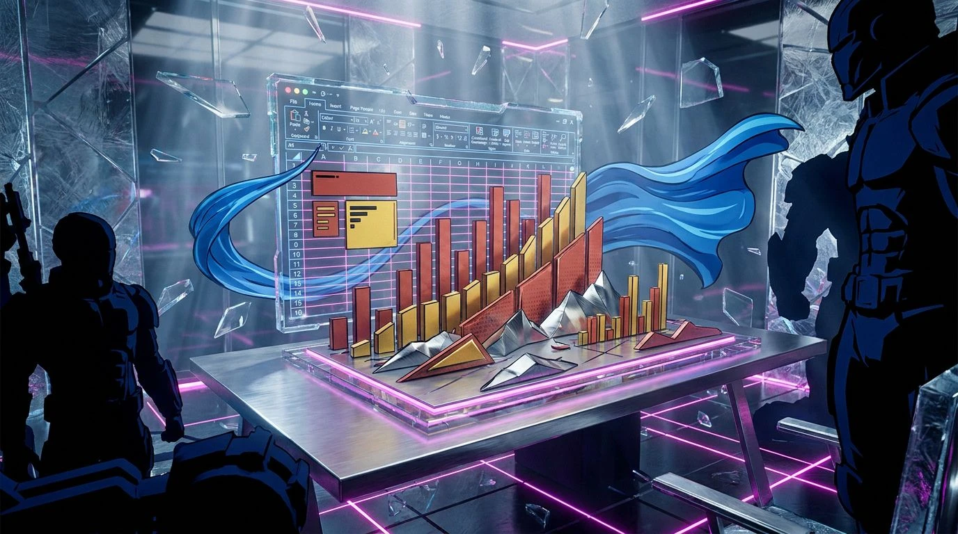
· 5 min readThere is a very specific sort of despair that settles over the human spirit around three in the afternoon, provoked entirely by the bleak, endless expanse of a standard corporate accounting grid. Life is too fleeting to spend it staring at the default sterile white and anemic grey of a quarterly earnings report. Thankfully, we have a way out. Borrowing the theatrical, pulse-quickening vocabulary of mid-century comic books, we can reframe dull logistical chores into something that looks genuinely thrilling. Giving numerical tedium a graphic makeover with heavy navy shadows and aggressive, vibrating orange strikes changes the relationship entirely. It becomes less about agonizing over misaligned decimal points and more about viewing data retrieval as a daring rescue mission played out across the screen.
Action Issue Number One 💥
The palette Action Issue Number One behaves exactly like the opening splash page of an overpriced collector edition comic. It announces itself without apologizing. Dropping Blast Radius Orange into a column of overdue payments immediately transforms mundane delays into a high stakes emergency. You do not simply note the deficit, you confront it like an encroaching supervillain. The foundation rests on the heavy, impenetrable block of Gotham Night, providing stark relief for the aggressive jolts of Zip Line Yellow and Supersonic Cyan. Framing fiscal quarters with Dried Blood Red and Pavement Grey strips away the polite suggestions of a typical office application. It creates an environment where rows of inventory demand your total attention. The resulting visual space refuses to be ignored, making the endless scrolling feel oddly cinematic.
The Graphic Novel Pivot 🦸♂️
When confronted with The Graphic Novel Pivot, the eye is instantly drawn to the tension between the stoic calmness of Midnight Ink and the almost obnoxious urgency of Hazard Orange. This is exactly the sort of visual vocabulary required for tracking volatile metrics capable of sinking an entire department. Assigning Golden Age Mustard to positive returns yields a triumphant, cape fluttering sensation, while Skybound Blue provides a brief moment of breathing room among the figures. Surrounding these bold statements with Newsprint Grey and Concrete Shadow ensures the more vibrant shades pop exactly as the artist intended, turning the screen into a pulp adventure. A Sunburst Pale background replaces the harsh glare of an empty monitor, softening the blow of reading yet another dense, incomprehensible pivot table and making it strangely compelling.
Metropolis Data Grid 🏙️
Metropolis Data Grid relies heavily on the gritty, street level aesthetic favored by origin stories that prefer alleyways over intergalactic battles. The mood is immediately established by Abyssal Navy and Industrial Smog, shades that anchor the numbers in a reassuringly serious, cinematic gravity. Across this heavy backdrop, Kinetic Orange and Tracers Peach dart like taillights in a high speed pursuit, directing the eye exactly where the most crucial financial discrepancies are hiding. First Draft Bone offers a softer, more textual base than blindingly clear white, making the numbers appear as if they were printed on poor quality pulp paper. Tarnished Brass and Rust Belt Brown apply a distinctly aged, archival feel to the interface. Managing expenses suddenly looks remarkably like deciphering encrypted transmissions to save the city.
Rogue Cell Formats 🦹♀️
Sometimes a standard ledger requires a blatant disregard for polite corporate sensibilities, which is where Rogue Cell Formats proves surprisingly useful. The presence of Mutated Magenta acting as a rogue agent alongside Radioactive Gold adds a chaotic, unpredictable quality to whatever statistical nightmare you are attempting to organize. Heroic Crest Navy tries to hold down the fort, providing the traditional authority figures expect, but it is ultimately the confrontation between Cape Swirl Blue and Brick Wall Red that keeps the visual field active and restless. Using Voids End Black for the heavy borders mimics the thick, unwavering ink lines of a graphic artist furiously delineating good versus evil. Filling the transitional spaces with Lead Pipe Silver gives the whole arrangement an industrial chill, proving that tracking profit margins can genuinely resemble assembling a team of antiheroes.
Crisis on Infinite Rows ⚡
Crisis on Infinite Rows abandons any pretense of quiet restraint, opting instead for a full scale sensory bombardment. Navigating a vast, overwhelming database using this collection turns an ordinary weekday into an operatic struggle for survival. Villainous Monologue Charcoal provides a bottomless trench where minor, unimportant figures can hide, allowing Laser Vision Red and Lightning Strike Yellow to explode across the screen when critical thresholds are breached. The contrasting chill of Frost Beam Blue and Deep Space Cyan pulls the user back from the brink of total overwhelm, offering a necessary optical reprieve from the blazing warm tones. Dust Plume Orange and Crater Dirt Brown help transition the eye between the extremes, ensuring the layout remains navigable despite its theatrical hostility. In the end, locating the right macro becomes a heroic feat worthy of a double page spread.
Reclaiming the visual landscape of our daily administrative tasks from the dreary grips of standard enterprise software is a surprisingly rebellious act. Applying the aggressive, contrasting hues of a sprawling comic book universe does far more than make the screen look momentarily interesting. It restructures how we interpret the information passing before us every day. The deep navies provide the requisite gravity, while the vibrating oranges and bright cyans demand our active, uninterrupted presence. We stop passively reading numbers and start engaging with them as vital pieces of an unfolding narrative. It is entirely possible that formatting a monthly schedule with this much theatrical flair will not shorten the working week, but it definitively proves that we do not have to succumb to the aesthetic misery usually expected of us.