'%3e%3cpath%20fill-rule='evenodd'%20clip-rule='evenodd'%20d='M51.1303%2019.2492C50.7278%2019.913%2050.1346%2020.4426%2049.3508%2020.838C48.5669%2021.2335%2047.6172%2021.4312%2046.5014%2021.4312C44.8208%2021.4312%2043.4367%2021.0216%2042.3492%2020.2025C41.2617%2019.3833%2040.6686%2018.2394%2040.5697%2016.7706H44.4253C44.4818%2017.3355%2044.6831%2017.7804%2045.0291%2018.1052C45.3751%2018.43%2045.8164%2018.5924%2046.3531%2018.5924C46.8192%2018.5924%2047.1864%2018.4653%2047.4547%2018.2111C47.7231%2017.9569%2047.8572%2017.618%2047.8572%2017.1943C47.8572%2016.8129%2047.7337%2016.4952%2047.4865%2016.241C47.2393%2015.9867%2046.9322%2015.7784%2046.565%2015.616C46.1978%2015.4536%2045.6893%2015.2594%2045.0397%2015.0334C44.0934%2014.7086%2043.3202%2014.3944%2042.72%2014.0907C42.1197%2013.7871%2041.6042%2013.3351%2041.1735%2012.7349C40.7427%2012.1347%2040.5273%2011.3544%2040.5273%2010.394C40.5273%209.50418%2040.7533%208.73448%2041.2053%208.08481C41.6572%207.43515%2042.2821%206.93731%2043.0801%206.5913C43.8781%206.24528%2044.7925%206.07227%2045.8235%206.07227C47.49%206.07227%2048.8141%206.46771%2049.7956%207.25861C50.7772%208.04951%2051.3315%209.13698%2051.4586%2010.5211H47.5395C47.4689%2010.0268%2047.2888%209.63483%2046.9993%209.3453C46.7097%209.05578%2046.3178%208.91102%2045.8235%208.91102C45.3998%208.91102%2045.0573%209.024%2044.7961%209.24997C44.5348%209.47594%2044.4041%209.80783%2044.4041%2010.2457C44.4041%2010.5988%2044.5207%2010.8989%2044.7537%2011.146C44.9867%2011.3932%2045.2798%2011.5944%2045.6328%2011.7498C45.9859%2011.9052%2046.4944%2012.1029%2047.1581%2012.343C48.1185%2012.6678%2048.9023%2012.9891%2049.5096%2013.3069C50.1169%2013.6246%2050.6395%2014.0872%2051.0773%2014.6945C51.5151%2015.3018%2051.734%2016.0927%2051.734%2017.0672C51.734%2017.8581%2051.5328%2018.5854%2051.1303%2019.2492ZM59.0242%206.3053V21.2829H55.4016V6.3053H59.0242ZM73.9409%206.3053V9.18642H69.8734V21.2829H66.2296V9.18642H62.2046V6.3053H73.9409ZM80.7438%209.18642V12.3218H85.8069V15.0546H80.7438V18.3806H86.4425V21.2829H77.1212V6.3053H86.4425V9.18642H80.7438ZM99.667%2016.0291V21.2829H96.0444V6.3053H101.913C103.692%206.3053%20105.048%206.74665%20105.98%207.62934C106.912%208.51204%20107.378%209.7019%20107.378%2011.199C107.378%2012.1311%20107.17%2012.9609%20106.753%2013.6882C106.337%2014.4155%20105.719%2014.9875%20104.9%2015.4042C104.08%2015.8208%20103.085%2016.0291%20101.913%2016.0291H99.667ZM103.692%2011.199C103.692%209.8855%20102.965%209.22879%20101.51%209.22879H99.667V13.1268H101.51C102.965%2013.1268%20103.692%2012.4842%20103.692%2011.199ZM120.092%2018.5501H114.478L113.546%2021.2829H109.732L115.219%206.41123H119.393L124.879%2021.2829H121.024L120.092%2018.5501ZM119.16%2015.7961L117.295%2010.2881L115.41%2015.7961H119.16ZM131.555%2018.5077H136.385V21.2829H127.933V6.3053H131.555V18.5077ZM143.337%209.18642V12.3218H148.4V15.0546H143.337V18.3806H149.035V21.2829H139.714V6.3053H149.035V9.18642H143.337ZM163.507%206.3053V9.18642H159.44V21.2829H155.796V9.18642H151.771V6.3053H163.507ZM177.449%206.3053V9.18642H173.382V21.2829H169.738V9.18642H165.713V6.3053H177.449ZM184.252%209.18642V12.3218H189.315V15.0546H184.252V18.3806H189.951V21.2829H180.629V6.3053H189.951V9.18642H184.252Z'%20fill='%23EEF0ED'/%3e%3cmask%20id='mask0_3101_7327'%20style='mask-type:alpha'%20maskUnits='userSpaceOnUse'%20x='0'%20y='0'%20width='27'%20height='28'%3e%3cpath%20d='M23.8328%200.759766H2.64808C1.18559%200.759766%200%201.94535%200%203.40785V24.5925C0%2026.055%201.18559%2027.2406%202.64808%2027.2406H23.8328C25.2952%2027.2406%2026.4808%2026.055%2026.4808%2024.5925V3.40785C26.4808%201.94535%2025.2952%200.759766%2023.8328%200.759766Z'%20fill='white'/%3e%3c/mask%3e%3cg%20mask='url(%23mask0_3101_7327)'%3e%3cpath%20d='M23.8328%200.759766H2.64808C1.18559%200.759766%200%201.94535%200%203.40785V24.5925C0%2026.055%201.18559%2027.2406%202.64808%2027.2406H23.8328C25.2952%2027.2406%2026.4808%2026.055%2026.4808%2024.5925V3.40785C26.4808%201.94535%2025.2952%200.759766%2023.8328%200.759766Z'%20fill='%23D8D8D8'/%3e%3cpath%20d='M13.2404%200.759766H0V14.0001H13.2404V0.759766Z'%20fill='%238C61FF'/%3e%3cpath%20d='M13.2404%2014H0V27.2404H13.2404V14Z'%20fill='%2336C3FE'/%3e%3cpath%20d='M26.4806%2014H13.2402V27.2404H26.4806V14Z'%20fill='%236592FE'/%3e%3cpath%20d='M26.4806%200.759766H13.2402V14.0002H26.4806V0.759766Z'%20fill='%236059F7'/%3e%3c/g%3e%3c/g%3e%3cdefs%3e%3cclipPath%20id='clip0_3101_7327'%3e%3crect%20width='190'%20height='28'%20fill='white'/%3e%3c/clipPath%3e%3c/defs%3e%3c/svg%3e)
'%3e%3cpath%20d='M23.8328%200.759521H2.64808C1.18559%200.759521%200%201.94511%200%203.40761V24.5923C0%2026.0548%201.18559%2027.2404%202.64808%2027.2404H23.8328C25.2952%2027.2404%2026.4808%2026.0548%2026.4808%2024.5923V3.40761C26.4808%201.94511%2025.2952%200.759521%2023.8328%200.759521Z'%20fill='%23D8D8D8'/%3e%3cpath%20d='M13.2404%200.759521H0V13.9999H13.2404V0.759521Z'%20fill='%238C61FF'/%3e%3cpath%20d='M13.2404%2013.9998H0V27.2402H13.2404V13.9998Z'%20fill='%2336C3FE'/%3e%3cpath%20d='M26.4809%2013.9998H13.2405V27.2402H26.4809V13.9998Z'%20fill='%236592FE'/%3e%3cpath%20d='M26.4809%200.759277H13.2405V13.9997H26.4809V0.759277Z'%20fill='%236059F7'/%3e%3c/g%3e%3c/svg%3e)
Terracotta & Blue Color Palette for Professional Design
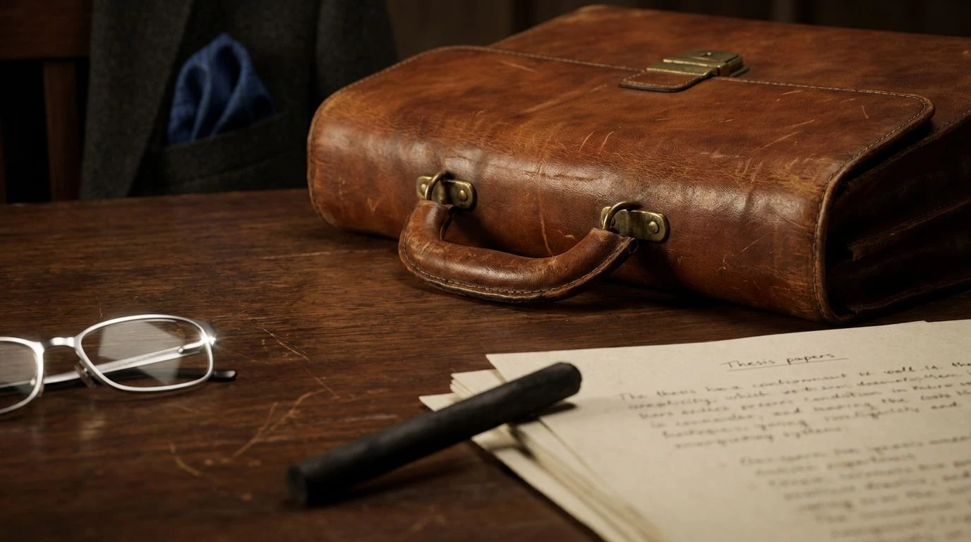
· 5 min readObjects that journey with us acquire a psychological weight that alters how we perceive them. A well-used leather briefcase serves as a striking psychological anchor in academic and professional spaces. The human visual system interprets the warm, oxidized tones of aged leather as markers of time and physical interaction. When contrasted against crisp, light blue accents, perhaps a shirt cuff or a freshly bound notebook, a compelling perceptual interaction occurs. The heavy, grounded wavelengths of burnt earth establish established authority, while the short, energetic wavelengths of light air convey momentum and active cognition. This visual equation constructs a vivid narrative of steady professional growth, anchoring cognitive sharpness within deep, seasoned experience.
Patina and Pages 💼
The human eye processes the opposition of warm reds and cool blues as a striking figure-ground relationship. In this array, the deep reddish-browns of Cured Hide and Clay Slip physically simulate the organic degradation of tannins in aged leather. Our brains read these warm, subdued hues as indices of durability and time passage. Against this heavy baseline, Oxidized Copper and Silver Clasp provide high-frequency visual relief. This specific light blue-green wavelength stimulates cognitive alertness, similar to the phenomenon of sky-blue light regulating our circadian rhythms. When observed together, the cool tones prevent the heavier leathers from appearing stagnant or archaic. Instead, the resulting perceptual experience suggests an active, inquisitive mind operating from a foundation of rigorous historical scholarship, capturing the visual signature of an esteemed professor mid-lecture.
Sabbatical Journey 👞
Warm, middle-wavelength colors often trigger associations with physical comfort and terrestrial environments. Brick Dust and Sunkissed Vellum mimic the pigmentation of vegetable-tanned leathers exposed to years of ultraviolet radiation, communicating a visual history of travel and practical application. Bindery White and Slate Stone serve as neutral anchors, providing the optic nerve a resting space between the warmer extremes. The introduction of Frost Covered Moss injects a low-arousal, cool stimulus. Psychologically, muted cool greens and blues lower human heart rates and signal safety or calm observation. In the context of the quiet authority, this specific color distribution speaks to the methodical gathering of knowledge. The visual weight of the sun-weathered leather tones suggests hard-earned field experience, while the quieter, cooler accents reflect the objective, analytic headspace required to translate that experience into enduring wisdom.
Tenure Track 🏛️
Contrast is a primary mechanism the brain uses to assign importance to incoming optical stimuli. The stark distance between Ink Spill and Lamp Light creates high legibility, mirroring the clarity required in academic publication. Fired Earth and Mahogany Trim provide a weighty, long-wavelength anchor, physically resembling the oxidized iron compounds found in natural clays and traditional leather dyes. This heavy red-orange base signals established rank and enduring presence. Cyanotype Blue and Library Binding counteract this heavy warmth. Short-wavelength blues are processed by the visual system as receding in space, which creates an illusion of depth and atmospheric perspective. This push-and-pull gives the arrangement a sense of structured, active intellect. The cool blues suggest abstract theory and cognitive expansion, firmly tethered to reality by the literal, earthy weight of the dark leathers.
Field Researcher 🌍
Color perception is deeply rooted in our evolutionary history, often tying specific wavelengths to environmental survival markers. The dominance of Canopy Shade, Lichen Dust, and Chlorophyll engages our natural affinity for productive landscapes. These verdant signals indicate biological growth and vitality. Dried Botanical and Crimson Wax introduce the oxidized tones of aged leather straps or weathered boots, signaling human navigation through these natural spaces. Night Sky acts as a profound cooling agent, its dark hue absorbing light and grounding the brighter, energetic greens. Psychologically, this array shifts the concept of authority from the reading room to the empirical world. The visual relationship between the terrestrial greens and the rich, earthen reds communicates hands-on expertise. It tells the story of an individual whose credibility is actively tested against the unpredictable variables of the living, breathing environment.
Boardroom Classic 🖋️
Achieving visual equilibrium requires a calculated distribution of light reflectance values. In this arrangement, Thesis Paper and Charcoal Stick establish maximum achromatic contrast, framing the other hues with absolute borders. Burnished Calfskin and Antique Walnut carry the familiar, stabilizing frequencies of traditional leather goods, heavily associated with the physical artifacts of legal and corporate professions. Academic Blue introduces a completely distinct, highly vivid cool focal point. Cognitive research frequently ties clear blues to increased task performance and perceived trustworthiness. The sharp wavelength of the blue slices through the subdued, light-absorbing qualities of the brown leathers. This interaction creates an immediate sense of intellectual precision. The leathers provide the institutional grounding, while the distinct blue conveys contemporary sharpness, representing a professional who respects precedent but operates with cutting-edge clarity.
The manner in which our visual system processes the contrasting wavelengths of rusted leathers and atmospheric blues reveals much about how we assign credibility. Heavy, warm tones physically resemble geological stability and chemical aging, signaling to the brain that an object or person has endured the test of time. Conversely, the cooler, higher-frequency blues stimulate optical alertness, suggesting active thought and ongoing maturation. By observing these specific visual pairings, it becomes clear why certain physical objects project such a profound sense of quiet power. The academic or professional who carries the weathered briefcase creates a complex optic signal, joining the weight of history with the bright, cognitive spark of continuous learning.