'%3e%3cpath%20fill-rule='evenodd'%20clip-rule='evenodd'%20d='M51.1303%2019.2492C50.7278%2019.913%2050.1346%2020.4426%2049.3508%2020.838C48.5669%2021.2335%2047.6172%2021.4312%2046.5014%2021.4312C44.8208%2021.4312%2043.4367%2021.0216%2042.3492%2020.2025C41.2617%2019.3833%2040.6686%2018.2394%2040.5697%2016.7706H44.4253C44.4818%2017.3355%2044.6831%2017.7804%2045.0291%2018.1052C45.3751%2018.43%2045.8164%2018.5924%2046.3531%2018.5924C46.8192%2018.5924%2047.1864%2018.4653%2047.4547%2018.2111C47.7231%2017.9569%2047.8572%2017.618%2047.8572%2017.1943C47.8572%2016.8129%2047.7337%2016.4952%2047.4865%2016.241C47.2393%2015.9867%2046.9322%2015.7784%2046.565%2015.616C46.1978%2015.4536%2045.6893%2015.2594%2045.0397%2015.0334C44.0934%2014.7086%2043.3202%2014.3944%2042.72%2014.0907C42.1197%2013.7871%2041.6042%2013.3351%2041.1735%2012.7349C40.7427%2012.1347%2040.5273%2011.3544%2040.5273%2010.394C40.5273%209.50418%2040.7533%208.73448%2041.2053%208.08481C41.6572%207.43515%2042.2821%206.93731%2043.0801%206.5913C43.8781%206.24528%2044.7925%206.07227%2045.8235%206.07227C47.49%206.07227%2048.8141%206.46771%2049.7956%207.25861C50.7772%208.04951%2051.3315%209.13698%2051.4586%2010.5211H47.5395C47.4689%2010.0268%2047.2888%209.63483%2046.9993%209.3453C46.7097%209.05578%2046.3178%208.91102%2045.8235%208.91102C45.3998%208.91102%2045.0573%209.024%2044.7961%209.24997C44.5348%209.47594%2044.4041%209.80783%2044.4041%2010.2457C44.4041%2010.5988%2044.5207%2010.8989%2044.7537%2011.146C44.9867%2011.3932%2045.2798%2011.5944%2045.6328%2011.7498C45.9859%2011.9052%2046.4944%2012.1029%2047.1581%2012.343C48.1185%2012.6678%2048.9023%2012.9891%2049.5096%2013.3069C50.1169%2013.6246%2050.6395%2014.0872%2051.0773%2014.6945C51.5151%2015.3018%2051.734%2016.0927%2051.734%2017.0672C51.734%2017.8581%2051.5328%2018.5854%2051.1303%2019.2492ZM59.0242%206.3053V21.2829H55.4016V6.3053H59.0242ZM73.9409%206.3053V9.18642H69.8734V21.2829H66.2296V9.18642H62.2046V6.3053H73.9409ZM80.7438%209.18642V12.3218H85.8069V15.0546H80.7438V18.3806H86.4425V21.2829H77.1212V6.3053H86.4425V9.18642H80.7438ZM99.667%2016.0291V21.2829H96.0444V6.3053H101.913C103.692%206.3053%20105.048%206.74665%20105.98%207.62934C106.912%208.51204%20107.378%209.7019%20107.378%2011.199C107.378%2012.1311%20107.17%2012.9609%20106.753%2013.6882C106.337%2014.4155%20105.719%2014.9875%20104.9%2015.4042C104.08%2015.8208%20103.085%2016.0291%20101.913%2016.0291H99.667ZM103.692%2011.199C103.692%209.8855%20102.965%209.22879%20101.51%209.22879H99.667V13.1268H101.51C102.965%2013.1268%20103.692%2012.4842%20103.692%2011.199ZM120.092%2018.5501H114.478L113.546%2021.2829H109.732L115.219%206.41123H119.393L124.879%2021.2829H121.024L120.092%2018.5501ZM119.16%2015.7961L117.295%2010.2881L115.41%2015.7961H119.16ZM131.555%2018.5077H136.385V21.2829H127.933V6.3053H131.555V18.5077ZM143.337%209.18642V12.3218H148.4V15.0546H143.337V18.3806H149.035V21.2829H139.714V6.3053H149.035V9.18642H143.337ZM163.507%206.3053V9.18642H159.44V21.2829H155.796V9.18642H151.771V6.3053H163.507ZM177.449%206.3053V9.18642H173.382V21.2829H169.738V9.18642H165.713V6.3053H177.449ZM184.252%209.18642V12.3218H189.315V15.0546H184.252V18.3806H189.951V21.2829H180.629V6.3053H189.951V9.18642H184.252Z'%20fill='%23EEF0ED'/%3e%3cmask%20id='mask0_3101_7327'%20style='mask-type:alpha'%20maskUnits='userSpaceOnUse'%20x='0'%20y='0'%20width='27'%20height='28'%3e%3cpath%20d='M23.8328%200.759766H2.64808C1.18559%200.759766%200%201.94535%200%203.40785V24.5925C0%2026.055%201.18559%2027.2406%202.64808%2027.2406H23.8328C25.2952%2027.2406%2026.4808%2026.055%2026.4808%2024.5925V3.40785C26.4808%201.94535%2025.2952%200.759766%2023.8328%200.759766Z'%20fill='white'/%3e%3c/mask%3e%3cg%20mask='url(%23mask0_3101_7327)'%3e%3cpath%20d='M23.8328%200.759766H2.64808C1.18559%200.759766%200%201.94535%200%203.40785V24.5925C0%2026.055%201.18559%2027.2406%202.64808%2027.2406H23.8328C25.2952%2027.2406%2026.4808%2026.055%2026.4808%2024.5925V3.40785C26.4808%201.94535%2025.2952%200.759766%2023.8328%200.759766Z'%20fill='%23D8D8D8'/%3e%3cpath%20d='M13.2404%200.759766H0V14.0001H13.2404V0.759766Z'%20fill='%238C61FF'/%3e%3cpath%20d='M13.2404%2014H0V27.2404H13.2404V14Z'%20fill='%2336C3FE'/%3e%3cpath%20d='M26.4806%2014H13.2402V27.2404H26.4806V14Z'%20fill='%236592FE'/%3e%3cpath%20d='M26.4806%200.759766H13.2402V14.0002H26.4806V0.759766Z'%20fill='%236059F7'/%3e%3c/g%3e%3c/g%3e%3cdefs%3e%3cclipPath%20id='clip0_3101_7327'%3e%3crect%20width='190'%20height='28'%20fill='white'/%3e%3c/clipPath%3e%3c/defs%3e%3c/svg%3e)
'%3e%3cpath%20d='M23.8328%200.759521H2.64808C1.18559%200.759521%200%201.94511%200%203.40761V24.5923C0%2026.0548%201.18559%2027.2404%202.64808%2027.2404H23.8328C25.2952%2027.2404%2026.4808%2026.0548%2026.4808%2024.5923V3.40761C26.4808%201.94511%2025.2952%200.759521%2023.8328%200.759521Z'%20fill='%23D8D8D8'/%3e%3cpath%20d='M13.2404%200.759521H0V13.9999H13.2404V0.759521Z'%20fill='%238C61FF'/%3e%3cpath%20d='M13.2404%2013.9998H0V27.2402H13.2404V13.9998Z'%20fill='%2336C3FE'/%3e%3cpath%20d='M26.4809%2013.9998H13.2405V27.2402H26.4809V13.9998Z'%20fill='%236592FE'/%3e%3cpath%20d='M26.4809%200.759277H13.2405V13.9997H26.4809V0.759277Z'%20fill='%236059F7'/%3e%3c/g%3e%3c/svg%3e)
Retro Arcade Color Palettes for Modern Sustainability
· 5 min readThere was a time, not so long ago, when reading a corporate sustainability report felt akin to looking at a damp piece of kale. Pages upon pages of earnest, muddy greens and apologetic recycled-paper browns did little to distract from the dense, uninspiring spreadsheets tracking carbon outputs. Now, corporate ecology has aggressively discovered the visual vocabulary of the 1980s video game arcade. It is a wildly unexpected aesthetic pivot. Reports detailing water conservation and professional growth targets are dripping in hyper-saturated fluorescence, looking less like a gentle promise to mother nature and more like a high-stakes campaign of Space Invaders. By bringing these unapologetic, eclectic hues to ecological tracking, designers are turning dry data into a vivid, gripping visual experience. It is a brilliant, slightly chaotic approach to corporate reporting, demanding attention through sheer retinal shock rather than polite request.
High Score Ecology 🕹️
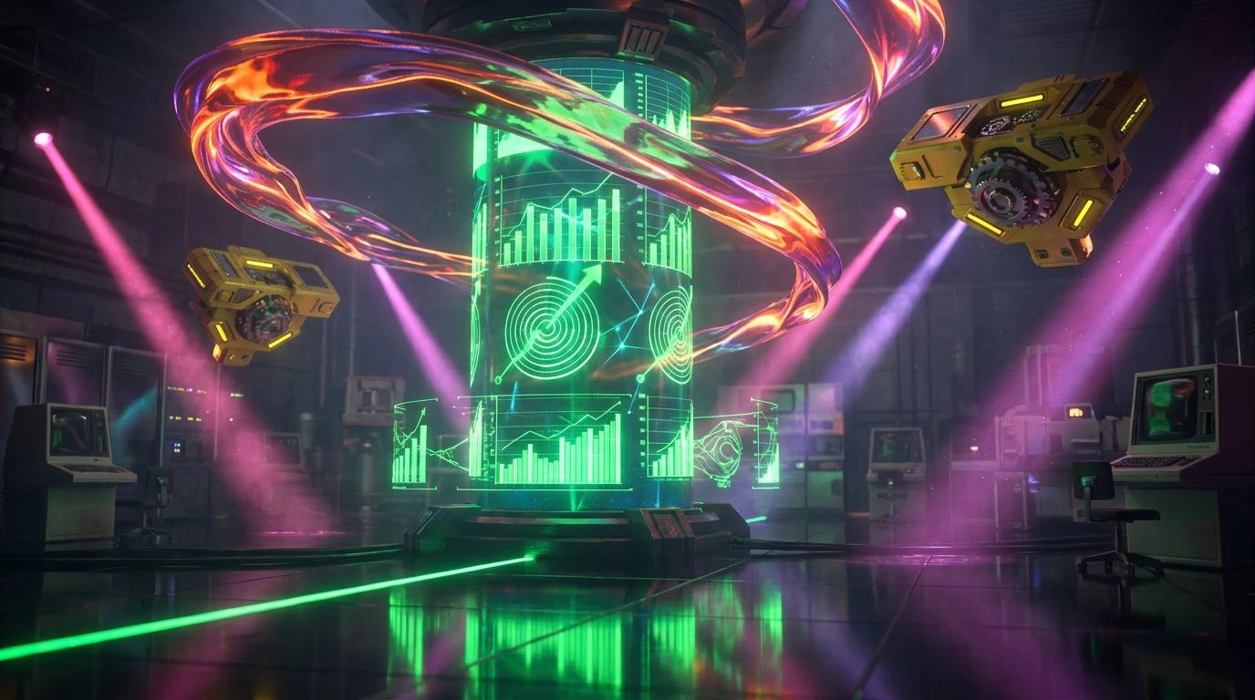
The High Score Ecology palette does not simply ask you to read about solar panel investments; it practically shouts the news over the electronic noise of a bustling amusement center. Anchored by the radioactive joy of Phosphor Green and the blistering heat of Neon Magma, this collection turns mundane statistical progress into an exhilarating sprint. Token Yellow provides a sharp flash of optimism, cutting entirely through the seriousness of the Deep Sea Cathode shadows. It is an aggressively cheerful palette, completed by the unabashed theatricality of Laser Flamingo. When applied to charts demonstrating emissions reductions or professional growth metrics, these colors make every fraction of a percent feel like unlocking a hidden level. It completely replaces the earnest guilt usually associated with ecological reading, offering instead a shot of pure, unadulterated graphical adrenaline.
Corporate Cyberpunk 💾
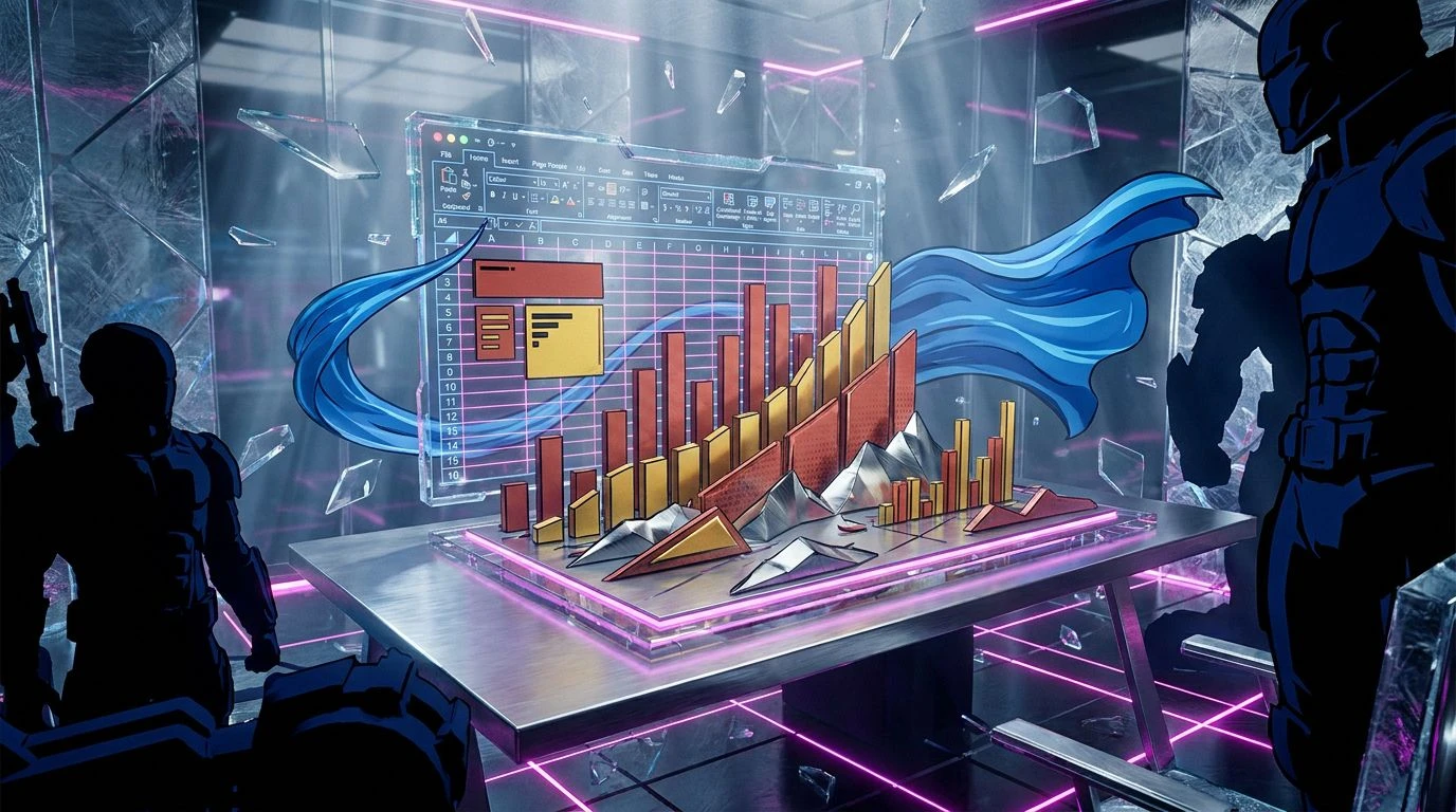
Imagine the standard, slightly depressing grey carpet of a traditional trading floor suddenly struck by a rogue bolt of neon lightning. That visually jarring but utterly thrilling collision is what the Corporate Cyberpunk palette brings to the table. It builds a foundation of expected professionalism with Spreadsheet Ash and Boardroom Slate, lulling the reader into a false sense of bureaucratic security. Then, it shatters that comfort with strikes of Ultraviolet Output and the startlingly bright Magenta Dividend. Cyan Emissions and Blue Sky Projection act as the electric connective tissue between the grim corporate reality of Charcoal Baseline and wild, unregulated future-facing optimism. Carbon Violet grounds the neon explosion just enough to keep the data readable while ensuring the visual landscape feels like a rebellious midnight hacker terminal rather than a daytime boardroom presentation.
Thermal Yield 📉
There is an undeniably urgent rhythm to the Thermal Yield palette, moving from stark neutrality straight into blazing, undeniable heat. The quiet, entirely unremarkable presence of Neutral Concrete and Pale Server Dust serves a very specific purpose: they act as the blank gallery wall for the violent interruption of Acid Lime Wire. In the context of a sustainability report, that shocking jolt of yellow-green forces the eye toward critical data points, refusing to let the reader skip past the details. Warning Light Red and Apricot Burn supply the necessary tension for risk assessment and climate targets, looking beautifully alarming against the dull industrial greys. This is the visual equivalent of an emergency siren in a retro-futurist bunker, stripping away any pretense of gentle nature and framing planetary survival as an intense, zero-sum game of strategy.
Analog Botanica 📼
In a dramatic departure from the overwhelming fluorescence of its peers, the Analog Botanica palette discovers a quiet, quirky intersection between natural foliage and decaying technological media. The hero here is Retro Olive, an unapologetically dated shade that feels plucked directly from a heavily carpeted rec room, yet miraculously finds its footing in modern discussions of eclectic creativity. It sits comfortably beside the soft, almost nostalgic pink of Muted Clay and the strict, unyielding lines of Magnetic Tape. Ream White provides the expansive breathing room necessary for modern layouts, while a sudden, peculiar splash of Glitch Cyan delivers that required arcade signature. It speaks to a sort of lived-in, deeply human approach to ecology, completely sidestepping the sterile, glossy perfection of standard corporate graphics in favor of something wonderfully imperfect and memorable.
Pixelated Canopy 🌍
The Pixelated Canopy palette builds a brilliant visual bridge between the physical reality of the natural world and the glowing topography of an eight-bit wilderness. Midnight Zenith and Arcade Ocean establish a serious, weighty foundation, plunging the document into a deep, screen-lit calmness reminiscent of after-hours coding sessions. From these deep waters rise the earthy tones of Moss Console and Mustard Lichen, offering a digitized nod to forests and fields. Frosted Glass and Aluminium Casing step in as cool, functional separators, allowing the brighter elements to pop without overwhelming the reader navigating complex data sets. When Glowing Spore hits the page, it shines like a prized collection item in a virtual forest, turning standard bar charts into a vibrant landscape. Pixel River washes over the entire collection, keeping the mood forward-looking, fresh, and undeniably rooted in an optimistic tech-driven future.
Approaching planetary health and professional growth through the lens of vintage coin-op entertainment is certainly a peculiar choice for corporate communications, yet it undeniably works. These palettes completely dismantle the tired, guilt-heavy imagery of traditional ecology, replacing it with an energy that demands direct engagement. By swapping out muted earth tones for electric pinks, phosphor greens, and distinctly retro olives, designers are making statistical progress visually irresistible. The dry ledgers of environmental responsibility have been fundamentally reimagined as thrilling, neon-soaked narratives of human potential. It leaves the reader not just informed about renewable targets, but weirdly eager to see the flashy visuals of the next quarter.