'%3e%3cpath%20fill-rule='evenodd'%20clip-rule='evenodd'%20d='M51.1303%2019.2492C50.7278%2019.913%2050.1346%2020.4426%2049.3508%2020.838C48.5669%2021.2335%2047.6172%2021.4312%2046.5014%2021.4312C44.8208%2021.4312%2043.4367%2021.0216%2042.3492%2020.2025C41.2617%2019.3833%2040.6686%2018.2394%2040.5697%2016.7706H44.4253C44.4818%2017.3355%2044.6831%2017.7804%2045.0291%2018.1052C45.3751%2018.43%2045.8164%2018.5924%2046.3531%2018.5924C46.8192%2018.5924%2047.1864%2018.4653%2047.4547%2018.2111C47.7231%2017.9569%2047.8572%2017.618%2047.8572%2017.1943C47.8572%2016.8129%2047.7337%2016.4952%2047.4865%2016.241C47.2393%2015.9867%2046.9322%2015.7784%2046.565%2015.616C46.1978%2015.4536%2045.6893%2015.2594%2045.0397%2015.0334C44.0934%2014.7086%2043.3202%2014.3944%2042.72%2014.0907C42.1197%2013.7871%2041.6042%2013.3351%2041.1735%2012.7349C40.7427%2012.1347%2040.5273%2011.3544%2040.5273%2010.394C40.5273%209.50418%2040.7533%208.73448%2041.2053%208.08481C41.6572%207.43515%2042.2821%206.93731%2043.0801%206.5913C43.8781%206.24528%2044.7925%206.07227%2045.8235%206.07227C47.49%206.07227%2048.8141%206.46771%2049.7956%207.25861C50.7772%208.04951%2051.3315%209.13698%2051.4586%2010.5211H47.5395C47.4689%2010.0268%2047.2888%209.63483%2046.9993%209.3453C46.7097%209.05578%2046.3178%208.91102%2045.8235%208.91102C45.3998%208.91102%2045.0573%209.024%2044.7961%209.24997C44.5348%209.47594%2044.4041%209.80783%2044.4041%2010.2457C44.4041%2010.5988%2044.5207%2010.8989%2044.7537%2011.146C44.9867%2011.3932%2045.2798%2011.5944%2045.6328%2011.7498C45.9859%2011.9052%2046.4944%2012.1029%2047.1581%2012.343C48.1185%2012.6678%2048.9023%2012.9891%2049.5096%2013.3069C50.1169%2013.6246%2050.6395%2014.0872%2051.0773%2014.6945C51.5151%2015.3018%2051.734%2016.0927%2051.734%2017.0672C51.734%2017.8581%2051.5328%2018.5854%2051.1303%2019.2492ZM59.0242%206.3053V21.2829H55.4016V6.3053H59.0242ZM73.9409%206.3053V9.18642H69.8734V21.2829H66.2296V9.18642H62.2046V6.3053H73.9409ZM80.7438%209.18642V12.3218H85.8069V15.0546H80.7438V18.3806H86.4425V21.2829H77.1212V6.3053H86.4425V9.18642H80.7438ZM99.667%2016.0291V21.2829H96.0444V6.3053H101.913C103.692%206.3053%20105.048%206.74665%20105.98%207.62934C106.912%208.51204%20107.378%209.7019%20107.378%2011.199C107.378%2012.1311%20107.17%2012.9609%20106.753%2013.6882C106.337%2014.4155%20105.719%2014.9875%20104.9%2015.4042C104.08%2015.8208%20103.085%2016.0291%20101.913%2016.0291H99.667ZM103.692%2011.199C103.692%209.8855%20102.965%209.22879%20101.51%209.22879H99.667V13.1268H101.51C102.965%2013.1268%20103.692%2012.4842%20103.692%2011.199ZM120.092%2018.5501H114.478L113.546%2021.2829H109.732L115.219%206.41123H119.393L124.879%2021.2829H121.024L120.092%2018.5501ZM119.16%2015.7961L117.295%2010.2881L115.41%2015.7961H119.16ZM131.555%2018.5077H136.385V21.2829H127.933V6.3053H131.555V18.5077ZM143.337%209.18642V12.3218H148.4V15.0546H143.337V18.3806H149.035V21.2829H139.714V6.3053H149.035V9.18642H143.337ZM163.507%206.3053V9.18642H159.44V21.2829H155.796V9.18642H151.771V6.3053H163.507ZM177.449%206.3053V9.18642H173.382V21.2829H169.738V9.18642H165.713V6.3053H177.449ZM184.252%209.18642V12.3218H189.315V15.0546H184.252V18.3806H189.951V21.2829H180.629V6.3053H189.951V9.18642H184.252Z'%20fill='%23EEF0ED'/%3e%3cmask%20id='mask0_3101_7327'%20style='mask-type:alpha'%20maskUnits='userSpaceOnUse'%20x='0'%20y='0'%20width='27'%20height='28'%3e%3cpath%20d='M23.8328%200.759766H2.64808C1.18559%200.759766%200%201.94535%200%203.40785V24.5925C0%2026.055%201.18559%2027.2406%202.64808%2027.2406H23.8328C25.2952%2027.2406%2026.4808%2026.055%2026.4808%2024.5925V3.40785C26.4808%201.94535%2025.2952%200.759766%2023.8328%200.759766Z'%20fill='white'/%3e%3c/mask%3e%3cg%20mask='url(%23mask0_3101_7327)'%3e%3cpath%20d='M23.8328%200.759766H2.64808C1.18559%200.759766%200%201.94535%200%203.40785V24.5925C0%2026.055%201.18559%2027.2406%202.64808%2027.2406H23.8328C25.2952%2027.2406%2026.4808%2026.055%2026.4808%2024.5925V3.40785C26.4808%201.94535%2025.2952%200.759766%2023.8328%200.759766Z'%20fill='%23D8D8D8'/%3e%3cpath%20d='M13.2404%200.759766H0V14.0001H13.2404V0.759766Z'%20fill='%238C61FF'/%3e%3cpath%20d='M13.2404%2014H0V27.2404H13.2404V14Z'%20fill='%2336C3FE'/%3e%3cpath%20d='M26.4806%2014H13.2402V27.2404H26.4806V14Z'%20fill='%236592FE'/%3e%3cpath%20d='M26.4806%200.759766H13.2402V14.0002H26.4806V0.759766Z'%20fill='%236059F7'/%3e%3c/g%3e%3c/g%3e%3cdefs%3e%3cclipPath%20id='clip0_3101_7327'%3e%3crect%20width='190'%20height='28'%20fill='white'/%3e%3c/clipPath%3e%3c/defs%3e%3c/svg%3e)
'%3e%3cpath%20d='M23.8328%200.759521H2.64808C1.18559%200.759521%200%201.94511%200%203.40761V24.5923C0%2026.0548%201.18559%2027.2404%202.64808%2027.2404H23.8328C25.2952%2027.2404%2026.4808%2026.0548%2026.4808%2024.5923V3.40761C26.4808%201.94511%2025.2952%200.759521%2023.8328%200.759521Z'%20fill='%23D8D8D8'/%3e%3cpath%20d='M13.2404%200.759521H0V13.9999H13.2404V0.759521Z'%20fill='%238C61FF'/%3e%3cpath%20d='M13.2404%2013.9998H0V27.2402H13.2404V13.9998Z'%20fill='%2336C3FE'/%3e%3cpath%20d='M26.4809%2013.9998H13.2405V27.2402H26.4809V13.9998Z'%20fill='%236592FE'/%3e%3cpath%20d='M26.4809%200.759277H13.2405V13.9997H26.4809V0.759277Z'%20fill='%236059F7'/%3e%3c/g%3e%3c/svg%3e)
Use Electric Purple Color Palettes for Digital Portfolios
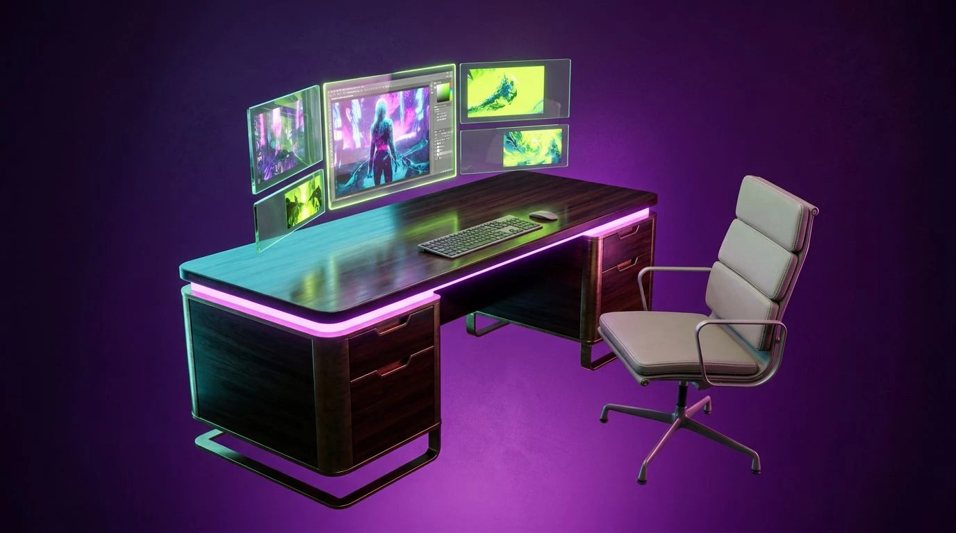
· 5 min readFor a decade, the default aesthetic for the creative portfolio has been a stark, clinical white. This approach, borrowed from the whitewashed walls of physical gallery spaces, supposedly allows the work to speak for itself without interference. Yet on a backlit screen, an endless sea of white deadens impact, flattening the digital space into a two-dimensional void. The creator of today requires an environment that matches their creative intensity. Moving away from a blank, sterile slate toward electric purple, deep black, and sharp cyan introduces a necessary depth. These bold alternatives cast neon-tinged shadows that push the work forward, creating an atmosphere belonging strictly to modern digital spaces rather than attempting to simulate a paper brochure. By adopting this commanding chromatic range, creators assert total environmental control over how the audience experiences their vision.
Midnight Voltage ⚡
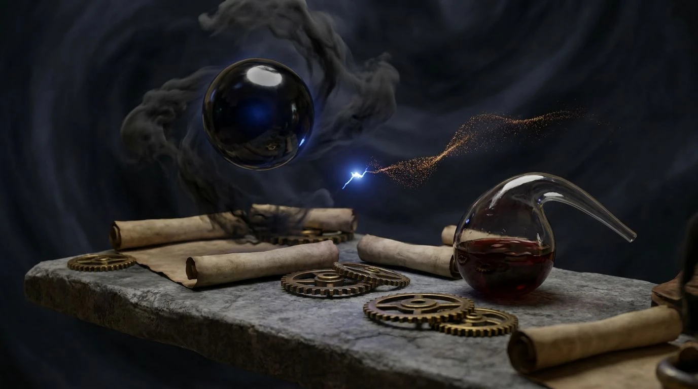
This sequence challenges the traditional gallery wall by establishing a foundation in Obsidian Night and Deep Cyan. When a designer or artist stages their work against these dark, cavernous tones, pieces suddenly acquire dramatic spatial volume. Electric Purple and Neon Fuchsia provide sharp, contrasting edges that cut through the darkness, allowing typography and interactive elements to jump off the screen. Pale Ash and Concrete Shadow offer quiet resting spaces for the eye, ensuring the vibrant tones do not overwhelm the viewer. Tarnished Brass adds an unexpected organic warmth, interrupting the strictly digital feel of the neon accents. Instead of a flat, passive reading experience, a portfolio built upon these intense shades turns navigation into an active exploration. The creator positions their work not as mere artifacts pinned to a board, but as luminous objects suspended in a richly constructed digital ether.
Ultraviolet Monolith 🔮
Grounded by the uncompromising darkness of Absolute Midnight, this collection provides the perfect stage for visual intensity. Charcoal Slate and Stone Gray build a structural, architectural silence around the central focal points, acting precisely as a high-end exhibition space should. The real power here lies in the interplay between these solemn neutrals and the piercing strike of Cobalt Purple. When creators abandon a sterile white backdrop for this deep, bruised sky aesthetic, images and videos immediately gain a theatrical presence. Lavender Mist serves as an ideal typographic alternative to stark white text, maintaining legibility while absorbing the atmospheric color cast of the space. Presenting a body of work within this environment signals a rejection of safe, expected norms. It constructs a framing device that demands attention, wrapping the viewer in a modern, nocturnal environment where color behaves like directed gallery lighting rather than background noise.
Electric Flora 🌿
The transition from an analog sensibility to unapologetic digital supremacy defines this chromatic arrangement. Roasted Espresso and Putty hint at physical materials and classic drafting tables, yet they are radically interrupted by Violet Surge and Acid Lime. Using Deep Eggplant as a primary structural background affords the creative portfolio an intimidating, luxurious vastness. Placed against this dark atmospheric weight, Ghost White typography remains crisp and authoritative. The introduction of Acid Lime creates a restless, electric tension when placed adjacent to Radiant Orchid, mimicking the hyper-real glow of screen-based art. By abandoning the predictable white canvas, graphic designers and visual artists can manipulate these neon-tinged shadows to push their primary subjects forward. The resulting space feels distinctly active, transforming a static archive of past projects into a living, breathing assertion of creative authority that commands the viewer completely.
Kinetic Spectrum 💥
Saturated to the point of structural collapse, this collection refuses to apologize for its existence. Taking Royal Velvet and Deep Ocean as foundational plains replaces the dead space of traditional web design with a boundless, energetic void. In this setting, imagery does not merely sit on a page; it emerges from a deeply colored expanse. Ultraviolet Flash and Hyper Blue act as navigational beacons, guiding the audience through the portfolio with aggressive confidence. Cyber Yellow and Magenta Shock slice through the darker fields, providing high-contrast markers that demand immediate interaction from the viewer. This uncompromising chromatic approach separates the passive archivist from the active creator. By forcing the audience to process these intense, luminous shades, the designer claims complete psychological control over the viewing environment. The work presented within such a demanding frame is instantly perceived as bold, contemporary, and fiercely original, leaving a lasting mark.
Synthwave Pulse 🎧
Navigating the space between stark minimalism and maximalist expression, this collection utilizes Steel Dust and Alabaster Tint to construct a recognizable structural grid. However, rather than resting in comfortable neutrality, the environment is violently interrupted by Amethyst Shock and Crushed Berry. When shadows are cast in these deep, neon-tinged purples instead of standard grays, the portfolio gains a physical density that flat backgrounds cannot achieve. Signal Red and Laser Pink operate as urgent calls to action, drawing the eye precisely where the designer intends. This strategic application of vivid color against a foundation of industrial gray creates a striking push-and-pull effect. A portfolio utilizing this arrangement signals an acute awareness of modern digital aesthetics, where intensity and restraint hold equal value. The creator deploying these tones recognizes that a backdrop should actively participate in the emotional delivery of the work, rather than quietly retreating behind it.
The persistent reliance on a blank canvas in digital portfolios displays a failure of imagination. Embracing these commanding, shadow-drenched purples and electric highlights shifts the power dynamic between the work and the observer. Such environments demand interaction, carving out digital volume where none previously existed. By treating the background as an active participant rather than an empty container, a designer establishes total atmospheric control. The result is a presentation space that matches the ambition and intensity of the creator, ensuring the work leaves a permanent, visceral impression on an increasingly distracted audience.