'%3e%3cpath%20fill-rule='evenodd'%20clip-rule='evenodd'%20d='M51.1303%2019.2492C50.7278%2019.913%2050.1346%2020.4426%2049.3508%2020.838C48.5669%2021.2335%2047.6172%2021.4312%2046.5014%2021.4312C44.8208%2021.4312%2043.4367%2021.0216%2042.3492%2020.2025C41.2617%2019.3833%2040.6686%2018.2394%2040.5697%2016.7706H44.4253C44.4818%2017.3355%2044.6831%2017.7804%2045.0291%2018.1052C45.3751%2018.43%2045.8164%2018.5924%2046.3531%2018.5924C46.8192%2018.5924%2047.1864%2018.4653%2047.4547%2018.2111C47.7231%2017.9569%2047.8572%2017.618%2047.8572%2017.1943C47.8572%2016.8129%2047.7337%2016.4952%2047.4865%2016.241C47.2393%2015.9867%2046.9322%2015.7784%2046.565%2015.616C46.1978%2015.4536%2045.6893%2015.2594%2045.0397%2015.0334C44.0934%2014.7086%2043.3202%2014.3944%2042.72%2014.0907C42.1197%2013.7871%2041.6042%2013.3351%2041.1735%2012.7349C40.7427%2012.1347%2040.5273%2011.3544%2040.5273%2010.394C40.5273%209.50418%2040.7533%208.73448%2041.2053%208.08481C41.6572%207.43515%2042.2821%206.93731%2043.0801%206.5913C43.8781%206.24528%2044.7925%206.07227%2045.8235%206.07227C47.49%206.07227%2048.8141%206.46771%2049.7956%207.25861C50.7772%208.04951%2051.3315%209.13698%2051.4586%2010.5211H47.5395C47.4689%2010.0268%2047.2888%209.63483%2046.9993%209.3453C46.7097%209.05578%2046.3178%208.91102%2045.8235%208.91102C45.3998%208.91102%2045.0573%209.024%2044.7961%209.24997C44.5348%209.47594%2044.4041%209.80783%2044.4041%2010.2457C44.4041%2010.5988%2044.5207%2010.8989%2044.7537%2011.146C44.9867%2011.3932%2045.2798%2011.5944%2045.6328%2011.7498C45.9859%2011.9052%2046.4944%2012.1029%2047.1581%2012.343C48.1185%2012.6678%2048.9023%2012.9891%2049.5096%2013.3069C50.1169%2013.6246%2050.6395%2014.0872%2051.0773%2014.6945C51.5151%2015.3018%2051.734%2016.0927%2051.734%2017.0672C51.734%2017.8581%2051.5328%2018.5854%2051.1303%2019.2492ZM59.0242%206.3053V21.2829H55.4016V6.3053H59.0242ZM73.9409%206.3053V9.18642H69.8734V21.2829H66.2296V9.18642H62.2046V6.3053H73.9409ZM80.7438%209.18642V12.3218H85.8069V15.0546H80.7438V18.3806H86.4425V21.2829H77.1212V6.3053H86.4425V9.18642H80.7438ZM99.667%2016.0291V21.2829H96.0444V6.3053H101.913C103.692%206.3053%20105.048%206.74665%20105.98%207.62934C106.912%208.51204%20107.378%209.7019%20107.378%2011.199C107.378%2012.1311%20107.17%2012.9609%20106.753%2013.6882C106.337%2014.4155%20105.719%2014.9875%20104.9%2015.4042C104.08%2015.8208%20103.085%2016.0291%20101.913%2016.0291H99.667ZM103.692%2011.199C103.692%209.8855%20102.965%209.22879%20101.51%209.22879H99.667V13.1268H101.51C102.965%2013.1268%20103.692%2012.4842%20103.692%2011.199ZM120.092%2018.5501H114.478L113.546%2021.2829H109.732L115.219%206.41123H119.393L124.879%2021.2829H121.024L120.092%2018.5501ZM119.16%2015.7961L117.295%2010.2881L115.41%2015.7961H119.16ZM131.555%2018.5077H136.385V21.2829H127.933V6.3053H131.555V18.5077ZM143.337%209.18642V12.3218H148.4V15.0546H143.337V18.3806H149.035V21.2829H139.714V6.3053H149.035V9.18642H143.337ZM163.507%206.3053V9.18642H159.44V21.2829H155.796V9.18642H151.771V6.3053H163.507ZM177.449%206.3053V9.18642H173.382V21.2829H169.738V9.18642H165.713V6.3053H177.449ZM184.252%209.18642V12.3218H189.315V15.0546H184.252V18.3806H189.951V21.2829H180.629V6.3053H189.951V9.18642H184.252Z'%20fill='%23EEF0ED'/%3e%3cmask%20id='mask0_3101_7327'%20style='mask-type:alpha'%20maskUnits='userSpaceOnUse'%20x='0'%20y='0'%20width='27'%20height='28'%3e%3cpath%20d='M23.8328%200.759766H2.64808C1.18559%200.759766%200%201.94535%200%203.40785V24.5925C0%2026.055%201.18559%2027.2406%202.64808%2027.2406H23.8328C25.2952%2027.2406%2026.4808%2026.055%2026.4808%2024.5925V3.40785C26.4808%201.94535%2025.2952%200.759766%2023.8328%200.759766Z'%20fill='white'/%3e%3c/mask%3e%3cg%20mask='url(%23mask0_3101_7327)'%3e%3cpath%20d='M23.8328%200.759766H2.64808C1.18559%200.759766%200%201.94535%200%203.40785V24.5925C0%2026.055%201.18559%2027.2406%202.64808%2027.2406H23.8328C25.2952%2027.2406%2026.4808%2026.055%2026.4808%2024.5925V3.40785C26.4808%201.94535%2025.2952%200.759766%2023.8328%200.759766Z'%20fill='%23D8D8D8'/%3e%3cpath%20d='M13.2404%200.759766H0V14.0001H13.2404V0.759766Z'%20fill='%238C61FF'/%3e%3cpath%20d='M13.2404%2014H0V27.2404H13.2404V14Z'%20fill='%2336C3FE'/%3e%3cpath%20d='M26.4806%2014H13.2402V27.2404H26.4806V14Z'%20fill='%236592FE'/%3e%3cpath%20d='M26.4806%200.759766H13.2402V14.0002H26.4806V0.759766Z'%20fill='%236059F7'/%3e%3c/g%3e%3c/g%3e%3cdefs%3e%3cclipPath%20id='clip0_3101_7327'%3e%3crect%20width='190'%20height='28'%20fill='white'/%3e%3c/clipPath%3e%3c/defs%3e%3c/svg%3e)
'%3e%3cpath%20d='M23.8328%200.759521H2.64808C1.18559%200.759521%200%201.94511%200%203.40761V24.5923C0%2026.0548%201.18559%2027.2404%202.64808%2027.2404H23.8328C25.2952%2027.2404%2026.4808%2026.0548%2026.4808%2024.5923V3.40761C26.4808%201.94511%2025.2952%200.759521%2023.8328%200.759521Z'%20fill='%23D8D8D8'/%3e%3cpath%20d='M13.2404%200.759521H0V13.9999H13.2404V0.759521Z'%20fill='%238C61FF'/%3e%3cpath%20d='M13.2404%2013.9998H0V27.2402H13.2404V13.9998Z'%20fill='%2336C3FE'/%3e%3cpath%20d='M26.4809%2013.9998H13.2405V27.2402H26.4809V13.9998Z'%20fill='%236592FE'/%3e%3cpath%20d='M26.4809%200.759277H13.2405V13.9997H26.4809V0.759277Z'%20fill='%236059F7'/%3e%3c/g%3e%3c/svg%3e)
Crimson Color Palettes Rule High-Frequency Trading Design
· 6 min readThere is a sudden, breathtaking shift happening across the glowing plains of modern trading floors. The screens that once swam in seas of sterile, reassuring greens and oceanic blues are now turning their gaze toward something far more visceral. We are witnessing the reclamation of a shade long feared by traders, bringing a rush of heat and breathtaking speed to the visual rhythm of high frequency commerce. Red is no longer the omen of a collapsing market, but rather a pulse of raw, creative vitality. Set against unending voids of pitch and shadowed charcoal, this newfound aesthetic transforms the financial dashboard into a theater of urgent elegance. The colors thrum with an electric urgency, capturing the very oxygen in the room and painting the pursuit of wealth with the dramatic tension of high art. It is a visual language of absolute velocity, where deep crimson slashes through obsidian darkness like a racing stripe, turning every fraction of a second into a moment of pure, uninterrupted intensity.
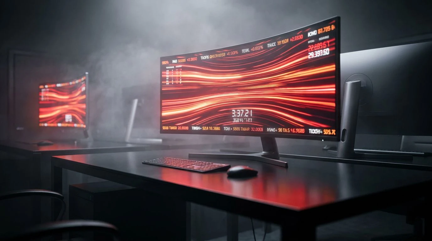
Midnight Velocity 🏎️
Picture the sensory rush of moving faster than the speed of sound, where the only things visible are stark flashes of light and shadow. Midnight Velocity sets the stage with deep, bottomless expanses of Obsidian Void and Graphite Shadow, crafting an infinite backdrop for data to sprint across. Suddenly, the screen is slashed with the aggressive, undeniable heat of Scorched Crimson and Electric Amber, pulsing like the taillights of a sports car tearing through a darkened tunnel. This is the new financial aesthetic of absolute, unfiltered speed, reclaiming danger as a sign of relentless momentum. The quiet touches of Snow Blindness and Dust Rose offer just enough visual breath, allowing the eye to register the sheer force of the darker, heavier tones. It turns a simple tracking system into an immersive experience of adrenaline, commanding the viewer to stay alert, sharp, and entirely consumed by the thrill of the flashing numbers.
Concrete and Coral 🏢
There is a quiet, devastating kind of elegance in removing everything unnecessary from the visual frame, leaving only the sharpest contrasts to guide the eye. Concrete and Coral approaches the trading monitor with the restraint of minimalist architecture, laying down expansive washes of Alabaster Frost and Midnight Iron. Against this cool, measured backdrop of Urban Stone and Smoked Glass, a sudden streak of Electric Coral emerges, demanding immediate and absolute attention. The vibrant pink-red shade feels almost startling in its brightness, stripping away the old associations of fear and replacing them with a sense of sharp, hyper-modern intelligence. This collection of shades transforms the daily act of observing data into an encounter with high-stakes design, where every glowing red line feels like a deliberate stroke of genius across a beautifully austere canvas. It is cool, calculating, and breathtakingly bold.
The Void's Edge 🌒
Sometimes the most powerful statement a designer can make is the complete withdrawal of color, reducing the world to light, shadow, and the infinite space between them. The Void's Edge constructs a financial interface built entirely from tension and stark clarity. Absolute Pitch provides an endless, cavernous space for glowing metrics, while Blinding White cuts through the darkness with the precision of a scalpel. Layers of Deep Carbon and Sterling Fog sit in the background, adding volume and texture without screaming for attention, allowing the architecture of the screen to breathe. In a world increasingly obsessed with the shock of crimson, this purely monochromatic environment serves as the ultimate stage. It prepares the eye, creating a dark, silent theater waiting for that sudden, solitary burst of colored light. It is a masterclass in atmospheric pressure, keeping the viewer teetering on a knife edge of anticipation.
Slate Whispers 🌪️
There is an undeniable sense of luxury in spaces that prioritize stillness, and the financial screens draped in these specific tones feel less like trading tools and more like peering into an exclusive, subterranean vault. Pure Light and Panther Black create an immediate, arresting contrast, grounding the entire visual field in weight and authority. Yet it is the inclusion of Tarnished Silver and Oxidized Copper that shifts the mood toward something deeply sophisticated and slightly mysterious. The muted teal acts as a cooling agent against the feverish demands of market tracking, providing a calm, steadying visual anchor. When the inevitable flash of a crimson indicator finally crosses this serene, mineral-toned landscape, the impact is utterly profound. The red burns brighter and feels more intentional, like a single drop of rare pigment on a centuries-old canvas, bringing a quiet, electric life to the machinery of modern wealth.
Neon Aristocracy 🥂
Here, the interface bursts into full, unapologetic glamour, transforming the act of high-frequency commerce into an experience of sensory excess. Neon Aristocracy drips with visual richness, plunging the viewer into the oceanic darkness of Depth of Navy and Storm Cloud, only to catch the light with bright, shimmering accents of Liquid Brass and Pearlescent Wash. This is where the red aesthetic reaches its most dramatic peak. Shock Magenta and Royal Blood streak across the cool Winter Steel like brilliant neon against a midnight cityscape. These fierce, vibrating pinks and reds do not signal disaster; they broadcast victory, speed, and untouchable confidence. These tones collide to create an atmosphere of high-stakes play, where enormous sums move at the speed of light, and the screen itself feels alive, thumping with a glamorous, irrepressible heartbeat that refuses to look away from the thrill of the chase.
The contemporary trading screen has fundamentally altered its visual vocabulary, stepping away from cautious palettes and stepping boldly toward the thrill of the visceral. Through sprawling depths of charcoal and brilliant, shocking strikes of red, a new aesthetic identity has taken hold across these monitors. Color is no longer a simple warning system, but an emotional landscape of absolute speed, power, and unapologetic style. By reclaiming the shades of danger, modern design has crowned a new visual language for ambition. As we look at these glowing terminals, we are no longer just tracking numbers; we are witnessing the breathless beauty of momentum itself, painted in the darkest blacks and the bravest, most vibrant crimsons.