'%3e%3cpath%20fill-rule='evenodd'%20clip-rule='evenodd'%20d='M51.1303%2019.2492C50.7278%2019.913%2050.1346%2020.4426%2049.3508%2020.838C48.5669%2021.2335%2047.6172%2021.4312%2046.5014%2021.4312C44.8208%2021.4312%2043.4367%2021.0216%2042.3492%2020.2025C41.2617%2019.3833%2040.6686%2018.2394%2040.5697%2016.7706H44.4253C44.4818%2017.3355%2044.6831%2017.7804%2045.0291%2018.1052C45.3751%2018.43%2045.8164%2018.5924%2046.3531%2018.5924C46.8192%2018.5924%2047.1864%2018.4653%2047.4547%2018.2111C47.7231%2017.9569%2047.8572%2017.618%2047.8572%2017.1943C47.8572%2016.8129%2047.7337%2016.4952%2047.4865%2016.241C47.2393%2015.9867%2046.9322%2015.7784%2046.565%2015.616C46.1978%2015.4536%2045.6893%2015.2594%2045.0397%2015.0334C44.0934%2014.7086%2043.3202%2014.3944%2042.72%2014.0907C42.1197%2013.7871%2041.6042%2013.3351%2041.1735%2012.7349C40.7427%2012.1347%2040.5273%2011.3544%2040.5273%2010.394C40.5273%209.50418%2040.7533%208.73448%2041.2053%208.08481C41.6572%207.43515%2042.2821%206.93731%2043.0801%206.5913C43.8781%206.24528%2044.7925%206.07227%2045.8235%206.07227C47.49%206.07227%2048.8141%206.46771%2049.7956%207.25861C50.7772%208.04951%2051.3315%209.13698%2051.4586%2010.5211H47.5395C47.4689%2010.0268%2047.2888%209.63483%2046.9993%209.3453C46.7097%209.05578%2046.3178%208.91102%2045.8235%208.91102C45.3998%208.91102%2045.0573%209.024%2044.7961%209.24997C44.5348%209.47594%2044.4041%209.80783%2044.4041%2010.2457C44.4041%2010.5988%2044.5207%2010.8989%2044.7537%2011.146C44.9867%2011.3932%2045.2798%2011.5944%2045.6328%2011.7498C45.9859%2011.9052%2046.4944%2012.1029%2047.1581%2012.343C48.1185%2012.6678%2048.9023%2012.9891%2049.5096%2013.3069C50.1169%2013.6246%2050.6395%2014.0872%2051.0773%2014.6945C51.5151%2015.3018%2051.734%2016.0927%2051.734%2017.0672C51.734%2017.8581%2051.5328%2018.5854%2051.1303%2019.2492ZM59.0242%206.3053V21.2829H55.4016V6.3053H59.0242ZM73.9409%206.3053V9.18642H69.8734V21.2829H66.2296V9.18642H62.2046V6.3053H73.9409ZM80.7438%209.18642V12.3218H85.8069V15.0546H80.7438V18.3806H86.4425V21.2829H77.1212V6.3053H86.4425V9.18642H80.7438ZM99.667%2016.0291V21.2829H96.0444V6.3053H101.913C103.692%206.3053%20105.048%206.74665%20105.98%207.62934C106.912%208.51204%20107.378%209.7019%20107.378%2011.199C107.378%2012.1311%20107.17%2012.9609%20106.753%2013.6882C106.337%2014.4155%20105.719%2014.9875%20104.9%2015.4042C104.08%2015.8208%20103.085%2016.0291%20101.913%2016.0291H99.667ZM103.692%2011.199C103.692%209.8855%20102.965%209.22879%20101.51%209.22879H99.667V13.1268H101.51C102.965%2013.1268%20103.692%2012.4842%20103.692%2011.199ZM120.092%2018.5501H114.478L113.546%2021.2829H109.732L115.219%206.41123H119.393L124.879%2021.2829H121.024L120.092%2018.5501ZM119.16%2015.7961L117.295%2010.2881L115.41%2015.7961H119.16ZM131.555%2018.5077H136.385V21.2829H127.933V6.3053H131.555V18.5077ZM143.337%209.18642V12.3218H148.4V15.0546H143.337V18.3806H149.035V21.2829H139.714V6.3053H149.035V9.18642H143.337ZM163.507%206.3053V9.18642H159.44V21.2829H155.796V9.18642H151.771V6.3053H163.507ZM177.449%206.3053V9.18642H173.382V21.2829H169.738V9.18642H165.713V6.3053H177.449ZM184.252%209.18642V12.3218H189.315V15.0546H184.252V18.3806H189.951V21.2829H180.629V6.3053H189.951V9.18642H184.252Z'%20fill='%23EEF0ED'/%3e%3cmask%20id='mask0_3101_7327'%20style='mask-type:alpha'%20maskUnits='userSpaceOnUse'%20x='0'%20y='0'%20width='27'%20height='28'%3e%3cpath%20d='M23.8328%200.759766H2.64808C1.18559%200.759766%200%201.94535%200%203.40785V24.5925C0%2026.055%201.18559%2027.2406%202.64808%2027.2406H23.8328C25.2952%2027.2406%2026.4808%2026.055%2026.4808%2024.5925V3.40785C26.4808%201.94535%2025.2952%200.759766%2023.8328%200.759766Z'%20fill='white'/%3e%3c/mask%3e%3cg%20mask='url(%23mask0_3101_7327)'%3e%3cpath%20d='M23.8328%200.759766H2.64808C1.18559%200.759766%200%201.94535%200%203.40785V24.5925C0%2026.055%201.18559%2027.2406%202.64808%2027.2406H23.8328C25.2952%2027.2406%2026.4808%2026.055%2026.4808%2024.5925V3.40785C26.4808%201.94535%2025.2952%200.759766%2023.8328%200.759766Z'%20fill='%23D8D8D8'/%3e%3cpath%20d='M13.2404%200.759766H0V14.0001H13.2404V0.759766Z'%20fill='%238C61FF'/%3e%3cpath%20d='M13.2404%2014H0V27.2404H13.2404V14Z'%20fill='%2336C3FE'/%3e%3cpath%20d='M26.4806%2014H13.2402V27.2404H26.4806V14Z'%20fill='%236592FE'/%3e%3cpath%20d='M26.4806%200.759766H13.2402V14.0002H26.4806V0.759766Z'%20fill='%236059F7'/%3e%3c/g%3e%3c/g%3e%3cdefs%3e%3cclipPath%20id='clip0_3101_7327'%3e%3crect%20width='190'%20height='28'%20fill='white'/%3e%3c/clipPath%3e%3c/defs%3e%3c/svg%3e)
'%3e%3cpath%20d='M23.8328%200.759521H2.64808C1.18559%200.759521%200%201.94511%200%203.40761V24.5923C0%2026.0548%201.18559%2027.2404%202.64808%2027.2404H23.8328C25.2952%2027.2404%2026.4808%2026.0548%2026.4808%2024.5923V3.40761C26.4808%201.94511%2025.2952%200.759521%2023.8328%200.759521Z'%20fill='%23D8D8D8'/%3e%3cpath%20d='M13.2404%200.759521H0V13.9999H13.2404V0.759521Z'%20fill='%238C61FF'/%3e%3cpath%20d='M13.2404%2013.9998H0V27.2402H13.2404V13.9998Z'%20fill='%2336C3FE'/%3e%3cpath%20d='M26.4809%2013.9998H13.2405V27.2402H26.4809V13.9998Z'%20fill='%236592FE'/%3e%3cpath%20d='M26.4809%200.759277H13.2405V13.9997H26.4809V0.759277Z'%20fill='%236059F7'/%3e%3c/g%3e%3c/svg%3e)
Bold Dark Color Palettes for Premium Magician Branding
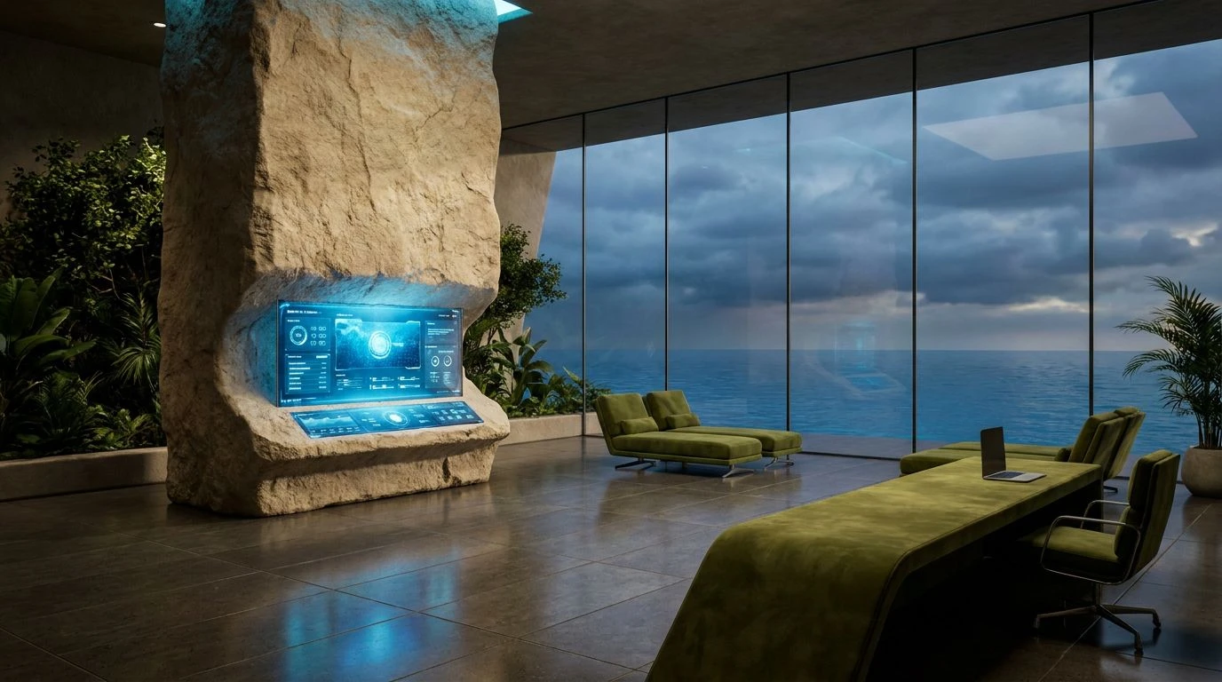
· 6 min readModern branding has spent the last decade obsessed with emptiness. Unforgiving expanses of stark white became the default language for luxury, shouting a sort of sterile minimalism that leaves nothing to the imagination. But brands built entirely on the magician archetype require a completely different visual vocabulary. They demand density, shadow, and a sense of secrecy. When we strip away the clinical empty space and plunge visual identities into the heavy, consuming depths of pure dark space, we create a stage for something transformative. Against this dark expanse, flashes of rusted metallic tones and dense slates act as visual alchemy. They project a sophisticated vitality that feels ancient yet entirely contemporary, demanding attention through sheer magnetism rather than loud typography. This transition from blank pages to shadowed depths offers premium labels a way to reclaim intrigue, crafting spaces where the audience feels like they are stepping into a private, arcane world rather than a brightly lit medical clinic.
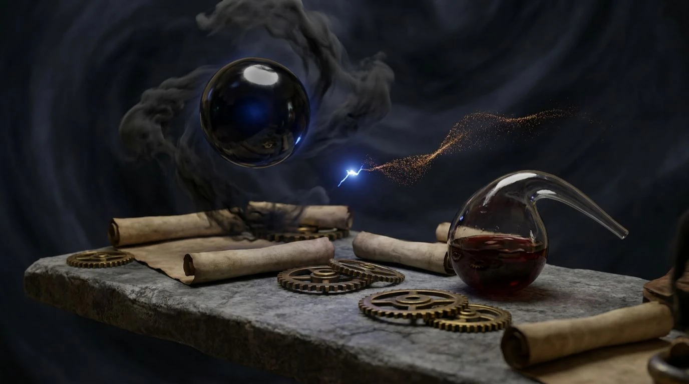
Alchemist's Study 🔮
The Alchemist's Study relies entirely on the heavy visual weight of its darkest tones to anchor a room or a brand identity. Here, an endless stretch of Inky Void replaces the expected light backgrounds, immediately sucking the viewer into a space of hushed secrecy. Smudged Charcoal and Ash Grey provide just enough tonal shift to create texture, acting like shadows cast across textured stone walls. From this imposing gloom, Oxblood and Amber Dust emerge with aggressive warmth, mimicking the glow of a low fire in a vast, dark hall. The sudden interruption of Cobalt Spark acts as a brilliant, unexpected flash of modern energy, preventing the collection from leaning too far into outright historical pastiche. Burnished Gold heavily applied across typography or packaging foil finishes the look, securing the scheme in unmistakable luxury. Balancing these dense tones with just a sliver of Parchment keeps the entire arrangement from feeling suffocating while maintaining that crucial air of exclusivity and hidden knowledge.
Arcane Forge 🏺
A successful pivot away from minimal layouts requires colors that can carry their own weight, and the Arcane Forge collection does exactly that by turning up the heat. Obsidian acts as the heavy curtain dropping across the screen, providing a bottomless stage for the vibrant, searing cut of Molten Rust. This pairing alone establishes an immediate sense of sophisticated vitality, stripping away any corporate stiffness usually found in standard design systems. The inclusion of Oxidized Copper and Pale Brass builds a bridge between raw earthiness and refined metallic finishes, offering designers exceptional tools for embossing and material contrast in physical products. Aureate serves as the unapologetic flash of wealth, gleaming sharply against the cooler, neutralizing presence of Slate Blue and Forged Steel. While a trace of Stark White remains, it is relegated to the absolute margins, used only for the sharpest functional details or microscopic text. The entire effect feels like peering into a glowing furnace, capturing the raw, transformative energy that premium labels need to ditch sterile backgrounds in favor of genuine mystery.
Midnight Ritual 🌑
Stepping into the Midnight Ritual space feels like entering a sensory deprivation tank where only the most critical visual information survives. Moving past the polite trends of the last decade, this arrangement allows Vantablack to consume the layout, creating a thick, light-swallowing environment that demands total focus. Muddy Slate operates in the background, offering subtle, almost imperceptible shifts in texture that look incredible on matte paper stock or dimly lit architectural renders. What makes this scheme truly compelling for a premium brand is the tension between Burnt Cinnabar and Phosphorescent Mint. The rusted, earthy red grounds the identity in ancient, terrestrial magic, while the jagged, unnatural hit of bright mint cuts through the darkness like a laser. It is a wildly confident combination that signals forward-thinking design. Capping it off with Antique Gold ensures the luxury positioning remains intact, using the metallic history of the color to add a layer of established wealth to an otherwise dangerously modern and nocturnal visual strategy.
Gilded Shadows 🕯️
Sometimes the transition from clean modernism to esoteric darkness requires a careful stepping stone, and Gilded Shadows builds that exact bridge. Matte Onyx swallows the majority of the visual field, introducing that necessary gravity without looking overly gothic or theatrical. Against this dark ground, the metallic warmth of Tarnished Brass and Weathered Amber suddenly carries immense importance. These two tones perform the heavy lifting, turning simple typographic elements or modest accent lines into objects of desire. They possess a worldly, aged quality that looks distinctly high-end, far removed from the sharp garishness of standard yellow. Industrial Lead and Milled Aluminum act as the utilitarian framing devices, keeping the ornate golds from feeling too traditional by injecting a cold, architectural strictness. Bleached Bone is kept strictly in reserve, deployed merely to catch the light on a sharp edge or define a tiny brand mark. The resulting aesthetic feels curated, secretive, and highly tailored, perfect for hospitality spaces or niche perfumeries that trade in whispered recommendations rather than billboard advertising.
The Mystic's Ledger 🎴
Trading the complete blackout for a dense, fog-like atmosphere, The Mystic's Ledger leans heavily into the textural qualities of Graphite Dust and Crushed Silver. This creates a mid-tone charcoal environment that feels like heavy linen or raw concrete, a perfect textural base for premium packaging. The true magic happens when the intense heat of Crimson Lake drops into this cool, grey landscape. This uncompromising red demands attention, carrying a sophisticated vitality that completely bypasses aggressive marketing tactics in favor of quiet, confident power. Aged Bronze supports the premium narrative, providing a muted, historical richness that works brilliantly for fine details, foiling, and interface accents. Finally, a sudden strike of Solar Flare serves as the wild card, a supercharged flash of light that prevents the arrangement from sinking into complete melancholy. Designers can deploy this bright yellow incredibly sparingly to guide the eye through the layout, ensuring that the shadows remain vast and mysterious while the interactive or functional elements shine like beacons in the dark.
The pivot purely toward shadow and heavy metallics is a complete rejection of the sterile minimalism that has dictated the visual landscape for too long. By stepping into these dense, uncompromisingly dark spaces, premium labels adopt a confident posture. They trade the accessible transparency of a blank page for the allure of the unknown. Rich rusts, deep slates, and gleaming bronzes give designers the tools to craft environments that feel secretive, powerful, and intentionally obscured. It leaves us with a profound understanding that in luxury spaces, what you hide in the shadows is often far more compelling than what you leave exposed in the light. This is how true magnetism is achieved today.