'%3e%3cpath%20fill-rule='evenodd'%20clip-rule='evenodd'%20d='M51.1303%2019.2492C50.7278%2019.913%2050.1346%2020.4426%2049.3508%2020.838C48.5669%2021.2335%2047.6172%2021.4312%2046.5014%2021.4312C44.8208%2021.4312%2043.4367%2021.0216%2042.3492%2020.2025C41.2617%2019.3833%2040.6686%2018.2394%2040.5697%2016.7706H44.4253C44.4818%2017.3355%2044.6831%2017.7804%2045.0291%2018.1052C45.3751%2018.43%2045.8164%2018.5924%2046.3531%2018.5924C46.8192%2018.5924%2047.1864%2018.4653%2047.4547%2018.2111C47.7231%2017.9569%2047.8572%2017.618%2047.8572%2017.1943C47.8572%2016.8129%2047.7337%2016.4952%2047.4865%2016.241C47.2393%2015.9867%2046.9322%2015.7784%2046.565%2015.616C46.1978%2015.4536%2045.6893%2015.2594%2045.0397%2015.0334C44.0934%2014.7086%2043.3202%2014.3944%2042.72%2014.0907C42.1197%2013.7871%2041.6042%2013.3351%2041.1735%2012.7349C40.7427%2012.1347%2040.5273%2011.3544%2040.5273%2010.394C40.5273%209.50418%2040.7533%208.73448%2041.2053%208.08481C41.6572%207.43515%2042.2821%206.93731%2043.0801%206.5913C43.8781%206.24528%2044.7925%206.07227%2045.8235%206.07227C47.49%206.07227%2048.8141%206.46771%2049.7956%207.25861C50.7772%208.04951%2051.3315%209.13698%2051.4586%2010.5211H47.5395C47.4689%2010.0268%2047.2888%209.63483%2046.9993%209.3453C46.7097%209.05578%2046.3178%208.91102%2045.8235%208.91102C45.3998%208.91102%2045.0573%209.024%2044.7961%209.24997C44.5348%209.47594%2044.4041%209.80783%2044.4041%2010.2457C44.4041%2010.5988%2044.5207%2010.8989%2044.7537%2011.146C44.9867%2011.3932%2045.2798%2011.5944%2045.6328%2011.7498C45.9859%2011.9052%2046.4944%2012.1029%2047.1581%2012.343C48.1185%2012.6678%2048.9023%2012.9891%2049.5096%2013.3069C50.1169%2013.6246%2050.6395%2014.0872%2051.0773%2014.6945C51.5151%2015.3018%2051.734%2016.0927%2051.734%2017.0672C51.734%2017.8581%2051.5328%2018.5854%2051.1303%2019.2492ZM59.0242%206.3053V21.2829H55.4016V6.3053H59.0242ZM73.9409%206.3053V9.18642H69.8734V21.2829H66.2296V9.18642H62.2046V6.3053H73.9409ZM80.7438%209.18642V12.3218H85.8069V15.0546H80.7438V18.3806H86.4425V21.2829H77.1212V6.3053H86.4425V9.18642H80.7438ZM99.667%2016.0291V21.2829H96.0444V6.3053H101.913C103.692%206.3053%20105.048%206.74665%20105.98%207.62934C106.912%208.51204%20107.378%209.7019%20107.378%2011.199C107.378%2012.1311%20107.17%2012.9609%20106.753%2013.6882C106.337%2014.4155%20105.719%2014.9875%20104.9%2015.4042C104.08%2015.8208%20103.085%2016.0291%20101.913%2016.0291H99.667ZM103.692%2011.199C103.692%209.8855%20102.965%209.22879%20101.51%209.22879H99.667V13.1268H101.51C102.965%2013.1268%20103.692%2012.4842%20103.692%2011.199ZM120.092%2018.5501H114.478L113.546%2021.2829H109.732L115.219%206.41123H119.393L124.879%2021.2829H121.024L120.092%2018.5501ZM119.16%2015.7961L117.295%2010.2881L115.41%2015.7961H119.16ZM131.555%2018.5077H136.385V21.2829H127.933V6.3053H131.555V18.5077ZM143.337%209.18642V12.3218H148.4V15.0546H143.337V18.3806H149.035V21.2829H139.714V6.3053H149.035V9.18642H143.337ZM163.507%206.3053V9.18642H159.44V21.2829H155.796V9.18642H151.771V6.3053H163.507ZM177.449%206.3053V9.18642H173.382V21.2829H169.738V9.18642H165.713V6.3053H177.449ZM184.252%209.18642V12.3218H189.315V15.0546H184.252V18.3806H189.951V21.2829H180.629V6.3053H189.951V9.18642H184.252Z'%20fill='%23EEF0ED'/%3e%3cmask%20id='mask0_3101_7327'%20style='mask-type:alpha'%20maskUnits='userSpaceOnUse'%20x='0'%20y='0'%20width='27'%20height='28'%3e%3cpath%20d='M23.8328%200.759766H2.64808C1.18559%200.759766%200%201.94535%200%203.40785V24.5925C0%2026.055%201.18559%2027.2406%202.64808%2027.2406H23.8328C25.2952%2027.2406%2026.4808%2026.055%2026.4808%2024.5925V3.40785C26.4808%201.94535%2025.2952%200.759766%2023.8328%200.759766Z'%20fill='white'/%3e%3c/mask%3e%3cg%20mask='url(%23mask0_3101_7327)'%3e%3cpath%20d='M23.8328%200.759766H2.64808C1.18559%200.759766%200%201.94535%200%203.40785V24.5925C0%2026.055%201.18559%2027.2406%202.64808%2027.2406H23.8328C25.2952%2027.2406%2026.4808%2026.055%2026.4808%2024.5925V3.40785C26.4808%201.94535%2025.2952%200.759766%2023.8328%200.759766Z'%20fill='%23D8D8D8'/%3e%3cpath%20d='M13.2404%200.759766H0V14.0001H13.2404V0.759766Z'%20fill='%238C61FF'/%3e%3cpath%20d='M13.2404%2014H0V27.2404H13.2404V14Z'%20fill='%2336C3FE'/%3e%3cpath%20d='M26.4806%2014H13.2402V27.2404H26.4806V14Z'%20fill='%236592FE'/%3e%3cpath%20d='M26.4806%200.759766H13.2402V14.0002H26.4806V0.759766Z'%20fill='%236059F7'/%3e%3c/g%3e%3c/g%3e%3cdefs%3e%3cclipPath%20id='clip0_3101_7327'%3e%3crect%20width='190'%20height='28'%20fill='white'/%3e%3c/clipPath%3e%3c/defs%3e%3c/svg%3e)
'%3e%3cpath%20d='M23.8328%200.759521H2.64808C1.18559%200.759521%200%201.94511%200%203.40761V24.5923C0%2026.0548%201.18559%2027.2404%202.64808%2027.2404H23.8328C25.2952%2027.2404%2026.4808%2026.0548%2026.4808%2024.5923V3.40761C26.4808%201.94511%2025.2952%200.759521%2023.8328%200.759521Z'%20fill='%23D8D8D8'/%3e%3cpath%20d='M13.2404%200.759521H0V13.9999H13.2404V0.759521Z'%20fill='%238C61FF'/%3e%3cpath%20d='M13.2404%2013.9998H0V27.2402H13.2404V13.9998Z'%20fill='%2336C3FE'/%3e%3cpath%20d='M26.4809%2013.9998H13.2405V27.2402H26.4809V13.9998Z'%20fill='%236592FE'/%3e%3cpath%20d='M26.4809%200.759277H13.2405V13.9997H26.4809V0.759277Z'%20fill='%236059F7'/%3e%3c/g%3e%3c/svg%3e)
Modern Color Palettes for Bold Academic Interior Design
· 5 min readThe visual sensory input of higher education has historically relied on muted greens, deep crimson, and heavy navy to signal permanence and exclusivity. Yet, as institutions open their doors to a wider, more diverse demographic, the psychological impact of these somber tones is being questioned by environmental psychologists. Researchers suggest that high-luminance colors trigger heightened cortical arousal, effectively waking up the brain's attention centers. Introducing a striking, energetic orange alongside the grounded weight of charcoal creates a visual tension that demands notice. This calculated shift away from visual monotony operates much like a sudden change in acoustic pitch, breaking through the quiet solemnity of classic academic architecture. By mapping such vivid stimuli onto the textured, familiar surfaces of recycled paper and the cool, modern finish of brushed aluminum, these architectural updates establish an environment of intellectual empowerment. The resulting chromatic structures actively restructure how incoming students perceive the accessibility and vitality of learning spaces.
Kinetic Campus ⚡
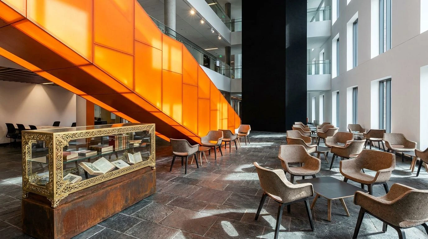
The visual contrast between a striking Energy Orange and the cavernous depth of Vantablack establishes an immediate perceptual hierarchy. In the context of reimagining educational spaces, this high-contrast pairing commands visual attention, mimicking the sudden burst of clarity that accompanies a conceptual breakthrough. The transition from the blinding purity of Optic White through the industrial coolness of Burnished Aluminum and Charcoal Slate grounds the intense orange, preventing visual fatigue while maintaining a thoroughly modern edge. Secondary notes of Rusted Iron and Archival Gold provide subtle chromatic anchors that point toward historical prestige, while the soft, tactile quality of Recycled Pulp softens the optical blow. This configuration physically transforms common areas, turning transitional corridors into active, stimulating zones that encourage lively debate and intellectual collision among students.
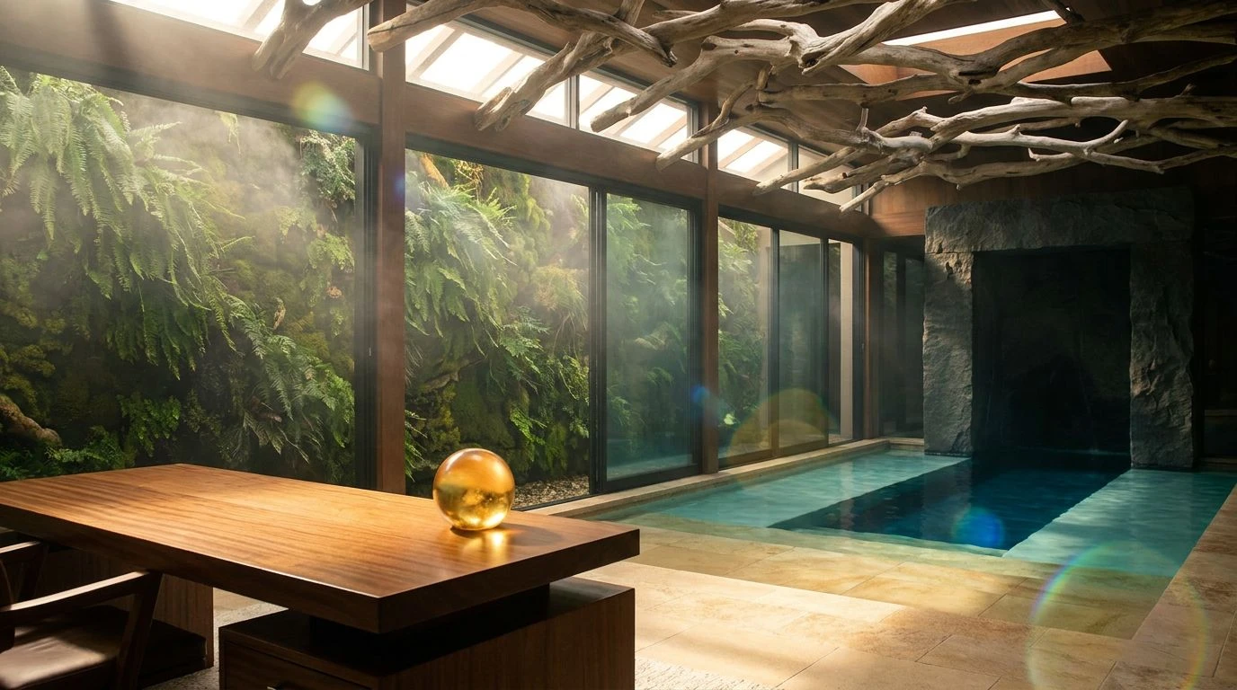
Bioluminescent Library 🌿
Human visual perception is particularly sensitive to the yellow-green spectrum, an adaptive trait that makes Phosphorescent Lime stand out vividly against darker, organic backgrounds. By placing this highly localized, electric hue against the deeply shadowed Midnight Charcoal and Oxidized Bronze, environments achieve an almost startling degree of legibility. While operating adjacent to orange, this intense acidic burst works on the exact same psychological frequency of unapologetic disruption within sleepy institutional halls. The muted, grounding presence of Pressed Newsprint and Campus Moss links the contemporary shock of color back to tangible, sustainable materials like reclaimed wood and coarse paper stocks. This precise manipulation of visual weight draws the eye directly toward wayfinding elements or interactive digital displays, ensuring that the modern university space feels less like a static vault of history and more like an active laboratory of living ideas.
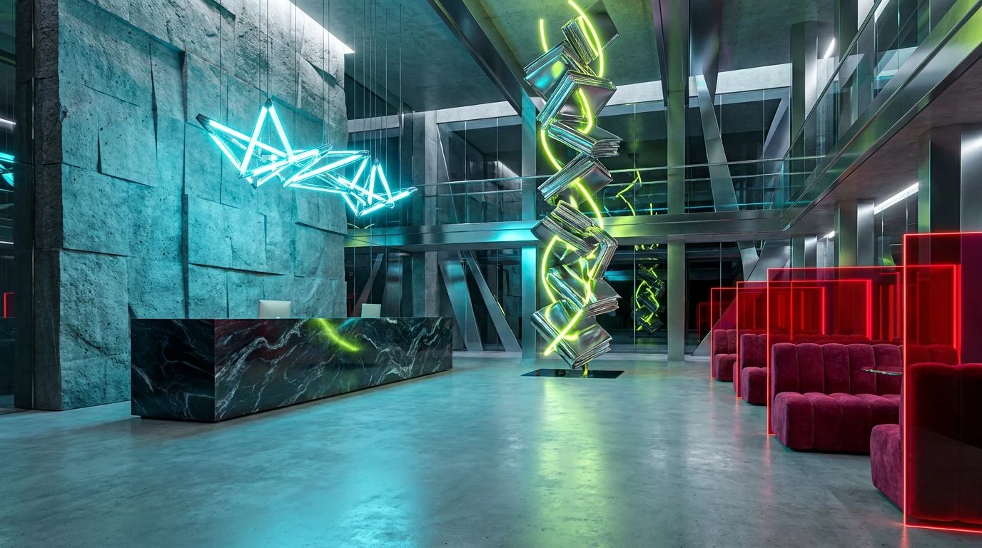
Radical Archives 💥
A fundamental principle of color theory is that opposing temperatures create spatial tension, shifting elements forward or backward in the visual field. Here, the warm, earthy aggression of Brick Dust advances rapidly toward the viewer, anchored firmly by the heavy, light-absorbing density of Asphalt Cinder. This bold, red-orange intensity rejects the quiet compliance historically expected in academic reading rooms, proposing instead an environment that demands active engagement and critical thought. Interjecting an unexpected stab of Radioactive Chartreuse introduces high-frequency visual noise, drawing sharp focus exactly where the architect intends. Between these extremes, the neutral, utilitarian stretches of Bound Leather and Milled Aluminum act as resting points for the optic nerve, imitating the textured grain of recycled materials and the sleek utility of modern technology. The resulting spatial experience is highly charged, communicating a clear rejection of outmoded gatekeeping protocols.
Cognitive Spark 🧠
Combining warm, arousing colors with cool, receding tones generates an optical vibration that keeps the human visual system actively engaged. Persimmon Blaze acts as the primary stimulant, raising the perceived temperature of the room and encouraging outward social behavior, which is critical for a diverse and interactive student body. When placed beside the cool, calculating wavelength of Cyanide Copper, the pairing sets up a reciprocal relationship where each hue makes the other appear more saturated. The surrounding environment is heavily stabilized by Absolute Void and Graphite Shadow, absorbing excess light and providing a serious, contemplative framework for the colorful bursts. Using Crisp Paper and Steel Composite as bridging elements recalls the physical touch of physical reading materials and modern architectural scaffolding. This precise chromatic engineering signals to observers that the institution values both the rigorous pursuit of knowledge and the vibrant, lived experiences of its community.
Sustainable Disruptor 🔋
The psychological transition from passive receiver to active participant is often mediated by the sensory inputs of an environment. Coating structural elements in Deep Obsidian and Cast Iron creates a stark, industrial framework that immediately strips away romanticized, ivy-league pretenses. Against this vast, monochromatic expanse, the sudden appearance of Chlorophyll Flare acts as a bio-mimetic signal of growth and renewal, a vivid marker that catches the peripheral vision and directs movement. The mid-range gray of Scratched Aluminum provides a neutral albedo, reflecting ambient light without altering its temperature, while Bleached Rag introduces a high-key contrast that ensures readability and focus. Together, this sequence functions as a visual reset mechanism, clearing away institutional stagnation and replacing it with an atmosphere of forward-looking sustainability. The starkness empowers students by framing their environment as a modern tool built for utility, accessibility, and unhindered innovation.
The strategic deployment of high-arousal colors against light-absorbing neutrals fundamentally alters the perceptual optics of educational environments. Shifting away from low-frequency, traditional hues allows institutions to manipulate spatial perception, using brilliant flashes of color to guide attention, encourage social gathering, and stimulate cognitive engagement. Adding materials associated with recycled matter and brushed metals physically grounds these visual experiments, providing tactile authenticity to the modernizing space. Rewriting the chromatic baseline of these historic structures communicates a vital shift in accessibility, actively welcoming a wider demographic through the undeniable biology of visual attraction.