'%3e%3cpath%20fill-rule='evenodd'%20clip-rule='evenodd'%20d='M51.1303%2019.2492C50.7278%2019.913%2050.1346%2020.4426%2049.3508%2020.838C48.5669%2021.2335%2047.6172%2021.4312%2046.5014%2021.4312C44.8208%2021.4312%2043.4367%2021.0216%2042.3492%2020.2025C41.2617%2019.3833%2040.6686%2018.2394%2040.5697%2016.7706H44.4253C44.4818%2017.3355%2044.6831%2017.7804%2045.0291%2018.1052C45.3751%2018.43%2045.8164%2018.5924%2046.3531%2018.5924C46.8192%2018.5924%2047.1864%2018.4653%2047.4547%2018.2111C47.7231%2017.9569%2047.8572%2017.618%2047.8572%2017.1943C47.8572%2016.8129%2047.7337%2016.4952%2047.4865%2016.241C47.2393%2015.9867%2046.9322%2015.7784%2046.565%2015.616C46.1978%2015.4536%2045.6893%2015.2594%2045.0397%2015.0334C44.0934%2014.7086%2043.3202%2014.3944%2042.72%2014.0907C42.1197%2013.7871%2041.6042%2013.3351%2041.1735%2012.7349C40.7427%2012.1347%2040.5273%2011.3544%2040.5273%2010.394C40.5273%209.50418%2040.7533%208.73448%2041.2053%208.08481C41.6572%207.43515%2042.2821%206.93731%2043.0801%206.5913C43.8781%206.24528%2044.7925%206.07227%2045.8235%206.07227C47.49%206.07227%2048.8141%206.46771%2049.7956%207.25861C50.7772%208.04951%2051.3315%209.13698%2051.4586%2010.5211H47.5395C47.4689%2010.0268%2047.2888%209.63483%2046.9993%209.3453C46.7097%209.05578%2046.3178%208.91102%2045.8235%208.91102C45.3998%208.91102%2045.0573%209.024%2044.7961%209.24997C44.5348%209.47594%2044.4041%209.80783%2044.4041%2010.2457C44.4041%2010.5988%2044.5207%2010.8989%2044.7537%2011.146C44.9867%2011.3932%2045.2798%2011.5944%2045.6328%2011.7498C45.9859%2011.9052%2046.4944%2012.1029%2047.1581%2012.343C48.1185%2012.6678%2048.9023%2012.9891%2049.5096%2013.3069C50.1169%2013.6246%2050.6395%2014.0872%2051.0773%2014.6945C51.5151%2015.3018%2051.734%2016.0927%2051.734%2017.0672C51.734%2017.8581%2051.5328%2018.5854%2051.1303%2019.2492ZM59.0242%206.3053V21.2829H55.4016V6.3053H59.0242ZM73.9409%206.3053V9.18642H69.8734V21.2829H66.2296V9.18642H62.2046V6.3053H73.9409ZM80.7438%209.18642V12.3218H85.8069V15.0546H80.7438V18.3806H86.4425V21.2829H77.1212V6.3053H86.4425V9.18642H80.7438ZM99.667%2016.0291V21.2829H96.0444V6.3053H101.913C103.692%206.3053%20105.048%206.74665%20105.98%207.62934C106.912%208.51204%20107.378%209.7019%20107.378%2011.199C107.378%2012.1311%20107.17%2012.9609%20106.753%2013.6882C106.337%2014.4155%20105.719%2014.9875%20104.9%2015.4042C104.08%2015.8208%20103.085%2016.0291%20101.913%2016.0291H99.667ZM103.692%2011.199C103.692%209.8855%20102.965%209.22879%20101.51%209.22879H99.667V13.1268H101.51C102.965%2013.1268%20103.692%2012.4842%20103.692%2011.199ZM120.092%2018.5501H114.478L113.546%2021.2829H109.732L115.219%206.41123H119.393L124.879%2021.2829H121.024L120.092%2018.5501ZM119.16%2015.7961L117.295%2010.2881L115.41%2015.7961H119.16ZM131.555%2018.5077H136.385V21.2829H127.933V6.3053H131.555V18.5077ZM143.337%209.18642V12.3218H148.4V15.0546H143.337V18.3806H149.035V21.2829H139.714V6.3053H149.035V9.18642H143.337ZM163.507%206.3053V9.18642H159.44V21.2829H155.796V9.18642H151.771V6.3053H163.507ZM177.449%206.3053V9.18642H173.382V21.2829H169.738V9.18642H165.713V6.3053H177.449ZM184.252%209.18642V12.3218H189.315V15.0546H184.252V18.3806H189.951V21.2829H180.629V6.3053H189.951V9.18642H184.252Z'%20fill='%23EEF0ED'/%3e%3cmask%20id='mask0_3101_7327'%20style='mask-type:alpha'%20maskUnits='userSpaceOnUse'%20x='0'%20y='0'%20width='27'%20height='28'%3e%3cpath%20d='M23.8328%200.759766H2.64808C1.18559%200.759766%200%201.94535%200%203.40785V24.5925C0%2026.055%201.18559%2027.2406%202.64808%2027.2406H23.8328C25.2952%2027.2406%2026.4808%2026.055%2026.4808%2024.5925V3.40785C26.4808%201.94535%2025.2952%200.759766%2023.8328%200.759766Z'%20fill='white'/%3e%3c/mask%3e%3cg%20mask='url(%23mask0_3101_7327)'%3e%3cpath%20d='M23.8328%200.759766H2.64808C1.18559%200.759766%200%201.94535%200%203.40785V24.5925C0%2026.055%201.18559%2027.2406%202.64808%2027.2406H23.8328C25.2952%2027.2406%2026.4808%2026.055%2026.4808%2024.5925V3.40785C26.4808%201.94535%2025.2952%200.759766%2023.8328%200.759766Z'%20fill='%23D8D8D8'/%3e%3cpath%20d='M13.2404%200.759766H0V14.0001H13.2404V0.759766Z'%20fill='%238C61FF'/%3e%3cpath%20d='M13.2404%2014H0V27.2404H13.2404V14Z'%20fill='%2336C3FE'/%3e%3cpath%20d='M26.4806%2014H13.2402V27.2404H26.4806V14Z'%20fill='%236592FE'/%3e%3cpath%20d='M26.4806%200.759766H13.2402V14.0002H26.4806V0.759766Z'%20fill='%236059F7'/%3e%3c/g%3e%3c/g%3e%3cdefs%3e%3cclipPath%20id='clip0_3101_7327'%3e%3crect%20width='190'%20height='28'%20fill='white'/%3e%3c/clipPath%3e%3c/defs%3e%3c/svg%3e)
'%3e%3cpath%20d='M23.8328%200.759521H2.64808C1.18559%200.759521%200%201.94511%200%203.40761V24.5923C0%2026.0548%201.18559%2027.2404%202.64808%2027.2404H23.8328C25.2952%2027.2404%2026.4808%2026.0548%2026.4808%2024.5923V3.40761C26.4808%201.94511%2025.2952%200.759521%2023.8328%200.759521Z'%20fill='%23D8D8D8'/%3e%3cpath%20d='M13.2404%200.759521H0V13.9999H13.2404V0.759521Z'%20fill='%238C61FF'/%3e%3cpath%20d='M13.2404%2013.9998H0V27.2402H13.2404V13.9998Z'%20fill='%2336C3FE'/%3e%3cpath%20d='M26.4809%2013.9998H13.2405V27.2402H26.4809V13.9998Z'%20fill='%236592FE'/%3e%3cpath%20d='M26.4809%200.759277H13.2405V13.9997H26.4809V0.759277Z'%20fill='%236059F7'/%3e%3c/g%3e%3c/svg%3e)
Legal Interface Design: Modern Color Palettes for UI UX
· 4 min readThere is a particular flavor of misery reserved for those who stare at corporate legal interfaces. For decades, the visual language of document management has relied on the aesthetic equivalent of a filing cabinet: endless grays, timid blues, and spaces devoid of human joy, designed entirely to signal immense authority. Yet, a restless shift is occurring across the design world, attempting to answer a rather peculiar question. Can the tart, tongue-clicking zing of a mixed fruit aesthetic, specifically electric magenta and bright cyan, stabilize a famously rigid environment without destroying its credibility? It sounds like an inevitable disaster, akin to wearing a neon track jacket to a high court hearing, but there is undeniable logic here. When applied correctly alongside deep trust-building navies, these sour surges of color act less as distractions and more as vital signs, waking the user up and proving that digital bureaucracy does not have to be entirely lifeless.
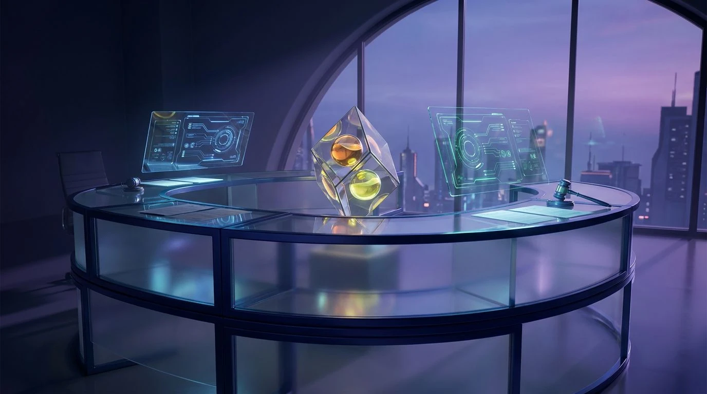
Executive Fruit Basket 🍏
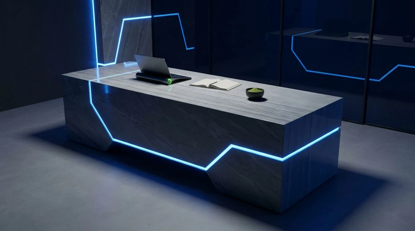
When looking at Executive Fruit Basket, one gets the immediate impression of a traditional law office attempting a team-building retreat. It anchors itself entirely in the sensible, sober realities of Midnight Ink and Graphite Ledger, the sort of tones that make you feel like your documents are legally binding and safe from hackers. But then you notice the rather jarring, hyper-alert presence of Electric Curacao and Crisp Apple sitting alongside the comforting authority of Solid Navy. This is the mixed fruit concept operating on a highly controlled leash. The acidic burst of cyan acts strictly as an alert mechanism, a sharp tap on the shoulder amidst endless frosted aluminum menus. It proves that a corporate legal interface can handle a sudden shock of brightness, provided the rest of the visual field remains firmly grounded in traditional authority. The sour cherry and lemon tart elements add a strangely appealing edge to what would otherwise be just another dreary list of clauses and sub-clauses, transforming fatigue into focus.
Neon Litigation 🍓
The aesthetic strategy of Neon Litigation is deeply fascinating precisely because it borders on the reckless. It asks us to trust a management console that openly flirts with Acidic Raspberry and Crushed Plum. In a conventional setting, these shades are reserved for trendy kombucha packaging, yet here they are pitched against the imposing weight of Blackened Sapphire and Slate Protocol. The trick is proportion. The dark, near-black sapphire creates a cavernous, serious space, exactly what an anxious paralegal needs when sorting through compliance documents. But instead of relying on a predictable corporate tone to signal a system error or a successful file upload, the interface flashes with that sharp, sour raspberry. It is a brilliant way to keep users alert without inducing panic, replacing the traditional anxiety of error messages with a tart, almost playful sting. The lighter Muted Steel and Glacial Cyan provide the neutral pathways through the software, ensuring that the fruit tones exist only as high-priority signals, never as overwhelming wallpaper.
Blackberry Injunction 🍇
There is a distinct minimalism at play in Blackberry Injunction, paring the legal workspace down to its absolute bare knuckles before throwing a single, startling punch of color. Dominating the screen with Paper White and Archive Grey, the environment feels exactly as a document repository should: clean, stark, and utterly devoid of distraction. It is the digital equivalent of a freshly printed contract on crisp paper. Then comes the sharp, unapologetic shock of Tart Dragonfruit trailing right behind a deep, pooling Jammy Violet. Using these specific fruit-inspired shades for progress bars or electronic signature prompts completely alters the user experience. Instead of the usual corporate dread associated with signing away your rights, there is a tiny, modern thrill. The acidic magenta cuts right through the bureaucratic gray, providing clear wayfinding without making the platform feel immature. It tells the user exactly where to click while maintaining a sense of sophisticated, modern design that feels firmly rooted in the twenty-first century rather than the dusty archives of the recent past.
Unnamed Palette
Unnamed Palette
Introducing the sharp, tart aesthetics of bright cyan and magenta into serious document management initially seems like a foolish aesthetic gamble. Yet, as these varying approaches demonstrate, a little sour zest is precisely what the famously sterile world of digital bureaucracy requires. By grounding these electric, fruit-inspired tones in deeply serious navies and unyielding grays, the authority of the software remains completely intact. The bright pops of color cease to be novelties and instead become brilliant functional tools, guiding tired eyes through dense text and signaling critical actions with a refreshing jolt. The result is a workspace that respects the gravity of the legal field while acknowledging that the human beings operating the system might appreciate being kept quite literally awake.