'%3e%3cpath%20fill-rule='evenodd'%20clip-rule='evenodd'%20d='M51.1303%2019.2492C50.7278%2019.913%2050.1346%2020.4426%2049.3508%2020.838C48.5669%2021.2335%2047.6172%2021.4312%2046.5014%2021.4312C44.8208%2021.4312%2043.4367%2021.0216%2042.3492%2020.2025C41.2617%2019.3833%2040.6686%2018.2394%2040.5697%2016.7706H44.4253C44.4818%2017.3355%2044.6831%2017.7804%2045.0291%2018.1052C45.3751%2018.43%2045.8164%2018.5924%2046.3531%2018.5924C46.8192%2018.5924%2047.1864%2018.4653%2047.4547%2018.2111C47.7231%2017.9569%2047.8572%2017.618%2047.8572%2017.1943C47.8572%2016.8129%2047.7337%2016.4952%2047.4865%2016.241C47.2393%2015.9867%2046.9322%2015.7784%2046.565%2015.616C46.1978%2015.4536%2045.6893%2015.2594%2045.0397%2015.0334C44.0934%2014.7086%2043.3202%2014.3944%2042.72%2014.0907C42.1197%2013.7871%2041.6042%2013.3351%2041.1735%2012.7349C40.7427%2012.1347%2040.5273%2011.3544%2040.5273%2010.394C40.5273%209.50418%2040.7533%208.73448%2041.2053%208.08481C41.6572%207.43515%2042.2821%206.93731%2043.0801%206.5913C43.8781%206.24528%2044.7925%206.07227%2045.8235%206.07227C47.49%206.07227%2048.8141%206.46771%2049.7956%207.25861C50.7772%208.04951%2051.3315%209.13698%2051.4586%2010.5211H47.5395C47.4689%2010.0268%2047.2888%209.63483%2046.9993%209.3453C46.7097%209.05578%2046.3178%208.91102%2045.8235%208.91102C45.3998%208.91102%2045.0573%209.024%2044.7961%209.24997C44.5348%209.47594%2044.4041%209.80783%2044.4041%2010.2457C44.4041%2010.5988%2044.5207%2010.8989%2044.7537%2011.146C44.9867%2011.3932%2045.2798%2011.5944%2045.6328%2011.7498C45.9859%2011.9052%2046.4944%2012.1029%2047.1581%2012.343C48.1185%2012.6678%2048.9023%2012.9891%2049.5096%2013.3069C50.1169%2013.6246%2050.6395%2014.0872%2051.0773%2014.6945C51.5151%2015.3018%2051.734%2016.0927%2051.734%2017.0672C51.734%2017.8581%2051.5328%2018.5854%2051.1303%2019.2492ZM59.0242%206.3053V21.2829H55.4016V6.3053H59.0242ZM73.9409%206.3053V9.18642H69.8734V21.2829H66.2296V9.18642H62.2046V6.3053H73.9409ZM80.7438%209.18642V12.3218H85.8069V15.0546H80.7438V18.3806H86.4425V21.2829H77.1212V6.3053H86.4425V9.18642H80.7438ZM99.667%2016.0291V21.2829H96.0444V6.3053H101.913C103.692%206.3053%20105.048%206.74665%20105.98%207.62934C106.912%208.51204%20107.378%209.7019%20107.378%2011.199C107.378%2012.1311%20107.17%2012.9609%20106.753%2013.6882C106.337%2014.4155%20105.719%2014.9875%20104.9%2015.4042C104.08%2015.8208%20103.085%2016.0291%20101.913%2016.0291H99.667ZM103.692%2011.199C103.692%209.8855%20102.965%209.22879%20101.51%209.22879H99.667V13.1268H101.51C102.965%2013.1268%20103.692%2012.4842%20103.692%2011.199ZM120.092%2018.5501H114.478L113.546%2021.2829H109.732L115.219%206.41123H119.393L124.879%2021.2829H121.024L120.092%2018.5501ZM119.16%2015.7961L117.295%2010.2881L115.41%2015.7961H119.16ZM131.555%2018.5077H136.385V21.2829H127.933V6.3053H131.555V18.5077ZM143.337%209.18642V12.3218H148.4V15.0546H143.337V18.3806H149.035V21.2829H139.714V6.3053H149.035V9.18642H143.337ZM163.507%206.3053V9.18642H159.44V21.2829H155.796V9.18642H151.771V6.3053H163.507ZM177.449%206.3053V9.18642H173.382V21.2829H169.738V9.18642H165.713V6.3053H177.449ZM184.252%209.18642V12.3218H189.315V15.0546H184.252V18.3806H189.951V21.2829H180.629V6.3053H189.951V9.18642H184.252Z'%20fill='%23EEF0ED'/%3e%3cmask%20id='mask0_3101_7327'%20style='mask-type:alpha'%20maskUnits='userSpaceOnUse'%20x='0'%20y='0'%20width='27'%20height='28'%3e%3cpath%20d='M23.8328%200.759766H2.64808C1.18559%200.759766%200%201.94535%200%203.40785V24.5925C0%2026.055%201.18559%2027.2406%202.64808%2027.2406H23.8328C25.2952%2027.2406%2026.4808%2026.055%2026.4808%2024.5925V3.40785C26.4808%201.94535%2025.2952%200.759766%2023.8328%200.759766Z'%20fill='white'/%3e%3c/mask%3e%3cg%20mask='url(%23mask0_3101_7327)'%3e%3cpath%20d='M23.8328%200.759766H2.64808C1.18559%200.759766%200%201.94535%200%203.40785V24.5925C0%2026.055%201.18559%2027.2406%202.64808%2027.2406H23.8328C25.2952%2027.2406%2026.4808%2026.055%2026.4808%2024.5925V3.40785C26.4808%201.94535%2025.2952%200.759766%2023.8328%200.759766Z'%20fill='%23D8D8D8'/%3e%3cpath%20d='M13.2404%200.759766H0V14.0001H13.2404V0.759766Z'%20fill='%238C61FF'/%3e%3cpath%20d='M13.2404%2014H0V27.2404H13.2404V14Z'%20fill='%2336C3FE'/%3e%3cpath%20d='M26.4806%2014H13.2402V27.2404H26.4806V14Z'%20fill='%236592FE'/%3e%3cpath%20d='M26.4806%200.759766H13.2402V14.0002H26.4806V0.759766Z'%20fill='%236059F7'/%3e%3c/g%3e%3c/g%3e%3cdefs%3e%3cclipPath%20id='clip0_3101_7327'%3e%3crect%20width='190'%20height='28'%20fill='white'/%3e%3c/clipPath%3e%3c/defs%3e%3c/svg%3e)
'%3e%3cpath%20d='M23.8328%200.759521H2.64808C1.18559%200.759521%200%201.94511%200%203.40761V24.5923C0%2026.0548%201.18559%2027.2404%202.64808%2027.2404H23.8328C25.2952%2027.2404%2026.4808%2026.0548%2026.4808%2024.5923V3.40761C26.4808%201.94511%2025.2952%200.759521%2023.8328%200.759521Z'%20fill='%23D8D8D8'/%3e%3cpath%20d='M13.2404%200.759521H0V13.9999H13.2404V0.759521Z'%20fill='%238C61FF'/%3e%3cpath%20d='M13.2404%2013.9998H0V27.2402H13.2404V13.9998Z'%20fill='%2336C3FE'/%3e%3cpath%20d='M26.4809%2013.9998H13.2405V27.2402H26.4809V13.9998Z'%20fill='%236592FE'/%3e%3cpath%20d='M26.4809%200.759277H13.2405V13.9997H26.4809V0.759277Z'%20fill='%236059F7'/%3e%3c/g%3e%3c/svg%3e)
Neo-Expressionist Color Palettes for Bold Fintech Design
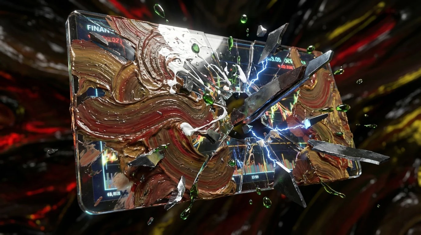
· 5 min readFinancial interfaces have spent a decade hiding behind a facade of sterile pastels and clinical white space, selling a comforting lie of unshakeable market stability. Real capital moves with brutal, unpredictable velocity, and the tools we use to track it should reflect that visceral reality, not disguise it. By applying the wild, unpolished aesthetic of the 1980s gallery scene directly into fintech, we strip away the minimalist anesthetic. Think less about soft, calming padding and more about slashed canvases, where stark contrasts and aggressive pigments confront the user with the genuine volatility of modern wealth. This approach trades deceptive cleanliness for raw honesty, transforming a conventional ledger into a high-stakes visual territory.
Market Hemorrhage 🩸
The immediate shock of Market Hemorrhage lies in its militant refusal to soften bad news. Against an unapologetic expanse of Void Black, Ash Gray and Graphite construct a brutalist architectural framework for financial figures to inhabit, completely devoid of warmth. When the market bleeds, it bleeds in Arterial Spray and Cadmium Strike. These reds refuse to sit quietly in a tidy line chart; they read like a violent brushstroke dragging across an untreated canvas, loud and undeniably urgent. A dashboard dressed in these tones rejects passive monitoring, forcing the user into a state of heightened alertness. It channels the visceral panic of the trading floor just before the closing bell, stripping wealth management down to its most agonizing, exhilarating elements without offering any visual comfort.
Industrial Attrition 🏚️
Industrial Attrition steps away from the slick glass-and-steel aesthetic of Silicon Valley and drags wealth tracking down into the dirt of the factory floor. The foundation relies on Smudged Charcoal and Pitch, creating a heavy, oppressive backdrop that feels thick with history and friction. Against this gloom, Cold Steel acts as the only source of light, a pale, uncompromising gleam that highlights severe drops and rapid inflation alike with emotionless clarity. The inclusion of Flesh Tone and Dried Rust introduces a startlingly organic, oxidized quality to the interface. It mimics the decay of old infrastructure, suggesting that money is not an abstract digital entity but something capable of aging and collapsing. This selection transforms a basic transaction history into a gritty, tactile ledger where every fiscal loss feels like scraping a knee on concrete.
Acid Shock Doctrine ☣️
There is nothing polite about Acid Shock Doctrine. This arrangement tears through the expected norms of banking aesthetics by throwing Toxic Sulfur and Highlighter Acid directly against the harsh, impenetrable wall of Obsidiana. Supported by the dead-pan neutrality of Primer Gray, Concrete Midtone, and Raw Plaster, the sudden flashes of neon become aggressively territorial, like warning labels on hazardous materials. Slashed Canvas Red cuts through the middle, providing an unignorable punctuation mark for critical alerts or massive liquidations. When applied to modern investment platforms, this combination feels electric and dangerous, demanding immediate action rather than quiet contemplation. It converts the act of checking a portfolio into a collision with high-voltage warnings, perfectly capturing the manic, caffeinated rush of day-trading crypto assets or navigating high-yield gambles.
Synthetic Fever Dream 💊
Synthetic Fever Dream abandons the macho posturing traditionally associated with Wall Street tools, opting instead for a hallucinatory clash of hyper-modern pastels and crushing darkness. The base of Deep Trench grounds the setup in an almost suffocating depth, allowing Oxidized Copper and Glacier Glitch to float above it like ghostly, phosphorescent after-images on a monitor. The true disruption arrives with Bubblegum Anarchy and Neon Fuchsia. These intensely artificial pinks mock the serious nature of institutional wealth, looking more like a late-night club flyer than a quarterly earnings report. Applying these shocking fluorescent bursts to personal finance upends the user expectations entirely, making the display of disposable income or mounting debt feel delirious and surreal. It injects a much-needed shot of punk irreverence into the usually rigid vocabulary of money management.
Toxic Asset Portfolio 🎨
Operating with a completely unrestrained palette, Toxic Asset Portfolio creates an environment of maximalist overload. It throws every warning sign and aggressive pigment onto the screen at once, anchoring the chaos in the suffocating depths of Tar Pit and Gunmetal Shell. Hazard Yellow and Radioactive Moss act as loud, abrasive signals, demanding attention with the urgency of a flickering engine light. Coagulated Crimson adds a heavy, violent anchor, while Cyanide Blue cuts through the visual noise with a chilling, electric sharpness. Titanium White and Bullet Lead offer tiny gasps of air in an otherwise overcrowded composition. This riot of color destroys the concept of organized, easy-to-digest metrics. Instead, it turns everyday capital allocation into a loud, frantic expressionist mural, where following the money feels like surviving a barrage of sensory assaults.
Reckoning with money is a chaotic enterprise, and treating it with polite graphic restraint does users a massive disservice. Introducing expressionist principles into financial tools forces a genuine examination of risk and reward, replacing sanitized charts with an interface that feels wonderfully alive and slightly threatening. These visual strategies break the comfortable illusion of predictable markets. By adopting harsh contrasts, acidic accents, and brutalist foundations, designers can craft spaces that finally match the actual, nerve-wracking reality of building and losing wealth in real time. We should accept the mess over the minimalist lie.