'%3e%3cpath%20fill-rule='evenodd'%20clip-rule='evenodd'%20d='M51.1303%2019.2492C50.7278%2019.913%2050.1346%2020.4426%2049.3508%2020.838C48.5669%2021.2335%2047.6172%2021.4312%2046.5014%2021.4312C44.8208%2021.4312%2043.4367%2021.0216%2042.3492%2020.2025C41.2617%2019.3833%2040.6686%2018.2394%2040.5697%2016.7706H44.4253C44.4818%2017.3355%2044.6831%2017.7804%2045.0291%2018.1052C45.3751%2018.43%2045.8164%2018.5924%2046.3531%2018.5924C46.8192%2018.5924%2047.1864%2018.4653%2047.4547%2018.2111C47.7231%2017.9569%2047.8572%2017.618%2047.8572%2017.1943C47.8572%2016.8129%2047.7337%2016.4952%2047.4865%2016.241C47.2393%2015.9867%2046.9322%2015.7784%2046.565%2015.616C46.1978%2015.4536%2045.6893%2015.2594%2045.0397%2015.0334C44.0934%2014.7086%2043.3202%2014.3944%2042.72%2014.0907C42.1197%2013.7871%2041.6042%2013.3351%2041.1735%2012.7349C40.7427%2012.1347%2040.5273%2011.3544%2040.5273%2010.394C40.5273%209.50418%2040.7533%208.73448%2041.2053%208.08481C41.6572%207.43515%2042.2821%206.93731%2043.0801%206.5913C43.8781%206.24528%2044.7925%206.07227%2045.8235%206.07227C47.49%206.07227%2048.8141%206.46771%2049.7956%207.25861C50.7772%208.04951%2051.3315%209.13698%2051.4586%2010.5211H47.5395C47.4689%2010.0268%2047.2888%209.63483%2046.9993%209.3453C46.7097%209.05578%2046.3178%208.91102%2045.8235%208.91102C45.3998%208.91102%2045.0573%209.024%2044.7961%209.24997C44.5348%209.47594%2044.4041%209.80783%2044.4041%2010.2457C44.4041%2010.5988%2044.5207%2010.8989%2044.7537%2011.146C44.9867%2011.3932%2045.2798%2011.5944%2045.6328%2011.7498C45.9859%2011.9052%2046.4944%2012.1029%2047.1581%2012.343C48.1185%2012.6678%2048.9023%2012.9891%2049.5096%2013.3069C50.1169%2013.6246%2050.6395%2014.0872%2051.0773%2014.6945C51.5151%2015.3018%2051.734%2016.0927%2051.734%2017.0672C51.734%2017.8581%2051.5328%2018.5854%2051.1303%2019.2492ZM59.0242%206.3053V21.2829H55.4016V6.3053H59.0242ZM73.9409%206.3053V9.18642H69.8734V21.2829H66.2296V9.18642H62.2046V6.3053H73.9409ZM80.7438%209.18642V12.3218H85.8069V15.0546H80.7438V18.3806H86.4425V21.2829H77.1212V6.3053H86.4425V9.18642H80.7438ZM99.667%2016.0291V21.2829H96.0444V6.3053H101.913C103.692%206.3053%20105.048%206.74665%20105.98%207.62934C106.912%208.51204%20107.378%209.7019%20107.378%2011.199C107.378%2012.1311%20107.17%2012.9609%20106.753%2013.6882C106.337%2014.4155%20105.719%2014.9875%20104.9%2015.4042C104.08%2015.8208%20103.085%2016.0291%20101.913%2016.0291H99.667ZM103.692%2011.199C103.692%209.8855%20102.965%209.22879%20101.51%209.22879H99.667V13.1268H101.51C102.965%2013.1268%20103.692%2012.4842%20103.692%2011.199ZM120.092%2018.5501H114.478L113.546%2021.2829H109.732L115.219%206.41123H119.393L124.879%2021.2829H121.024L120.092%2018.5501ZM119.16%2015.7961L117.295%2010.2881L115.41%2015.7961H119.16ZM131.555%2018.5077H136.385V21.2829H127.933V6.3053H131.555V18.5077ZM143.337%209.18642V12.3218H148.4V15.0546H143.337V18.3806H149.035V21.2829H139.714V6.3053H149.035V9.18642H143.337ZM163.507%206.3053V9.18642H159.44V21.2829H155.796V9.18642H151.771V6.3053H163.507ZM177.449%206.3053V9.18642H173.382V21.2829H169.738V9.18642H165.713V6.3053H177.449ZM184.252%209.18642V12.3218H189.315V15.0546H184.252V18.3806H189.951V21.2829H180.629V6.3053H189.951V9.18642H184.252Z'%20fill='%23EEF0ED'/%3e%3cmask%20id='mask0_3101_7327'%20style='mask-type:alpha'%20maskUnits='userSpaceOnUse'%20x='0'%20y='0'%20width='27'%20height='28'%3e%3cpath%20d='M23.8328%200.759766H2.64808C1.18559%200.759766%200%201.94535%200%203.40785V24.5925C0%2026.055%201.18559%2027.2406%202.64808%2027.2406H23.8328C25.2952%2027.2406%2026.4808%2026.055%2026.4808%2024.5925V3.40785C26.4808%201.94535%2025.2952%200.759766%2023.8328%200.759766Z'%20fill='white'/%3e%3c/mask%3e%3cg%20mask='url(%23mask0_3101_7327)'%3e%3cpath%20d='M23.8328%200.759766H2.64808C1.18559%200.759766%200%201.94535%200%203.40785V24.5925C0%2026.055%201.18559%2027.2406%202.64808%2027.2406H23.8328C25.2952%2027.2406%2026.4808%2026.055%2026.4808%2024.5925V3.40785C26.4808%201.94535%2025.2952%200.759766%2023.8328%200.759766Z'%20fill='%23D8D8D8'/%3e%3cpath%20d='M13.2404%200.759766H0V14.0001H13.2404V0.759766Z'%20fill='%238C61FF'/%3e%3cpath%20d='M13.2404%2014H0V27.2404H13.2404V14Z'%20fill='%2336C3FE'/%3e%3cpath%20d='M26.4806%2014H13.2402V27.2404H26.4806V14Z'%20fill='%236592FE'/%3e%3cpath%20d='M26.4806%200.759766H13.2402V14.0002H26.4806V0.759766Z'%20fill='%236059F7'/%3e%3c/g%3e%3c/g%3e%3cdefs%3e%3cclipPath%20id='clip0_3101_7327'%3e%3crect%20width='190'%20height='28'%20fill='white'/%3e%3c/clipPath%3e%3c/defs%3e%3c/svg%3e)
'%3e%3cpath%20d='M23.8328%200.759521H2.64808C1.18559%200.759521%200%201.94511%200%203.40761V24.5923C0%2026.0548%201.18559%2027.2404%202.64808%2027.2404H23.8328C25.2952%2027.2404%2026.4808%2026.0548%2026.4808%2024.5923V3.40761C26.4808%201.94511%2025.2952%200.759521%2023.8328%200.759521Z'%20fill='%23D8D8D8'/%3e%3cpath%20d='M13.2404%200.759521H0V13.9999H13.2404V0.759521Z'%20fill='%238C61FF'/%3e%3cpath%20d='M13.2404%2013.9998H0V27.2402H13.2404V13.9998Z'%20fill='%2336C3FE'/%3e%3cpath%20d='M26.4809%2013.9998H13.2405V27.2402H26.4809V13.9998Z'%20fill='%236592FE'/%3e%3cpath%20d='M26.4809%200.759277H13.2405V13.9997H26.4809V0.759277Z'%20fill='%236059F7'/%3e%3c/g%3e%3c/svg%3e)
Olive Green Color Palettes for Professional Baking Design
· 5 min readWhen we enter a culinary workspace, human perception immediately processes environmental cues that alter our physiological arousal and cognitive focus. The modern baking workshop often leans heavily on stark whites and polished metals, establishing a sterile atmosphere that prompts high-tension alertness. However, a growing body of behavioral design research suggests that shifting to a space grounded in organic greens and earthy terracottas actively drops heart rates and extends attention spans. Translating the visual spectrum of the natural world into professional interiors reduces the sensory fatigue typical of high-stakes pastry creation. By surrounding bakers with colors traditionally associated with steady growth and reliable clay implements, instructors notice a marked decrease in rushed errors. The question arises whether this specific visual combination serves as a cognitive tether, shifting the mind from a state of frantic productivity to one of deliberate craftsmanship.
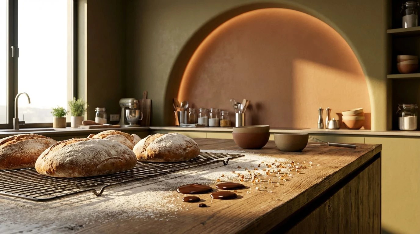
Hearth and Harvest 🥖
The visual weight of the Hearth and Harvest sequence rests firmly on warm, mid-spectrum wavelengths that stimulate spatial comfort without inducing distraction. Within a culinary laboratory setting, establishing a foundation composed of Dusty Flour and Milled Rye regulates light bounce, preventing the harsh glare commonly found in stainless-steel kitchens. Against this muted background, touches of Baked Clay draw the eye precisely where action is required, acting as a gentle orienting mechanism for students navigating complex recipes. The deep visual anchor of Roasted Cocoa grounds the physical workstation, signaling sturdy reliability, while occasional highlights of Crystallized Sugar maintain necessary environmental brightness. Psychologists note that these specific wavelengths mimic the biological markers of a traditional fire baking process, tricking our nervous systems into a state of methodical labor rather than panicked haste.
Grove Cultivation 🌿
Optic nerve stimulation changes dramatically when introducing the vibrant yet grounded wavelengths found in the Grove Cultivation sequence. Here, the energetic yellow-green frequencies of Crushed Pistachio interact directly with our evolutionary wiring, mimicking the signs of fresh, vital vegetation and prompting a state of alert curiosity within the workshop environment. To prevent this vegetative brightness from overwhelming the visual field, the composition applies the deep, light-absorbing qualities of Pressed Olive alongside a neutral Slate Surface. Surrounding students with these specific greens alongside dashes of Sunbaked Brick constructs an atmosphere resembling a mature, sunlit orchard. Cognitive studies measure fewer minor mistakes in spaces that balance physiological arousal against environmental calmness. Burnt Espresso provides a high-contrast boundary that defines edges clearly, allowing bakers to execute precision knife work without straining their oculomotor muscles against expanses of Pure Alabaster.
Botanical Oven 🏺
Perception in high-temperature environments alters how individuals estimate time and sequence tasks. The Botanical Oven arrangement utilizes opposing sides of the color wheel to regulate these internal clocks during complex pastry preparations. The thermal intensity suggested by Fired Glaze and Deep Scorched Earth communicates biological urgency, keeping mental acuity sharp as ovens reach peak temperatures. Conversely, introducing short-wavelength visual interventions like Frosted Mint and Pine Needles activates parasympathetic pathways, actively cooling the psychological temperature of the room. A background established in Kneaded Dough and Dried Sage ensures the light reflecting off tables remains muted, reducing the physiological stress of prolonged proximity to intense heat sources. Finishing the visual field with Charred Crust adds a necessary heavy boundary that organizes peripheral vision. By orchestrating this specific thermal dichotomy, spatial designers create a workshop that manages both the excitement of creation and the patience required for proving bread.
Minimalist Mill 🌾
Stripping an educational space of unnecessary visual stimuli brings profound changes to a student's working memory capacity. The Minimalist Mill sequence approaches color through a strictly utilitarian lens, relying entirely on luminance contrast rather than chromatic saturation to guide attention. The stark transition from a Snow Drift ceiling to an Obsidian Counter creates clear spatial definitions, giving the brain an immediate map of active and passive zones. Introducing the soft, mid-range reflectance of an Oatmeal Loaf backdrop softens the transition and saves the eyes from rapid dilation and constriction cycles. Placed securely within this high-contrast scaffolding, the specific clay-toned presence of Earthen Ware acts as a visual target. Cognitive science demonstrates that when one single warm hue operates within a monochrome setting, the human gaze naturally gravitates toward it. This mechanism directs focus precisely onto the machinery and the materials, demanding a steady, quiet professionalism from everyone operating within the room.
Canopy Kitchen 🍃
Human biological responses to color possess deep roots in ancestral survival mechanisms, particularly regarding the identification of safety and sustenance under the shelter of foliage. The Canopy Kitchen spectrum activates these exact neurological pathways by applying the desaturated, cooling tones of Eucalyptus Leaf and Forest Shadow. These low-arousal greens actively suppress cortisol production, a critical advantage in professional settings where high-stakes timelines frequently cause performance anxiety. A quiet inclusion of Weathered Pottery functions as a necessary warm touch, giving the eye a resting point among the heavy vegetation tones to prevent visual boredom. The ambient light reflecting off a Morning Overcast wall treatment establishes an effectively shadowless workspace, essential for reading fine textures in batters and doughs. Bounded entirely by the absorbing density of Midnight Ash, this specific chromatic calibration effectively turns a loud, competitive workshop into a quiet laboratory of deliberate culinary practice.
The psychological impacts of color within professional spaces extend far beyond mere decoration, actively shaping the metabolic and cognitive rhythms of the people working inside them. By strategically deploying the light-absorbing qualities of terracotta and the parasympathetic activation mechanisms of organic greenery, workshop designers successfully manipulate human perception to favor careful craftsmanship over panicked speed. Moving away from stark, sterile kitchens allows the nervous system to relax into a state of steady focus, proving that the visual environment holds profound influence over physical outputs and educational success. Instructors observing these spaces confirm that when the room signals safety, stability, and natural predictability, human hands inevitably follow suit with exactness and confidence.