'%3e%3cpath%20fill-rule='evenodd'%20clip-rule='evenodd'%20d='M51.1303%2019.2492C50.7278%2019.913%2050.1346%2020.4426%2049.3508%2020.838C48.5669%2021.2335%2047.6172%2021.4312%2046.5014%2021.4312C44.8208%2021.4312%2043.4367%2021.0216%2042.3492%2020.2025C41.2617%2019.3833%2040.6686%2018.2394%2040.5697%2016.7706H44.4253C44.4818%2017.3355%2044.6831%2017.7804%2045.0291%2018.1052C45.3751%2018.43%2045.8164%2018.5924%2046.3531%2018.5924C46.8192%2018.5924%2047.1864%2018.4653%2047.4547%2018.2111C47.7231%2017.9569%2047.8572%2017.618%2047.8572%2017.1943C47.8572%2016.8129%2047.7337%2016.4952%2047.4865%2016.241C47.2393%2015.9867%2046.9322%2015.7784%2046.565%2015.616C46.1978%2015.4536%2045.6893%2015.2594%2045.0397%2015.0334C44.0934%2014.7086%2043.3202%2014.3944%2042.72%2014.0907C42.1197%2013.7871%2041.6042%2013.3351%2041.1735%2012.7349C40.7427%2012.1347%2040.5273%2011.3544%2040.5273%2010.394C40.5273%209.50418%2040.7533%208.73448%2041.2053%208.08481C41.6572%207.43515%2042.2821%206.93731%2043.0801%206.5913C43.8781%206.24528%2044.7925%206.07227%2045.8235%206.07227C47.49%206.07227%2048.8141%206.46771%2049.7956%207.25861C50.7772%208.04951%2051.3315%209.13698%2051.4586%2010.5211H47.5395C47.4689%2010.0268%2047.2888%209.63483%2046.9993%209.3453C46.7097%209.05578%2046.3178%208.91102%2045.8235%208.91102C45.3998%208.91102%2045.0573%209.024%2044.7961%209.24997C44.5348%209.47594%2044.4041%209.80783%2044.4041%2010.2457C44.4041%2010.5988%2044.5207%2010.8989%2044.7537%2011.146C44.9867%2011.3932%2045.2798%2011.5944%2045.6328%2011.7498C45.9859%2011.9052%2046.4944%2012.1029%2047.1581%2012.343C48.1185%2012.6678%2048.9023%2012.9891%2049.5096%2013.3069C50.1169%2013.6246%2050.6395%2014.0872%2051.0773%2014.6945C51.5151%2015.3018%2051.734%2016.0927%2051.734%2017.0672C51.734%2017.8581%2051.5328%2018.5854%2051.1303%2019.2492ZM59.0242%206.3053V21.2829H55.4016V6.3053H59.0242ZM73.9409%206.3053V9.18642H69.8734V21.2829H66.2296V9.18642H62.2046V6.3053H73.9409ZM80.7438%209.18642V12.3218H85.8069V15.0546H80.7438V18.3806H86.4425V21.2829H77.1212V6.3053H86.4425V9.18642H80.7438ZM99.667%2016.0291V21.2829H96.0444V6.3053H101.913C103.692%206.3053%20105.048%206.74665%20105.98%207.62934C106.912%208.51204%20107.378%209.7019%20107.378%2011.199C107.378%2012.1311%20107.17%2012.9609%20106.753%2013.6882C106.337%2014.4155%20105.719%2014.9875%20104.9%2015.4042C104.08%2015.8208%20103.085%2016.0291%20101.913%2016.0291H99.667ZM103.692%2011.199C103.692%209.8855%20102.965%209.22879%20101.51%209.22879H99.667V13.1268H101.51C102.965%2013.1268%20103.692%2012.4842%20103.692%2011.199ZM120.092%2018.5501H114.478L113.546%2021.2829H109.732L115.219%206.41123H119.393L124.879%2021.2829H121.024L120.092%2018.5501ZM119.16%2015.7961L117.295%2010.2881L115.41%2015.7961H119.16ZM131.555%2018.5077H136.385V21.2829H127.933V6.3053H131.555V18.5077ZM143.337%209.18642V12.3218H148.4V15.0546H143.337V18.3806H149.035V21.2829H139.714V6.3053H149.035V9.18642H143.337ZM163.507%206.3053V9.18642H159.44V21.2829H155.796V9.18642H151.771V6.3053H163.507ZM177.449%206.3053V9.18642H173.382V21.2829H169.738V9.18642H165.713V6.3053H177.449ZM184.252%209.18642V12.3218H189.315V15.0546H184.252V18.3806H189.951V21.2829H180.629V6.3053H189.951V9.18642H184.252Z'%20fill='%23EEF0ED'/%3e%3cmask%20id='mask0_3101_7327'%20style='mask-type:alpha'%20maskUnits='userSpaceOnUse'%20x='0'%20y='0'%20width='27'%20height='28'%3e%3cpath%20d='M23.8328%200.759766H2.64808C1.18559%200.759766%200%201.94535%200%203.40785V24.5925C0%2026.055%201.18559%2027.2406%202.64808%2027.2406H23.8328C25.2952%2027.2406%2026.4808%2026.055%2026.4808%2024.5925V3.40785C26.4808%201.94535%2025.2952%200.759766%2023.8328%200.759766Z'%20fill='white'/%3e%3c/mask%3e%3cg%20mask='url(%23mask0_3101_7327)'%3e%3cpath%20d='M23.8328%200.759766H2.64808C1.18559%200.759766%200%201.94535%200%203.40785V24.5925C0%2026.055%201.18559%2027.2406%202.64808%2027.2406H23.8328C25.2952%2027.2406%2026.4808%2026.055%2026.4808%2024.5925V3.40785C26.4808%201.94535%2025.2952%200.759766%2023.8328%200.759766Z'%20fill='%23D8D8D8'/%3e%3cpath%20d='M13.2404%200.759766H0V14.0001H13.2404V0.759766Z'%20fill='%238C61FF'/%3e%3cpath%20d='M13.2404%2014H0V27.2404H13.2404V14Z'%20fill='%2336C3FE'/%3e%3cpath%20d='M26.4806%2014H13.2402V27.2404H26.4806V14Z'%20fill='%236592FE'/%3e%3cpath%20d='M26.4806%200.759766H13.2402V14.0002H26.4806V0.759766Z'%20fill='%236059F7'/%3e%3c/g%3e%3c/g%3e%3cdefs%3e%3cclipPath%20id='clip0_3101_7327'%3e%3crect%20width='190'%20height='28'%20fill='white'/%3e%3c/clipPath%3e%3c/defs%3e%3c/svg%3e)
'%3e%3cpath%20d='M23.8328%200.759521H2.64808C1.18559%200.759521%200%201.94511%200%203.40761V24.5923C0%2026.0548%201.18559%2027.2404%202.64808%2027.2404H23.8328C25.2952%2027.2404%2026.4808%2026.0548%2026.4808%2024.5923V3.40761C26.4808%201.94511%2025.2952%200.759521%2023.8328%200.759521Z'%20fill='%23D8D8D8'/%3e%3cpath%20d='M13.2404%200.759521H0V13.9999H13.2404V0.759521Z'%20fill='%238C61FF'/%3e%3cpath%20d='M13.2404%2013.9998H0V27.2402H13.2404V13.9998Z'%20fill='%2336C3FE'/%3e%3cpath%20d='M26.4809%2013.9998H13.2405V27.2402H26.4809V13.9998Z'%20fill='%236592FE'/%3e%3cpath%20d='M26.4809%200.759277H13.2405V13.9997H26.4809V0.759277Z'%20fill='%236059F7'/%3e%3c/g%3e%3c/svg%3e)
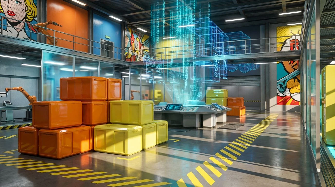
Pop Art Color Palettes for Industrial Design Strategy
· 5 min readThere is a curious visual misery associated with industrial supply chain software. For decades, we have accepted that tracking thousand-ton shipments of raw materials requires interfaces built entirely in punishing shades of spreadsheet grey. But a recent shift sees the rigid geometry of warehouse management colliding with the explosive, primary-color drama of 1960s pop art. Why should an impending stock shortage not be announced with the same visual theatricality as a comic strip heroine crying over a broken heart? Applying the aggressive optimism of Roy Lichtenstein and the austere structuralism of De Stijl to inventory platforms does more than just decorate a dashboard. It recalculates how human attention navigates vast fields of data, replacing bureaucratic exhaustion with a sharp, color-blocked jolt of efficiency.
Warehouse Lichtenstein 📦
Warehouse Lichtenstein operates on the principle that logistics should grab you by the collar. By contrasting a visually loud Pop Art Crimson with the grounded, earthy reliability of Kraft Paper, this selection immediately creates visual hierarchy without trying too hard. Sunlit Newsprint provides a sharp, high-visibility background for urgent stock alerts, while Patinated Copper offers a calm, secondary channel for regular metrics. The heavy presence of Deep Indigo anchors the interface, preventing the brighter shades from becoming a chaotic distraction. Within a distribution dashboard, this combination mimics the strict framing of a mid-century comic strip. The worker is guided from one data point to the next through sheer color contrast, turning the tedious act of monitoring supply levels into an almost cinematic progression. It cuts through the fog of data fatigue with an unapologetic sense of graphic purpose, proving that utility does not demand visual austerity.
Warhol Logistics 🥫
There is a distinct, rhythmic repetition found in mass-produced goods, a visual language that Warhol Logistics speaks fluently. It captures the repetitive churn of a conveyor belt but coats it in high-gloss theatricality. Industrial Concrete acts as the sprawling floor of the software interface, a neutral canvas that allows the aggressive Warning Tape Yellow and Factory Orange to flag critical bottlenecks. Electric Cyan injects a sudden, hyper-modern spark, perfect for highlighting active transport routes or real-time location tracking. Blueprint Blue serves as the structural skeleton, holding the entire visual economy together. When applied to dashboard architecture, this selection strips away the pretension of complex data visualization. It relies instead on the blunt, immediate recognition of color blocks. The manager looks at an inventory grid and instantly reads the narrative of supply and demand, informed by the same visual shorthand that makes a soup can pop off a supermarket shelf.
De Stijl Depot 🏗️
Rejecting the messiness of modern gradients, De Stijl Depot turns to the strict, uncompromising geometry favored by early twentieth-century modernists. Here, Studio White and Aluminum Dust provide an expansive, breathable grid, ensuring that large volumes of data never feel claustrophobic. Against this stark architecture, Emergency Red and Hazard Yellow scream for immediate attention, ideal for flagging severe shortages or mechanical failures on the warehouse floor. Carbon Steel provides the heavy, structural lines needed to build tables and separate logistical regions. Tarnished Brass and Verdigris Green soften the aggressive modernity, offering quieter navigation cues that do not demand an immediate reaction from the user. This selection forces supply chain software to behave like a piece of minimalist architecture. The screen becomes a disciplined exercise in spatial awareness, where every color has a specific, immovable job, replacing cognitive overload with sharp, clean efficiency.
Ben-Day Bottleneck 💥
Ben-Day Bottleneck introduces an almost reckless sense of play into the typically dour environment of inventory management. The shock of Ultraviolet Neon and Machine Cyan creates a futuristic, screen-printed aesthetic that feels more at home in an underground gallery than a freight tracking office. Yet, this high-contrast approach performs remarkably well in highly dense information environments. Cadmium Red operates as the ultimate stop-sign for severe system alerts, while Cobalt Blue builds the reliable, sturdy navigational headers that users rely on. Post-it Yellow acts as the highlighter pen of the interface, drawing the eye to temporary stock shifts or incoming deliveries. The psychological effect of navigating a system built from these unapologetic, high-voltage hues is profound. It turns a passive, monotonous task into an energetic interaction, keeping operators alert and highly responsive. It proves that tracking global shipping routes can have a genuine pulse, treating logistical data with a rebellious, graphic charm.
Assembly Line Primary 🎨
Operating firmly within the bounds of primary color brutalism, Assembly Line Primary strips inventory visualization down to its absolute bare essentials. This is not about decoration; it is about blunt operational clarity. Galvanized Steel blankets the structural background, offering a cool, muted theater for the rest of the tones to perform against. Stoplight Red and Signal Green function exactly as their names suggest, providing universally understood cues for halted shipments and cleared goods. Ultramarine introduces a deep, highly readable contrast for text and primary action buttons. The addition of Marigold and Rust Oxide rounds out the industrial motif, perfect for tracking age, wear, or depreciation in physical stock. This visual strategy removes all ambiguity from the software. A warehouse manager does not need to pause and interpret a bespoke chart; the raw, unadulterated primary tones deliver the necessary operational facts in a split second, championing pure, utilitarian speed.
Treating industrial software interfaces as an extension of graphic art alters the fundamental relationship between worker and workflow. Moving away from dreary, corporate minimalism toward the high-stakes drama of pop art and primary geometry acknowledges that human attention is a finite resource. These color structures do not hide complexity; they confront it with vigorous optimism and strict, unyielding contrast. When a massive global shortage or an inbound fleet of materials is painted in bold cyan and deep crimson, the data transforms from a boring metric into an urgent narrative. The result is an environment where utility and aesthetic pleasure are no longer treated as enemies, but as necessary partners in keeping modern systems moving with speed and style.