'%3e%3cpath%20fill-rule='evenodd'%20clip-rule='evenodd'%20d='M51.1303%2019.2492C50.7278%2019.913%2050.1346%2020.4426%2049.3508%2020.838C48.5669%2021.2335%2047.6172%2021.4312%2046.5014%2021.4312C44.8208%2021.4312%2043.4367%2021.0216%2042.3492%2020.2025C41.2617%2019.3833%2040.6686%2018.2394%2040.5697%2016.7706H44.4253C44.4818%2017.3355%2044.6831%2017.7804%2045.0291%2018.1052C45.3751%2018.43%2045.8164%2018.5924%2046.3531%2018.5924C46.8192%2018.5924%2047.1864%2018.4653%2047.4547%2018.2111C47.7231%2017.9569%2047.8572%2017.618%2047.8572%2017.1943C47.8572%2016.8129%2047.7337%2016.4952%2047.4865%2016.241C47.2393%2015.9867%2046.9322%2015.7784%2046.565%2015.616C46.1978%2015.4536%2045.6893%2015.2594%2045.0397%2015.0334C44.0934%2014.7086%2043.3202%2014.3944%2042.72%2014.0907C42.1197%2013.7871%2041.6042%2013.3351%2041.1735%2012.7349C40.7427%2012.1347%2040.5273%2011.3544%2040.5273%2010.394C40.5273%209.50418%2040.7533%208.73448%2041.2053%208.08481C41.6572%207.43515%2042.2821%206.93731%2043.0801%206.5913C43.8781%206.24528%2044.7925%206.07227%2045.8235%206.07227C47.49%206.07227%2048.8141%206.46771%2049.7956%207.25861C50.7772%208.04951%2051.3315%209.13698%2051.4586%2010.5211H47.5395C47.4689%2010.0268%2047.2888%209.63483%2046.9993%209.3453C46.7097%209.05578%2046.3178%208.91102%2045.8235%208.91102C45.3998%208.91102%2045.0573%209.024%2044.7961%209.24997C44.5348%209.47594%2044.4041%209.80783%2044.4041%2010.2457C44.4041%2010.5988%2044.5207%2010.8989%2044.7537%2011.146C44.9867%2011.3932%2045.2798%2011.5944%2045.6328%2011.7498C45.9859%2011.9052%2046.4944%2012.1029%2047.1581%2012.343C48.1185%2012.6678%2048.9023%2012.9891%2049.5096%2013.3069C50.1169%2013.6246%2050.6395%2014.0872%2051.0773%2014.6945C51.5151%2015.3018%2051.734%2016.0927%2051.734%2017.0672C51.734%2017.8581%2051.5328%2018.5854%2051.1303%2019.2492ZM59.0242%206.3053V21.2829H55.4016V6.3053H59.0242ZM73.9409%206.3053V9.18642H69.8734V21.2829H66.2296V9.18642H62.2046V6.3053H73.9409ZM80.7438%209.18642V12.3218H85.8069V15.0546H80.7438V18.3806H86.4425V21.2829H77.1212V6.3053H86.4425V9.18642H80.7438ZM99.667%2016.0291V21.2829H96.0444V6.3053H101.913C103.692%206.3053%20105.048%206.74665%20105.98%207.62934C106.912%208.51204%20107.378%209.7019%20107.378%2011.199C107.378%2012.1311%20107.17%2012.9609%20106.753%2013.6882C106.337%2014.4155%20105.719%2014.9875%20104.9%2015.4042C104.08%2015.8208%20103.085%2016.0291%20101.913%2016.0291H99.667ZM103.692%2011.199C103.692%209.8855%20102.965%209.22879%20101.51%209.22879H99.667V13.1268H101.51C102.965%2013.1268%20103.692%2012.4842%20103.692%2011.199ZM120.092%2018.5501H114.478L113.546%2021.2829H109.732L115.219%206.41123H119.393L124.879%2021.2829H121.024L120.092%2018.5501ZM119.16%2015.7961L117.295%2010.2881L115.41%2015.7961H119.16ZM131.555%2018.5077H136.385V21.2829H127.933V6.3053H131.555V18.5077ZM143.337%209.18642V12.3218H148.4V15.0546H143.337V18.3806H149.035V21.2829H139.714V6.3053H149.035V9.18642H143.337ZM163.507%206.3053V9.18642H159.44V21.2829H155.796V9.18642H151.771V6.3053H163.507ZM177.449%206.3053V9.18642H173.382V21.2829H169.738V9.18642H165.713V6.3053H177.449ZM184.252%209.18642V12.3218H189.315V15.0546H184.252V18.3806H189.951V21.2829H180.629V6.3053H189.951V9.18642H184.252Z'%20fill='%23EEF0ED'/%3e%3cmask%20id='mask0_3101_7327'%20style='mask-type:alpha'%20maskUnits='userSpaceOnUse'%20x='0'%20y='0'%20width='27'%20height='28'%3e%3cpath%20d='M23.8328%200.759766H2.64808C1.18559%200.759766%200%201.94535%200%203.40785V24.5925C0%2026.055%201.18559%2027.2406%202.64808%2027.2406H23.8328C25.2952%2027.2406%2026.4808%2026.055%2026.4808%2024.5925V3.40785C26.4808%201.94535%2025.2952%200.759766%2023.8328%200.759766Z'%20fill='white'/%3e%3c/mask%3e%3cg%20mask='url(%23mask0_3101_7327)'%3e%3cpath%20d='M23.8328%200.759766H2.64808C1.18559%200.759766%200%201.94535%200%203.40785V24.5925C0%2026.055%201.18559%2027.2406%202.64808%2027.2406H23.8328C25.2952%2027.2406%2026.4808%2026.055%2026.4808%2024.5925V3.40785C26.4808%201.94535%2025.2952%200.759766%2023.8328%200.759766Z'%20fill='%23D8D8D8'/%3e%3cpath%20d='M13.2404%200.759766H0V14.0001H13.2404V0.759766Z'%20fill='%238C61FF'/%3e%3cpath%20d='M13.2404%2014H0V27.2404H13.2404V14Z'%20fill='%2336C3FE'/%3e%3cpath%20d='M26.4806%2014H13.2402V27.2404H26.4806V14Z'%20fill='%236592FE'/%3e%3cpath%20d='M26.4806%200.759766H13.2402V14.0002H26.4806V0.759766Z'%20fill='%236059F7'/%3e%3c/g%3e%3c/g%3e%3cdefs%3e%3cclipPath%20id='clip0_3101_7327'%3e%3crect%20width='190'%20height='28'%20fill='white'/%3e%3c/clipPath%3e%3c/defs%3e%3c/svg%3e)
'%3e%3cpath%20d='M23.8328%200.759521H2.64808C1.18559%200.759521%200%201.94511%200%203.40761V24.5923C0%2026.0548%201.18559%2027.2404%202.64808%2027.2404H23.8328C25.2952%2027.2404%2026.4808%2026.0548%2026.4808%2024.5923V3.40761C26.4808%201.94511%2025.2952%200.759521%2023.8328%200.759521Z'%20fill='%23D8D8D8'/%3e%3cpath%20d='M13.2404%200.759521H0V13.9999H13.2404V0.759521Z'%20fill='%238C61FF'/%3e%3cpath%20d='M13.2404%2013.9998H0V27.2402H13.2404V13.9998Z'%20fill='%2336C3FE'/%3e%3cpath%20d='M26.4809%2013.9998H13.2405V27.2402H26.4809V13.9998Z'%20fill='%236592FE'/%3e%3cpath%20d='M26.4809%200.759277H13.2405V13.9997H26.4809V0.759277Z'%20fill='%236059F7'/%3e%3c/g%3e%3c/svg%3e)
Corporate Design Trends: Color Palettes for Total Trust
· 6 min readCorporate branding has spent the last decade trapped in a sterile waiting room of flat blues and optimistic whites, desperately trying to project transparency. But transparency, it turns out, is exhausting. Enter a new aesthetic obsession: the shadowy, terrifying, yet undeniably secure depths of an eclipsed marine biome. Designing for professional authority no longer means looking like a friendly tech startup. Instead, it means embracing the profound absolute dark of a coral reef during a solar eclipse, where navy shadows swallow doubt and sudden electric bioluminescence guides the way. We are asked to place our faith not in brightly lit open plan offices, but in the quiet, pressurized calm of the deep ocean. It is an aesthetic of survival, precision, and immense unseen power precisely what one wants from a financial institution or legal firm in anxious times.
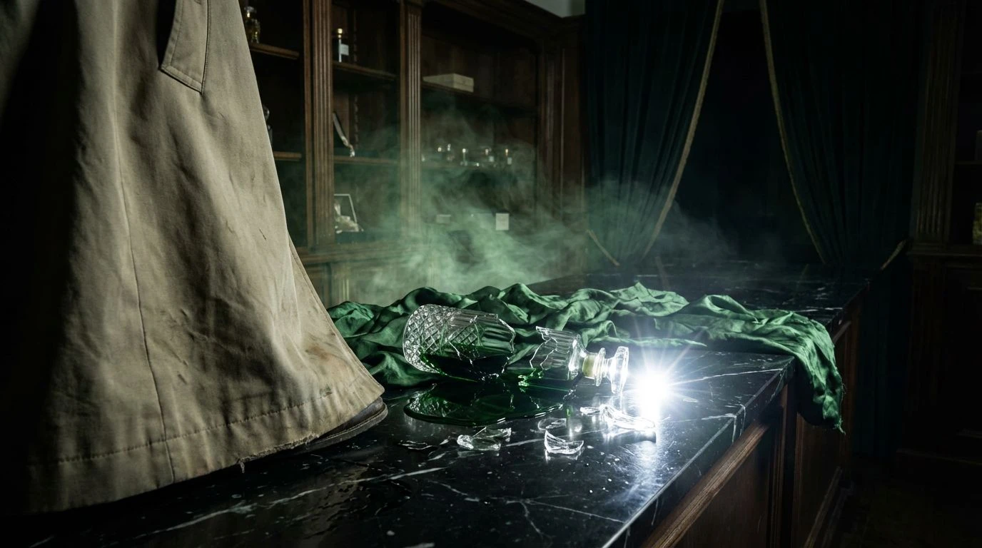
Midnight Bioluminescence 🪸
The corporate landscape rarely leaves room for whimsy, yet Midnight Bioluminescence proves that serious institutions can still flash a bit of teeth. The foundation here is strictly disciplined, relying on Trench Dark and Submerged Slate to provide the heavy, impenetrable walls of a reliable bank vault. But it is the sudden flashes of Coral Flash and Bioluminescent Pink that make this collection fascinating. Imagine a private wealth management interface that looks entirely sensible until a transaction is confirmed with a sudden, electric burst of marine pink, like an anemone responding to a passing current. This approach does not scream for attention. Rather, it whispers competence through controlled bursts of vivid life against a vast, silent backdrop. The Emerald Abyss acts as a stabilizing middle ground, proving that green can represent growth without looking like a spreadsheet. It establishes an environment where clients feel securely guided through dark waters by a very capable, if slightly alien, intelligence.
Abyssal Vault 🌊
If a legal contract were converted into colors, it would undoubtedly look like Abyssal Vault. This is a study in absolute authority, stripping away any pretense of approachability in favor of crushing, oceanic pressure. Abyssal Pitch and Mariana Midnight form a suffocatingly secure base, communicating that secrets kept here will truly never see the light of day. It abandons the friendly reassurances of traditional corporate aesthetics and replaces them with an almost terrifying oceanic vastness. To navigate an interface built on these tones is to plunge straight into the deep without a tether. Yet, the presence of Reef Current and Cobalt Spine provides exactly enough visibility to prevent total disorientation. These precise, sharp blues act like the beam of a high tech submarine, cutting through the murk to deliver crucial information. It is strictly designed for those moments when a client needs to feel protected by an entity larger and more ancient than their own minor anxieties.
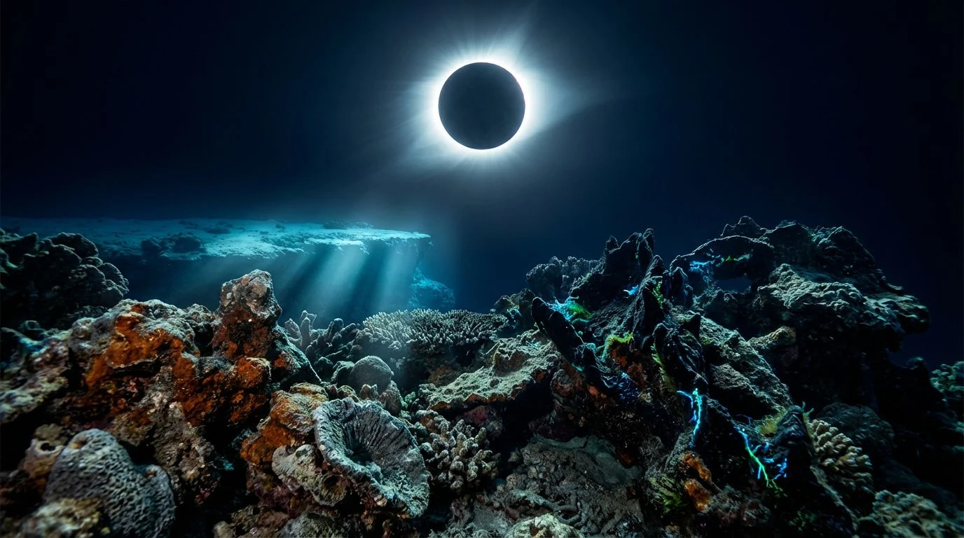
Eclipsed Tide 🌘
There is an unexpected quietness to Eclipsed Tide, capturing the exact moment the moon completely blots out the sun above a shallow tropical shelf. The usual tropical brightness is extinguished, leaving behind Lunar Reflection and Eclipsed Sky to do the heavy lifting of establishing a clinical, professional calm. This collection feels less like a predator in the dark and more like a high tech observation deck, coolly monitoring the tides below. The transition from Trench Bottom up to Electric Surge offers a perfect visual hierarchy for data displays, trading the aggressive reds and optimistic greens of standard finance for a spectrum that feels distinctly analytical. It asks users to check their panic at the door. Employing these cool, removed oceanic blues constructs an atmosphere of detached expertise. A corporate narrative built around these shades tells the public that the firm is watching the shifting currents of the global market from a safe, pressurized distance, entirely undisturbed by the stormy weather passing on the surface.
Solar Transit 🦑
Most corporate identities flee from anything resembling the unpredictable forces of nature, but Solar Transit actively recruits them. The juxtaposition of Drowned Rust and Solar Corona against a heavily shadowed marine backdrop is nothing short of theatrical. It brings to mind the strange, orange glow of an eclipse casting its unnatural light over an otherwise dark, indifferent ocean. Absolute Dark and Pressurized Indigo secure the professional parameters, maintaining the necessary gravity of a boardroom, while the sudden strike of warm, cosmic light introduces an element of bold foresight. This is not the styling of a conservative legacy firm clinging to the past. It speaks to a modern ambition, suggesting an institution that thrives during celestial disruptions and market anomalies. Applying these shades to a digital presence transforms a standard user journey into a dramatic event. The Shallow Cyan serves to temper the aggression of the orange, introducing a brief moment of cool, breathable air before pulling the viewer right back into the heavy, uncompromising depths.
Nocturnal Reef 🪼
There is a distinct tension in Nocturnal Reef, balancing the eerie calm of Shipwreck Grey with the startling, chemical clarity of Bioluminescent Flash. It is fundamentally an exercise in controlled contrast, mimicking the sudden, vivid activity of a marine ecosystem exactly when the sunlight vanishes. In a professional context, this translates to a workplace environment where vast stretches of operational boredom are punctuated by moments of extreme, high speed execution. The heavy foundation of Deepest Trench and Silt Shadow suggests bureaucratic permanence and unshakeable physical structures, the kind of quiet authority that assumes you already know its weight. Meanwhile, the electric jolts of Electric Neon and Night Kelp serve to alert rather than alarm, guiding a visitors eye precisely where it needs to go without unnecessary noise. It rejects the warm, eager to please palettes of modern startups in favor of a visual language that functions flawlessly in the pitch black. To use these shades is to admit that the business world is a cold, dark place, but one where the host knows exactly how to navigate.
The era of polite, pastel washed corporate identity is quietly ending, replaced by something vastly more imposing. Borrowing the visual language of an eclipsed marine landscape acknowledges that modern clients no longer want to be greeted as friends; they want to be shielded by an apex predator. Whether through the uncompromising pressures of absolute oceanic dark or the sudden, precise warning lights of bioluminescence, these aesthetic directions offer a completely different model for projecting authority. They communicate security not by pretending the world is safe and bright, but by proving they have the necessary tools to survive perfectly well in the dark. It is a cynical, slightly chilling, and entirely magnificent approach to professional design, trading false warmth for sheer, undeniable competence.