'%3e%3cpath%20fill-rule='evenodd'%20clip-rule='evenodd'%20d='M51.1303%2019.2492C50.7278%2019.913%2050.1346%2020.4426%2049.3508%2020.838C48.5669%2021.2335%2047.6172%2021.4312%2046.5014%2021.4312C44.8208%2021.4312%2043.4367%2021.0216%2042.3492%2020.2025C41.2617%2019.3833%2040.6686%2018.2394%2040.5697%2016.7706H44.4253C44.4818%2017.3355%2044.6831%2017.7804%2045.0291%2018.1052C45.3751%2018.43%2045.8164%2018.5924%2046.3531%2018.5924C46.8192%2018.5924%2047.1864%2018.4653%2047.4547%2018.2111C47.7231%2017.9569%2047.8572%2017.618%2047.8572%2017.1943C47.8572%2016.8129%2047.7337%2016.4952%2047.4865%2016.241C47.2393%2015.9867%2046.9322%2015.7784%2046.565%2015.616C46.1978%2015.4536%2045.6893%2015.2594%2045.0397%2015.0334C44.0934%2014.7086%2043.3202%2014.3944%2042.72%2014.0907C42.1197%2013.7871%2041.6042%2013.3351%2041.1735%2012.7349C40.7427%2012.1347%2040.5273%2011.3544%2040.5273%2010.394C40.5273%209.50418%2040.7533%208.73448%2041.2053%208.08481C41.6572%207.43515%2042.2821%206.93731%2043.0801%206.5913C43.8781%206.24528%2044.7925%206.07227%2045.8235%206.07227C47.49%206.07227%2048.8141%206.46771%2049.7956%207.25861C50.7772%208.04951%2051.3315%209.13698%2051.4586%2010.5211H47.5395C47.4689%2010.0268%2047.2888%209.63483%2046.9993%209.3453C46.7097%209.05578%2046.3178%208.91102%2045.8235%208.91102C45.3998%208.91102%2045.0573%209.024%2044.7961%209.24997C44.5348%209.47594%2044.4041%209.80783%2044.4041%2010.2457C44.4041%2010.5988%2044.5207%2010.8989%2044.7537%2011.146C44.9867%2011.3932%2045.2798%2011.5944%2045.6328%2011.7498C45.9859%2011.9052%2046.4944%2012.1029%2047.1581%2012.343C48.1185%2012.6678%2048.9023%2012.9891%2049.5096%2013.3069C50.1169%2013.6246%2050.6395%2014.0872%2051.0773%2014.6945C51.5151%2015.3018%2051.734%2016.0927%2051.734%2017.0672C51.734%2017.8581%2051.5328%2018.5854%2051.1303%2019.2492ZM59.0242%206.3053V21.2829H55.4016V6.3053H59.0242ZM73.9409%206.3053V9.18642H69.8734V21.2829H66.2296V9.18642H62.2046V6.3053H73.9409ZM80.7438%209.18642V12.3218H85.8069V15.0546H80.7438V18.3806H86.4425V21.2829H77.1212V6.3053H86.4425V9.18642H80.7438ZM99.667%2016.0291V21.2829H96.0444V6.3053H101.913C103.692%206.3053%20105.048%206.74665%20105.98%207.62934C106.912%208.51204%20107.378%209.7019%20107.378%2011.199C107.378%2012.1311%20107.17%2012.9609%20106.753%2013.6882C106.337%2014.4155%20105.719%2014.9875%20104.9%2015.4042C104.08%2015.8208%20103.085%2016.0291%20101.913%2016.0291H99.667ZM103.692%2011.199C103.692%209.8855%20102.965%209.22879%20101.51%209.22879H99.667V13.1268H101.51C102.965%2013.1268%20103.692%2012.4842%20103.692%2011.199ZM120.092%2018.5501H114.478L113.546%2021.2829H109.732L115.219%206.41123H119.393L124.879%2021.2829H121.024L120.092%2018.5501ZM119.16%2015.7961L117.295%2010.2881L115.41%2015.7961H119.16ZM131.555%2018.5077H136.385V21.2829H127.933V6.3053H131.555V18.5077ZM143.337%209.18642V12.3218H148.4V15.0546H143.337V18.3806H149.035V21.2829H139.714V6.3053H149.035V9.18642H143.337ZM163.507%206.3053V9.18642H159.44V21.2829H155.796V9.18642H151.771V6.3053H163.507ZM177.449%206.3053V9.18642H173.382V21.2829H169.738V9.18642H165.713V6.3053H177.449ZM184.252%209.18642V12.3218H189.315V15.0546H184.252V18.3806H189.951V21.2829H180.629V6.3053H189.951V9.18642H184.252Z'%20fill='%23EEF0ED'/%3e%3cmask%20id='mask0_3101_7327'%20style='mask-type:alpha'%20maskUnits='userSpaceOnUse'%20x='0'%20y='0'%20width='27'%20height='28'%3e%3cpath%20d='M23.8328%200.759766H2.64808C1.18559%200.759766%200%201.94535%200%203.40785V24.5925C0%2026.055%201.18559%2027.2406%202.64808%2027.2406H23.8328C25.2952%2027.2406%2026.4808%2026.055%2026.4808%2024.5925V3.40785C26.4808%201.94535%2025.2952%200.759766%2023.8328%200.759766Z'%20fill='white'/%3e%3c/mask%3e%3cg%20mask='url(%23mask0_3101_7327)'%3e%3cpath%20d='M23.8328%200.759766H2.64808C1.18559%200.759766%200%201.94535%200%203.40785V24.5925C0%2026.055%201.18559%2027.2406%202.64808%2027.2406H23.8328C25.2952%2027.2406%2026.4808%2026.055%2026.4808%2024.5925V3.40785C26.4808%201.94535%2025.2952%200.759766%2023.8328%200.759766Z'%20fill='%23D8D8D8'/%3e%3cpath%20d='M13.2404%200.759766H0V14.0001H13.2404V0.759766Z'%20fill='%238C61FF'/%3e%3cpath%20d='M13.2404%2014H0V27.2404H13.2404V14Z'%20fill='%2336C3FE'/%3e%3cpath%20d='M26.4806%2014H13.2402V27.2404H26.4806V14Z'%20fill='%236592FE'/%3e%3cpath%20d='M26.4806%200.759766H13.2402V14.0002H26.4806V0.759766Z'%20fill='%236059F7'/%3e%3c/g%3e%3c/g%3e%3cdefs%3e%3cclipPath%20id='clip0_3101_7327'%3e%3crect%20width='190'%20height='28'%20fill='white'/%3e%3c/clipPath%3e%3c/defs%3e%3c/svg%3e)
'%3e%3cpath%20d='M23.8328%200.759521H2.64808C1.18559%200.759521%200%201.94511%200%203.40761V24.5923C0%2026.0548%201.18559%2027.2404%202.64808%2027.2404H23.8328C25.2952%2027.2404%2026.4808%2026.0548%2026.4808%2024.5923V3.40761C26.4808%201.94511%2025.2952%200.759521%2023.8328%200.759521Z'%20fill='%23D8D8D8'/%3e%3cpath%20d='M13.2404%200.759521H0V13.9999H13.2404V0.759521Z'%20fill='%238C61FF'/%3e%3cpath%20d='M13.2404%2013.9998H0V27.2402H13.2404V13.9998Z'%20fill='%2336C3FE'/%3e%3cpath%20d='M26.4809%2013.9998H13.2405V27.2402H26.4809V13.9998Z'%20fill='%236592FE'/%3e%3cpath%20d='M26.4809%200.759277H13.2405V13.9997H26.4809V0.759277Z'%20fill='%236059F7'/%3e%3c/g%3e%3c/svg%3e)
90s Neon Color Palettes Reviving Modern Software Design
· 4 min readFor over a decade, enterprise software design has prioritized safety above all else, leaning heavily on sanitized whites and predictable blues. This conservative approach maximized readability but systematically stripped joy and character from the digital tools used by millions daily. A surprising corrective has emerged from the archives of extreme sports. By borrowing the aggressive, high visibility neon accents originally designed to keep mountain bikers safe on treacherous trails in the 1990s, contemporary designers are rescuing productivity platforms from aesthetic boredom. The introduction of stark lime green and electric citrus against reliable charcoal and deep navy backgrounds provides a necessary visual jolt. It establishes a spatial language of athletic energy and forward momentum, proving that professional functionality and visual excitement are not mutually exclusive in the workplace.
Trailhead Velocity 🚵♂️
Software dashboards frequently suffer from aesthetic fatigue, trapped in endless seas of muted whites and predictable blues. Introducing Trailhead Velocity changes this trajectory entirely. By scattering sharp bursts of electric lime across navigation ribbons and progress trackers, designers introduce athletic energy without sacrificing legibility. The contrast against midnight navy mimics the starkness of a mountain biker navigating a dark ravine. Dusty olive and charcoal gray provide the corporate anchor, grounding the sudden shock of cobalt blue and periwinkle sky. Users encounter a digital tool that pulses with forward momentum, encouraging rapid decision making and sustained focus across complex workflows.
Downhill Sprint 🏁
Moving through the corporate workspace requires clarity, a demand answered by the structured asphalt and frost tones of Downhill Sprint. Against this quiet background, neon chartreuse and scree green interrupt the visual monotony, pulling focus exactly where an interface needs attention. It draws direct inspiration from the extreme sports catalogs of the 1990s, where high stakes outdoor gear relied on aggressive visibility to prevent accidents. In a project management platform, applying active azure and neon chartreuse to overdue notifications or critical path indicators ensures immediate user response. The slate brown holds the design steady, preventing the brighter shades from overwhelming the senses while injecting much needed vitality into otherwise predictable layouts.
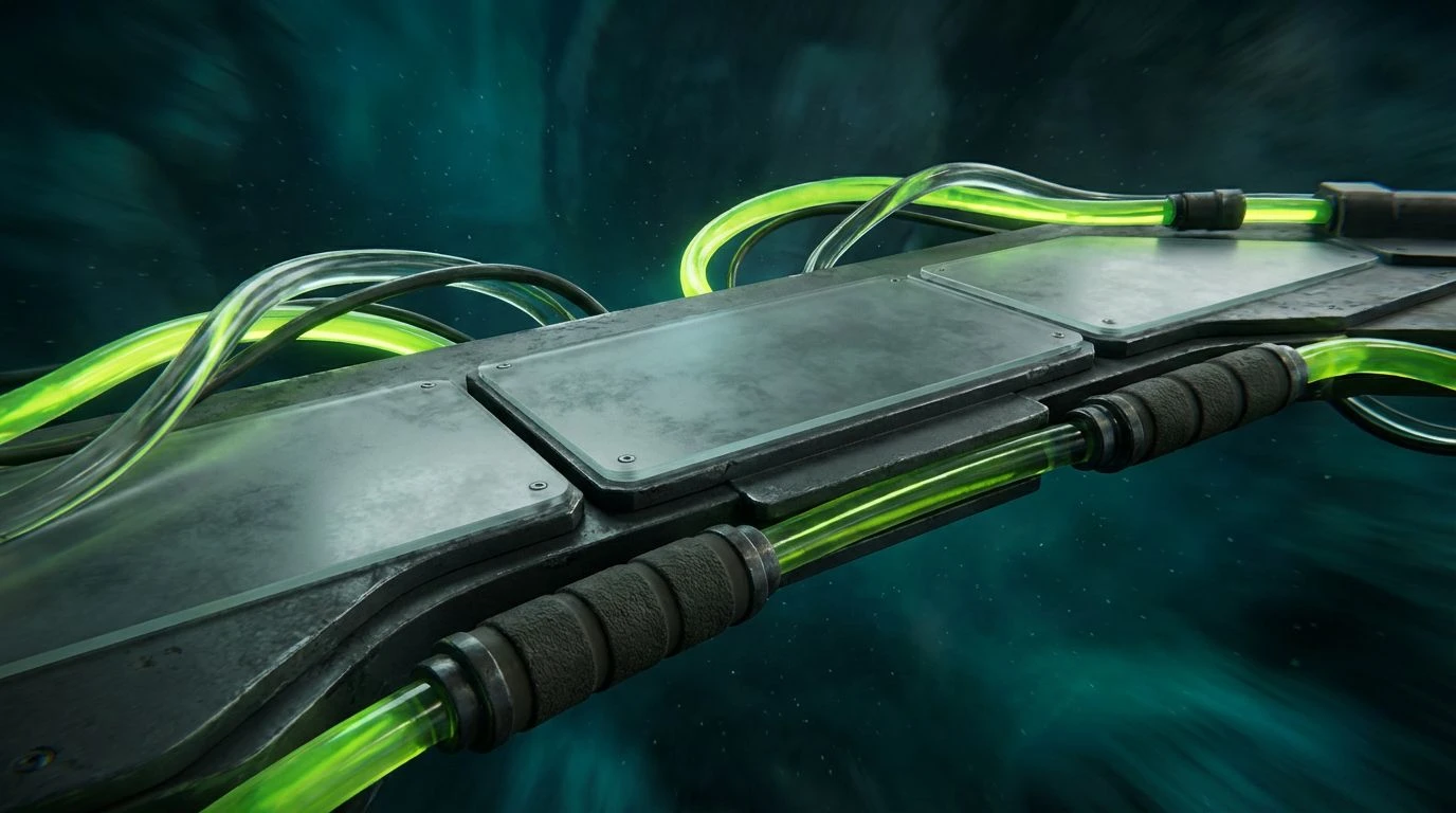
Freeride Protocol 🏔️
Software that manages complex logistics frequently defaults to uninspired layouts. Freeride Protocol introduces a calculated disruption of the status quo. Heavy graphite and pitch black construct a rigid, dependable foundation akin to high end bicycle frames, clearing the way for safety orange and acid lime to serve as wayfinding mechanisms. These sharp, aggressively bright markers guide a user through dense spreadsheets and layered menus with the ease of finding trail markers in dense woods. Adding deep teal and steel indigo provides a cooling counterbalance to the visual heat of the neon shades. The presence of khaki dust and glacier blue offers gentle resting spots for the eyes, ensuring the aesthetic remains professional and usable during long hours of operation.
Apex Suspension 🚴♂️
The architectural demands of specialized enterprise platforms require a visual language that speaks both to precision and speed. Apex Suspension relies heavily on carbon fiber and titanium to establish a serious, industrial base layer. From there, shock green and anodized yellow operate as high frequency signals, breaking through the neutral background like a brightly painted suspension fork on a rugged bicycle. This strategy is particularly effective when applied to real time data feeds, where moss shadow can track historical trends while cyan flare and cyanotype indicate sudden market shifts. The result is an interface that commands attention without causing fatigue, bringing the raw excitement of extreme sports engineering into the daily workflow.
Extreme Terrain ⚡
Pushing the boundaries of corporate software requires a daring departure from standard palettes, a move encapsulated perfectly by Extreme Terrain. The grounding force of abyss and base gray establishes unquestionable authority, readying the stage for an intense clash of pigments. Neon mint acts as a leading indicator, rushing across the screen to highlight primary calls to action, while ultra purple and magenta rush add a secondary layer of vibrant categorization. It brings to mind the bold, unapologetic geometry and loud branding on vintage mountain biking jerseys. Applying crimson grip alongside ocean trench in a financial dashboard transforms a mundane task into an engaging exercise, proving that professional digital environments can embrace athletic intensity without losing their primary function.
Modern productivity environments desperately require a visual vocabulary that inspires rather than merely sustains. By looking to the uninhibited color choices of vintage downhill racing gear, interface designers have discovered a method for capturing attention without compromising usability. The careful placement of intense neon alongside mature, brooding grays and navies creates an atmosphere of focused momentum. Every high contrast badge and vibrant navigation bar serves as a reminder that digital workspaces do not have to be devoid of personality. This renewed approach to software aesthetics transforms routine administrative tasks into visually engaging experiences, signaling a new era where functional design operates with unapologetic vibrancy and distinct character.