'%3e%3cpath%20fill-rule='evenodd'%20clip-rule='evenodd'%20d='M51.1303%2019.2492C50.7278%2019.913%2050.1346%2020.4426%2049.3508%2020.838C48.5669%2021.2335%2047.6172%2021.4312%2046.5014%2021.4312C44.8208%2021.4312%2043.4367%2021.0216%2042.3492%2020.2025C41.2617%2019.3833%2040.6686%2018.2394%2040.5697%2016.7706H44.4253C44.4818%2017.3355%2044.6831%2017.7804%2045.0291%2018.1052C45.3751%2018.43%2045.8164%2018.5924%2046.3531%2018.5924C46.8192%2018.5924%2047.1864%2018.4653%2047.4547%2018.2111C47.7231%2017.9569%2047.8572%2017.618%2047.8572%2017.1943C47.8572%2016.8129%2047.7337%2016.4952%2047.4865%2016.241C47.2393%2015.9867%2046.9322%2015.7784%2046.565%2015.616C46.1978%2015.4536%2045.6893%2015.2594%2045.0397%2015.0334C44.0934%2014.7086%2043.3202%2014.3944%2042.72%2014.0907C42.1197%2013.7871%2041.6042%2013.3351%2041.1735%2012.7349C40.7427%2012.1347%2040.5273%2011.3544%2040.5273%2010.394C40.5273%209.50418%2040.7533%208.73448%2041.2053%208.08481C41.6572%207.43515%2042.2821%206.93731%2043.0801%206.5913C43.8781%206.24528%2044.7925%206.07227%2045.8235%206.07227C47.49%206.07227%2048.8141%206.46771%2049.7956%207.25861C50.7772%208.04951%2051.3315%209.13698%2051.4586%2010.5211H47.5395C47.4689%2010.0268%2047.2888%209.63483%2046.9993%209.3453C46.7097%209.05578%2046.3178%208.91102%2045.8235%208.91102C45.3998%208.91102%2045.0573%209.024%2044.7961%209.24997C44.5348%209.47594%2044.4041%209.80783%2044.4041%2010.2457C44.4041%2010.5988%2044.5207%2010.8989%2044.7537%2011.146C44.9867%2011.3932%2045.2798%2011.5944%2045.6328%2011.7498C45.9859%2011.9052%2046.4944%2012.1029%2047.1581%2012.343C48.1185%2012.6678%2048.9023%2012.9891%2049.5096%2013.3069C50.1169%2013.6246%2050.6395%2014.0872%2051.0773%2014.6945C51.5151%2015.3018%2051.734%2016.0927%2051.734%2017.0672C51.734%2017.8581%2051.5328%2018.5854%2051.1303%2019.2492ZM59.0242%206.3053V21.2829H55.4016V6.3053H59.0242ZM73.9409%206.3053V9.18642H69.8734V21.2829H66.2296V9.18642H62.2046V6.3053H73.9409ZM80.7438%209.18642V12.3218H85.8069V15.0546H80.7438V18.3806H86.4425V21.2829H77.1212V6.3053H86.4425V9.18642H80.7438ZM99.667%2016.0291V21.2829H96.0444V6.3053H101.913C103.692%206.3053%20105.048%206.74665%20105.98%207.62934C106.912%208.51204%20107.378%209.7019%20107.378%2011.199C107.378%2012.1311%20107.17%2012.9609%20106.753%2013.6882C106.337%2014.4155%20105.719%2014.9875%20104.9%2015.4042C104.08%2015.8208%20103.085%2016.0291%20101.913%2016.0291H99.667ZM103.692%2011.199C103.692%209.8855%20102.965%209.22879%20101.51%209.22879H99.667V13.1268H101.51C102.965%2013.1268%20103.692%2012.4842%20103.692%2011.199ZM120.092%2018.5501H114.478L113.546%2021.2829H109.732L115.219%206.41123H119.393L124.879%2021.2829H121.024L120.092%2018.5501ZM119.16%2015.7961L117.295%2010.2881L115.41%2015.7961H119.16ZM131.555%2018.5077H136.385V21.2829H127.933V6.3053H131.555V18.5077ZM143.337%209.18642V12.3218H148.4V15.0546H143.337V18.3806H149.035V21.2829H139.714V6.3053H149.035V9.18642H143.337ZM163.507%206.3053V9.18642H159.44V21.2829H155.796V9.18642H151.771V6.3053H163.507ZM177.449%206.3053V9.18642H173.382V21.2829H169.738V9.18642H165.713V6.3053H177.449ZM184.252%209.18642V12.3218H189.315V15.0546H184.252V18.3806H189.951V21.2829H180.629V6.3053H189.951V9.18642H184.252Z'%20fill='%23EEF0ED'/%3e%3cmask%20id='mask0_3101_7327'%20style='mask-type:alpha'%20maskUnits='userSpaceOnUse'%20x='0'%20y='0'%20width='27'%20height='28'%3e%3cpath%20d='M23.8328%200.759766H2.64808C1.18559%200.759766%200%201.94535%200%203.40785V24.5925C0%2026.055%201.18559%2027.2406%202.64808%2027.2406H23.8328C25.2952%2027.2406%2026.4808%2026.055%2026.4808%2024.5925V3.40785C26.4808%201.94535%2025.2952%200.759766%2023.8328%200.759766Z'%20fill='white'/%3e%3c/mask%3e%3cg%20mask='url(%23mask0_3101_7327)'%3e%3cpath%20d='M23.8328%200.759766H2.64808C1.18559%200.759766%200%201.94535%200%203.40785V24.5925C0%2026.055%201.18559%2027.2406%202.64808%2027.2406H23.8328C25.2952%2027.2406%2026.4808%2026.055%2026.4808%2024.5925V3.40785C26.4808%201.94535%2025.2952%200.759766%2023.8328%200.759766Z'%20fill='%23D8D8D8'/%3e%3cpath%20d='M13.2404%200.759766H0V14.0001H13.2404V0.759766Z'%20fill='%238C61FF'/%3e%3cpath%20d='M13.2404%2014H0V27.2404H13.2404V14Z'%20fill='%2336C3FE'/%3e%3cpath%20d='M26.4806%2014H13.2402V27.2404H26.4806V14Z'%20fill='%236592FE'/%3e%3cpath%20d='M26.4806%200.759766H13.2402V14.0002H26.4806V0.759766Z'%20fill='%236059F7'/%3e%3c/g%3e%3c/g%3e%3cdefs%3e%3cclipPath%20id='clip0_3101_7327'%3e%3crect%20width='190'%20height='28'%20fill='white'/%3e%3c/clipPath%3e%3c/defs%3e%3c/svg%3e)
'%3e%3cpath%20d='M23.8328%200.759521H2.64808C1.18559%200.759521%200%201.94511%200%203.40761V24.5923C0%2026.0548%201.18559%2027.2404%202.64808%2027.2404H23.8328C25.2952%2027.2404%2026.4808%2026.0548%2026.4808%2024.5923V3.40761C26.4808%201.94511%2025.2952%200.759521%2023.8328%200.759521Z'%20fill='%23D8D8D8'/%3e%3cpath%20d='M13.2404%200.759521H0V13.9999H13.2404V0.759521Z'%20fill='%238C61FF'/%3e%3cpath%20d='M13.2404%2013.9998H0V27.2402H13.2404V13.9998Z'%20fill='%2336C3FE'/%3e%3cpath%20d='M26.4809%2013.9998H13.2405V27.2402H26.4809V13.9998Z'%20fill='%236592FE'/%3e%3cpath%20d='M26.4809%200.759277H13.2405V13.9997H26.4809V0.759277Z'%20fill='%236059F7'/%3e%3c/g%3e%3c/svg%3e)
Gen Alpha Color Palettes: Why Muted Tones Rule Design
· 6 min readHistorically, the visual landscape of early childhood was dominated by high-intensity primary colors. The psychological rationale was straightforward: developing visual systems respond most selectively to stark, high-contrast wavelengths like vivid reds and pure blues. However, recent observations in consumer psychology and visual design indicate a remarkable shift among the youngest demographic. The blinding neons and primary plastics of previous decades are being rapidly replaced by somber, desaturated tones typically reserved for professional-grade adult technology. This phenomenon points to a fascinating psychological adaptation, where young users now associate muted, clinical aesthetics with technological capability and maturity. By trading visually loud plastics for matte dark greys and subdued, pale pinks, this generation is rejecting the traditional hyper-stimulation of childhood in favor of a visual language that communicates precision, seriousness, and a native fluency in the modern digital environment. Let us examine the specific chromatic phenomena driving this transformation.
Matte Prosumer 🎧
The chromatic transition of youth aesthetics is clearly observable in the Matte Prosumer palette. Here, the traditional toybox reds and yellows are discarded in favor of Obsidian Carbon and Industrial Ash, colors that absorb light rather than reflect it, thereby reducing glaring corneal stimulation. The inclusion of Desaturated Peach and Muted Clay provides a remarkable study in visual psychology. These low-intensity warm tones serve as the modern equivalent of pink, stripped of its historically high-saturation intensity. By surrounding these muted earthy tones with the sterile neutrality of Clinical Linen, industrial designers craft hardware for children that visually mimics adult professional environments. The psychological impact of interacting with this low-intensity gradient is one of calm concentration rather than manic excitement. Children interpreting these colors recognize them as signifiers of capable, adult-tier technology rather than temporary, disposable playthings, altering their physiological response during regular interaction.
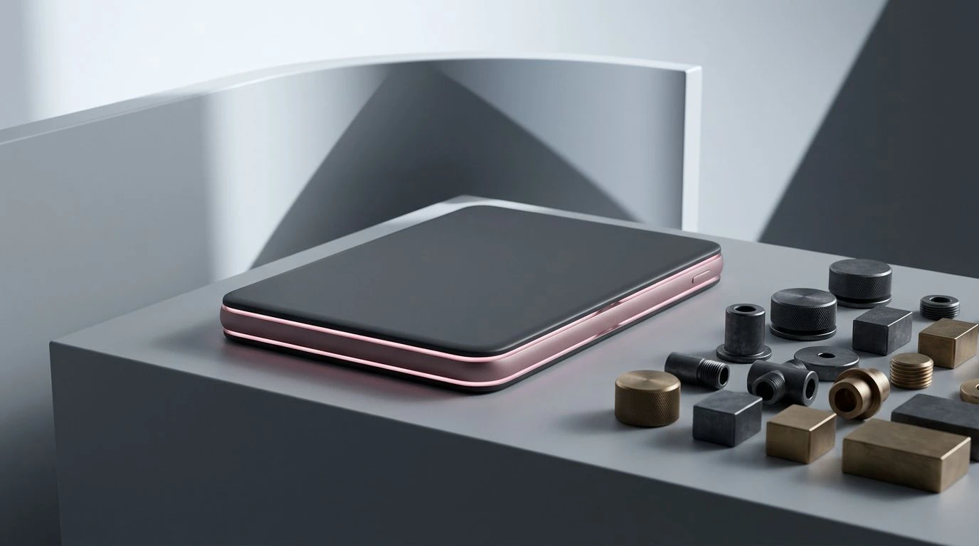
Interface Contrast 🕹️
When analyzing the Interface Contrast collection, the mechanism of highly targeted retinal stimulation becomes apparent. The foundation of the visual experience relies on an achromatic base, utilizing Glacial White, Aluminum Silver, Graphite Casing, and Void Black to create a completely neutral resting state for the eyes. Against this sterile background, the addition of specific high-frequency wavelengths found in Synthetic Cyan, Neon Ultraviolet, and Signal Magenta acts with precise intent. Instead of covering an entire device in loud colors, modern technological tools for adolescents use these intense spectral spikes purely as functional indicators, such as a glowing notification light or an active screen element. This approach aligns perfectly with the cognitive processing patterns of young digital natives, who have learned to parse vast amounts of information by seeking out concentrated bursts of color against otherwise dark, non-distracting backgrounds. The clinical chill of the dark greys makes the functional colors highly legible.
Tactile Diagnostics 🔬
The psychological framing of the Tactile Diagnostics spectrum reveals how color communicates structural integrity to young observers. In previous eras, a children's tool or device would announce its presence with bright, artificial pigments. In contrast, this collection utilizes Oxidized Iron and Dull Ochre, colors naturally associated with industrial materials deeply grounded in the physical world. When paired with the severe light absorption of Optical Black and the neutral reflectance of Titanium Shell and Machined Steel, these understated warm tones create an optical illusion of density and weight. Even when the object is manufactured from lightweight polymers, the Sterilized Chalk accents trick the human visual cortex into perceiving a solid, metallic object. For young consumers who are highly sensitive to authenticity in product design, this mimicry of heavy, adult-grade materials signifies that the device is a serious piece of equipment rather than a fragile toy, encouraging more deliberate and careful motor interactions.
Sensory Reduction 🖥️
Operating entirely within the parameters of low cognitive load, the Sensory Reduction assortment demonstrates the modern push toward visual silence in adolescent technology. Constant exposure to rapid screen movements and bright digital interfaces creates visual fatigue. To counter this, physical product designers employ Deep Slate and Anodized Carbon to absorb ambient light in the user's peripheral vision. The resulting visual field is remarkably quiet. The inclusion of Bleached Bone and Matte Platinum offers just enough contrast for the haptic identification of buttons and switches, without triggering unnecessary arousal in the nervous system. Even the mid-tone Neutral Concrete serves an optical purpose, bridging the gap between extreme light and shadow to prevent sharp, jarring visual transitions. Children interacting with these suppressed wavelengths experience a subtle drop in physiological arousal. The clinical, almost utilitarian application of these grays operates as an optical anchor, providing a restful visual environment.
Premium Mimicry ⚙️
The phenomenon of aspirational design is brilliantly captured within the Premium Mimicry arrangement. Here, the visual language entirely abandons childhood signifiers to replicate the sophisticated finishing techniques of high-end adult electronics. The central optical feature is Tarnished Brass, a highly specific color frequency that human vision naturally associates with expensive, milled metals and precise engineering. When designers place this specific yellow-brown hue against the absolute starkness of Laboratory White and the deep light-swallowing properties of Vented Charcoal, the contrast tricks the eye into perceiving premium material textures. Meanwhile, Palladium Grey and Oxidized Zinc offer a flat, non-reflective visual resting space. This creates a perceptual shortcut for younger users. They immediately process the visual information not as a plaything, but as a prestigious artifact. The clinical chill of the surrounding greys strictly regulates the warmth of the metallic tone, resulting in an object that commands careful handling.
The wholesale abandonment of primary colors by a new demographic of young users represents a measurable shift in human visual processing and product psychology. By surrounding themselves with the austere greys, desaturated pinks, and clinical blacks of premium adult technology, these adolescents are actively lowering their baseline visual stimulation in the physical world. This chromatic adaptation serves a functional biological purpose, providing optical rest for eyes that are chronically exposed to luminous digital screens. The preference for dark, light-absorbing palettes and carefully metered, low-intensity warm tones demonstrates a demographic that no longer requires visually loud artifacts to hold its attention. Instead, they interpret sophisticated, subdued color profiles as signs of structural authenticity, high function, and technological seriousness. This quiet revolution in the visual logic of youth products fundamentally alters our understanding of how developing minds process and prioritize visual information.