'%3e%3cpath%20fill-rule='evenodd'%20clip-rule='evenodd'%20d='M51.1303%2019.2492C50.7278%2019.913%2050.1346%2020.4426%2049.3508%2020.838C48.5669%2021.2335%2047.6172%2021.4312%2046.5014%2021.4312C44.8208%2021.4312%2043.4367%2021.0216%2042.3492%2020.2025C41.2617%2019.3833%2040.6686%2018.2394%2040.5697%2016.7706H44.4253C44.4818%2017.3355%2044.6831%2017.7804%2045.0291%2018.1052C45.3751%2018.43%2045.8164%2018.5924%2046.3531%2018.5924C46.8192%2018.5924%2047.1864%2018.4653%2047.4547%2018.2111C47.7231%2017.9569%2047.8572%2017.618%2047.8572%2017.1943C47.8572%2016.8129%2047.7337%2016.4952%2047.4865%2016.241C47.2393%2015.9867%2046.9322%2015.7784%2046.565%2015.616C46.1978%2015.4536%2045.6893%2015.2594%2045.0397%2015.0334C44.0934%2014.7086%2043.3202%2014.3944%2042.72%2014.0907C42.1197%2013.7871%2041.6042%2013.3351%2041.1735%2012.7349C40.7427%2012.1347%2040.5273%2011.3544%2040.5273%2010.394C40.5273%209.50418%2040.7533%208.73448%2041.2053%208.08481C41.6572%207.43515%2042.2821%206.93731%2043.0801%206.5913C43.8781%206.24528%2044.7925%206.07227%2045.8235%206.07227C47.49%206.07227%2048.8141%206.46771%2049.7956%207.25861C50.7772%208.04951%2051.3315%209.13698%2051.4586%2010.5211H47.5395C47.4689%2010.0268%2047.2888%209.63483%2046.9993%209.3453C46.7097%209.05578%2046.3178%208.91102%2045.8235%208.91102C45.3998%208.91102%2045.0573%209.024%2044.7961%209.24997C44.5348%209.47594%2044.4041%209.80783%2044.4041%2010.2457C44.4041%2010.5988%2044.5207%2010.8989%2044.7537%2011.146C44.9867%2011.3932%2045.2798%2011.5944%2045.6328%2011.7498C45.9859%2011.9052%2046.4944%2012.1029%2047.1581%2012.343C48.1185%2012.6678%2048.9023%2012.9891%2049.5096%2013.3069C50.1169%2013.6246%2050.6395%2014.0872%2051.0773%2014.6945C51.5151%2015.3018%2051.734%2016.0927%2051.734%2017.0672C51.734%2017.8581%2051.5328%2018.5854%2051.1303%2019.2492ZM59.0242%206.3053V21.2829H55.4016V6.3053H59.0242ZM73.9409%206.3053V9.18642H69.8734V21.2829H66.2296V9.18642H62.2046V6.3053H73.9409ZM80.7438%209.18642V12.3218H85.8069V15.0546H80.7438V18.3806H86.4425V21.2829H77.1212V6.3053H86.4425V9.18642H80.7438ZM99.667%2016.0291V21.2829H96.0444V6.3053H101.913C103.692%206.3053%20105.048%206.74665%20105.98%207.62934C106.912%208.51204%20107.378%209.7019%20107.378%2011.199C107.378%2012.1311%20107.17%2012.9609%20106.753%2013.6882C106.337%2014.4155%20105.719%2014.9875%20104.9%2015.4042C104.08%2015.8208%20103.085%2016.0291%20101.913%2016.0291H99.667ZM103.692%2011.199C103.692%209.8855%20102.965%209.22879%20101.51%209.22879H99.667V13.1268H101.51C102.965%2013.1268%20103.692%2012.4842%20103.692%2011.199ZM120.092%2018.5501H114.478L113.546%2021.2829H109.732L115.219%206.41123H119.393L124.879%2021.2829H121.024L120.092%2018.5501ZM119.16%2015.7961L117.295%2010.2881L115.41%2015.7961H119.16ZM131.555%2018.5077H136.385V21.2829H127.933V6.3053H131.555V18.5077ZM143.337%209.18642V12.3218H148.4V15.0546H143.337V18.3806H149.035V21.2829H139.714V6.3053H149.035V9.18642H143.337ZM163.507%206.3053V9.18642H159.44V21.2829H155.796V9.18642H151.771V6.3053H163.507ZM177.449%206.3053V9.18642H173.382V21.2829H169.738V9.18642H165.713V6.3053H177.449ZM184.252%209.18642V12.3218H189.315V15.0546H184.252V18.3806H189.951V21.2829H180.629V6.3053H189.951V9.18642H184.252Z'%20fill='%23EEF0ED'/%3e%3cmask%20id='mask0_3101_7327'%20style='mask-type:alpha'%20maskUnits='userSpaceOnUse'%20x='0'%20y='0'%20width='27'%20height='28'%3e%3cpath%20d='M23.8328%200.759766H2.64808C1.18559%200.759766%200%201.94535%200%203.40785V24.5925C0%2026.055%201.18559%2027.2406%202.64808%2027.2406H23.8328C25.2952%2027.2406%2026.4808%2026.055%2026.4808%2024.5925V3.40785C26.4808%201.94535%2025.2952%200.759766%2023.8328%200.759766Z'%20fill='white'/%3e%3c/mask%3e%3cg%20mask='url(%23mask0_3101_7327)'%3e%3cpath%20d='M23.8328%200.759766H2.64808C1.18559%200.759766%200%201.94535%200%203.40785V24.5925C0%2026.055%201.18559%2027.2406%202.64808%2027.2406H23.8328C25.2952%2027.2406%2026.4808%2026.055%2026.4808%2024.5925V3.40785C26.4808%201.94535%2025.2952%200.759766%2023.8328%200.759766Z'%20fill='%23D8D8D8'/%3e%3cpath%20d='M13.2404%200.759766H0V14.0001H13.2404V0.759766Z'%20fill='%238C61FF'/%3e%3cpath%20d='M13.2404%2014H0V27.2404H13.2404V14Z'%20fill='%2336C3FE'/%3e%3cpath%20d='M26.4806%2014H13.2402V27.2404H26.4806V14Z'%20fill='%236592FE'/%3e%3cpath%20d='M26.4806%200.759766H13.2402V14.0002H26.4806V0.759766Z'%20fill='%236059F7'/%3e%3c/g%3e%3c/g%3e%3cdefs%3e%3cclipPath%20id='clip0_3101_7327'%3e%3crect%20width='190'%20height='28'%20fill='white'/%3e%3c/clipPath%3e%3c/defs%3e%3c/svg%3e)
'%3e%3cpath%20d='M23.8328%200.759521H2.64808C1.18559%200.759521%200%201.94511%200%203.40761V24.5923C0%2026.0548%201.18559%2027.2404%202.64808%2027.2404H23.8328C25.2952%2027.2404%2026.4808%2026.0548%2026.4808%2024.5923V3.40761C26.4808%201.94511%2025.2952%200.759521%2023.8328%200.759521Z'%20fill='%23D8D8D8'/%3e%3cpath%20d='M13.2404%200.759521H0V13.9999H13.2404V0.759521Z'%20fill='%238C61FF'/%3e%3cpath%20d='M13.2404%2013.9998H0V27.2402H13.2404V13.9998Z'%20fill='%2336C3FE'/%3e%3cpath%20d='M26.4809%2013.9998H13.2405V27.2402H26.4809V13.9998Z'%20fill='%236592FE'/%3e%3cpath%20d='M26.4809%200.759277H13.2405V13.9997H26.4809V0.759277Z'%20fill='%236059F7'/%3e%3c/g%3e%3c/svg%3e)
Brutalist Color Palettes for High-Stakes UI Design
· 6 min readIn the ephemeral world of digital assets, trust is not built on marshmallow gradients or whimsical rounded corners; it is forged in the visual language of permanence. We have become too accustomed to the apologetic softness of modern interface design, forgetting that when vast sums of value are at stake, the user craves the unyielding solidity of a bunker. This is a return to honesty in material. Just as architects poured thousands of tons of concrete to signal the enduring power of the state, your financial interface must communicate an unshakeable gravity. By rejecting the fragile sweetness of pastel trends, we invite a raw, tactile authority back onto the screen. This is about heavy shadows, functional contrast, and colors that taste of iron, earth, and stone. To interact with your dashboard should feel less like swiping through a social feed and more like operating the heavy machinery of a new economic era. We seek the aesthetic of the monolith, where every pixel carries the weight of a foundational truth.
Foundry & Clay 🧱
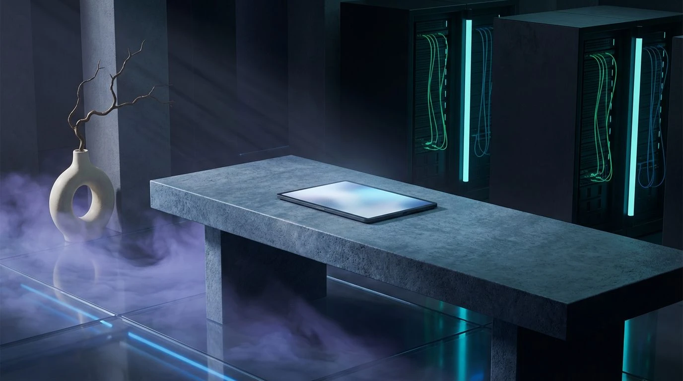
This assembly speaks the language of excavation and raw assembly, a somber ode to the materials we pull from the ground to build empires. It begins with the stark, uncompromising silence of Void and Gesso, establishing a ground that refuses to apologize for its starkness. But the true weight emerges in the interaction between Wet Concrete and Oxidized Iron. These are not decorative hues; they are the colors of industry in motion, of girders rusting in the rain and structures rising from the mud. Terracotta Dust adds a biological warmth, a reminder of the earth displaced to make way for the monument. When applied to a dashboard, this scheme imposes a sense of geological time. It tells the user that their assets are not floating in the cloud but anchored deep within the bedrock. The inclusion of Storm Cloud provides a moody, atmospheric density, preventing the starkness from becoming sterile, ensuring every pixel carries the tactile quality of a roughly hewn surface.
Infrastructure Dawn 🏗️
There is a distinct rhythm here, reminiscent of a city waking up under the haze of construction smoke. The greyscale spectrum, running from the faint whisper of Steel Beam to the dense heaviness of Asphalt, creates a functional hierarchy that is strictly utilitarian. Yet, it is the interruption of Burnished Brass and Warning Flare that transforms the visual field. These colors act as signals, piercing the fog like safety lights in a shipyard. They command attention without shouting, directing the eye with the precision of a foreman’s hand signals. Blueprint Cyan offers a momentary release, a cool breath against the heat of the warm metals, suggesting architectural planning and foresight. This selection does not coddle the viewer; it hands them a hard hat. It suggests that the mechanisms behind the screen are robust, mechanical, and actively working. It is the aesthetic of capability, where every hue serves a structural purpose and the user feels the thrum of the engine.
Constructivist Propaganda 📢
Drawing inspiration from the fearless geometry of early twentieth-century posters, this grouping rejects subtlety in favor of declaration. Revolutionary Brick creates an immediate focal point, a color of urgency and action that demands to be acknowledged. It stands in stark opposition to the sickly, utilitarian tone of Sulfur and the militant groundedness of Surplus Fatigues. This is the palette of the manifesto. It does not suggest; it asserts. The backdrop of Granite and Midnight Oil provides a somber, serious stage for these active tones to operate. Using such a scheme transforms a staking interface into a command terminal. It feels instructional, precise, and radical. The tension between the organic, mossy undertones and the man-made precision of the greys creates a friction that keeps the eye alert. It is an aesthetic essentialism, stripping away the decorative to reveal the machinery of power underneath.
Neon Brutalism 💿
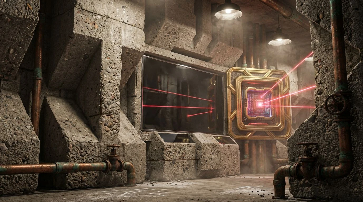
Here we see the collision of the monolith with the digital glitch. The foundation is built upon layers of Exposed Aggregate and Obsidian, a reliable and immovable surfacing that mimics the vast, windowless walls of government bureaus. Yet, the brutalist slab is defaced by the electric shock of Laser Beam and Patina. It is the texture of a squat in a derelict power plant, where old machinery is hot-wired for new purposes. This juxtaposition creates a sophisticated tension between the archaic and the futuristic. The inclusion of Gilded Frame adds a surprising touch of faded aristocracy, a hint of old wealth trapped behind the concrete. For a financial tool, this combination suggests a disruption of the old guard using the heaviest tools available. It is aggressive, certainly, but also undeniably deeply cool, transforming the mundane act of asset management into an act of cyber-cultural rebellion.
High-Voltage Hazard ⚡
This is the ultimate expression of high-fidelity functionalism. There is no room for ambiguity when Vantablack meets Floodlight; the contrast is absolute, sharp enough to cut glass. It mimics the visual language of heavy machinery control panels, where legibility is a matter of life and death. The searing brightness of Warning Tape and the visceral distinctness of Emergency Stop cut through the monochrome darkness with violent clarity. Moss on Concrete adds a grime-streaked realism, preventing the look from becoming too sterile or plastic. It feels experienced, used, and weathered. Applying these tones creates an environment of intense focus. The user feels the weight of consequences. It signals that this interface interacts with high voltage, requiring respect and attention. It is a protective aesthetic, prioritizing information density and rapid cognitive processing over comfort or ease, perfectly suited for the relentless pace of high-stakes dashboard management.
Abandoning the safety of the soft and palatable requires courage, but the reward is an interface that commands respect rather than asking for it. These aesthetic choices prove that greyscale is not merely an absence of color but a violent assertion of gravity, and that the strategic use of industrial ochres and warning reds can guide the user with more efficacy than any tooltip. By embracing the weight of concrete and the bite of raw iron, we move beyond the superficial gloss of consumer applications and into the realm of serious instrumentation. This visual language speaks to the user’s desire for stability in a volatile market. It is a reminder that in a world of fleeting digital tokens, the platform that holds them acts as the vault. And vaults should look like they can survive the apocalypse. The screen becomes a surface of resistance, a declaration of utility, and a monument to the serious business of building the future.