'%3e%3cpath%20fill-rule='evenodd'%20clip-rule='evenodd'%20d='M51.1303%2019.2492C50.7278%2019.913%2050.1346%2020.4426%2049.3508%2020.838C48.5669%2021.2335%2047.6172%2021.4312%2046.5014%2021.4312C44.8208%2021.4312%2043.4367%2021.0216%2042.3492%2020.2025C41.2617%2019.3833%2040.6686%2018.2394%2040.5697%2016.7706H44.4253C44.4818%2017.3355%2044.6831%2017.7804%2045.0291%2018.1052C45.3751%2018.43%2045.8164%2018.5924%2046.3531%2018.5924C46.8192%2018.5924%2047.1864%2018.4653%2047.4547%2018.2111C47.7231%2017.9569%2047.8572%2017.618%2047.8572%2017.1943C47.8572%2016.8129%2047.7337%2016.4952%2047.4865%2016.241C47.2393%2015.9867%2046.9322%2015.7784%2046.565%2015.616C46.1978%2015.4536%2045.6893%2015.2594%2045.0397%2015.0334C44.0934%2014.7086%2043.3202%2014.3944%2042.72%2014.0907C42.1197%2013.7871%2041.6042%2013.3351%2041.1735%2012.7349C40.7427%2012.1347%2040.5273%2011.3544%2040.5273%2010.394C40.5273%209.50418%2040.7533%208.73448%2041.2053%208.08481C41.6572%207.43515%2042.2821%206.93731%2043.0801%206.5913C43.8781%206.24528%2044.7925%206.07227%2045.8235%206.07227C47.49%206.07227%2048.8141%206.46771%2049.7956%207.25861C50.7772%208.04951%2051.3315%209.13698%2051.4586%2010.5211H47.5395C47.4689%2010.0268%2047.2888%209.63483%2046.9993%209.3453C46.7097%209.05578%2046.3178%208.91102%2045.8235%208.91102C45.3998%208.91102%2045.0573%209.024%2044.7961%209.24997C44.5348%209.47594%2044.4041%209.80783%2044.4041%2010.2457C44.4041%2010.5988%2044.5207%2010.8989%2044.7537%2011.146C44.9867%2011.3932%2045.2798%2011.5944%2045.6328%2011.7498C45.9859%2011.9052%2046.4944%2012.1029%2047.1581%2012.343C48.1185%2012.6678%2048.9023%2012.9891%2049.5096%2013.3069C50.1169%2013.6246%2050.6395%2014.0872%2051.0773%2014.6945C51.5151%2015.3018%2051.734%2016.0927%2051.734%2017.0672C51.734%2017.8581%2051.5328%2018.5854%2051.1303%2019.2492ZM59.0242%206.3053V21.2829H55.4016V6.3053H59.0242ZM73.9409%206.3053V9.18642H69.8734V21.2829H66.2296V9.18642H62.2046V6.3053H73.9409ZM80.7438%209.18642V12.3218H85.8069V15.0546H80.7438V18.3806H86.4425V21.2829H77.1212V6.3053H86.4425V9.18642H80.7438ZM99.667%2016.0291V21.2829H96.0444V6.3053H101.913C103.692%206.3053%20105.048%206.74665%20105.98%207.62934C106.912%208.51204%20107.378%209.7019%20107.378%2011.199C107.378%2012.1311%20107.17%2012.9609%20106.753%2013.6882C106.337%2014.4155%20105.719%2014.9875%20104.9%2015.4042C104.08%2015.8208%20103.085%2016.0291%20101.913%2016.0291H99.667ZM103.692%2011.199C103.692%209.8855%20102.965%209.22879%20101.51%209.22879H99.667V13.1268H101.51C102.965%2013.1268%20103.692%2012.4842%20103.692%2011.199ZM120.092%2018.5501H114.478L113.546%2021.2829H109.732L115.219%206.41123H119.393L124.879%2021.2829H121.024L120.092%2018.5501ZM119.16%2015.7961L117.295%2010.2881L115.41%2015.7961H119.16ZM131.555%2018.5077H136.385V21.2829H127.933V6.3053H131.555V18.5077ZM143.337%209.18642V12.3218H148.4V15.0546H143.337V18.3806H149.035V21.2829H139.714V6.3053H149.035V9.18642H143.337ZM163.507%206.3053V9.18642H159.44V21.2829H155.796V9.18642H151.771V6.3053H163.507ZM177.449%206.3053V9.18642H173.382V21.2829H169.738V9.18642H165.713V6.3053H177.449ZM184.252%209.18642V12.3218H189.315V15.0546H184.252V18.3806H189.951V21.2829H180.629V6.3053H189.951V9.18642H184.252Z'%20fill='%23EEF0ED'/%3e%3cmask%20id='mask0_3101_7327'%20style='mask-type:alpha'%20maskUnits='userSpaceOnUse'%20x='0'%20y='0'%20width='27'%20height='28'%3e%3cpath%20d='M23.8328%200.759766H2.64808C1.18559%200.759766%200%201.94535%200%203.40785V24.5925C0%2026.055%201.18559%2027.2406%202.64808%2027.2406H23.8328C25.2952%2027.2406%2026.4808%2026.055%2026.4808%2024.5925V3.40785C26.4808%201.94535%2025.2952%200.759766%2023.8328%200.759766Z'%20fill='white'/%3e%3c/mask%3e%3cg%20mask='url(%23mask0_3101_7327)'%3e%3cpath%20d='M23.8328%200.759766H2.64808C1.18559%200.759766%200%201.94535%200%203.40785V24.5925C0%2026.055%201.18559%2027.2406%202.64808%2027.2406H23.8328C25.2952%2027.2406%2026.4808%2026.055%2026.4808%2024.5925V3.40785C26.4808%201.94535%2025.2952%200.759766%2023.8328%200.759766Z'%20fill='%23D8D8D8'/%3e%3cpath%20d='M13.2404%200.759766H0V14.0001H13.2404V0.759766Z'%20fill='%238C61FF'/%3e%3cpath%20d='M13.2404%2014H0V27.2404H13.2404V14Z'%20fill='%2336C3FE'/%3e%3cpath%20d='M26.4806%2014H13.2402V27.2404H26.4806V14Z'%20fill='%236592FE'/%3e%3cpath%20d='M26.4806%200.759766H13.2402V14.0002H26.4806V0.759766Z'%20fill='%236059F7'/%3e%3c/g%3e%3c/g%3e%3cdefs%3e%3cclipPath%20id='clip0_3101_7327'%3e%3crect%20width='190'%20height='28'%20fill='white'/%3e%3c/clipPath%3e%3c/defs%3e%3c/svg%3e)
'%3e%3cpath%20d='M23.8328%200.759521H2.64808C1.18559%200.759521%200%201.94511%200%203.40761V24.5923C0%2026.0548%201.18559%2027.2404%202.64808%2027.2404H23.8328C25.2952%2027.2404%2026.4808%2026.0548%2026.4808%2024.5923V3.40761C26.4808%201.94511%2025.2952%200.759521%2023.8328%200.759521Z'%20fill='%23D8D8D8'/%3e%3cpath%20d='M13.2404%200.759521H0V13.9999H13.2404V0.759521Z'%20fill='%238C61FF'/%3e%3cpath%20d='M13.2404%2013.9998H0V27.2402H13.2404V13.9998Z'%20fill='%2336C3FE'/%3e%3cpath%20d='M26.4809%2013.9998H13.2405V27.2402H26.4809V13.9998Z'%20fill='%236592FE'/%3e%3cpath%20d='M26.4809%200.759277H13.2405V13.9997H26.4809V0.759277Z'%20fill='%236059F7'/%3e%3c/g%3e%3c/svg%3e)
Modern Retro Color Palettes for 1970s Casino App Design
· 5 min readThe current landscape of B2C mobile interface design often suffers from clinical sterility—an endless parade of safe whites, non-committal greys, and friendly but soulless blues. We have scrubbed the digital surface so clean that it lacks friction, grip, and character. There is a growing appetite for interfaces that feel inhabited, spaces that possess a mood rather than just a grid. By looking back to the seamy, dimly lit glamour of a 1970s casino floor, we find an antidote to this emptiness. This aesthetic isn't about kitsch; it is about weight, texture, and a specific kind of atmospheric density. It creates a digital environment that feels expensive, slightly dangerous, and undeniably human. We are trading the doctor’s office for the lounge, using heavy velvets and tarnished metals to guide user attention. The goal is to build a screen that feels like it smells of whiskey and expensive perfume, transforming a mundane transaction into an event.
High Stakes Haze 🎰
There is a distinct tension here between the refined and the chaotic, perfectly mimicking the visual noise of a crowded gaming floor. The deepness of Curdled Burgundy anchors the scheme, acting as a heavy background element that suggests the plush, light-absorbing quality of thick carpet. Against this shadowy base, Electric Felt serves as an aggressive, vibrating accent, reminiscent of the bold hues used on table surfaces to keep players awake. The interplay between Brushed Brass and Martini Olive introduces a metallic, savory complexity that feels distinctly vintage without slipping into sepia-toned parody. In an app context, this combination works best when dividing information density; the murky greens and greys provide a low-contrast section for long-form reading, while the brass tones highlight the transactional moments. It captures the slightly disorienting, time-dilating effect of a room with no windows.
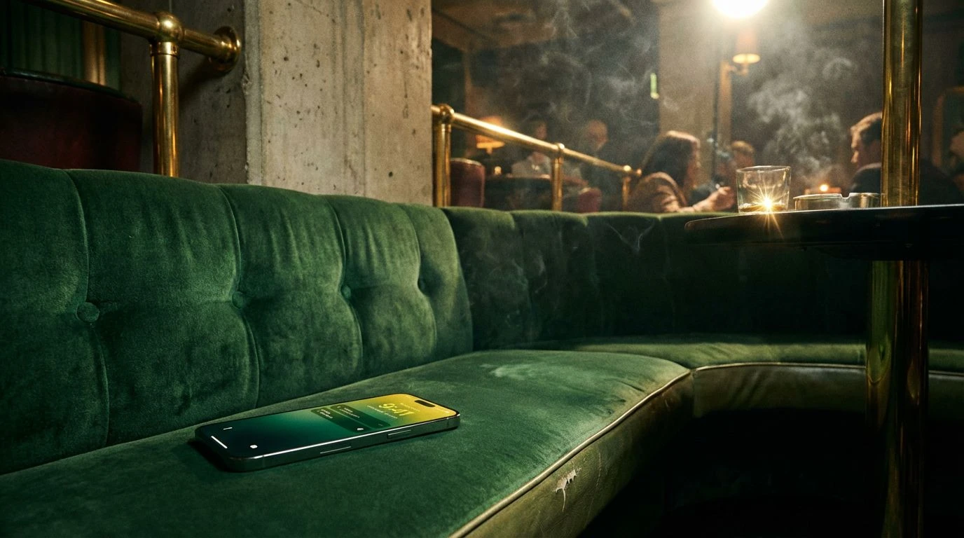
Sunset Strip Lounge 🥃
This selection moves away from the gaming tables and into the adjacent cocktail lounge, focusing on warm, organic textures rather than electric stimulation. The gradient from Cigar Wrapper to Cognac Leather implies a tactile quality, suggesting an interface that feels like handling a well-worn wallet or sitting in a deep booth. Marquee Bulb provides the necessary luminous cut through the earthy browns, functioning as the primary call-to-action color. It mimics the incandescent glow of signage against a dark wood interior. For a mobile layout, this palette creates a sense of exclusivity and comfort. It avoids the coldness of modern tech aesthetics by wrapping the user’s content in layers of warm darkness and soft light. The near-black Midnight Tuxedo allows text to pop with high contrast, ensuring accessibility remains high even within such a moody atmosphere.
The Monte Carlo Heist 🎲
Here we find a sharper, more European interpretation of the 70s aesthetic, leaning into the era's fascination with revived Art Deco geometry. The contrast is severe. Vantablack and Marble Counter create a stark, almost brutalist framework, allowing the metallic sheens of Antique Gold and Aged Whiskey to act as jewellery within the UI. The surprise element is Patina Turquoise, a specific shade that recalls oxidized copper roofing or velvet ropes. This cool tone prevents the warm metallics from becoming stifling. In a B2C application, this palette suggests high value and precision. It suits interfaces that deal with finance or luxury bookings, where the user needs to feel a sense of security and solidity. The gunmetal tones can be used for secondary boundaries, keeping the layout strict and orderly while the gold highlights guide the eye to the 'pay' or 'confirm' interactions.
Avocado & Acid 🥑
This grouping embraces the 'ugly-chic' dissonance that defined much of the decade's interior design. It is unapologetic, combining the murky depths of Avocado Skin and Vinyl Seat with the jarring brightness of Acid Lemon. This clash is what gives the palette its energy; it refuses to recede into the background. It mimics the aesthetic of independent cinema or underground pamplets from the era rather than the polished casino floor. However, in a mobile context, this friction is useful. The Harvest Gold and murky greens create a muted, heavy container for content, making the Acid Lemon elements scream for attention. It is a perfect scheme for a brand that positions itself as an outsider or a disruptor. The visuals feel raw and curated, rejecting the smooth gradients of Silicon Valley for something that feels flat, blocked-out, and intentionally jarring.
Saturday Night Feverdream 🕺
While the previous palettes focused on the heavy interior architecture of the casino, this one captures the ephemeral, glittering lights of the disco influence bleeding into the mainstream. It is lighter, airier, yet still grounded by the earthy Dried Herb tone which prevents it from drifting into a pure 80s vaporwave aesthetic. Electric Orchid and Polyester Blue vibrate against each other, creating a sense of motion and nightlife energy. This is the palette for the gamified aspects of an app—the rewards, the notifications, the moments of delight. Washed Denim and Chiffon Dress provide a softer, pastel backdrop that keeps the interface breathable. It channels the shiny, synthetic glamour of the era, suggesting plastic surfaces and colored gels over lens flares. It brings a playful, slightly hallucinogenic vibe to the user journey, perfect for breaking up the monotony of list views and forms.
Adopting these heavy, saturated schemes requires a shift in how we view the role of a mobile screen. It moves the device from being a passive window into being an active object of luxury. These colors do not just sit in the background; they push forward, demanding a reaction from the user. We see that nostalgia does not have to mean dusty skeuomorphism. Instead, it offers a library of sensory cues—the heat of a lamp, the cool touch of brass, the roughness of wool—that can be flattened and modernized for a touch interface. By rejecting the safety of standard material design lightness, these palettes offer a new kind of usability, one defined by high contrast, clear hierarchy, and a bold, cinematic presentation. The result is an application that feels less like a tool and more like a destination.