'%3e%3cpath%20fill-rule='evenodd'%20clip-rule='evenodd'%20d='M51.1303%2019.2492C50.7278%2019.913%2050.1346%2020.4426%2049.3508%2020.838C48.5669%2021.2335%2047.6172%2021.4312%2046.5014%2021.4312C44.8208%2021.4312%2043.4367%2021.0216%2042.3492%2020.2025C41.2617%2019.3833%2040.6686%2018.2394%2040.5697%2016.7706H44.4253C44.4818%2017.3355%2044.6831%2017.7804%2045.0291%2018.1052C45.3751%2018.43%2045.8164%2018.5924%2046.3531%2018.5924C46.8192%2018.5924%2047.1864%2018.4653%2047.4547%2018.2111C47.7231%2017.9569%2047.8572%2017.618%2047.8572%2017.1943C47.8572%2016.8129%2047.7337%2016.4952%2047.4865%2016.241C47.2393%2015.9867%2046.9322%2015.7784%2046.565%2015.616C46.1978%2015.4536%2045.6893%2015.2594%2045.0397%2015.0334C44.0934%2014.7086%2043.3202%2014.3944%2042.72%2014.0907C42.1197%2013.7871%2041.6042%2013.3351%2041.1735%2012.7349C40.7427%2012.1347%2040.5273%2011.3544%2040.5273%2010.394C40.5273%209.50418%2040.7533%208.73448%2041.2053%208.08481C41.6572%207.43515%2042.2821%206.93731%2043.0801%206.5913C43.8781%206.24528%2044.7925%206.07227%2045.8235%206.07227C47.49%206.07227%2048.8141%206.46771%2049.7956%207.25861C50.7772%208.04951%2051.3315%209.13698%2051.4586%2010.5211H47.5395C47.4689%2010.0268%2047.2888%209.63483%2046.9993%209.3453C46.7097%209.05578%2046.3178%208.91102%2045.8235%208.91102C45.3998%208.91102%2045.0573%209.024%2044.7961%209.24997C44.5348%209.47594%2044.4041%209.80783%2044.4041%2010.2457C44.4041%2010.5988%2044.5207%2010.8989%2044.7537%2011.146C44.9867%2011.3932%2045.2798%2011.5944%2045.6328%2011.7498C45.9859%2011.9052%2046.4944%2012.1029%2047.1581%2012.343C48.1185%2012.6678%2048.9023%2012.9891%2049.5096%2013.3069C50.1169%2013.6246%2050.6395%2014.0872%2051.0773%2014.6945C51.5151%2015.3018%2051.734%2016.0927%2051.734%2017.0672C51.734%2017.8581%2051.5328%2018.5854%2051.1303%2019.2492ZM59.0242%206.3053V21.2829H55.4016V6.3053H59.0242ZM73.9409%206.3053V9.18642H69.8734V21.2829H66.2296V9.18642H62.2046V6.3053H73.9409ZM80.7438%209.18642V12.3218H85.8069V15.0546H80.7438V18.3806H86.4425V21.2829H77.1212V6.3053H86.4425V9.18642H80.7438ZM99.667%2016.0291V21.2829H96.0444V6.3053H101.913C103.692%206.3053%20105.048%206.74665%20105.98%207.62934C106.912%208.51204%20107.378%209.7019%20107.378%2011.199C107.378%2012.1311%20107.17%2012.9609%20106.753%2013.6882C106.337%2014.4155%20105.719%2014.9875%20104.9%2015.4042C104.08%2015.8208%20103.085%2016.0291%20101.913%2016.0291H99.667ZM103.692%2011.199C103.692%209.8855%20102.965%209.22879%20101.51%209.22879H99.667V13.1268H101.51C102.965%2013.1268%20103.692%2012.4842%20103.692%2011.199ZM120.092%2018.5501H114.478L113.546%2021.2829H109.732L115.219%206.41123H119.393L124.879%2021.2829H121.024L120.092%2018.5501ZM119.16%2015.7961L117.295%2010.2881L115.41%2015.7961H119.16ZM131.555%2018.5077H136.385V21.2829H127.933V6.3053H131.555V18.5077ZM143.337%209.18642V12.3218H148.4V15.0546H143.337V18.3806H149.035V21.2829H139.714V6.3053H149.035V9.18642H143.337ZM163.507%206.3053V9.18642H159.44V21.2829H155.796V9.18642H151.771V6.3053H163.507ZM177.449%206.3053V9.18642H173.382V21.2829H169.738V9.18642H165.713V6.3053H177.449ZM184.252%209.18642V12.3218H189.315V15.0546H184.252V18.3806H189.951V21.2829H180.629V6.3053H189.951V9.18642H184.252Z'%20fill='%23EEF0ED'/%3e%3cmask%20id='mask0_3101_7327'%20style='mask-type:alpha'%20maskUnits='userSpaceOnUse'%20x='0'%20y='0'%20width='27'%20height='28'%3e%3cpath%20d='M23.8328%200.759766H2.64808C1.18559%200.759766%200%201.94535%200%203.40785V24.5925C0%2026.055%201.18559%2027.2406%202.64808%2027.2406H23.8328C25.2952%2027.2406%2026.4808%2026.055%2026.4808%2024.5925V3.40785C26.4808%201.94535%2025.2952%200.759766%2023.8328%200.759766Z'%20fill='white'/%3e%3c/mask%3e%3cg%20mask='url(%23mask0_3101_7327)'%3e%3cpath%20d='M23.8328%200.759766H2.64808C1.18559%200.759766%200%201.94535%200%203.40785V24.5925C0%2026.055%201.18559%2027.2406%202.64808%2027.2406H23.8328C25.2952%2027.2406%2026.4808%2026.055%2026.4808%2024.5925V3.40785C26.4808%201.94535%2025.2952%200.759766%2023.8328%200.759766Z'%20fill='%23D8D8D8'/%3e%3cpath%20d='M13.2404%200.759766H0V14.0001H13.2404V0.759766Z'%20fill='%238C61FF'/%3e%3cpath%20d='M13.2404%2014H0V27.2404H13.2404V14Z'%20fill='%2336C3FE'/%3e%3cpath%20d='M26.4806%2014H13.2402V27.2404H26.4806V14Z'%20fill='%236592FE'/%3e%3cpath%20d='M26.4806%200.759766H13.2402V14.0002H26.4806V0.759766Z'%20fill='%236059F7'/%3e%3c/g%3e%3c/g%3e%3cdefs%3e%3cclipPath%20id='clip0_3101_7327'%3e%3crect%20width='190'%20height='28'%20fill='white'/%3e%3c/clipPath%3e%3c/defs%3e%3c/svg%3e)
'%3e%3cpath%20d='M23.8328%200.759521H2.64808C1.18559%200.759521%200%201.94511%200%203.40761V24.5923C0%2026.0548%201.18559%2027.2404%202.64808%2027.2404H23.8328C25.2952%2027.2404%2026.4808%2026.0548%2026.4808%2024.5923V3.40761C26.4808%201.94511%2025.2952%200.759521%2023.8328%200.759521Z'%20fill='%23D8D8D8'/%3e%3cpath%20d='M13.2404%200.759521H0V13.9999H13.2404V0.759521Z'%20fill='%238C61FF'/%3e%3cpath%20d='M13.2404%2013.9998H0V27.2402H13.2404V13.9998Z'%20fill='%2336C3FE'/%3e%3cpath%20d='M26.4809%2013.9998H13.2405V27.2402H26.4809V13.9998Z'%20fill='%236592FE'/%3e%3cpath%20d='M26.4809%200.759277H13.2405V13.9997H26.4809V0.759277Z'%20fill='%236059F7'/%3e%3c/g%3e%3c/svg%3e)
Arctic Winter Color Palettes for High-Focus Code Design
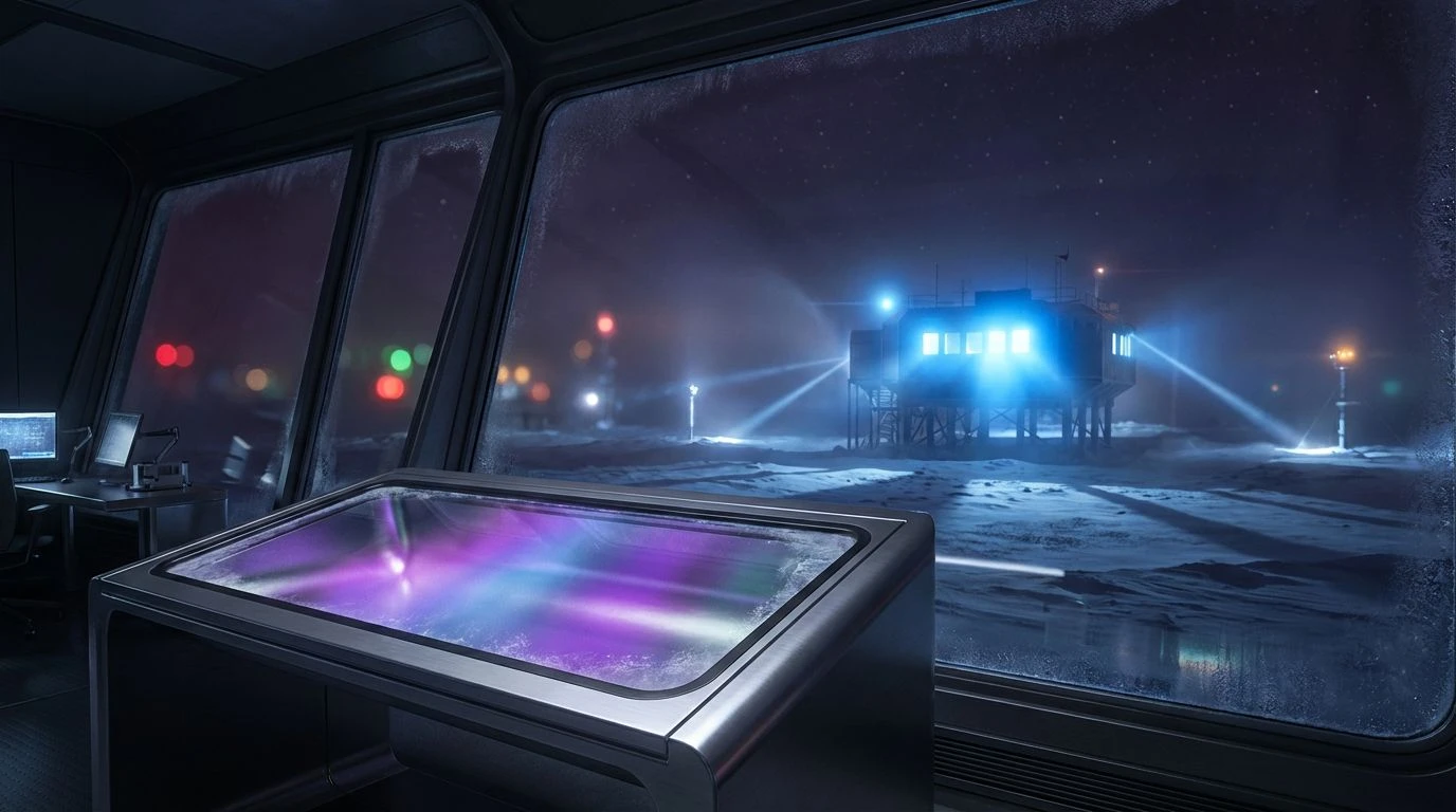
· 6 min readThe human visual cortex processes millions of bits of data every second, creating a constant biological demand for filtration and focus. In environments demanding absolute concentration—whether tracing faint stellar signals from an Antarctic observatory or debugging complex algorithms late at night—the reduction of visual noise becomes a physiological necessity rather than a mere stylistic preference. We observe a fascinating functional parallel where the aesthetics of extreme, high-latitude environments inform the digital interfaces used for deep intellectual work. By mimicking the lighting conditions of an arctic winter, where the world is reduced to deep shadows and piercing beacons of artificial light, we create a digital simulacrum of professional isolation. This approach minimizes pupillary constriction and reduces eye strain, but more significant is its psychological effect: it signals to the brain that the extraneous world has fallen away. The result is a visual ecology that supports prolonged attention spans, leaving only the task at hand visible in cool, spectral clarity, much like a lone research station glowing against an infinite polar night.
Cryogenic Circuit ❄️
This arrangement of hues functions by exploiting the eye's sensitivity to green and blue wavelengths in low-light conditions, a phenomenon known broadly as the Purkinje effect. The dominating presence of Abyssal Void creates a visual sink, absorbing ambient screen radiation and allowing the pupils to dilate slightly, which reduces the muscular fatigue associated with staring at bright white backgrounds. Against this near-black substrate, data points represented by Phosphor Green and Cobalt Laser appear with exceptional sharpness without causing the haloing effect often seen with warmer colors. The inclusion of Ionized Periwinkle acts as a bridging hue, soft enough to handle secondary information or comments without competing for primary attention. This palette mimics the instrument panels of submersible vehicles or isolated server rooms, where the environment is intentionally darkened to ensure that every photon emitted by the display carries significant information, prioritizing signal over noise.
Cherenkov Glow 🧪
Drawing inspiration from the physics of super-cooled liquids and high-energy particle detection, this selection utilizes the cooling psychological impact of the blue spectrum. The interplay between Boreal Shadow and the piercing intensity of Electric Argon replicates the visual experience of Cherenkov radiation—the blue glow emitted when charged particles pass through a dielectric medium faster than the phase velocity of light in that medium. By anchoring the view in Deep Sea Pressure, the eye is given a resting place, while the highlights of Glacial Meltwater and Absolute White guide the foveal focus to critical syntax elements. Subjectively, this temperature range is associated with sterility and precision; there are no warm distractions here, only the clinical exactitude of a laboratory. It creates a headspace of detached observation, perfect for reviewing logic flows where emotional distance and rigorous scrutiny are required to identify errors.
Tundra Expedition 🏔️
Unlike the purely spectral nature of other high-contrast themes, this collection introduces organic earth tones found in the rocky outcrops of polar regions. The use of Lichen Gold and Taiga Green creates a distinct categorical separation from the standard blue-based syntax, allowing for a more complex taxonomy of visual information. This is particularly useful in coding environments where distinguishing between variable types, strings, and functions is critical for rapid scanning. The background tones, specifically Obsidian Rock and Basalt Cliff, provide a matte, non-reflective surface appearance that mimics the light-absorbing qualities of wet stone. Together with the stark readability of Snow Blindness for main text, this palette suggests the rugged utilitarianism of field equipment. It balances the futuristic feel of a screen with the grounded reality of geological exploration, providing a visual texture that feels durable rather than ephemeral.
Ionosphere Borealis 🌌
This configuration moves beyond visible terrestrial light into the realm of atmospheric physics and ultraviolet phenomena. The dominance of Stratospheric Blue and Plasma Violet engages the short-wavelength cones in the human retina, which are less dense than red or green cones, potentially reducing the harshness or 'glare' perceived during long sessions. The background, a rich Dark Matter Plum, offers a chromatic richness that pure black lacks, adding depth to the editor window that feels vast and spatial rather than flat. This evokes the imagery of the aurora borealis dancing over a darkened research outpost—a reminder of the electromagnetic forces at play. By strictly limiting the palette to cool, neighboring hues on the spectrum, the cognitive load is managed through analogous color harmony, allowing the user to drift into a flow state where the interface feels like a natural extension of thought rather than a rigid barrier.
Telemetry Warning 🚨
Reflecting the heads-up displays (HUDs) of aviation and critical monitoring systems, this palette is engineered for rapid anomaly detection. The high-contrast pairing of Deep Trench backgrounds with Flare Red and Sulfur Vent highlights ensures that errors, breakpoints, or critical warnings bypass the brain's filtering mechanisms and command immediate attention. In a high-altitude research context, these are the colors of survival—flares against the snow or warning LEDs on a failing generator. The presence of Urgent Magenta and High Voltage Purple provides a distinct layer for specific syntax structures, separating them from standard operational data represented by Glacial Silt. This is a high-stimulus environment designed for debugging and crisis management within code; it does not aim for relaxation but for maximum vigilance, using the hierarchy of color intensity to prioritize information based on its urgency and potential impact on the system.
Adopting these high-altitude, low-temperature color schemes represents a shift in how we understand the ergonomics of digital labor. It is no longer sufficient to simply reduce brightness; the specific wavelengths and contrast ratios used in these environments mimic the biological conditions of hyper-focus found in extreme physical isolation. By stripping away warm, ambient noise and replacing it with the stark, instructive contrast of spectral highlights against deep voids, we align the developer's visual field with the precision required by their work. This is visual psychology applied to productivity: a recognition that the most effective tool for complex problem-solving is a curated absence of distraction. Just as the arctic researcher relies on the interplay of darkness and instrument light to survive and discover, the modern developer utilizes these chromatic tools to navigate the sprawling, invisible architecture of code. The screen becomes a portal to a quiet, cold place where clarity is the only variable that remains.