'%3e%3cpath%20fill-rule='evenodd'%20clip-rule='evenodd'%20d='M51.1303%2019.2492C50.7278%2019.913%2050.1346%2020.4426%2049.3508%2020.838C48.5669%2021.2335%2047.6172%2021.4312%2046.5014%2021.4312C44.8208%2021.4312%2043.4367%2021.0216%2042.3492%2020.2025C41.2617%2019.3833%2040.6686%2018.2394%2040.5697%2016.7706H44.4253C44.4818%2017.3355%2044.6831%2017.7804%2045.0291%2018.1052C45.3751%2018.43%2045.8164%2018.5924%2046.3531%2018.5924C46.8192%2018.5924%2047.1864%2018.4653%2047.4547%2018.2111C47.7231%2017.9569%2047.8572%2017.618%2047.8572%2017.1943C47.8572%2016.8129%2047.7337%2016.4952%2047.4865%2016.241C47.2393%2015.9867%2046.9322%2015.7784%2046.565%2015.616C46.1978%2015.4536%2045.6893%2015.2594%2045.0397%2015.0334C44.0934%2014.7086%2043.3202%2014.3944%2042.72%2014.0907C42.1197%2013.7871%2041.6042%2013.3351%2041.1735%2012.7349C40.7427%2012.1347%2040.5273%2011.3544%2040.5273%2010.394C40.5273%209.50418%2040.7533%208.73448%2041.2053%208.08481C41.6572%207.43515%2042.2821%206.93731%2043.0801%206.5913C43.8781%206.24528%2044.7925%206.07227%2045.8235%206.07227C47.49%206.07227%2048.8141%206.46771%2049.7956%207.25861C50.7772%208.04951%2051.3315%209.13698%2051.4586%2010.5211H47.5395C47.4689%2010.0268%2047.2888%209.63483%2046.9993%209.3453C46.7097%209.05578%2046.3178%208.91102%2045.8235%208.91102C45.3998%208.91102%2045.0573%209.024%2044.7961%209.24997C44.5348%209.47594%2044.4041%209.80783%2044.4041%2010.2457C44.4041%2010.5988%2044.5207%2010.8989%2044.7537%2011.146C44.9867%2011.3932%2045.2798%2011.5944%2045.6328%2011.7498C45.9859%2011.9052%2046.4944%2012.1029%2047.1581%2012.343C48.1185%2012.6678%2048.9023%2012.9891%2049.5096%2013.3069C50.1169%2013.6246%2050.6395%2014.0872%2051.0773%2014.6945C51.5151%2015.3018%2051.734%2016.0927%2051.734%2017.0672C51.734%2017.8581%2051.5328%2018.5854%2051.1303%2019.2492ZM59.0242%206.3053V21.2829H55.4016V6.3053H59.0242ZM73.9409%206.3053V9.18642H69.8734V21.2829H66.2296V9.18642H62.2046V6.3053H73.9409ZM80.7438%209.18642V12.3218H85.8069V15.0546H80.7438V18.3806H86.4425V21.2829H77.1212V6.3053H86.4425V9.18642H80.7438ZM99.667%2016.0291V21.2829H96.0444V6.3053H101.913C103.692%206.3053%20105.048%206.74665%20105.98%207.62934C106.912%208.51204%20107.378%209.7019%20107.378%2011.199C107.378%2012.1311%20107.17%2012.9609%20106.753%2013.6882C106.337%2014.4155%20105.719%2014.9875%20104.9%2015.4042C104.08%2015.8208%20103.085%2016.0291%20101.913%2016.0291H99.667ZM103.692%2011.199C103.692%209.8855%20102.965%209.22879%20101.51%209.22879H99.667V13.1268H101.51C102.965%2013.1268%20103.692%2012.4842%20103.692%2011.199ZM120.092%2018.5501H114.478L113.546%2021.2829H109.732L115.219%206.41123H119.393L124.879%2021.2829H121.024L120.092%2018.5501ZM119.16%2015.7961L117.295%2010.2881L115.41%2015.7961H119.16ZM131.555%2018.5077H136.385V21.2829H127.933V6.3053H131.555V18.5077ZM143.337%209.18642V12.3218H148.4V15.0546H143.337V18.3806H149.035V21.2829H139.714V6.3053H149.035V9.18642H143.337ZM163.507%206.3053V9.18642H159.44V21.2829H155.796V9.18642H151.771V6.3053H163.507ZM177.449%206.3053V9.18642H173.382V21.2829H169.738V9.18642H165.713V6.3053H177.449ZM184.252%209.18642V12.3218H189.315V15.0546H184.252V18.3806H189.951V21.2829H180.629V6.3053H189.951V9.18642H184.252Z'%20fill='%23EEF0ED'/%3e%3cmask%20id='mask0_3101_7327'%20style='mask-type:alpha'%20maskUnits='userSpaceOnUse'%20x='0'%20y='0'%20width='27'%20height='28'%3e%3cpath%20d='M23.8328%200.759766H2.64808C1.18559%200.759766%200%201.94535%200%203.40785V24.5925C0%2026.055%201.18559%2027.2406%202.64808%2027.2406H23.8328C25.2952%2027.2406%2026.4808%2026.055%2026.4808%2024.5925V3.40785C26.4808%201.94535%2025.2952%200.759766%2023.8328%200.759766Z'%20fill='white'/%3e%3c/mask%3e%3cg%20mask='url(%23mask0_3101_7327)'%3e%3cpath%20d='M23.8328%200.759766H2.64808C1.18559%200.759766%200%201.94535%200%203.40785V24.5925C0%2026.055%201.18559%2027.2406%202.64808%2027.2406H23.8328C25.2952%2027.2406%2026.4808%2026.055%2026.4808%2024.5925V3.40785C26.4808%201.94535%2025.2952%200.759766%2023.8328%200.759766Z'%20fill='%23D8D8D8'/%3e%3cpath%20d='M13.2404%200.759766H0V14.0001H13.2404V0.759766Z'%20fill='%238C61FF'/%3e%3cpath%20d='M13.2404%2014H0V27.2404H13.2404V14Z'%20fill='%2336C3FE'/%3e%3cpath%20d='M26.4806%2014H13.2402V27.2404H26.4806V14Z'%20fill='%236592FE'/%3e%3cpath%20d='M26.4806%200.759766H13.2402V14.0002H26.4806V0.759766Z'%20fill='%236059F7'/%3e%3c/g%3e%3c/g%3e%3cdefs%3e%3cclipPath%20id='clip0_3101_7327'%3e%3crect%20width='190'%20height='28'%20fill='white'/%3e%3c/clipPath%3e%3c/defs%3e%3c/svg%3e)
'%3e%3cpath%20d='M23.8328%200.759521H2.64808C1.18559%200.759521%200%201.94511%200%203.40761V24.5923C0%2026.0548%201.18559%2027.2404%202.64808%2027.2404H23.8328C25.2952%2027.2404%2026.4808%2026.0548%2026.4808%2024.5923V3.40761C26.4808%201.94511%2025.2952%200.759521%2023.8328%200.759521Z'%20fill='%23D8D8D8'/%3e%3cpath%20d='M13.2404%200.759521H0V13.9999H13.2404V0.759521Z'%20fill='%238C61FF'/%3e%3cpath%20d='M13.2404%2013.9998H0V27.2402H13.2404V13.9998Z'%20fill='%2336C3FE'/%3e%3cpath%20d='M26.4809%2013.9998H13.2405V27.2402H26.4809V13.9998Z'%20fill='%236592FE'/%3e%3cpath%20d='M26.4809%200.759277H13.2405V13.9997H26.4809V0.759277Z'%20fill='%236059F7'/%3e%3c/g%3e%3c/svg%3e)
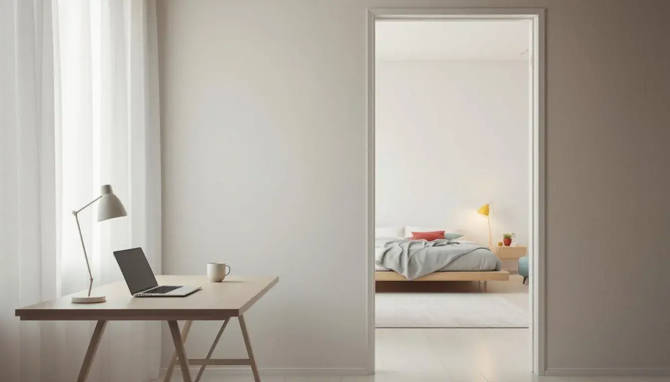
From Boardroom to Bedroom: The Year's Most Adaptable Color Palettes 🏠
· 7 min readThe shift from professional life to personal space is not merely a change of location, but a transformation of atmosphere. The colors that surround us dictate whether we feel invigorated for a presentation or soothed for sleep. This year's most adaptable palettes understand this duality, offering the flexibility to project competence in the office and inspire relaxation in the bedroom, without sacrificing style. They speak to a world where the boundaries between work and rest are increasingly blurred, demanding visual vocabularies that can navigate this fluidity with grace and intention. The right colors can be a quiet declaration of intent, shaping our mood and influencing our productivity, even subconsciously. The art lies in finding the shades that can whisper both "focus" and "unwind." These spaces should tell a story, not a history lesson, but a vibrant narrative of living in the moment.
Cool Harmony 🧊 offers a study in contrasts, a landscape where Off White meets Black, and Medium Gray finds itself neighbor to Bright Pink. This palette does not scream, it whispers – a quiet confidence that is perfect for the modern professional. Imagine this: stark white walls in a home office, punctuated by a single graphic print featuring the Sky Blue, a jolt of energy amidst the calm. Or, conversely, a bedroom swathed in varying tones of gray, the Dark Charcoal grounding the space with a sense of serenity. The Bright Pink could then appear as a subtle, unexpected accent – a throw pillow, a bedside vase – adding a touch of playful femininity without disrupting the overall tranquility. It's a palette that understands the power of restraint, using color as a tool for both focus and relaxation. The balanced distribution of the Off White with the Medium Gray mimics the soft glow of a winter morning, lending inspiration to projects that need a touch of subtle intensity. The Black acts as a stabilizing force to keep the space from feeling too airy or detached from reality, especially in areas where introspection is key. The thoughtful arrangement inspires a space that morphs into its different roles without sacrificing the overarching feel.
Modern Serenity 🎨 strikes a graceful balance between sophistication and comfort. It's a palette that speaks of tailored suits and linen sheets, of boardrooms that transition into restful havens. The Off White provides a canvas of possibility, allowing the Slate Gray to infuse a sense of calm authority, suitable for a professional who means business. A touch of the unexpected comes via Mustard Yellow, introducing warmth and a glimmer of optimism to the scene. The Brick Red gives a subtle, earthy counterbalance to the cooler tones and feels natural and human. Picture a study where walls are painted in Off White, the desk a warm wood tone, a Brick Red chair, and Navy Cobalt accents in the artwork. The same colors, softened and diffused, could transform a bedroom into a space of refuge. Use the Slate Gray on walls for a soothing effect, accented with Mustard Yellow cushions and a Brick Red throw. The Navy Cobalt appears in bedding for depth. It has the feeling of an oceanside estate, especially with a view of natural elements. It’s a palette that reassures, whether a deal needs sealing or a good night's rest is the order of the day. The colors work together to provide a feeling of professional security and restful possibility.
Aqua Serenity 🌊 brings the calming presence of the ocean indoors, where Light Gray forms the foundation, a neutral stage set for imagination. Soft Turquoise infuses the air with freshness, as if there’s a quiet breeze whispering through open windows. Imagine a high-rise office, miles from the shore, where a single wall painted in Soft Turquoise can instantly transform the atmosphere, encouraging clear thinking and collaboration. Then, picture a sprawling bedroom, where Azure Blue linens cascade over a bed, invoking deep sleep and peaceful dreams. The Dusty Blue adds a touch of sophistication to the walls and floor, as if borrowed from misty mornings. The Deep Teal, used sparingly, adds depth and intrigue, as though the ocean floor whispered its secrets. Used in a subtle rug or armchair, it helps lend a comforting feeling to the room. These are colors that ebb and flow, transitioning seamlessly between spaces and states of mind. The color of sand and sea, the palette aims to calm and guide those seeking moments of clarity. The Azure Blue will help anyone feel like they can tackle issues from different points of view.
St.Patrick's Mental Health ☘️ is a name that reveals the core of this palette. Pale Grayish Green serves as a base that is at once nurturing and supportive. Light Teal then instills a sense of openness, like the window is open to a field of herbs. In an office, these tones promote focus and relaxation in equal measure. Burnt Sienna adds a grounding earthiness, offering a counterpoint to the coolness of the blues. Dark Teal goes one shade darker to provide a richer, grounding color to inspire thought, while Brownish Gray provides a hint of elegance and sophistication, perfectly suitable for a study. As for a bedroom, this is a palette of restful sanctuary. Imagine the Pale Grayish Green on the walls, with Light Teal accents in the bedding and artwork. The Burnt Sienna weaves its way into a rug, echoing the color of the earth beneath your feet. The Dark Teal serves as a dark accent, whether it's an armchair or some other form of darker wood. The Brownish Gray could be a desk, or another similar item to add depth. This palette doesn't just decorate a space; it cultivates a feeling.
Thread Designs 🧶 carries the promise of comfort and sophistication. Imagine this palette adorning a creative workspace, where Goldenrod injects a dose of inspiration, a burst of creative electricity. Seafoam Green and Vivid Blue temper the warmth with cool tranquility, fostering a sense of balance and focus. Deep Teal serves as a rich, grounding shade, while Black adds a bold touch of modernity. In the bedroom, the same palette takes on a more subdued tone. Goldenrod appears as an accent color, perhaps in a throw or artwork, while Seafoam Green washes over the walls in a moment of serenity. The Vivid Blue might be in the bedding, bringing the sky to the sleeping mind. The Deep Teal can easily be introduced into a rug, and Black can act as a stabilizing force on accents around the room. It’s a scheme for those who see the world in layers, textures, and subtle shifts in tone. The colors evoke the image of well-curated textile pieces that are at once elegant and approachable. Those who believe that a home should whisper its stories will find much to enjoy.
Each of these palettes represents a subtle shift in the way we view our environments, moving beyond mere decoration to cultivate spaces that truly serve our needs. The Cool Harmony 🧊 offers a quiet sanctuary, while Modern Serenity 🎨 inspires professional confidence. Aqua Serenity 🌊 evokes the calm depth of the ocean, while St.Patrick's Mental Health ☘️ aims to promote true tranquility, and Thread Designs 🧶 brings the feeling of casual comfort. They are not just colors, but emotional touchstones, subtly shaping our experience of the spaces we inhabit. Those who use them correctly will find rooms that meet their requirements in both form and function. As spaces are redefined, these carefully curated palettes help us shape them, making each transition between labor and leisure a seamless and stylish act.