Industrial Color Palettes for High-Conversion Retail UX
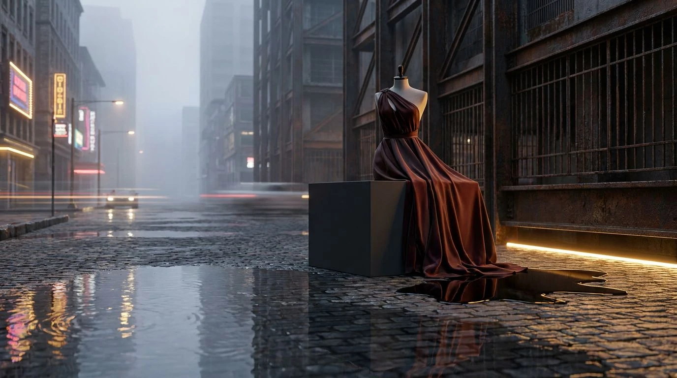
· 6 min readSensory experience dictates modern commercial transactions. The visual language of a storefront, once built on brick and glass, now relies entirely on the precise calibration of pixels on a screen. Translating the physical world into a digital retail space requires more than mere accuracy; it demands an aesthetic that captures the immediate, tactile reality of a bustling metropolis. When an e-commerce platform successfully channels the sensory friction of a city the sudden downpour on a paved avenue crossed with the rich, heavy air of a merchant stall it transforms casual browsing into an engaging, cinematic narrative. The tension between harsh industrial surfaces and warm, rare commodities offers an arresting visual strategy. This approach borrows heavily from independent filmmaking, where stark shadows and flashes of intense pigment create a constant, undeniable forward motion. Shoppers no longer want sterile showrooms. They respond to environments that feel lived-in, grounded by dark, heavy foundations and punctuated by sharp, unexpected warmth.
Metropolis Spice 🚕
The Metropolis Spice collection establishes a distinct narrative grounded in industrial realism, where the deep black of Midnight Alley provides an uncompromising foundation. Against this heavy background, Saffron Thread offers a sharp, commanding burst of warmth, reminiscent of rare goods sold under flickering streetlamps. The intermediate tones of Dry Concrete and Urban Slate bridge the gap between stark darkness and vibrant luxury, creating a visual texture similar to a newly paved sidewalk drying in the afternoon sun. Crisp Linen acts as a necessary resting space for the eye, preventing the arrangement from becoming overwhelmingly heavy. In an online retail setting, applying these shades translates to a highly structural design. The darker tones anchor the navigation and borders, while the golden elements draw immediate attention to purchasing actions. This creates an environment that feels both sophisticated and raw, steering the consumer through the space with the deliberate pacing of an independent film.
Night Market Neon 🏮
Capturing the restless motion of an evening street market, Night Market Neon thrives on high contrast and unexpected interruptions of color. Pitch Black serves as the primary canvas, absorbing light to let the surrounding pigments stand out with startling clarity. Smoldering Brick and Electric Persimmon act as the immediate visual hooks, much like the glowing signage of a late-night food stall or a sudden flash of taillights in moving traffic. Crushed Turmeric and Aged Brass provide a more measured, historical weight to the arrangement, suggesting the presence of high-value artisanal goods resting on rough tables. City Dust softens the edges of this high-energy collision, offering a neutral backdrop for text or supporting imagery. When applied to a digital storefront, this approach effectively directs consumer attention with almost aggressive confidence. The bright orange and yellow tones act as navigational beacons against the dark background, simulating the urgent, compelling atmosphere of a crowded street where every merchant demands notice.
Rainy District Saffron ☔
Rainy District Saffron leans heavily into a cinematic mood, utilizing a broad spectrum of atmospheric grays and sudden, intense reds to create narrative tension. Morning Fog and Weathered Steel set a somber, muted stage, acting as the overcast sky and wet pavement that define an urban winter. Iron Grate and Ink Spill ground the design with profound, impenetrable shadows, giving the layout a palpable sense of weight and architecture. Against these cold industrial elements, Oxblood and Sliced Fig introduce a deep, biological warmth, while Burnished Saffron provides a singular, luxurious flash of gold. Puddle Reflection adds a momentary glint of cool blue, breaking the warmth with a sharp, metallic edge. For a retail platform, this arrangement speaks to exclusivity and high design. The heavy use of shadow creates an atmosphere of anticipation, turning the act of discovering a product into a quiet, dramatic reveal. The golden and red elements serve as crucial markers, guiding the user toward a transaction with a feeling of deliberate discovery.
Asphalt and Amber 🚏
A study in temperature and texture, Asphalt and Amber relies on the stark division between industrial cooling and agricultural warmth. Matte Coal, Pedestrian Walkway, and Storm Cloud form a relentless, utilitarian backdrop, mimicking the uncompromising surfaces of modern city infrastructure. Chalk Dust and Gallery Wall provide clean, negative space, ensuring the layout remains readable and spacious. The narrative shifts abruptly with the introduction of Vibrant Mustard, Ground Coriander, and Roasted Cumin. These highly concentrated, earthen yellows function as the commercial draw, possessing the same magnetic pull as a spice vendor hidden within a brutalist concrete complex. Implementing this aesthetic in a digital marketplace results in a highly legible, modern interface that still feels remarkably human. The stark grays communicate efficiency and speed, while the rich, heavily pigmented yellows offer comfort and value. This distinct separation allows products to sit proudly within the frame, supported by an environment that feels both relentlessly contemporary and deeply rooted in historical trade.
Cinema Verité Streets 🎬
Drawing direct inspiration from observational filmmaking, Cinema Verité Streets captures the unpredictable beauty of a city in motion. Nightfall Charcoal and Cobblestone provide the necessary grit, establishing an authentic setting that refuses to look overly polished. Blank Canvas offers stark relief, allowing the more aggressive tones to breathe and preventing visual fatigue. The sudden introduction of Traffic Signal Red and Golden Hour Sun creates an immediate sense of urgency and vitality, mirroring the fast-paced, unscripted reality of urban life. Faded Neon Pink adds an unexpected, slightly artificial sweetness to the arrangement, a nod to the glowing signs that reflect off wet streets at dusk. When utilized in an online shop, this collection of colors creates an environment of controlled chaos. The high-energy reds and yellows encourage immediate action and rapid scrolling, while the solid charcoal foundations keep the user grounded. It is a visually demanding approach that rewards the consumer with a fast, engaging, and highly memorable shopping experience.
The application of industrial shadows and concentrated, warm pigments offers a distinct departure from conventional retail design. By treating a digital storefront as a physical, atmospheric location, brands can establish a profound emotional connection with the consumer. The visual language of wet concrete and expensive spices relies on the tension between the common and the rare, driving attention toward specific actions without relying on tired marketing gimmicks. This cinematic approach transforms a simple transaction into a memorable event. Ultimately, the careful placement of heavy charcoal against striking gold proves that an online space can possess the same weight, texture, and undeniable presence as a physical storefront on a bustling, rain-slicked avenue.