Vermilion Color Palettes for Authoritative Brand Design
· 5 min readCorporate storytelling is undergoing a drastic tonal shift. We are moving past the era of friendly, approachable pastels and safe tech blues. Today, brands need to cut through a saturated market with absolute authority, demanding attention rather than politely asking for it. Enter a palette strategy pulled straight from a political thriller: stark neutral greys punctured by the unapologetic urgency of vermilion. This high-octane red does not just decorate a webpage or an annual report; it dictates the pacing. When placed against concrete greys and stark blacks, vermilion commands the room, directing the eye exactly where the narrative needs it to go. It is a calculated, cinematic approach to design, turning standard corporate messaging into a high-stakes briefing.
Executive Briefing 💼
The Executive Briefing color arrangement operates on calculated contrast, much like the redacted pages of a classified dossier. A base of Graphite and Crisp White sets a highly disciplined, bureaucratic stage, perfect for sharp, sans-serif typography and rigid grid structures. Into this sterile environment, Vermilion drops like a sudden alarm, drawing immediate focus to crucial data points or call-to-action buttons. Oxblood grounds the brighter red, preventing it from feeling overly aggressive, while Fog Blue and Soft Clay offer just enough breathing room in secondary graphic elements. This combination works exceptionally well for fintech or legal firms looking to project both established reliability and forward-thinking agility. It builds a visual tension that keeps the viewer alert, scanning the layout for the next critical piece of information.
Press Room 🎙️
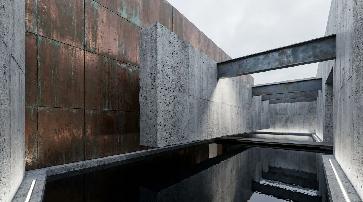
Framing a narrative often requires a backdrop that feels grounded and immovable. The Press Room palette achieves this with heavy structural tones of Concrete and Asphalt, creating a brutalist foundation for editorial layouts and corporate collateral. Classified Red steps in as the primary narrator, demanding absolute focus without shouting, perfect for drop caps, pull quotes, or stark data visualizations. Adding Brass and Moss introduces an unexpected vintage journalistic quality, recalling the dimly lit offices and fluorescent-lit archives of classic espionage cinema. In a branding context, this collection creates an atmosphere of serious investigative weight. It positions a company as a thought leader dealing in hard facts and uncompromising truths, using color to establish a sense of historical permanence mixed with breaking-news immediacy.
Crisis Management 🚨
Stripped of all unnecessary ornamentation, the Crisis Management selection relies on extreme visual polarity to communicate urgency. Pitch Black and Printer Paper form a high-contrast binary environment, turning any typographic treatment into a definitive statement. When Emergency Red breaks through this greyscale framework, it functions as a visual siren. This is not a color for passive decoration; it is applied strictly for maximum impact, guiding users through critical pathways on a landing page or highlighting the most vital metric in an investor deck. The addition of Mid-tone Grey softens the brutal transition between black and white, while Rust provides a slight, oxidized warmth to secondary elements. Brands adopting this approach project a commanding, no-nonsense attitude, signaling to their audience that they operate with total clarity under high-pressure conditions.
Covert Operations 🕵️
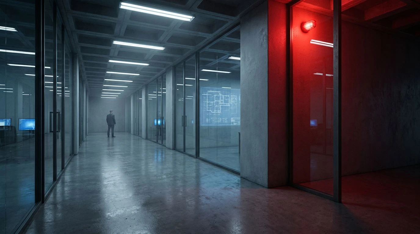
Shifting toward a more cinematic, nocturnal atmosphere, the Covert Operations grouping relies heavily on deep, shadowy tones. Midnight and Surveillance Blue build an environment steeped in corporate secrecy, reminiscent of late-night boardroom negotiations or secure server rooms. Against this heavy, cooling backdrop, Cardinal Red acts as an urgent alert. It cuts through the darkness with surgical precision, ideal for interface notifications or critical navigational anchors. The softer inclusions of Blush Pink and Muted Rose offer a surprisingly human touch, preventing the interface from feeling entirely robotic or cold. This specific color grouping is highly effective for cybersecurity firms or strategic consultancies, utilizing deep blues to establish trust while deploying red to communicate rapid, decisive action in the face of unseen variables.
Classified Dossier 📁
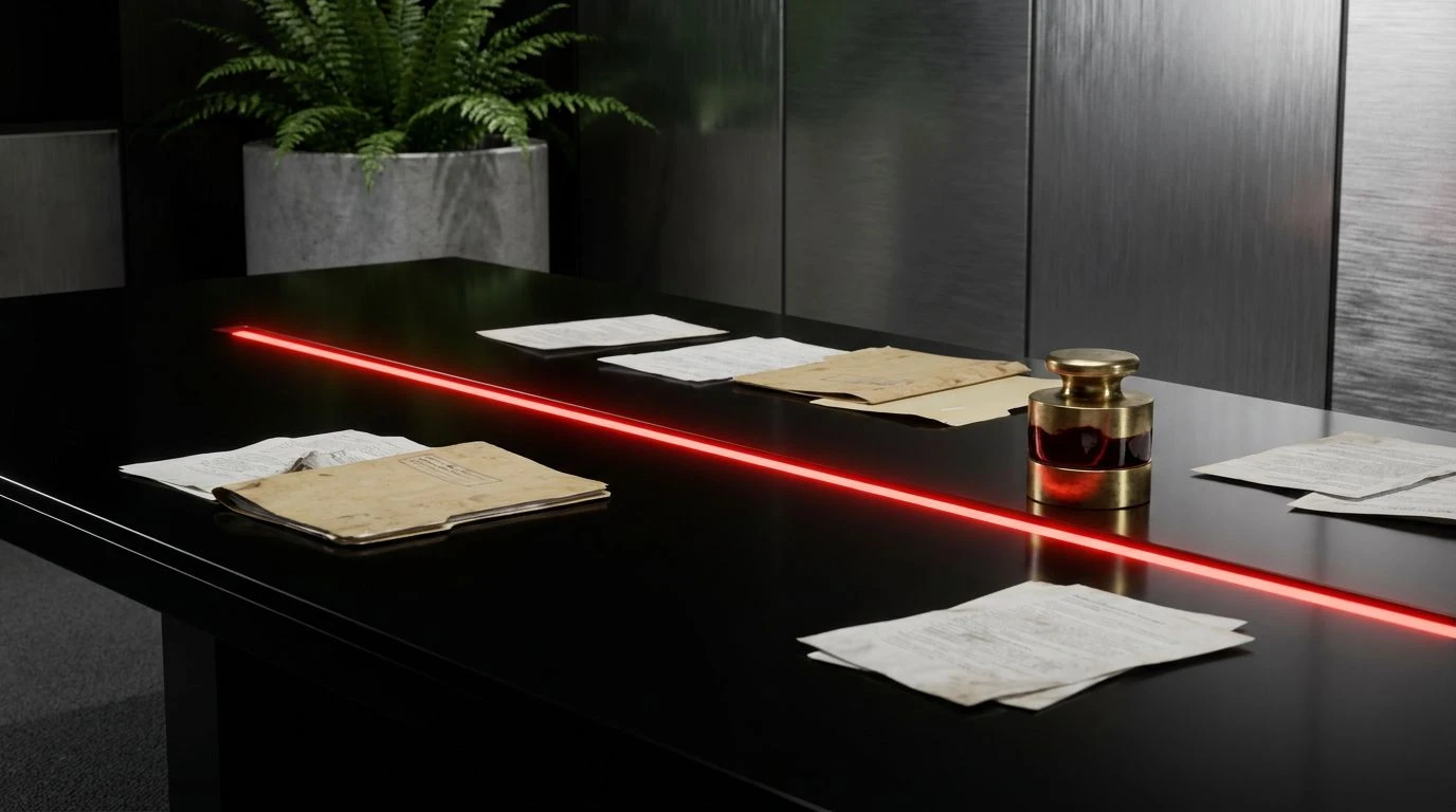
The Classified Dossier arrangement feels instantly archival, combining the starkness of a modern thriller with the tactile quality of physical evidence. Void Black and Signal Red create an aggressive, contemporary pairing, delivering immediate visual stopping power in any digital or print layout. The brilliant red commands the hierarchy, directing traffic and pointing to critical insights. However, the supporting cast dramatically shifts the context. Manila Folder and Field Green introduce a muted, utilitarian aesthetic, mimicking the look of military documents or raw, unbleached paper stocks. Dried Blood bridges the gap between the brilliant red and the earthy neutrals. This collection serves brands that want to position themselves as industry disruptors with a grounding in tangible, proven tactics, balancing aggressive modern messaging with an established, analog weight.
Opting for a high-intensity red against neutral, brutalist backgrounds changes the entire posture of corporate communication. These palettes abandon passive engagement, opting instead for a visual language that demands immediate attention and respect. By treating brand identity like the set design of a tense thriller, designers can construct narratives that feel urgent, deliberate, and undeniably authoritative. The contrast between sterile greys and fiery vermilion ensures that the most critical messages never get lost in the noise. It is a strategy built for brands ready to stop participating in the conversation and start directing it altogether.