Cinematic Color Palettes for High-Stakes Boardroom Design
· 6 min readThe human brain is remarkably adept at interpreting visual stimuli to determine the safety, urgency, and significance of an environment. In the realm of blockbuster cinema, directors manipulate light and color to artificially trigger the sympathetic nervous system, inducing a racing pulse through the deployment of deep shadows pierced by fiery explosions. Translating this intense physiological reaction into the measured, high-stakes environment of an executive suite requires a precise understanding of color psychology and optical physics. By isolating the classic cinematic contrast of deep navy and brilliant gold, we can observe how specific wavelengths govern attention and perceived authority. When extreme visual contrast is carefully managed, the adrenaline typically associated with a cinematic action sequence can be channeled into sustained cognitive focus. This architectural application of cinematic color grading transforms the modern boardroom from a static meeting space into an environment that actively primes the nervous system for decisive, critical thinking.
Kinetic Equilibrium 🎬
The human visual system processes contrast before it recognizes color. In cinematic action, rapid shifts between brilliant flashes and deep shadows trigger a low-level threat response, sharpening attention. Kinetic Equilibrium takes this physiological mechanism and applies it to executive spaces through a precise gradient from Strobe White to Matte Obsidian. The sudden presence of Laser Green acts similarly to a targeting laser or digital readout in a thriller, drawing immediate ocular focus. When paired with Trophy Gold, these highly stimulating elements are grounded in a metallic warmth that human psychology associates with established value and permanence. A boardroom utilizing these tones translates the frantic energy of a chase sequence into a state of high alertness, keeping occupants engaged and intellectually primed without triggering cognitive fatigue. The Concrete Dust and Shadowed Steel provide a necessary neutral ground where the eye can rest, ensuring the nervous system remains steady during high-stakes negotiations.
Midnight Premiere 🎞️
Color perception is heavily influenced by surrounding wavelengths, a phenomenon central to the visual storytelling of modern thrillers. Midnight Premiere captures the classic action movie grading technique known as orange and teal, a complementary contrast that maximizes visual separation between human skin tones and background environments. In an executive suite, applying Explosion Amber and Tarnished Brass against a vast expanse of Celluloid Black creates an immediate sense of gravity and consequence. The eye is naturally drawn to the warmer, golden tones, making them ideal for highlighting focal points like the head of a conference table or critical presentation screens. Meanwhile, the cooler wavelengths of Atmospheric Blue and Adrenaline Cobalt recede in human vision, expanding the perceived volume of the room and lowering the heart rate. This deliberate manipulation of spatial perception turns a potentially claustrophobic meeting room into a theater of calculated strategy, channeling cinematic intensity into a focused, commanding atmosphere.
Executive Storyboard 🏙️
The cognitive processing of high-stakes environments often relies on familiar visual anchoring. Executive Storyboard establishes this baseline by employing Deepest Navy and Cinematic Void, colors that absorb light and minimize distractions in our peripheral vision. This simulates the darkened theater experience, where all attention is forced toward a central narrative. By introducing Velocity Cyan, a wavelength that stimulates the specialized photosensitive retinal ganglion cells, the nervous system receives a non-visual signal to maintain wakefulness and alertness. When this high-frequency energy meets the structured weight of Urban Slate and Aperture Silver, the result is a sophisticated architectural tension. The metallic warmth of Gilded Vault introduces a material richness that humans historically equate with authority and permanence. Translating these cinematic lighting cues into a corporate setting allows decision-makers to operate within an environment that feels both expansive and highly controlled, mirroring the precise orchestration of a major motion picture climax.
Climax Sequence 🏆
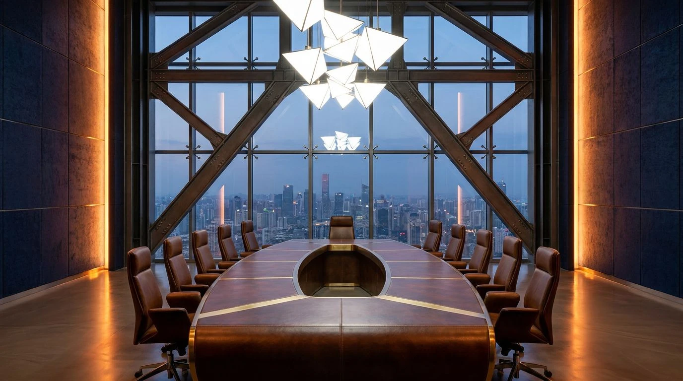
Human psychological responses to color are frequently tied to environmental survival mechanisms, where bright, warm hues signal fire or the sun. Climax Sequence utilizes this evolutionary wiring by presenting an array of intense yellows, from the blinding peak of Sunlit Pyrotechnic to the softer glow of Sodium Flare. In a blockbuster film, these tones often represent the explosive resolution of a conflict. To adapt this high-octane visual information for a respectable executive suite, it must be contained by wavelengths that convey stability and structure. Abyssal Navy provides this necessary boundary. As a color with exceptionally low light reflectance, it grounds the erratic energy of the warmer tones, lowering the overall visual noise of the space. The inclusion of Steel Truss and Burnished Leather introduces textural references to industrial strength and refined luxury. This precise balance ensures that the room retains the psychological thrill of a cinematic climax while maintaining the absolute professional composure required for executive leadership and strategic planning.
Strategic Overdrive 🚁
The interplay of warm and cool light sources creates a stereoscopic depth that cinematographers rely on to build three-dimensional tension on a two-dimensional screen. Strategic Overdrive achieves this effect by placing the high-luminance Arc Lamp Yellow alongside the dense, light-absorbing qualities of Midnight Boardroom. The physiological effect of this pairing is a heightened state of visual acuity. The cooler tones, specifically Tactical Sapphire and Industrial Fog, engage the parasympathetic nervous system, promoting a sense of calm calculation typical of a high-tech command center. Conversely, Molten Bullion injects a concentrated dose of warmth that draws the eye and signals high-value information. In an executive suite, distributing these colors strategically can guide the behavior of its occupants. Using the darker blues for walls and structural elements encourages quiet focus, while the sharp yellows and golds can be deployed on interactive surfaces or critical documents to instantly command attention, effectively turning the boardroom into a machine for optimized decision-making.
Observing how the visual cortex responds to cinematic color grading offers a fascinating window into human spatial cognition. The strategic application of dark navy and luminous gold demonstrates that the physiological excitement generated by action films is not incompatible with professional composure. Instead, these wavelengths act as tools to regulate ambient light, direct visual attention, and establish a hierarchy of information within a physical room. When the extreme contrasts of a film screen are translated into the tactile materials of a corporate environment, they construct an atmosphere that demands both respect and alertness. The resulting spaces function as cognitive architectures, proving that the thrilling visual vocabulary of popular entertainment can be systematically applied to optimize human performance in high-pressure leadership scenarios.