Olive and Slate Color Palettes for Intellectual Design
· 5 min readPicture a space where rigid analytical methods meet deliberate aesthetic choices. The room is painted in heavy, grounding tones that reflect deep focus and creative intent. A forensic scientist and a graphic designer sit across from one another, surrounded by the quiet intensity of olive greens and stark slate grays. This pairing of colors is far from arbitrary; it constructs a visual environment where raw logic and structural design speak the exact same language. The green tones anchor the mind, offering a natural weight that feels deeply rooted, while the cool, flat greys provide a clean slate for uninterrupted thought. Together, they build a backdrop for professional rigor, stripping away unnecessary noise to leave only what is entirely essential for the work at hand.
The Evidence Room 🔬
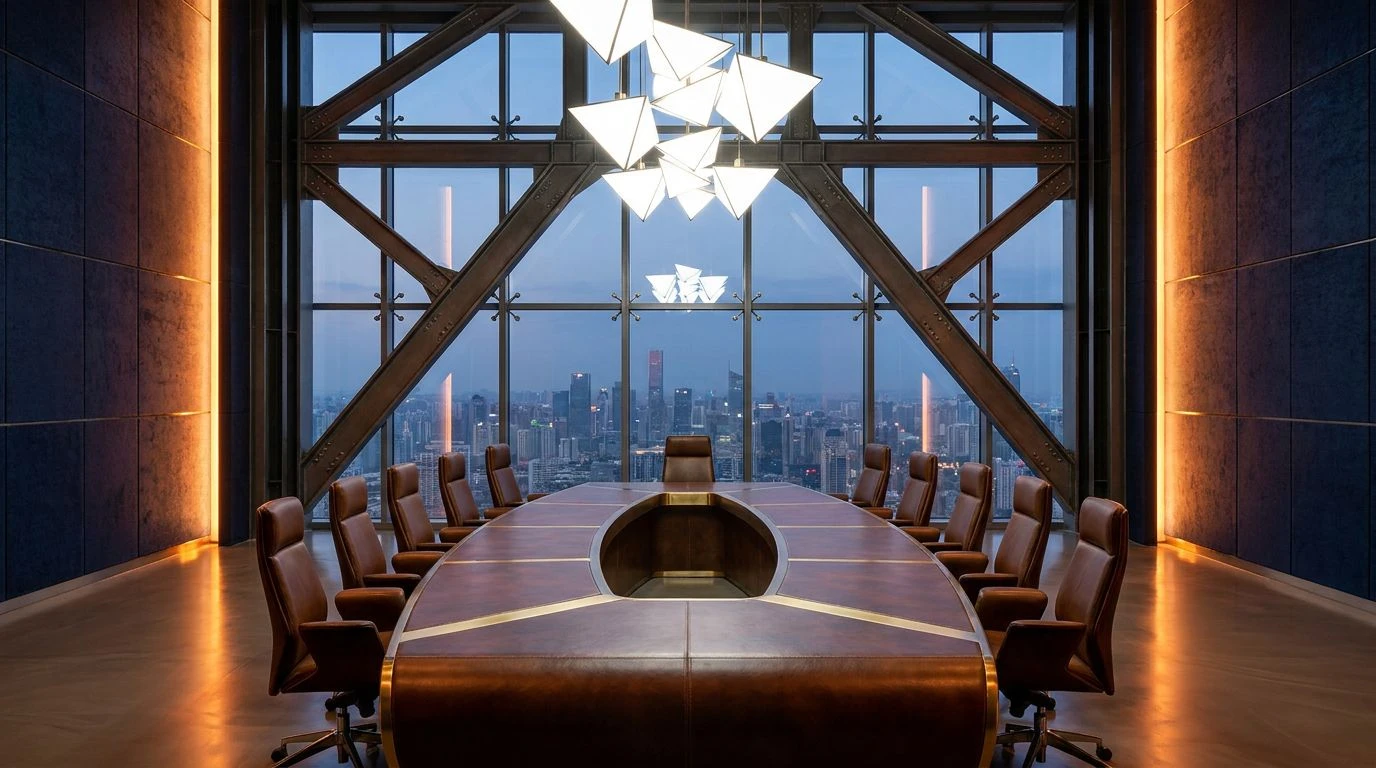
The Evidence Room paints the exact moment these two professions cross paths. Slate Ash sets a firm, uncompromising foundation, acting much like a stainless steel examination table or an empty layout grid. Against this severe backdrop, Acid Olive and Deep Moss introduce a sudden spark of life, bringing an organic texture that demands attention without feeling chaotic. The forensic mind requires strict order, which Carbon Black delivers through high contrast and sharp boundaries. Meanwhile, the designer finds inspiration in the quiet relief of Frosted Beaker and Lab Glass Teal, colors that cool down the heavy greens and provide visual resting points. This combination shapes an interior that feels highly regulated yet remarkably alive, suitable for spaces where intense concentration and meticulous drafting happen simultaneously. Every tone serves a strict purpose, balancing raw organic matter with sterile precision.
Drafting Table Shadows 📐
Moving into softer territory, Drafting Table Shadows strips the environment down to its barest functional requirements. The presence of Studio White and Kraft Paper mimics the physical materials shared by both disciplines, resembling the pristine surface of a fresh sketchpad or an untouched forensic report. Pine Ink steps in to anchor the space with an incredibly dark, grounded weight, substituting loud colors with quiet, professional authority. It acts alongside Graphite Dust and Cool Steel to build an atmosphere of pure logic and calculation. This arrangement is highly methodical, perfectly suited for an architectural studio or an investigative workspace where distractions are deliberately minimized. The aesthetic relies entirely on restraint, proving that you do not need bright flashes to create a compelling visual narrative. The cool metals and warm paper tones form a quiet dialogue, leaving the focus entirely on the work happening across the table.
Ultraviolet Analysis 🔦
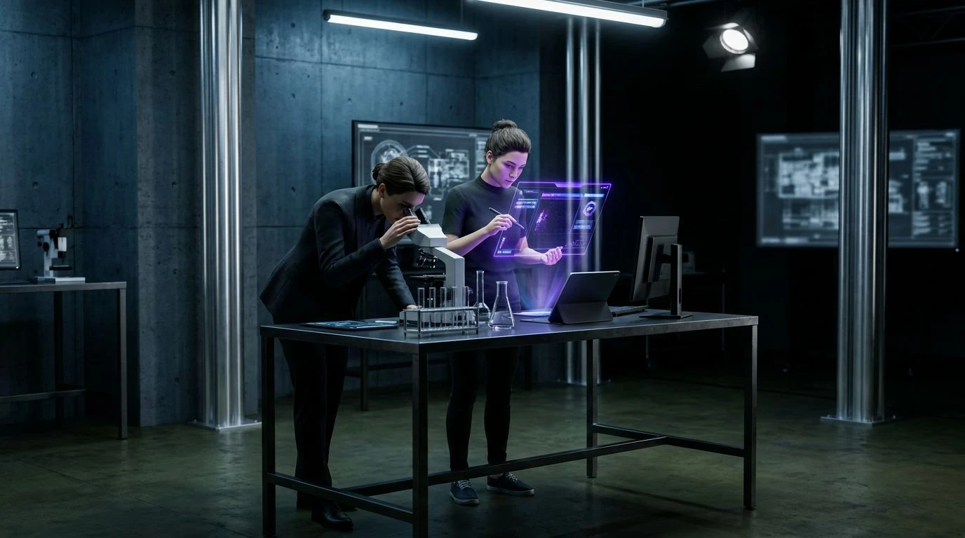
Ultraviolet Analysis takes a distinct shift toward the cool, calculating energy of a laboratory environment under specialized lighting. The sudden punch of Ultraviolet breaks through the otherwise subdued collection of industrial grays, mimicking the glow of a blacklight scanning for unseen details. This color acts as the graphic designer's unexpected accent against the forensic scientist's rigid backdrop of Iron Ore and Slate Blue. The transition from Pure White down to Pitch Black establishes a rigid grayscale spectrum, ensuring that visual hierarchy remains entirely intact. Designing a space or a brand identity with these tones creates a feeling of absolute precision and modern technology. It feels clean, sharp, and highly observational. The blues cool the temperature of the room significantly, demanding a professional posture and a focused mindset. It is an environment built for looking closer, where the sharp contrast reveals exactly what lies beneath the surface.
Crime Scene Tape 🚧
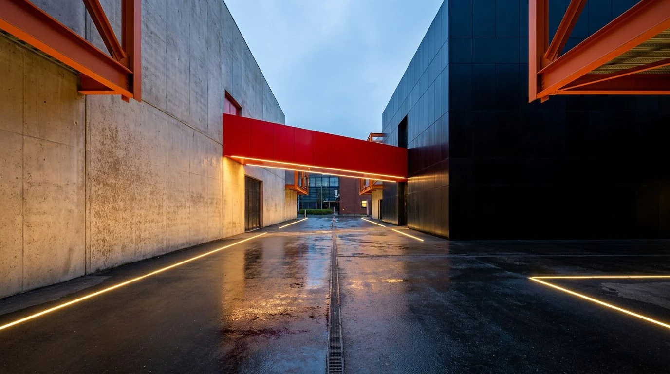
Sometimes, professional logic requires a bright warning signal. Crime Scene Tape introduces highly visible markers into a heavily structured gray environment. The foundation of Chalk White, Concrete, and Charcoal Gray provides a brutalist, strictly functional setting. These are the colors of city pavements and unpainted office walls. However, the designer introduces Safety Orange, Cyan Marker, and Cobalt Blue to guide the eye precisely where it needs to go. This reflects a shared need for clear communication, whether marking evidence at a scene or directing user flow through a complex digital interface. The bright colors act as data points on a graph, strictly placed for maximum visibility and comprehension. The result is an atmosphere that feels urgent but completely under control. It translates perfectly into industrial design or technical branding, where highly visible alerts must coexist with serious, heavy machinery or strict administrative protocols.
Archival Records 🗄️
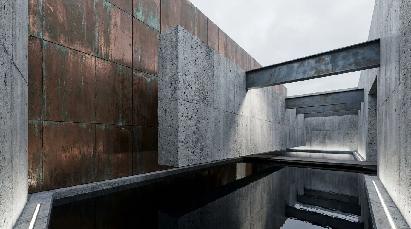
Archival Records grounds the intellectual exchange in history and documentation. The inclusion of Faded Rust warms up the otherwise clinical space, resembling aging folders, dried elements, or exposed brick in a renovated warehouse studio. Blueprint Blue serves as the connective tissue between the two professions, referencing both technical drafting and administrative case files. Surrounded by the strict boundaries of Archival White and Carbon Black, these mid-tones establish a deeply intellectual mood. Dark Steel and Silver Lead maintain the professional, unyielding standard required by both analytical minds. Using these colors in an interior or a print publication creates a sense of established authority and careful preservation. It feels less like an active scene and more like the quiet aftermath, where information is processed, categorized, and stored away. The colors speak to long hours of study, building a setting where logic is recorded permanently onto paper.
Stepping away from this conceptual room leaves a lasting impression of how seriously we process visual information. When rigorous science and calculated aesthetics share a table, the resulting atmosphere strips away all frivolity. The interaction between deep, grounding greens and sharp, analytical greys constructs an environment where nothing is accidental. Every shade performs a specific job, either anchoring the eye or guiding the mind toward a clear deduction. These collections demonstrate that professional spaces do not need to be sterile to be highly effective. By pairing heavy, rooted tones with cool, detached metals, designers can build settings that support intense intellectual labor while still feeling visually rich. The conversation between these disciplines ultimately proves that aesthetic choices carry real, functional weight.