Tactile Felt Texture and Deep Charcoal Design Palettes
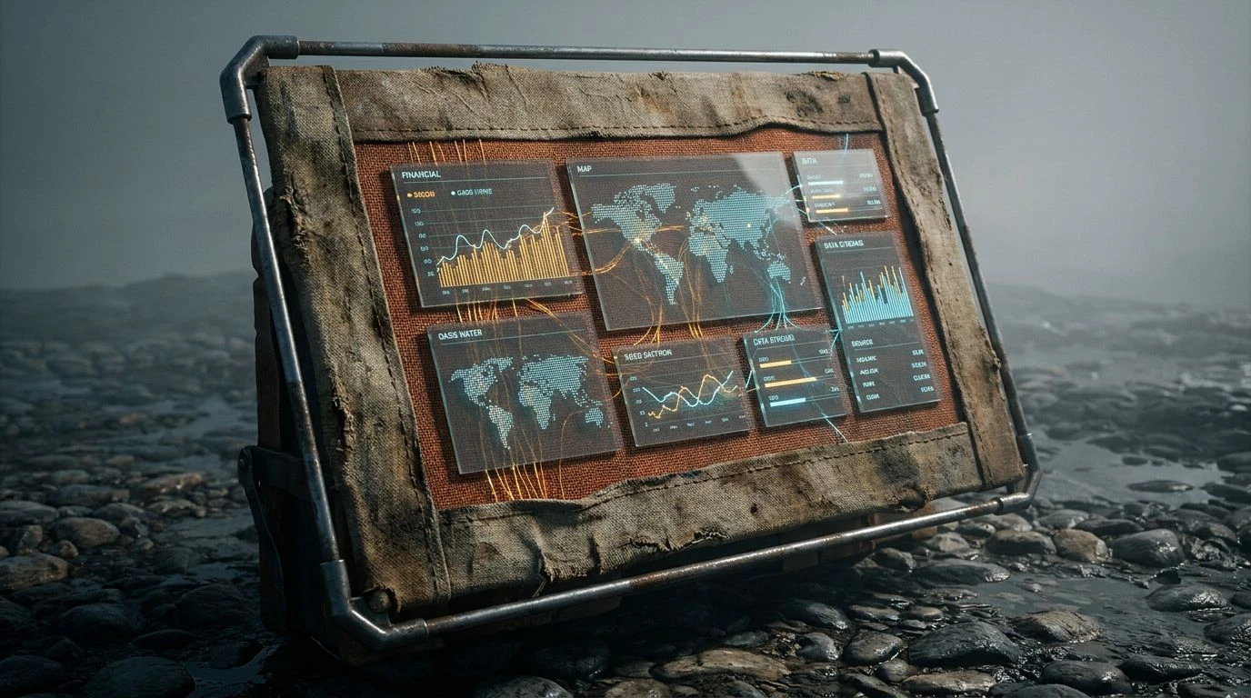
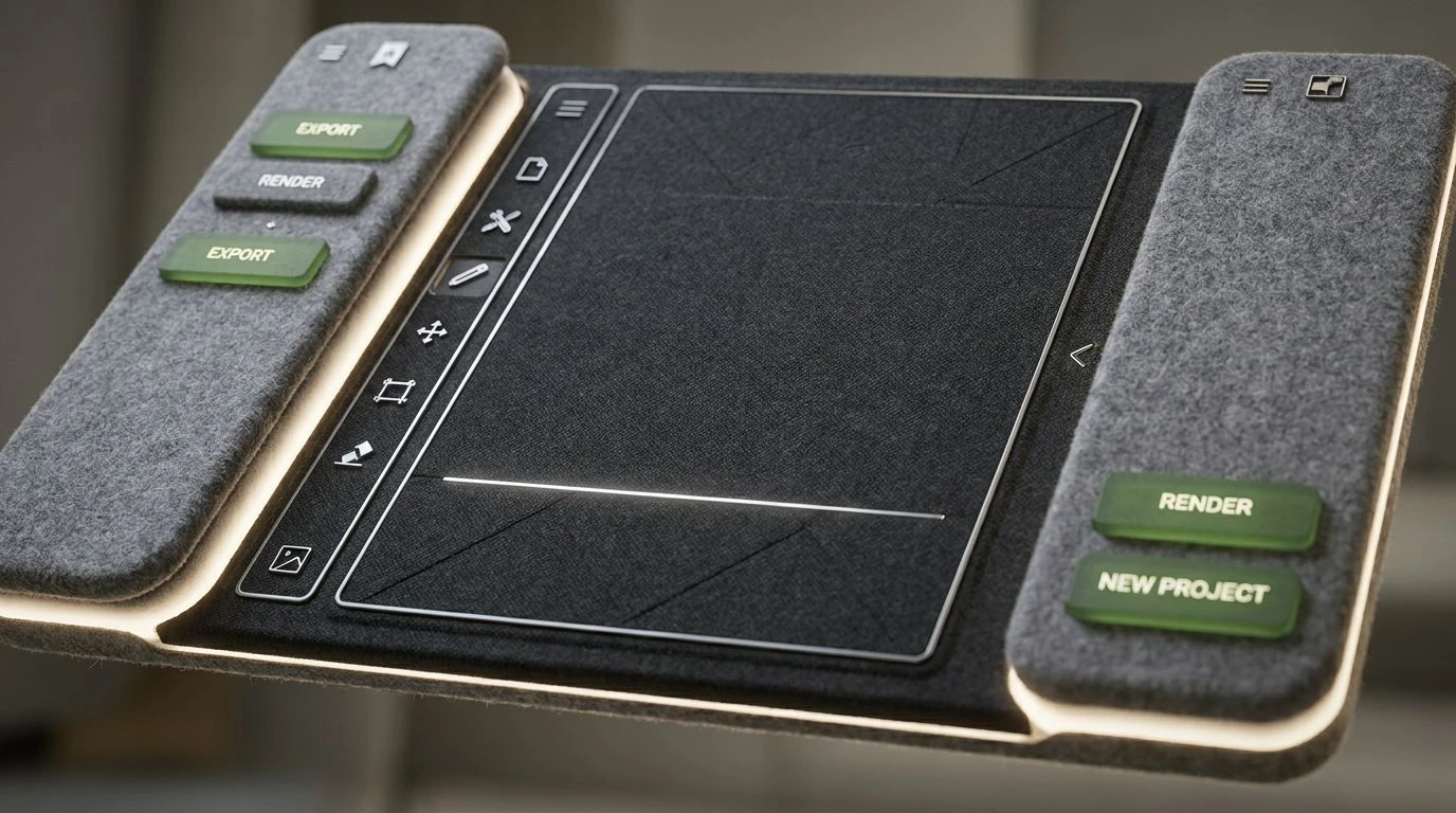
· 5 min readTranslating the physical warmth of acoustic felt into the digital realm offers a compelling approach to modern interface design. In physical workspaces, deep charcoal and heathered greys quiet the environment, absorbing noise and visually grounding the space. Applying this tactile softness to dark mode screens transforms how users interact with professional software. Instead of harsh blacks that create eye strain, introducing textural grays mimics the calming effect of pressed wool panels. This approach establishes a setting built for sustained focus and quiet productivity. By applying the visual weight and matte finish of felt to digital backgrounds, interfaces become less demanding and highly supportive of human attention, acting as a buffer against digital fatigue.
Studio Acoustics 🎙️
The Studio Acoustics palette draws a direct line between the tactile reality of soundproofing materials and digital workspaces. Graphite Shadow provides a solid, light-absorbing foundation that mimics the matte finish of heavy felt panels used in recording booths, minimizing screen glare and reducing visual fatigue. Pressed Ash and Heathered Steel offer soft, mid-tone transitions that prevent high-contrast eye strain, giving the interface a breathable, fibrous quality. To prevent the environment from feeling sterile or overly industrial, Acoustic Rust and Plum Velvet introduce calculated moments of warmth and depth. These saturated accents function like physical fabric tags or powder-coated aluminum fixtures in a thoughtfully planned office space, guiding the user's attention toward active states or primary buttons without breaking the quiet, concentrated atmosphere established by the darker slate backgrounds.
Botanical Boardroom 🌿
Botanical Boardroom captures the architectural trend of bringing natural elements into heavily structured environments. Woven Basalt serves as the primary dark mode surface, offering a gentle, off-black canvas that feels more like tailored wool than an empty digital void. This textural darkness pairs smoothly with Flannel Stone and Muted Silver, which can be applied to secondary panels, sidebars, or typography to maintain a low-fatigue reading experience. Crisp Paper cuts through the heavier tones to provide absolute clarity for essential data points or reading panels. The defining element is Moss Terrarium, a lively green that mimics indoor plants set against brutalist concrete or acoustic paneling. In an interface, this green directs focus with a refreshing vitality, signaling success states or notifications while maintaining the calm, grounded professional aesthetic required for deep work.
Midnight Fibers 🧵
Focusing on the cooler spectrum of workspace materials, Midnight Fibers applies the aesthetics of premium commercial upholstery to digital environments. Ink Void establishes an ultra-deep background, dropping the interface into a quiet, resting state, while Midnight Yarn and Slate Twill step up the visual hierarchy for active modules and navigation bars. These layered dark blues and greys mimic the depth of folded fabric, softening the harsh edges of traditional geometric layouts. Fogged Iron, Dusty Aluminum, and Heathered Frost supply a gradient of legible greys for typography, ensuring text feels gently printed onto the surface rather than backlit and glaring. Electric Cobalt slices through the muted surroundings with high-energy precision, acting as a vivid interactive marker for active tabs, hyperlinks, or loading indicators. This setup keeps the user anchored in a highly professional, trustworthy space while allowing for sharp, functional navigation.
Executive Contrast 📐
Executive Contrast introduces a mid-century architectural attitude to dark mode screens. Carbon Weave lays down an exceptionally dark yet matte foundation, functioning much like thick acoustic flooring that absorbs both light and distraction. Against this heavy, quiet base, Pumice Stone offers a smooth, reliable contrast for primary reading material, keeping the visual experience soft and highly legible. The character of the palette emerges through its highly specific accents. Terracotta Stitch and Leather Binding bring the tactile warmth of crafted furniture into the digital space, offering grounded options for warning states, charts, or secondary buttons. Oxidized Copper injects a cool, sharp energy, perfect for primary calls to action or progress bars. This specific arrangement of tones creates a workspace that feels highly tailored and deliberately constructed, offering users a sense of calm authority and structured navigation.
Tactile Workspace 🛋️
Tactile Workspace expands the tonal range of greys, prioritizing mid-tones to create a highly dimensional digital environment. Carbon Weave acts as the deepest shadow, grounding the layout, while Industrial Felt and Brushed Nickel form the primary structural components like sidebars, menus, and card backgrounds. Using these lighter, fuzzy greys mimics the physical layering of varying sound-absorbing materials in an open-plan studio. Set against this softer, highly textured backdrop, the bold accents take on a new character. Terracotta Stitch and Leather Binding provide rich, earthy contrast for data visualization or interactive toggles, standing out without blinding the user. Oxidized Copper serves as a striking, cool-toned indicator for live updates or primary navigation. The resulting interface feels incredibly approachable and materially rich, allowing professionals to navigate complex software comfortably over long periods.
Designing interfaces with the material qualities of acoustic felt introduces a necessary physical comfort to screen-based work. Softening harsh blacks into matte charcoals and heathered greys fundamentally changes how a digital space feels, moving away from high-glare exhaustion toward a quiet, focused calm. By selectively applying saturated accents, whether they mimic vibrant moss, oxidized metal, or tailored stitching, designers can build clear visual hierarchies that do not disrupt the peaceful foundation. This approach respects the user's attention, creating digital environments that look and perform like well-crafted, soundproofed physical rooms built for serious, uninterrupted focus.