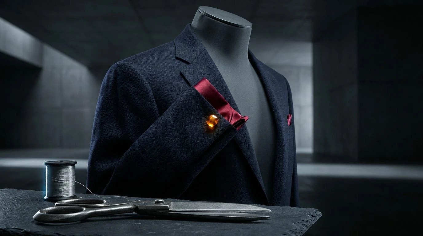
Mastering Navy and Charcoal Color Palettes for Authority
· 5 min readHuman color perception is intimately tied to our physiological understanding of weight, stability, and structure. When a master tailor selected deep navy and stark charcoal to construct a modern silhouette, they were actively manipulating fundamental optical rules. Darker, low-reflectance colors absorb ambient light, creating a visual density that the brain immediately interprets as grounded and secure. This optical reaction explains why the classic dark suit commands attention upon entering a room. Translated into a digital environment, this specific range of low-frequency hues constructs an architecture of absolute trust. The human eye is drawn to the high-contrast boundaries of these dark tones, processing them as sharp, precise, and mathematically organized. By dissecting this exact visual phenomenon, we can understand how authority and modern masculinity are visually coded, relying on the physics of light rather than mere cultural convention.
Tailored Precision 🪡
The visual field responds dramatically to sudden shifts in wavelength, a principle masterfully demonstrated in Tailored Precision. Here, the profound light-absorbing qualities of Obsidian Worsted and Deep Indigo establish a massive, unmoving foundation. Against this dark expanse, the high-frequency wavelengths of Vermilion Stitch and Brass Thimble strike the retina with startling intensity. This optical reaction mimics the physiological response to a perfectly placed pocket square or a hidden silk seam catching the light. The brain registers these bright flashes as signals of deliberate intent and precision, rather than mere decoration. In an interface, this arrangement directs user attention with surgical accuracy. The softer mid-tones of Burnished Brogue and Raw Silk serve as perceptual bridges, preventing visual fatigue. By balancing immense visual gravity with sharp, localized energetic bursts, this selection constructs an environment that feels both relentlessly disciplined and vividly alive.
Midnight Worsted 🧵
Monochromatic scales rely on luminance rather than hue to construct spatial depth, an optical trick clearly visible in Midnight Worsted. The human visual system processes the transition from the icy, highly reflective Silver Lapel down to the completely light-absorbent Abyssal Navy as a physical recession in space. This creates an interface that feels expansive and three-dimensional. As light bounces off the lighter Chambray Ice and Royal Oxford, it stimulates the short-wavelength cones in our eyes, triggering psychological associations with open skies and clear water. These physiological triggers reduce cognitive load, producing a state of focused calm. When applied to digital branding, this continuous spectrum of blue communicates unwavering reliability. The gradual step-down in brightness requires very little effort for the eye to track, establishing a fluid user experience that feels remarkably secure and mathematically precise.
Sartorial Blueprint 🧥
The precise interaction between dark blues and greys produces a unique optical tension, perfectly captured in Sartorial Blueprint. When Void Navy is placed adjacent to Charcoal Trench, the phenomenon of simultaneous contrast occurs. The eye struggles to immediately separate the two low-reflectance surfaces, forcing a closer, more deliberate inspection from the viewer. This requirement for focused attention translates psychologically into a perception of seriousness and high value. The cooler, structured greys like Ash Flannel and Graphite Tweed neutralize the visual field, absorbing excess glare from digital screens. Against this completely stabilized background, the distinct, concentrated wavelengths of Classic Cerulean and Prussian Twill emerge with quiet authority. This combination replicates the material weight of heavy wools and dense cottons on a flat monitor. The resulting digital environment feels physically heavy and structurally sound, commanding respect through pure optical density.
Bespoke Anatomy ✂️
Human vision is evolutionarily tuned to detect warm colors against neutral backgrounds, a survival mechanism cleverly exploited in Bespoke Anatomy. The dominant fields of Midnight Wool and Pewter Shears absorb the majority of ambient screen light, creating a calm, low-stimulation environment for the retina. Within this quiet visual space, the introduction of Amber Cufflink and Crimson Lining creates immediate, localized physiological arousal. The longer wavelengths of red and gold bypass the brain's passive scanning, demanding rapid processing. This mirrors the physical experience of unbuttoning a severe dark jacket to reveal a startlingly bright interior lining. In digital design, these powerful warm tones function as critical navigational landmarks, guiding the user through an otherwise austere landscape. By strictly limiting the presence of these highly active colors, the design maintains its absolute authority while ensuring that key interactions are impossible to ignore.
Authoritative Thread 👔
Trust in digital spaces is frequently mediated through our biological response to specific wavelengths, a concept thoroughly explored in Authoritative Thread. The human eye exhibits extraordinary sensitivity to the blue region of the visible spectrum. The gradual shift from the heavily saturated Sovereign Blue to the highly luminous Sky Poplin engages the visual cortex in a soothing pattern recognition exercise. Because blue light scatters easily, these colors mimic the natural optical scattering found in our atmosphere, triggering deeply ingrained feelings of safety and permanence. The mid-tones of Aegean Canvas and Maritime Twill provide the necessary contrast to maintain legibility without overwhelming the optic nerve. This specific range of light and dark blues avoids the severity of pure black, offering instead a deeply professional and accessible visual field. The resulting experience feels highly intelligent and carefully constructed, mirroring the exacting standards of a master craftsman.
The translation of physical tailoring into optical phenomena demonstrates the profound power of light and wavelength over human psychology. By analyzing the precise interaction of dark, light-absorbing foundations with targeted, high-frequency energetic bursts, we reveal the biological basis for visual authority. These carefully constructed visual fields do not merely decorate an interface; they actively manipulate the user's perception of space, weight, and structure. The strategic application of low-reflectance tones creates a measurable sense of physical stability on a flat screen, guiding the eye with deliberate intent. Ultimately, understanding the science behind these choices allows us to construct digital spaces that command the exact same respect and attention as a perfectly measured, masterfully cut garment.