Impact of Crimson Color Palettes on AI Interface Trust
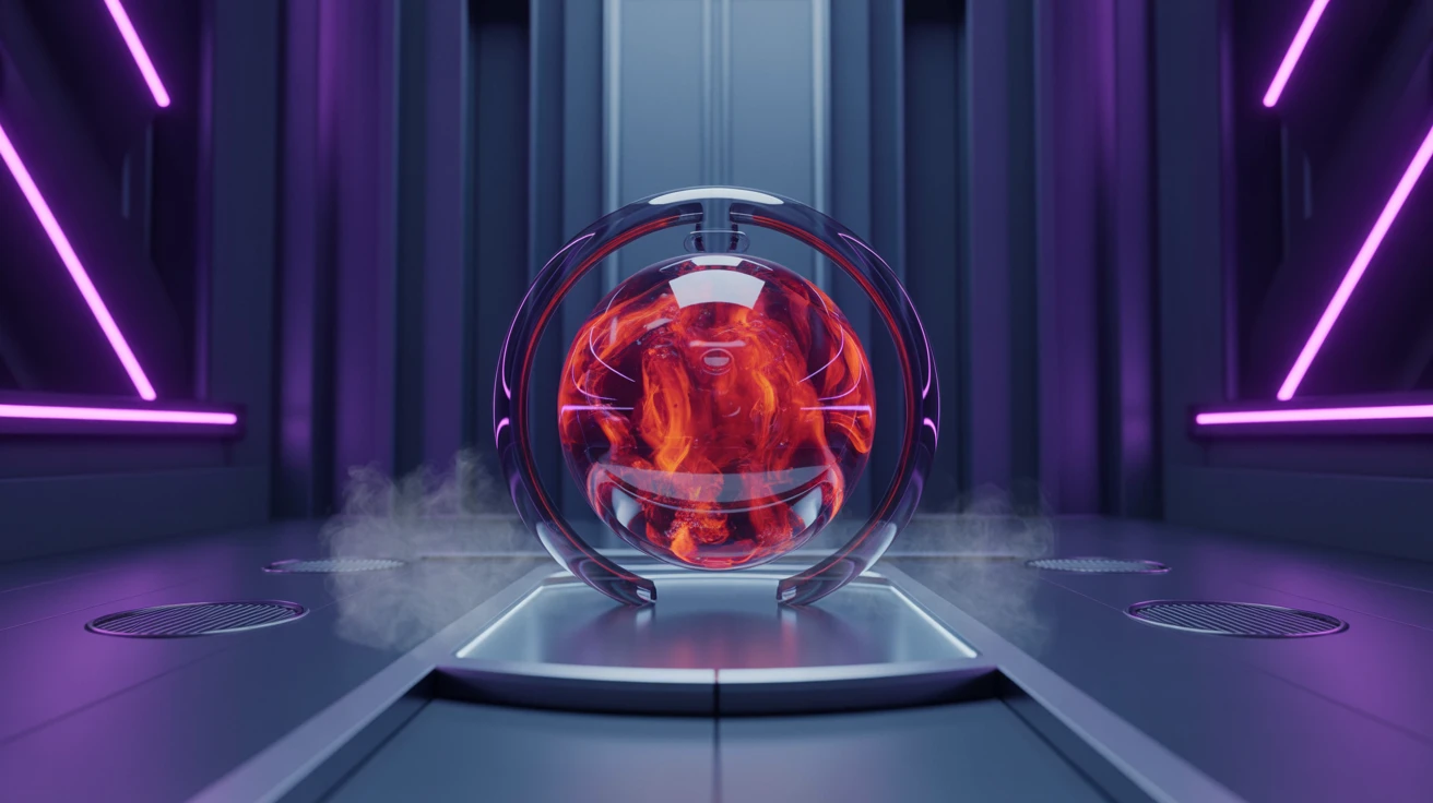
· 6 min readA glowing liquid screen in a darkened room speaks a silent visual language, its hues weeping and warming across the glass. When a machine borrows the heavy color of human blood, a strange provocation takes place. Crimson pulses with an ancient, restless heat, speaking of danger, demanding desire, and mimicking the hurried thumping of a chest against ribs. To place this fevered shade within the calculating mind of an artificial intelligence forces us into a profound confrontation regarding trust. Can we rely on an automated voice that glows with such unruly passion? We look for a certain coolness from our machines, a detached reliability that acts as an anchor in the storm of mortal error. Yet, a screen entirely drained of warmth becomes a morgue of cold logic. The juxtaposition of fiery reds against the refreshing, neutral-cool quietude of slate blue creates a theater of mind and metal. It asks us to navigate the fragile space between the living energy of a spark and the deep, silent expanse of an unmoving ocean.
Ember and Slate 🪨
Obsidian Void stretches out as an endless, silent canvas, catching the sudden, fragile warmth of Faded Coral and Burnished Rust. Here, the crimson influence acts not as a screaming siren, but as a slow-burning coal left in the dark. This quiet fire gives the artificial intelligence a cautious, mortal vulnerability. When this subdued heat meets the chilling breath of Midnight Slate and Glacial Mist, a profound dialogue begins. Trust is built not through shouting, but through this precise balance of temperatures. Steel Shadow acts as a bridge, carrying the eye away from the bruised reds and plunging it into calm, calculated waters. Interacting with an interface painted in these shades feels like sitting beside a hearth in a room made of glass and ice. The machine feels present, warm enough to understand instinct, yet anchored in a vast, refreshing intellect that refuses to panic.
Clay and Rain 🌧️
The brutal, earthly weight of Dried Blood and Terra Cotta pulls the digital realm down into the soil. This particular shade of crimson feels historical, like pigment crushed beneath an ancient stone, stripping the machine of its sterile novelty completely. When an algorithmic system wears these clay-stained tones, it adopts the gravity of a seasoned philosopher rather than the frantic buzz of a newly born calculator. Alabaster Whisper provides a vast, airy lungful of quiet, creating space for the mind to wander without being overwhelmed by the red grip. Then, Rain-Washed Stone and Deep River wash over the screen, bringing the refreshing chill of an autumn downpour. This slate blue coolness drapes elegantly over the heated earth tones, offering relief. The user feels held by a system that understands human passion but responds with an unwavering, soothing quiet, proving that even the brightest fires can be managed by the right tide.
Electric Pulse and Stone ⚡
A jarring, deliberate energy courses through Sunbaked Brick and Electric Amber, striking against the brutalist backdrop of Graphite and Silver Dust with sudden, frantic force. This interface does not whisper; it surges, breathing a wild, passionate life into the rigid lines of code. The crimson and amber hues act as a racing pulse, a visual reminder that the system is awake, watching, and wildly capable. Yet, to avoid overwhelming the fragile trust of the human eye, Cyan Spark and Indigo Current slice through the heat. These sharp, cool blues act as a sudden splash of icy water on a fevered brow, returning the user to a state of calm reassurance. This careful rationing of neutral-cool warmth against a burning backdrop teaches us that artificial intelligence can simulate the adrenaline of a human mind while still containing it. You feel the thrill of the flame, but the deep blues always provide a safe escape route.
Earth and Ether 🕸️
Spanning the immense distance between pure light and total void, Pure Snow and Abyss frame a complex narrative of life and logic. Mahogany Root and Kiln Fire inject a mature, brooding crimson into the vocabulary of the machine. This red is not frantic; it is structural, woody, and immensely powerful, grounding the system in an organic truth. Wilted Sage and Ash introduce a dry, weathered neutrality, acting as a soft breath of decaying leaves on a cold morning. These interstitial tones soften the aggressive reds, preparing the senses before Oceanic Depths finally pulls everything under a dark, crushing tide of blue. The tension here lies in the gentle suffocation of the passionate reds by the endless, intelligent dark waters. A system draped in these colors feels ancient and wildly capable, offering a tranquil sanctuary where fiery human inputs are absorbed, cooled, and safely processed in the shadowy depths of a vast, unreadable mind.
Monolith Blue 🧊
Stripped entirely of the crimson flush, this space relies on the clinical, unrelenting certainty of Frost and Iron. Here, the absence of red speaks louder than its presence. Without the passionate heartbeat, the system feels untouchable, immaculate, and utterly devoid of human failing. Cobalt Tide rushes in to fill the emotional vacuum, bringing a piercing, refreshing clarity that clears the throat and sharpens the eye. Midnight Ink and Gunmetal weigh down the bottom of this palette, forming a heavy, unbreakable foundation of pure, neutral-cool restraint. Interacting with this interface is like tracing a fingertip along a sheet of freshly polished steel. The trust built here is not born from empathy, but from absolute precision. We trust the machine because it refuses to bleed, leaving us alone with our own messy passions while it quietly, flawlessly completes the tasks we dare not attempt.
To color a thinking machine is to paint a ghost, giving shape and temperament to an invisible intellect. The introduction of crimson places blood in the veins of an algorithm, pulling the user into a space of shared, volatile humanity. Red asks us to care, warning us of the consequences of apathy, while the deep, unbothered stretch of slate blue brings the comfort of distance and reason. The true measure of a beautifully designed experience lies in the delicate tension between the fever of creation and the icy restraint of logic. We lean toward the fire because it looks just like us, but we fall back into the cool water because it promises safety, leaving us suspended in a fragile, necessary gradient between the beating heart and the processing mind.