Eclectic Color Palettes for Modern SaaS UI Design Guide
· 6 min readModern software design has fallen into a predictable rut, characterized by endless seas of clinical white space and reassuring corporate blues. It is a visual landscape designed not to offend, which inevitably means it fails to inspire. Yet, there is a growing appetite to disrupt this monotony by looking backward to the unruly, expressive aesthetics of the 1980s. Picture the promotional art for a late-night jazz festival from that era: unapologetically loud, throwing vibrant pink against deep teal, and daring to be interesting. Bringing this energy into a contemporary application interface is an exercise in balancing nostalgia with utility. The challenge lies in introducing these wildly eclectic colors while retaining the professional reliability users expect from their daily tools. By anchoring these electric hues with warm-leaning neutrals and thoughtful splashes of bright blue, designers can create interfaces that feel alive, proving that business software does not have to resemble a municipal spreadsheet.
Midnight Saxophone 🎷
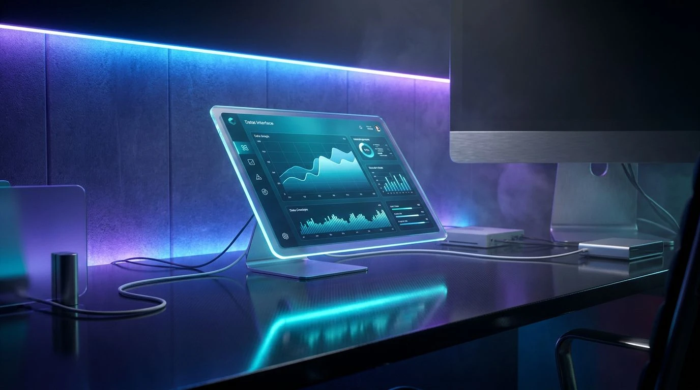
This selection captures the specific mood of a smoky downtown club at two in the morning, right as the headline act takes the stage. The tension between Electric Flamingo and Deep Ocean Teal brings an immediate, undeniable energy to an otherwise static interface. When applied to software, this tension creates a visual hierarchy that guides the eye effortlessly. The Frosted Cyan serves as a bright, optimistic counterweight, perfect for interactive elements or primary buttons, while Velvet Plum and Dusky Lilac provide a sophisticated background depth that prevents the brighter tones from overwhelming the user. It is a bold departure from standard enterprise styling, offering a surprisingly mature take on retro excess. Users navigating a dashboard bathed in these tones are greeted by an atmosphere of creative confidence. The interplay here suggests a product built for professionals who appreciate a bit of theatricality alongside their analytics, striking a delicate balance between artistic rebellion and functional clarity.
Neon Syncopation 📻
There is a restless, improvisational quality here that practically demands attention, reminiscent of album sleeves scattered across a record store floor. Acid Brass and Electric Lime clash gloriously with Synthwave Pink, delivering a jolt of pure adrenaline suited for onboarding screens or achievement states in an application. To prevent this visual loudmouth from becoming completely unreadable in a software environment, Midnight Indigo acts as the crucial anchor, offering a dark, legible backdrop for text and data tables. The Concrete Neutral steps in quietly, providing the warm-leaning breathing room necessary to process the surrounding chaos. This combination works brilliantly for creative platforms where users expect the tools to match their own imaginative output. Vintage Teal and Deep Crimson offer secondary accents that can highlight notifications or subtle status changes without competing with the primary action. The entire arrangement captures the unpredictable, freewheeling spirit of an improvised solo, packaged neatly for modern digital consumption.
Miami Brass 🌴
Transporting the aesthetic straight to a humid coastal evening, this grouping offers a slightly more relaxed interpretation of the retro jazz theme. The unexpected pairing of Coral Sunset and Mint Mojito feels distinctly out of a bygone era, yet remarkably fresh when applied to a modern user interface. Pure Vinyl provides the crisp, clean canvas required for data-heavy applications, ensuring that readability is never sacrificed for the sake of style. When Muted Ocean and Abyss Navy enter the fray, they bring the necessary corporate weight, signaling reliability and security. This specific balance is highly effective for financial or management tools that want to shed their traditionally stuffy exteriors. A sidebar rendered in Abyss Navy with Coral Sunset alert badges communicates professionalism while sneaking in a playful wink. The overall effect is both breezy and structured, proving that enterprise tools can possess a distinct personality without resorting to gimmicks, inviting users into a space that feels both efficient and effortlessly cool.
Studio Session 🎙️
Sometimes the most powerful statements are made by stripping away the excess and focusing entirely on rhythm and contrast. This collection leans heavily into the cooler side of the spectrum, with Electric Cyan providing the sharp, piercing note that cuts through the mix. Deep Groove Teal offers a rich, resonant mid-tone, ideal for navigation bars or active states, while Carbon Shadow delivers an incredibly sharp contrast for typography. The presence of Studio Slate and Crisp Ice introduces the warm-leaning neutral territory needed to keep the eyes rested during long hours of screen time. In a digital product, this arrangement speaks to an audience that values precision and speed, wrapped in an undeniably retro-futuristic shell. It feels like stepping into a high-end recording studio from decades past, where every button and slider has a distinct, tactile purpose. By keeping the brighter flashes contained to the cyan and teal spectrum, the interface maintains an air of serious intent, allowing the user to focus on their work while still enjoying a visually rich environment.
Vinyl Archive 💽
Grounding the loud aesthetics of the era with a decidedly earthy, analog warmth, this combination feels like flipping through crates of classic records. The pairing of Golden Marigold and Brass Trumpet introduces a brassy, acoustic warmth that stands in stark opposition to typical tech industry color schemes. When placed next to the sharp, authoritative presence of Classic Teal, the contrast is both startling and inviting. Bright Canvas ensures the interface remains open and legible, while Dusty Rose serves as an unexpectedly sophisticated neutral for borders and empty states. Obsidian Green acts as the heavy bassline, providing a striking alternative to standard black text. This styling is wonderfully suited for productivity tools or writing applications where creating a comfortable, focused atmosphere is paramount. It manages to capture the soulful, tactile quality of analog media while delivering the crisp, instantaneous feedback required by contemporary software, creating a digital space that users will actually want to spend time in.
Breaking away from the safe, sanitized norms of corporate software design requires a certain degree of bravery, but the visual payoff is immense. By borrowing the unapologetic vibrancy of vintage gig posters, designers can craft digital environments that actually possess a pulse. The trick is always proportion. A shock of electric pink or an unexpected mint green can transform a mundane dashboard into an engaging workspace, provided they are anchored by thoughtful neutrals and deep, serious tones. These color strategies demonstrate that professional tools do not have to be entirely devoid of joy or personality to be taken seriously. Instead, they offer a blueprint for building interfaces that treat users as creative individuals rather than mere data processors, leaving us with software that is not only highly functional but genuinely a pleasure to look at.