Gold and Slate Brutalist Design Color Palettes for Decor
· 5 min readStepping into an abandoned brutalist structure often feels like walking into a massive, poured-concrete tomb. When that space is a library, the heaviness of the architecture meets the weight of stored human knowledge. Designing for this specific intersection requires an understanding of how raw materials interact with quiet intellectualism. Gold accents naturally draw the eye, signaling value and history, while slate blues drop the temperature, grounding the space in austere stillness. It is a balancing act between the stark reality of exposed structural elements and the warm, quiet dignity of a reading room left untouched for decades. Here, color acts as both the raw construction material and the intellectual atmosphere, transforming empty spatial volumes into places of profound contemplation.
Hushed Archives 🏛️
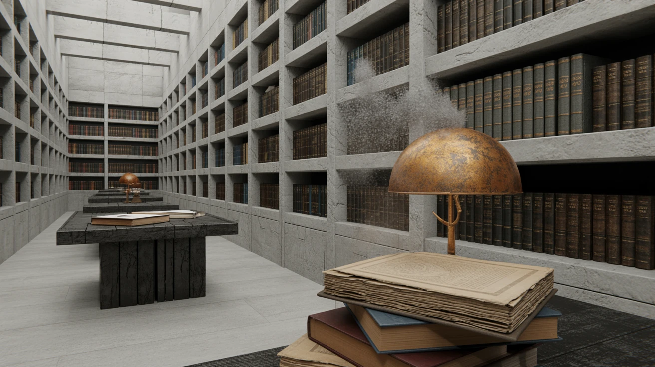
This selection captures the exact moment morning light hits a dust-covered reading desk. The interaction between Gilded Ash and Antique Brass introduces a metallic warmth against the structural coldness of Concrete Dust, capturing a tactile tension common in preservation-focused design. Frosted Vellum acts as a breathable void, preventing the heavier earth-bound tones from feeling oppressive. When applied to spatial design, this collection of tones works beautifully in areas where quiet luxury meets raw materiality. Oxidized Bronze grounds the lower visual field, functioning the way a heavy metal baseplate anchors a delicate glass partition. It feels serious and heavily rooted in architectural brutalism, yet retains a gentle, almost literary warmth that prevents the atmosphere from tipping into complete industrial detachment.
Structural Volumes 📚
Moving deeper into the stacks, the atmosphere grows noticeably cooler and more commanding. Midnight Blueprint and Beaten Lead create a formidable foundation, recalling vast stretches of poured-in-place concrete and shadow-drenched corridors. The strict discipline of Pure Titanium and Obsidian Shadow provides a high-contrast architectural framing, much like black steel mullions cutting across a stark white ceiling. To keep the space from feeling entirely sterile, Terracotta Clay and Walnut Veneer introduce a grounded, earthen texture reminiscent of vintage leather bindings and aged wooden shelving. Lichen Spore adds a faint organic whisper, suggesting moss creeping up a forgotten exterior wall. Using this precise array of shades allows designers to construct a visual narrative rooted in unyielding permanence, perfect for environments demanding both intellectual rigor and physical stability.
Monolithic Silence 🪨
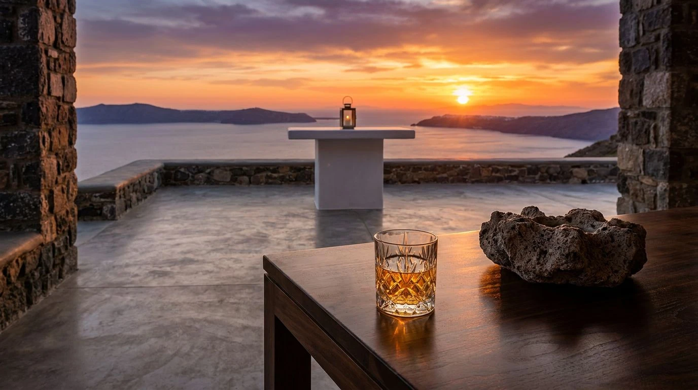
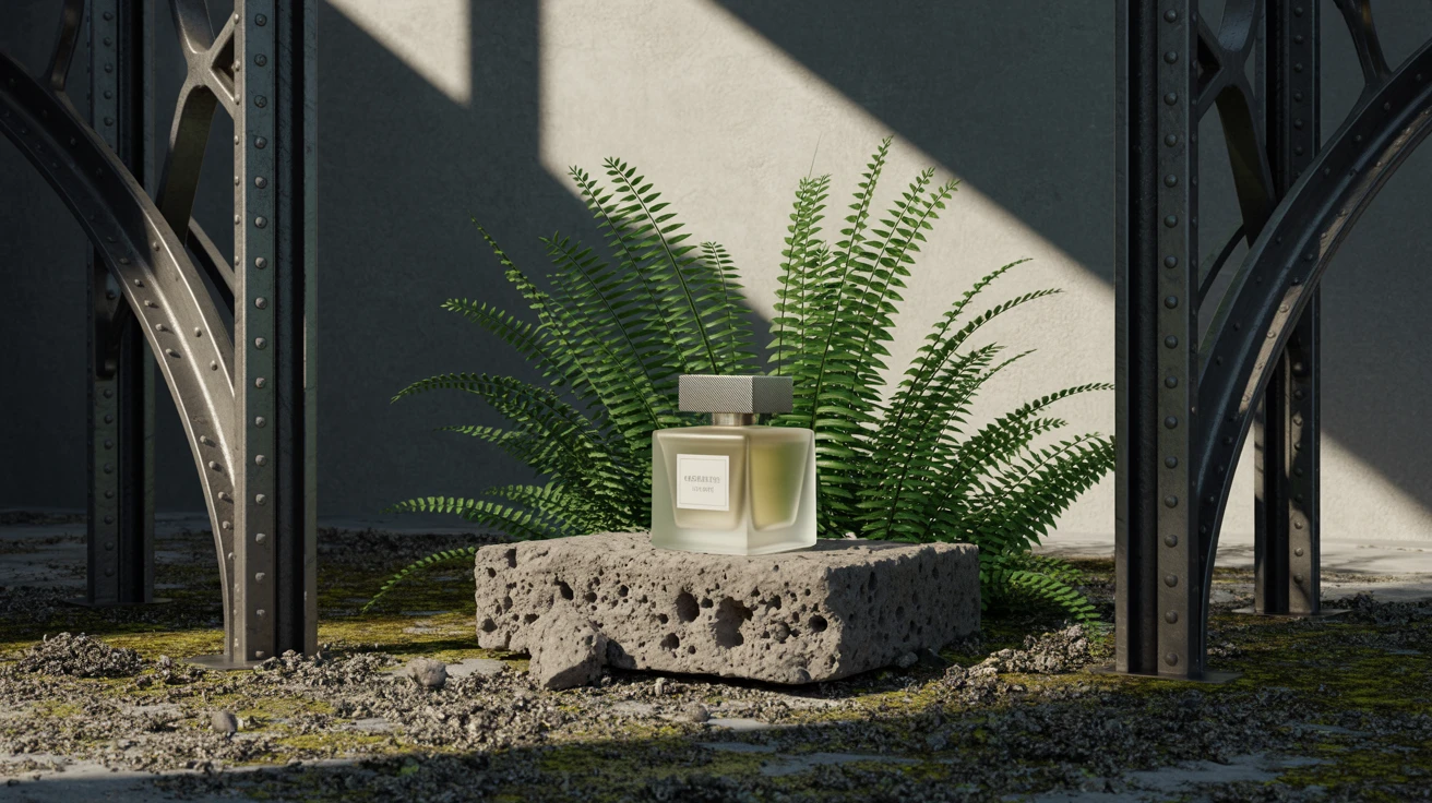
There is an undeniable gravity to finding Burnished Brass glowing faintly against the muted backdrop of Weathered Steel Blue. This combination thrives on the contrast between luxury and decay, an aesthetic highly visible in adaptive reuse projects where modern fixtures meet historic ruins. The heavy, unchanging presence of Void anchors the layout, establishing sharp boundaries and defining spatial depth. Limestone Plinth provides a vast, highly textured canvas over which the rest of the colors play, mimicking the pockmarked surfaces of exposed aggregate. Mossy Aggregate and Faded Brick offer a distinct connection to the earth, recalling neglected courtyards holding out against encroaching nature. Applied to interior spaces, these tones create a deeply introspective environment, ideal for zones designed around solitary focus and the slow, deliberate processing of information.
Forgotten Periodicals 🕰️
The tactile sensation of handling old archives finds visual equivalent in this specific selection of tones. Gilded Lettering and Tarnished Ochre bring a distinct, aged richness that immediately reads as old-world wealth, yet they are reined in by the sobering chill of Denim Binding. This cool blue acts as an architectural counterweight, pulling the warmer tones out of the realm of pure nostalgia and situating them in a rigid, structural context. Charred Timber sets a decisive floor, making every other color appear brighter and more intentional by comparison. Yellowed Page and Pumice Stone serve as the plaster and paper, acting as the fragile, human elements resting within the brutalist shell. This particular set thrives in editorial design and physical publishing, offering a grounded, highly legible aesthetic that feels both permanently settled and incredibly sophisticated.
Cantilevered Intellect 📐
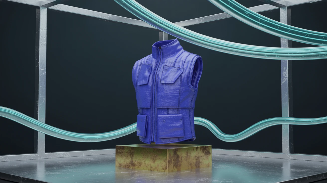
Bold geometric forms and heavy materials dictate the mood here. Structural Cyan acts as the dominant cooling force, injecting an industrial, almost clinical precision into the visual field. Against this striking blue, Sunlit Anodized Gold and Corten Steel introduce sudden flashes of raw material warmth, similar to brass fittings embedded in a heavily weathered facade. Basalt Rock provides the necessary darkness to let these contrasting elements pop, anchoring the scene with undeniable weight. Exposed Aggregate and Frosted Glass act as acoustic dampening materials in an echoing room, softening the harsh edges of the heavier tones. Translating these shades into furniture or spatial layout yields extremely confident results, pairing the severity of mid-century brutalism with an intellectual sharpness that refuses to become lost in the background.
Navigating these palettes is akin to mapping a forgotten architectural layout. The metallic flashes provide necessary navigation clues through heavy, shadowed spaces, while the cool blue tones mimic the stark reality of stone and steel. By balancing earthen warmth against industrial cold, these selections offer a highly functional language for spatial and graphic designers alike. The resulting visual systems allow creators to build environments that feel permanent, deliberate, and fiercely intelligent, ensuring the raw material weight never crushes the sophisticated quiet necessary for deep thought.