Royal Blue Color Palettes: Industrial Zen Design Guide
· 5 min readThe intersection of heavy industrial labor and quiet introspection seems unlikely until you examine the visual language that connects them. High-visibility gear is designed to trigger an immediate, life-saving alert, using piercing yellows and deep royal blues to cut through cement structures and heavy machinery. Yet, by turning down the surrounding visual noise, these same aggressive pigments shift dramatically in purpose. When stripped of their hectic context and applied to tactile, thoughtful materials, the stark optic contrast of a royal blue safety vest transitions from a frantic warning into a focal point for deeper meditation. This visual recalibration transforms the utilitarian language of the construction site into spaces and garments optimized for mental stillness. It asks a compelling question about how we process intense colors: can the exact tones that shout at us to pay attention also teach us how to sit perfectly still?
Industrial Zen 🧘♂️
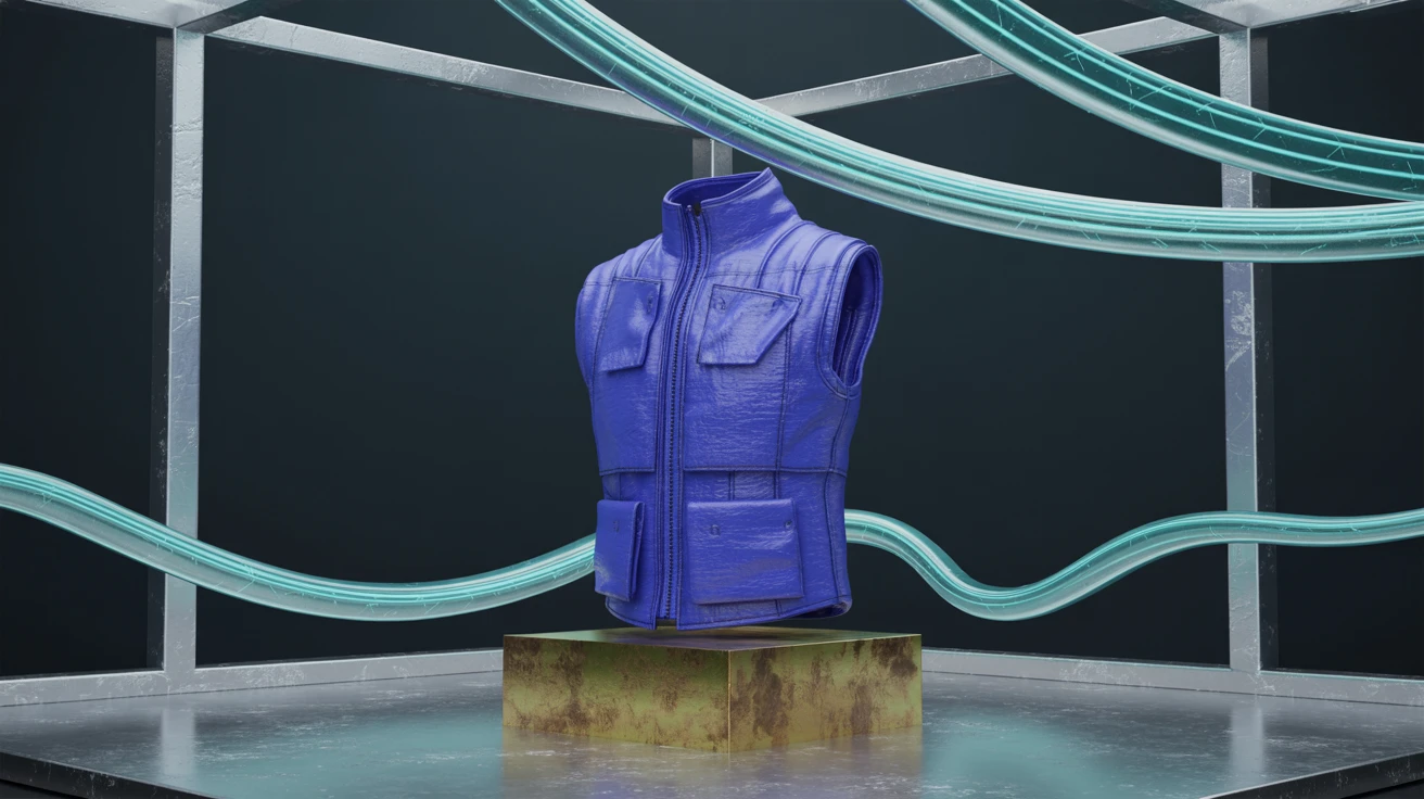
The crossover between construction sites and quiet reflection finds an anchor in Industrial Zen. This selection grounds electric royal blues with the weighted presence of cool grey steel and a tarnished brass tone native to heavy machinery. By taking the aggressive edge off high-visibility gear, the bright blues act as focal points rather than alarms. Visualizing a garment crafted from heavy cotton canvas dyed in deep abyss tones, offset by bright azure reflective piping, demonstrates how functional workwear softens into quiet contemplation. The grey absorbs the frenetic energy typically associated with roadside labor, transforming a strictly utilitarian aesthetic into a minimalist sanctuary. The result is a space or object that supports focus and calm, turning a high-urgency context into a place for steady, rhythmic breathing.
Meditative Infrastructure 🏗️
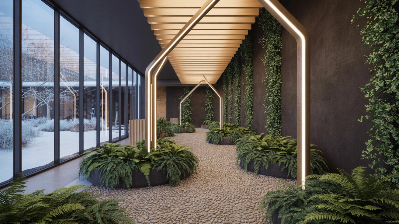
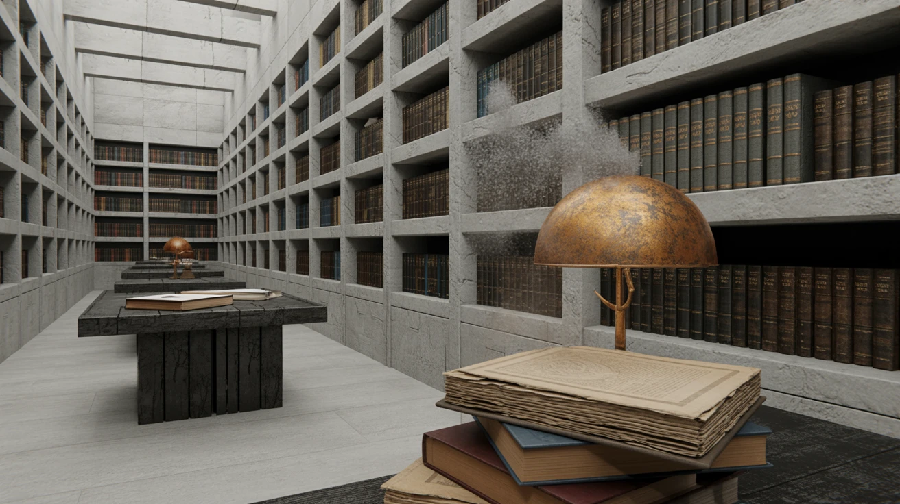
Translating heavy industry into quiet minimalism relies on stripping away visual noise, a technique mastered by Meditative Infrastructure. Here, the traditional high-alert warning colors cool down dramatically into muted factory navys and light oxidized aluminum shades. Instead of shouting for attention, these colors guide navigation softly, reminiscent of clean architectural spaces and raw concrete shadows. A vast warehouse bathed in bleached frost daylight creates an atmosphere akin to a modern monastery. The dark carbon void grounds the lighter, airier blues, providing a solid foundation that prevents the combination from floating away completely. It proves that functional spaces do not need to rely on screaming contrasts to be safe; rather, a calm, calculated tonal shift can instill both awareness and deep, restorative peace in environments built for physical labor.
High-Vis Altar 🕯️
High-Vis Altar introduces surprising warmth to the usually austere world of safety equipment. The startling interruption of dried clay and faded rose against standard hazard yellow recalibrates our expectation of utility wear. When paired with bright stratosphere blue and midnight asphalt, the yellow shifts from a warning sign to a glowing, almost spiritual light source. This specific combination draws a line between heavy industrial scaffolding and the stained glass windows of modernist chapels. Applying this to object design or textile production means playing with texture, perhaps crossing an industrial ripstop nylon with a soft, brushed wool. The iron cladding and scaffolding greys temper the warmer extremes, pulling everything into a composed, grounded state that provokes quiet observation rather than a flight-or-fight response to danger.
Factory Enlightenment ⚙️
Bridging the gap between a frantic production floor and a quiet personal retreat demands careful balancing, something Factory Enlightenment achieves through crisp contrasts. True royal blues and sudden flashes of emergency crimson interrupt a landscape of cement dust and pitch black. The presence of these vibrant industrial pigments traditionally signals caution, but when arranged against calming clear sky and cyan elements, their urgency diffuses. They transform into objects for quiet visual meditation. Imagine a heavy-duty work jacket dyed in deep royal, detailed with just a sliver of bright crimson and safety mustard; it feels less like a uniform for physical labor and more like a carefully considered garment for quiet grounding. The neutral greys absorb the shock of the brilliant hues, allowing the high-visibility colors to exist peacefully within a domestic or quiet architectural context.
Contemplative Workwear 🚧
Contemplative Workwear tackles the paradox of making fluorescent tones feel tranquil. The electric vibration of luminous sulfur sits comfortably next to a deep, heavy cobalt, creating an optic tension that eventually settles into a steady, hypnotic rhythm. Grounded by utility grey and brick dust, the extreme ends of the spectrum lose their aggressive edge. This selection mimics the atmosphere of a quiet construction site before dawn, where neon vests and heavy machinery reflect the early morning light in a way that feels almost poetic. In contemporary fashion or interior staging, pairing that intense cobalt with muted iris and graphite grit allows the eye to rest, completely reframing high-alert colors as tools for focus. The jarring neon becomes a gentle awakening, a beacon that guides the mind inward rather than demanding immediate exterior action.
Redefining the boundaries of functional design requires a willingness to observe familiar objects from a completely new perspective. Taking the sharp, alerting combinations of royal blue and safety yellow out of their industrial habitats reveals an unexpected capacity for quiet grounding. These selections prove that intense high-visibility pigments do not always equate to noise; under the right conditions, they provide a resting place for the wandering eye. We are left looking at the daily theater of roadside construction and warehouse logistics in a distinctly altered light. The visual triggers that keep workers safe hold an equally powerful potential to center our minds, proving that true utility might just lie in bringing a sense of profound calm to environments usually defined by urgency and chaos.