Lavender and Sage Color Palettes for Brutalist Design
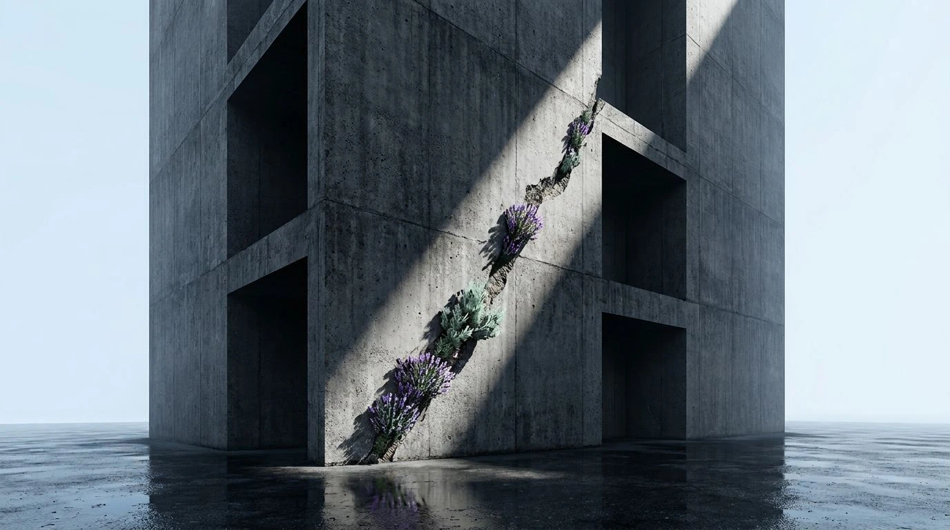
· 6 min readWe build fortresses of slate gray and steel blue to shield ourselves from the elements, erecting monuments of heavy geometry that dominate the skyline with uncompromising severity. Brutalist architecture demands attention, standing as an unapologetic testament to human engineering and raw material strength. Yet, within these towering walls of poured concrete, the human spirit starves for something tender. The starkness of industrial design longs for the quiet interruption of organic life. Introducing the gentle breath of pale violet and muted green transforms these imposing structures, offering a necessary vulnerability. A sprig of lavender resting on a cinderblock, or wild sage creeping through a crack in the pavement, creates a visual dialogue between the manufactured and the grown. This tension between monumental weight and fragile flora shapes a space where we can finally breathe.
Concrete Petals 🥀
Staring at Concrete Petals is like standing before a vast, unyielding wall of Iron Shadow and Weathered Slate, only to discover a fragile bud pushing its way through the mortar. The monumental weight of Maritime Steel anchors the visual experience, dragging the eye down into the deep, quiet isolation of Midnight Void. Yet, a sudden flash of Terracotta Dust warms the starkness, acting as an earthy counterpart to the creeping vines of unseen sage that soften the surrounding brutalism. Alabaster Frost provides a much-needed gasp of air amidst the claustrophobia of heavy construction. We witness a landscape where the coldness of structural engineering yields to the poetry of slow, botanical decay. A room dressed in these tones feels protective rather than oppressive, trading the harshness of a bunker for the quiet dignity of an overgrown ruin. The relationship between the earthen clay and the industrial gray mimics the very act of nature reclaiming the city block by block.
Overgrown Atrium 🌿
Overgrown Atrium paints the exact moment when the forest devours the factory. The unyielding austerity of Industrial Ash and the heavy, melancholic depths of Deep Ocean Blueprint establish a foundation of raw, unpolished concrete. This industrial weight feels almost too vast to comprehend until the eye catches the climbing tendrils of Wild Sage spreading across the rigid columns. This muted green breathes life into the Pitch darkness, turning a sterile space into a thriving greenhouse. The sudden, earthen warmth of Sunbaked Clay and Wet Bark grounds the soaring metallic tones, reminding us that every towering skyscraper ultimately rests upon the soil. Striking a perfect equilibrium, Chalk White filters through the heavy canopy like afternoon light through a skylight. Utilizing these colors inside a brutalist space invites the outdoors in, transforming a cavernous, intimidating hall into a sanctuary of quiet growth and unexpected botanical triumph.
Urban Wildflower 🏙️
Walking through the tones of Urban Wildflower is akin to finding an impossible blossom surviving on the shoulder of a busy highway. The crushing, monochromatic reality of Storm Bunker and Wet Pavement sets a scene of endless city grit, wrapped in the absolute darkness of Onyx. Suddenly, Azure Beam pierces the gloom like a pane of glass reflecting a clear sky amidst the smog. The true surprise lies in the vivid streak of Crushed Petal, a sudden, urgent splash of floral life that fights against the heavy Ghosted Cement. This brilliant red-pink acts as a defiant scream of nature within an artificial wasteland, working alongside the pale lavender and sage themes of softening hard edges. Winter Air provides the necessary atmospheric distance, separating the heavy masonry from the delicate blooms. Applied to an interior, this palette tells a story of survival, offering flashes of vibrant botanical energy that refuse to be buried beneath slabs of poured gray.
Brutalist Bloom 🌸
Brutalist Bloom captures the quiet poetry of a forgotten courtyard where shadows stretch long over cracked paving stones. The heavy, sorrowful gaze of Abyssal Blue and Slate Shingle mirrors the imposing facades of modernist block housing, threatening to swallow the light entirely. Yet, drifting through the Morning Fog comes the delicate, pale touch of Iced Lilac, a color so fragile it seems almost out of place against the structural might of the dark blues. This gentle floral tone acts as a cooling breeze across warm concrete, easing the aggressive posture of the architecture. Deepening the story, Bruised Rose sits quietly in the corner, offering a melancholic, organic warmth that bridges the gap between the manufactured and the natural. We feel the heavy silence of the city briefly interrupted by the scent of rain-soaked petals. Designing a space with these shades invites a solemn, meditative calm, replacing intimidation with a profound sense of quietude.
Steel Blue Solace 🕊️
The colors of Steel Blue Solace sing a song of vast, echoing corridors and soaring vaulted ceilings. Charcoal Vault and Gunmetal build the heavy, impenetrable walls of a modern fortress, demanding absolute quiet from anyone who enters. Clouded Chrome stretches across the ceiling, capturing the dull sheen of industrial materials left exposed to the elements. Against this oppressive weight, Electric Indigo cuts through the space like a neon sign flickering to life in a deserted alleyway, a striking contrast to the muted sage and lavender elements found elsewhere in our architectural exploration. Porcelain acts as a blank canvas, giving the eye a place to rest when the heavy metals become too loud. Bringing these tones together creates a room that feels both intensely private and surprisingly expansive. The metallic blues and grays provide the structure, while the stark white and brilliant indigo provide the necessary oxygen to keep the space from closing in on itself entirely.
The dialogue between poured concrete and fragile petals speaks to a deeper human necessity for contrast. We construct monumental, unyielding shelters to protect ourselves, yet we instinctively reach for pale blossoms and trailing vines to remind us of the living world outside those walls. The heavy slate and deep blue tones offer security and permanence, anchoring us in space. By inviting tender violet and quiet sage into these severe environments, we create rooms that hold us without crushing us. This visual tension allows the architecture to maintain its dignified strength while offering a softer place to land, proving that even the most formidable structures can shelter something deeply delicate.