Industrial Color Palettes for Functional Garden App Design
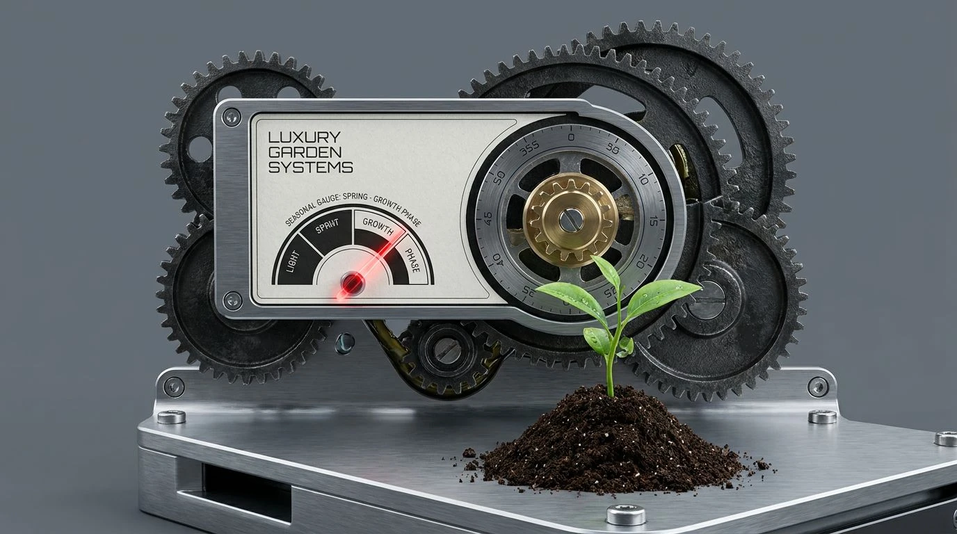
· 6 min readThere is a curious disconnect in how we design software for growing things. Most horticultural applications lean heavily into pastoral sentiment, offering soft pastel vegetables and whimsical typography that suggest a child's storybook rather than the muddy, demanding reality of a backyard greenhouse. Real cultivation demands strict precision. It relies on sharp shears, exact soil temperatures, and unforgiving seasonal timelines. Treating a gardening interface with the mechanical rigor of a luxury chronograph makes a peculiar kind of sense. By pairing cold, high-function industrial slates with the organic textures of soil and foliage, we find a visual language built on practicality rather than romance. This approach relies on crisp legibility, where high-visibility accents typically found on safety equipment strike through sober, metallic backgrounds, ensuring absolute focus when your hands are covered in potting dust.
Chronograph & Clay ⏱️
Chronograph & Clay pits absolute starkness against earthen warmth, delivering a surprisingly tactile experience. The collision of Obsidian Black and Stark White provides the necessary contrast to read a screen under blinding mid-July sunlight, acting much like the luminous hands on a pilot's timepiece. Against this austere metallic backdrop, Warning Orange leaps off the display, directing the eye toward immediate tasks like watering alerts or frost warnings. It mimics the high-visibility tags on heavy agricultural machinery, ensuring urgent notifications are entirely unavoidable. Machined Blue and Gunmetal Shell lower the visual temperature, offering calm, recessed zones for reading passive data such as humidity charts or barometric pressure. The unexpected dash of Terracotta Dust grounds this highly mechanical interface, pulling the mind back from the sterile laboratory and into the rich, baked soil of a late summer garden. The entire arrangement keeps the user anchored in utility, cutting through distractions with a remarkably crisp, legible hierarchy.
Botanical Calibration 🧭
Botanical Calibration reads like the dashboard of an expensive tractor or the dial of a vintage field compass. It relies heavily on middle values, utilizing Primer Grey and Zinc Plate to create a quiet, non-distracting canvas where information can live comfortably. When developing an interface meant to map out greenhouse crop rotation, this neutral expanse prevents eye fatigue during long planning sessions. Hazard Red operates as the singular shock to the system, acting exactly like the red-tipped second hand on a mechanical dial. It signals the time-sensitive nature of pruning schedules or harvest windows, demanding immediate action without overwhelming the broader visual field. The inclusion of Brass Pinion adds a sudden, metallic warmth, suggesting the oiled gears of vintage pruning shears or an antique pressure gauge, while Forged Iron anchors the bottom of the screen with serious, heavy contrast. It is an aesthetic built for people who view cultivation as an exact science rather than a weekend hobby, requiring tools that look as capable as the gardener feels.
Greenhouse Machining ⚙️
For those who prefer their information pared back to the absolute minimum, Greenhouse Machining offers a masterclass in quiet utility. Stripping away the louder alarm tones common in safety gear, this four-part arrangement trades visible shocks for sober, sustained concentration. Porcelain Dial offers a clean, expansive background, creating the kind of breathing room necessary when cataloging hundreds of distinct seed varieties. Deep Sage replaces traditional mechanical blacks and greys with a botanical anchor, functioning as the heavy, guiding weight of the interface. This shade is dark enough to provide razor-sharp text legibility but organic enough to remember it belongs in a garden rather than on a factory floor. Supporting this relationship are Anodized Steel and Tungsten Bezel, which step gracefully into the background to handle secondary data, border lines, and passive navigation elements. The overall effect mimics the quiet ticking of an exceptionally well-crafted pocket watch resting on a wooden potting bench, offering a cool, measured environment for planning long-term agricultural growth.
Soil & Second Hands 🚜
Soil & Second Hands aggressively bridges the gap between rough outdoor labor and meticulous data tracking. Unlike cooler, more metallic treatments, this arrangement leans heavily into raw organic matter while maintaining strict operational clarity. Canvas Strap and Loam lay down an earthy foundation, immediately recalling burlap sacks, dried clay, and weathered work gloves. Yet, this muddy base is sliced open by the aggressive, synthetic jolt of Caution Orange. This particular pairing is entirely deliberate, lifting the visual language straight from heavy-duty chainsaws and industrial farm equipment, where dangerous parts are marked in searing brights to prevent accidents. Carbon Black ensures that typographical elements remain firm and highly structured against the murky browns. Meanwhile, Luminous Yellow acts like the glowing painted markers on dive watches, providing small, highly visible points of light for status indicators or battery warnings. It frames cultivation as serious, physical work that requires highly responsive, professional-grade monitoring.
Horological Flora 🌿
Horological Flora delivers the exact temperature of a stainless steel dive watch submerged in cold water, bringing an unshakeable sense of calm to complex biological data. At the foundation, Midnight Enclosure pushes the interface into near-darkness, providing a vast, bottomless recess where glowing information can emerge without glare. Above this, Slate Casing and Milled Platinum construct the architectural framework of the app, building cool, logical grids that organize moisture levels, wind speeds, and sunlight hours with clinical detachment. The sudden introduction of Mint Luminescence mimics the backlight on a digital sensor, giving vital readouts a crisp, glowing presence that remains completely legible whether in a dimly lit shed or under harsh daylight. Finally, Enameled Sage acts as the connective tissue between the cold machinery of the device and the living plants it tracks. This arrangement feels exceptionally modern and deeply capable, stripping away all pastoral romance to present horticulture as an exacting, data-driven discipline.
Treating a greenhouse application with the demanding visual exactness of a high-end timepiece proves to be highly effective. The aesthetics of physical labor and biological growth do not require overly sweet or romanticized treatments. Instead, turning to industrial slates, high-visibility warning oranges, and quiet sage greens respects the physical reality of the work. These exact arrangements acknowledge that managing a plot of land involves heavy tools, dirty boots, and rigid data tracking. By employing stark mechanical contrasts and deliberate, legible visual hierarchies, designers can build tools that feel as sturdy, reliable, and necessary as a well-calibrated compass on a long hike. The user is ultimately left with digital instruments that match the serious grit of actual cultivation.