Earth Tone Color Palettes for Raw Travel App Design
· 5 min readIn an era where travel applications insist on looking like sterile airport lounges—all blinding white space and clinical blue buttons urging you to 'book now'—there is a quiet rebellion brewing. The device screen, it turns out, does not have to feel like a spreadsheet of flight times. A truly modern interface meant for the modern traveler ought to look more like the terrain they are hoping to conquer. We are talking about the visual equivalent of a scuffed hiking boot, the quiet dirt paths that do not show up on glossy promotional brochures. By borrowing the raw, unpolished hues of baked terracotta, weathered stone, and damp soil, a screen can suddenly behave less like a digital concierge and more like a worn, reliable paper map. The idea is to shed the high-gloss veneer in favor of something aggressively ordinary, yet deeply comforting. When the colors suggest dry trails and shifting weather, the journey feels distinctly real before the ticket is even purchased.
Dusty Footpath 🏜️
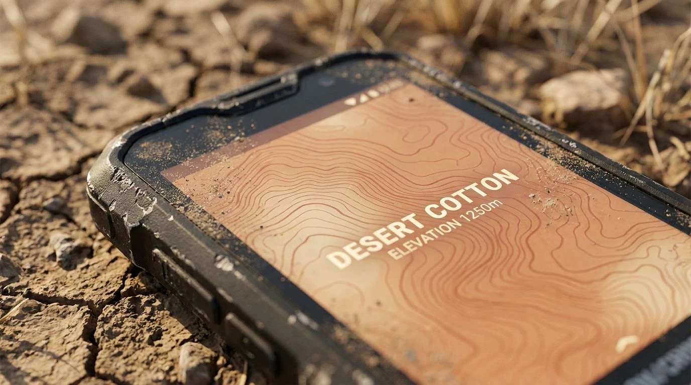
There is a distinct sort of minimalism here that feels less like a Silicon Valley whiteboard and more like an arid trail at high noon. The visual weight shifts between Sunbaked Clay and the stark interruption of Obsidian Splinter, creating a tension that demands attention without shouting for it. Weathered Taupe acts as the grounding dirt beneath the feet, entirely practical and unbothered by trends, while Desert Cotton provides a soft, breathable backdrop to keep the whole affair from feeling too heavy. For an interface guiding someone toward an isolated canyon or a forgotten ghost town, these colors offer immediate credibility. They suggest dry heat, silence, and the kind of quiet concentration required to read topographical lines. It strips away the unnecessary, leaving only what is required to navigate unfamiliar ground.
Twilight Topography ⛺
Approaching the intersection of utility and atmosphere, this collection feels like losing daylight on a mountain ridge in the best possible way. The unexpected appearance of Bruised Heather alongside Overcast Sky pulls the mind away from sunlit meadows and points it toward the encroaching evening. Meanwhile, Rusted Iron and Warm Silt remain stubbornly terrestrial, reminding us that we are still standing on solid, if cooling, soil. Midnight Pitch provides the sharp contrast needed for legibility, ensuring the layout remains strictly functional even as the colors hint at a temperature drop. If a digital tool is meant to guide a user through nocturnal city walks or a late-afternoon scramble back to the campsite, this is the visual vocabulary it needs. It rejects the aggressively cheerful palettes of budget airline promos, offering instead a sober, quietly romantic view of the outdoors.
Cartographer's Ink 🗺️
For all the talk of stripping things back, sometimes you actually need the visual diversity of a physical atlas. This selection leans heavily into the traditional mapmaker's instincts, utilizing Bleached Parchment and Oxidized Silver to create a wide, open canvas for discovery. Against this neutral expanse, the sudden, sharp interruptions of Alpine Lake and Dried Blood read like territorial markers or sudden changes in elevation. Mustard Seed and Pine Needle ground the cooler tones, making sure the overall effect does not slip into something clinical. It feels incredibly busy in a way that suggests a world thick with possibilities, reminiscent of unfolding a massive paper map on the hood of a car. A platform adopting these shades is not holding your hand; it is merely presenting the chaotic, vibrant reality of the wilderness and inviting you to pick a direction.
Fire and Flint 🔥
It is fascinating how a simple shift in temperature can turn a utilitarian interface into a fireside gathering. What anchors this group is the heavy, unapologetic presence of Carbon Black and Crushed Graphite, elements that feel cold, hard, and entirely indifferent to human comfort. Yet, they sit right next to Stoked Embers and Pale Biscuit, creating a startling but brilliant juxtaposition. The hot, earthy orange suddenly becomes a beacon, a signal fire cutting through an otherwise rocky and unforgiving landscape. Applying these to a screen generates an immediate hierarchy. The stony greys handle the boring administrative tasks of menus and loading screens, while the warmth is reserved for the destination itself, the very thing pulling the traveler forward. It is a brilliant psychological trick, mimicking the relief of spotting a glowing tent light after miles of walking over River Stone.
Red Dirt Wanderer 🥾
Here we find the most direct translation of dragging heavy boots across oxidized soil. With Crushed Brick and Faded Terracotta leading the charge, the palette immediately claims an identity tied to canyons, heat, and physical exertion. There is no blue sky here to offer relief, only the grounded, herbaceous touch of Dry Sage and the stark, starchy backdrop of Chalk Dust. Bitter Chocolate stands by to handle the heavy lifting of lettering and borders, avoiding the aggressive finality of pure black in favor of something slightly more organic. Designing a user experience with these tones is a deliberate rejection of digital slickness. It is messy, unapologetically dusty, and feels as though it might leave a fine red residue on your swiping thumb. It speaks to a demographic entirely uninterested in standard tourist traps, appealing instead to those who measure the success of a trip by the miles logged on foot.
Moving away from the overly polished aesthetics of standard consumer tech is less of a design trend and more of a psychic necessity for the exhausted traveler. When the digital tools we use to plan an escape stop resembling the corporate software we are trying to run away from, the trip begins long before we leave the house. By adopting the unpretentious, raw pigments of soil, rock, and vegetation, a screen transforms from a mere transaction portal into an entryway toward the actual physical world. These collections prove that the screen does not have to be an abrasive barrier between the wanderer and the wilderness. It can, quite effectively, act as the very first stretch of dirt beneath their boots.