'%3e%3cpath%20fill-rule='evenodd'%20clip-rule='evenodd'%20d='M51.1303%2019.2492C50.7278%2019.913%2050.1346%2020.4426%2049.3508%2020.838C48.5669%2021.2335%2047.6172%2021.4312%2046.5014%2021.4312C44.8208%2021.4312%2043.4367%2021.0216%2042.3492%2020.2025C41.2617%2019.3833%2040.6686%2018.2394%2040.5697%2016.7706H44.4253C44.4818%2017.3355%2044.6831%2017.7804%2045.0291%2018.1052C45.3751%2018.43%2045.8164%2018.5924%2046.3531%2018.5924C46.8192%2018.5924%2047.1864%2018.4653%2047.4547%2018.2111C47.7231%2017.9569%2047.8572%2017.618%2047.8572%2017.1943C47.8572%2016.8129%2047.7337%2016.4952%2047.4865%2016.241C47.2393%2015.9867%2046.9322%2015.7784%2046.565%2015.616C46.1978%2015.4536%2045.6893%2015.2594%2045.0397%2015.0334C44.0934%2014.7086%2043.3202%2014.3944%2042.72%2014.0907C42.1197%2013.7871%2041.6042%2013.3351%2041.1735%2012.7349C40.7427%2012.1347%2040.5273%2011.3544%2040.5273%2010.394C40.5273%209.50418%2040.7533%208.73448%2041.2053%208.08481C41.6572%207.43515%2042.2821%206.93731%2043.0801%206.5913C43.8781%206.24528%2044.7925%206.07227%2045.8235%206.07227C47.49%206.07227%2048.8141%206.46771%2049.7956%207.25861C50.7772%208.04951%2051.3315%209.13698%2051.4586%2010.5211H47.5395C47.4689%2010.0268%2047.2888%209.63483%2046.9993%209.3453C46.7097%209.05578%2046.3178%208.91102%2045.8235%208.91102C45.3998%208.91102%2045.0573%209.024%2044.7961%209.24997C44.5348%209.47594%2044.4041%209.80783%2044.4041%2010.2457C44.4041%2010.5988%2044.5207%2010.8989%2044.7537%2011.146C44.9867%2011.3932%2045.2798%2011.5944%2045.6328%2011.7498C45.9859%2011.9052%2046.4944%2012.1029%2047.1581%2012.343C48.1185%2012.6678%2048.9023%2012.9891%2049.5096%2013.3069C50.1169%2013.6246%2050.6395%2014.0872%2051.0773%2014.6945C51.5151%2015.3018%2051.734%2016.0927%2051.734%2017.0672C51.734%2017.8581%2051.5328%2018.5854%2051.1303%2019.2492ZM59.0242%206.3053V21.2829H55.4016V6.3053H59.0242ZM73.9409%206.3053V9.18642H69.8734V21.2829H66.2296V9.18642H62.2046V6.3053H73.9409ZM80.7438%209.18642V12.3218H85.8069V15.0546H80.7438V18.3806H86.4425V21.2829H77.1212V6.3053H86.4425V9.18642H80.7438ZM99.667%2016.0291V21.2829H96.0444V6.3053H101.913C103.692%206.3053%20105.048%206.74665%20105.98%207.62934C106.912%208.51204%20107.378%209.7019%20107.378%2011.199C107.378%2012.1311%20107.17%2012.9609%20106.753%2013.6882C106.337%2014.4155%20105.719%2014.9875%20104.9%2015.4042C104.08%2015.8208%20103.085%2016.0291%20101.913%2016.0291H99.667ZM103.692%2011.199C103.692%209.8855%20102.965%209.22879%20101.51%209.22879H99.667V13.1268H101.51C102.965%2013.1268%20103.692%2012.4842%20103.692%2011.199ZM120.092%2018.5501H114.478L113.546%2021.2829H109.732L115.219%206.41123H119.393L124.879%2021.2829H121.024L120.092%2018.5501ZM119.16%2015.7961L117.295%2010.2881L115.41%2015.7961H119.16ZM131.555%2018.5077H136.385V21.2829H127.933V6.3053H131.555V18.5077ZM143.337%209.18642V12.3218H148.4V15.0546H143.337V18.3806H149.035V21.2829H139.714V6.3053H149.035V9.18642H143.337ZM163.507%206.3053V9.18642H159.44V21.2829H155.796V9.18642H151.771V6.3053H163.507ZM177.449%206.3053V9.18642H173.382V21.2829H169.738V9.18642H165.713V6.3053H177.449ZM184.252%209.18642V12.3218H189.315V15.0546H184.252V18.3806H189.951V21.2829H180.629V6.3053H189.951V9.18642H184.252Z'%20fill='%23EEF0ED'/%3e%3cmask%20id='mask0_3101_7327'%20style='mask-type:alpha'%20maskUnits='userSpaceOnUse'%20x='0'%20y='0'%20width='27'%20height='28'%3e%3cpath%20d='M23.8328%200.759766H2.64808C1.18559%200.759766%200%201.94535%200%203.40785V24.5925C0%2026.055%201.18559%2027.2406%202.64808%2027.2406H23.8328C25.2952%2027.2406%2026.4808%2026.055%2026.4808%2024.5925V3.40785C26.4808%201.94535%2025.2952%200.759766%2023.8328%200.759766Z'%20fill='white'/%3e%3c/mask%3e%3cg%20mask='url(%23mask0_3101_7327)'%3e%3cpath%20d='M23.8328%200.759766H2.64808C1.18559%200.759766%200%201.94535%200%203.40785V24.5925C0%2026.055%201.18559%2027.2406%202.64808%2027.2406H23.8328C25.2952%2027.2406%2026.4808%2026.055%2026.4808%2024.5925V3.40785C26.4808%201.94535%2025.2952%200.759766%2023.8328%200.759766Z'%20fill='%23D8D8D8'/%3e%3cpath%20d='M13.2404%200.759766H0V14.0001H13.2404V0.759766Z'%20fill='%238C61FF'/%3e%3cpath%20d='M13.2404%2014H0V27.2404H13.2404V14Z'%20fill='%2336C3FE'/%3e%3cpath%20d='M26.4806%2014H13.2402V27.2404H26.4806V14Z'%20fill='%236592FE'/%3e%3cpath%20d='M26.4806%200.759766H13.2402V14.0002H26.4806V0.759766Z'%20fill='%236059F7'/%3e%3c/g%3e%3c/g%3e%3cdefs%3e%3cclipPath%20id='clip0_3101_7327'%3e%3crect%20width='190'%20height='28'%20fill='white'/%3e%3c/clipPath%3e%3c/defs%3e%3c/svg%3e)
'%3e%3cpath%20d='M23.8328%200.759521H2.64808C1.18559%200.759521%200%201.94511%200%203.40761V24.5923C0%2026.0548%201.18559%2027.2404%202.64808%2027.2404H23.8328C25.2952%2027.2404%2026.4808%2026.0548%2026.4808%2024.5923V3.40761C26.4808%201.94511%2025.2952%200.759521%2023.8328%200.759521Z'%20fill='%23D8D8D8'/%3e%3cpath%20d='M13.2404%200.759521H0V13.9999H13.2404V0.759521Z'%20fill='%238C61FF'/%3e%3cpath%20d='M13.2404%2013.9998H0V27.2402H13.2404V13.9998Z'%20fill='%2336C3FE'/%3e%3cpath%20d='M26.4809%2013.9998H13.2405V27.2402H26.4809V13.9998Z'%20fill='%236592FE'/%3e%3cpath%20d='M26.4809%200.759277H13.2405V13.9997H26.4809V0.759277Z'%20fill='%236059F7'/%3e%3c/g%3e%3c/svg%3e)
Bauhaus Color Palettes for Data Visualization Design
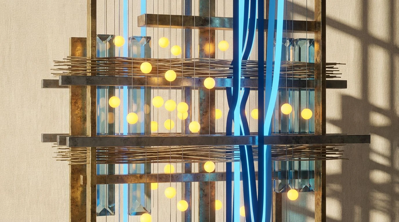
· 5 min readStep into a space where the absolute precision of geometry meets the spirited rhythm of the loom. Imagine a world where the relentless flow of information finds order not in sterile spreadsheets, but in the striking tension of rectilinear forms and unapologetic pigments. Drawing directly from the intellectual vigor of the 1920s, these visual narratives turn pure mathematics into highly structural, deeply sensorial experiences. It is a brilliant collision of pragmatic structure and radical optimism, where every graph and chart feels woven by a master craftswoman sorting the chaos of modernity into something thrillingly legible. This aesthetic approaches the digital screen as a loom, crossing bold vertical forces with sharp horizontal grounding, creating an environment as intellectually stimulating as it is gorgeously austere.
Loom and Lacquer 🧵
The eye is immediately captured by the structural weight of Midnight Wool and Loom Iron, establishing an uncompromising foundation akin to the cast iron mechanisms of a heavy industrial textile machine. Across this darkened grid, striking flashes of Spun Brass and Burnished Ochre interrupt the silence, pulling attention exactly where the gaze needs to land. It feels like stepping into a Bauhaus studio just after dusk, where warm lamplight hits cold metal. Cobalt Dye acts as the defining vertical thread, introducing a shock of pure, unadulterated primary optimism against the industrial grounding. Chambray Blue offers a soft place for the vision to rest between these high-contrast statements. When visual information takes this form, the user experiences total clarity dressed in severe elegance, moving through metrics as though tracing the bold, overlapping rectangles of a purely non-objective artwork.
Geometric Optimism 🪡
Washed in the clean light of Unbleached Canvas and Dusty Chrome, this selection breathes with an airy, intellectual spaciousness. It channels the sprawling daylight of a Weimar workshop, expansive and entirely free of clutter. Against this pale expanse, Overcoat Navy and Pewter Thread draw crisp, definitive lines, dividing the screen into rational, easily navigable sectors. Peeking through these strict architectural divisions, Bauhaus Sun flashes with brilliant, pragmatic energy, turning otherwise mundane metrics into bright focal points. Cerulean Screen acts as the cool, rational counterpart, bringing a soothing yet deeply analytical chill to the fiery gold. To navigate a screen painted in these pigments is to feel a sense of absolute order and lightness, where vast quantities of information are neatly organized into visually striking, easily digestible blocks of primary joy.
Woven Rationality 📐
Chalk White and Graphite Sketch provide an impeccably stark background, creating an environment that feels both clinical and incredibly chic. Grounding the soaring lightness is Abyssal Ink, a grounding pigment so deep it feels like looking into a completely lightless room. The true character emerges through the vibrant intersection of Royal Indigo and Woven Lilac, casting an unexpected, modern coolness over the strict geometric arrangement. Slashing through these cool and dark tones is Electric Mustard, a saturated jolt that demands immediate attention and directs the gaze with masterful authority. Experiencing this environment is similar to reading a brilliantly designed architectural blueprint. The sheer severity of the white and black structure makes the sudden flashes of primary yellow and vivid indigo feel almost electric, transforming the act of reviewing daily figures into an encounter with high art.
De Stijl Tension 🟥
A true homage to the supremacy of the primary spectrum, this arrangement pulses with intense visual rhythm. Constructivist Red and Cadmium Yellow strike the eye with unapologetic brightness, demanding engagement and projecting a fearless, pragmatic optimism. These high-voltage pigments are immediately anchored by Typewriter Keys, a dark shade that provides necessary gravity and frames the brighter tones into strict, disciplined squares. Cool Steel and Stark Linen keep the composition from overwhelming the viewer, offering vast, breathable margins that make the intense colors pop with even greater ferocity. Patina Teal serves as an unexpected twist, introducing a sophisticated, slightly vintage cool tone that plays off the fiery red and gold perfectly. The atmosphere is loud but completely disciplined, turning any digital interaction into a striking exercise in optical geometry and bold communication.
Radical Pigments 🧶
Here, the traditional primary wheel takes a slight, highly stylish detour into something unexpectedly lush. Raw Silk and Ashen Gray lay a surprisingly soft, tactile grounding, feeling less like a metallic machine and more like an untreated bolt of fine fabric. Against this gentle stage, Midnight Indigo draws sharp boundaries and heavy structural outlines. The emotional pitch rises dramatically with Tangerine Thread and Kelly Green, replacing classic red and blue with zesty, botanical vibrations. Vivid Mint and Muted Lavender add a wildly modern, almost hallucinatory edge to the classical Bauhaus severity. Interacting with this arrangement is a highly sensorial journey. The rigid math of the grid remains, but it is dressed in a riotous assembly of colors that feel daringly avant-garde. It transforms the screen into a vivid playground of intersecting lines, proving that logical structures can still thrill the senses.
Looking through this lens changes forever how one perceives the rigid, often uninspired world of numerical analysis. By applying the fearless, unyielding geometry of early twentieth-century weavers, the purely analytical becomes undeniably sensual and breathtakingly chic. These visual strategies prove that strict architecture does not demand sterility, and that highly functional navigation can still delight the eye. The bold collision of austere neutrals and piercing primary tones offers a timeless lesson in visual communication. It reminds us that every line drawn on a screen, and every block of pigment placed within a rigid boundary, holds the power to transform passive observation into an active, joyous experience of looking.