'%3e%3cpath%20fill-rule='evenodd'%20clip-rule='evenodd'%20d='M51.1303%2019.2492C50.7278%2019.913%2050.1346%2020.4426%2049.3508%2020.838C48.5669%2021.2335%2047.6172%2021.4312%2046.5014%2021.4312C44.8208%2021.4312%2043.4367%2021.0216%2042.3492%2020.2025C41.2617%2019.3833%2040.6686%2018.2394%2040.5697%2016.7706H44.4253C44.4818%2017.3355%2044.6831%2017.7804%2045.0291%2018.1052C45.3751%2018.43%2045.8164%2018.5924%2046.3531%2018.5924C46.8192%2018.5924%2047.1864%2018.4653%2047.4547%2018.2111C47.7231%2017.9569%2047.8572%2017.618%2047.8572%2017.1943C47.8572%2016.8129%2047.7337%2016.4952%2047.4865%2016.241C47.2393%2015.9867%2046.9322%2015.7784%2046.565%2015.616C46.1978%2015.4536%2045.6893%2015.2594%2045.0397%2015.0334C44.0934%2014.7086%2043.3202%2014.3944%2042.72%2014.0907C42.1197%2013.7871%2041.6042%2013.3351%2041.1735%2012.7349C40.7427%2012.1347%2040.5273%2011.3544%2040.5273%2010.394C40.5273%209.50418%2040.7533%208.73448%2041.2053%208.08481C41.6572%207.43515%2042.2821%206.93731%2043.0801%206.5913C43.8781%206.24528%2044.7925%206.07227%2045.8235%206.07227C47.49%206.07227%2048.8141%206.46771%2049.7956%207.25861C50.7772%208.04951%2051.3315%209.13698%2051.4586%2010.5211H47.5395C47.4689%2010.0268%2047.2888%209.63483%2046.9993%209.3453C46.7097%209.05578%2046.3178%208.91102%2045.8235%208.91102C45.3998%208.91102%2045.0573%209.024%2044.7961%209.24997C44.5348%209.47594%2044.4041%209.80783%2044.4041%2010.2457C44.4041%2010.5988%2044.5207%2010.8989%2044.7537%2011.146C44.9867%2011.3932%2045.2798%2011.5944%2045.6328%2011.7498C45.9859%2011.9052%2046.4944%2012.1029%2047.1581%2012.343C48.1185%2012.6678%2048.9023%2012.9891%2049.5096%2013.3069C50.1169%2013.6246%2050.6395%2014.0872%2051.0773%2014.6945C51.5151%2015.3018%2051.734%2016.0927%2051.734%2017.0672C51.734%2017.8581%2051.5328%2018.5854%2051.1303%2019.2492ZM59.0242%206.3053V21.2829H55.4016V6.3053H59.0242ZM73.9409%206.3053V9.18642H69.8734V21.2829H66.2296V9.18642H62.2046V6.3053H73.9409ZM80.7438%209.18642V12.3218H85.8069V15.0546H80.7438V18.3806H86.4425V21.2829H77.1212V6.3053H86.4425V9.18642H80.7438ZM99.667%2016.0291V21.2829H96.0444V6.3053H101.913C103.692%206.3053%20105.048%206.74665%20105.98%207.62934C106.912%208.51204%20107.378%209.7019%20107.378%2011.199C107.378%2012.1311%20107.17%2012.9609%20106.753%2013.6882C106.337%2014.4155%20105.719%2014.9875%20104.9%2015.4042C104.08%2015.8208%20103.085%2016.0291%20101.913%2016.0291H99.667ZM103.692%2011.199C103.692%209.8855%20102.965%209.22879%20101.51%209.22879H99.667V13.1268H101.51C102.965%2013.1268%20103.692%2012.4842%20103.692%2011.199ZM120.092%2018.5501H114.478L113.546%2021.2829H109.732L115.219%206.41123H119.393L124.879%2021.2829H121.024L120.092%2018.5501ZM119.16%2015.7961L117.295%2010.2881L115.41%2015.7961H119.16ZM131.555%2018.5077H136.385V21.2829H127.933V6.3053H131.555V18.5077ZM143.337%209.18642V12.3218H148.4V15.0546H143.337V18.3806H149.035V21.2829H139.714V6.3053H149.035V9.18642H143.337ZM163.507%206.3053V9.18642H159.44V21.2829H155.796V9.18642H151.771V6.3053H163.507ZM177.449%206.3053V9.18642H173.382V21.2829H169.738V9.18642H165.713V6.3053H177.449ZM184.252%209.18642V12.3218H189.315V15.0546H184.252V18.3806H189.951V21.2829H180.629V6.3053H189.951V9.18642H184.252Z'%20fill='%23EEF0ED'/%3e%3cmask%20id='mask0_3101_7327'%20style='mask-type:alpha'%20maskUnits='userSpaceOnUse'%20x='0'%20y='0'%20width='27'%20height='28'%3e%3cpath%20d='M23.8328%200.759766H2.64808C1.18559%200.759766%200%201.94535%200%203.40785V24.5925C0%2026.055%201.18559%2027.2406%202.64808%2027.2406H23.8328C25.2952%2027.2406%2026.4808%2026.055%2026.4808%2024.5925V3.40785C26.4808%201.94535%2025.2952%200.759766%2023.8328%200.759766Z'%20fill='white'/%3e%3c/mask%3e%3cg%20mask='url(%23mask0_3101_7327)'%3e%3cpath%20d='M23.8328%200.759766H2.64808C1.18559%200.759766%200%201.94535%200%203.40785V24.5925C0%2026.055%201.18559%2027.2406%202.64808%2027.2406H23.8328C25.2952%2027.2406%2026.4808%2026.055%2026.4808%2024.5925V3.40785C26.4808%201.94535%2025.2952%200.759766%2023.8328%200.759766Z'%20fill='%23D8D8D8'/%3e%3cpath%20d='M13.2404%200.759766H0V14.0001H13.2404V0.759766Z'%20fill='%238C61FF'/%3e%3cpath%20d='M13.2404%2014H0V27.2404H13.2404V14Z'%20fill='%2336C3FE'/%3e%3cpath%20d='M26.4806%2014H13.2402V27.2404H26.4806V14Z'%20fill='%236592FE'/%3e%3cpath%20d='M26.4806%200.759766H13.2402V14.0002H26.4806V0.759766Z'%20fill='%236059F7'/%3e%3c/g%3e%3c/g%3e%3cdefs%3e%3cclipPath%20id='clip0_3101_7327'%3e%3crect%20width='190'%20height='28'%20fill='white'/%3e%3c/clipPath%3e%3c/defs%3e%3c/svg%3e)
'%3e%3cpath%20d='M23.8328%200.759521H2.64808C1.18559%200.759521%200%201.94511%200%203.40761V24.5923C0%2026.0548%201.18559%2027.2404%202.64808%2027.2404H23.8328C25.2952%2027.2404%2026.4808%2026.0548%2026.4808%2024.5923V3.40761C26.4808%201.94511%2025.2952%200.759521%2023.8328%200.759521Z'%20fill='%23D8D8D8'/%3e%3cpath%20d='M13.2404%200.759521H0V13.9999H13.2404V0.759521Z'%20fill='%238C61FF'/%3e%3cpath%20d='M13.2404%2013.9998H0V27.2402H13.2404V13.9998Z'%20fill='%2336C3FE'/%3e%3cpath%20d='M26.4809%2013.9998H13.2405V27.2402H26.4809V13.9998Z'%20fill='%236592FE'/%3e%3cpath%20d='M26.4809%200.759277H13.2405V13.9997H26.4809V0.759277Z'%20fill='%236059F7'/%3e%3c/g%3e%3c/svg%3e)
Use Color Field Design for Focus and Productivity Maxima
· 5 min readWhen designing digital environments, the strategic application of broad, uninterrupted expanses of color operates on the visual system much like an acoustic noise-canceling headphone operates on the ear. Drawing from mid-century painting movements, modern interface design has begun experimenting with large geometric blocks of carefully selected hues to shape human attention. This structural approach to visual space removes extraneous stimuli, directing the optic nerve and the mind toward a single point of concentration. Working specifically with cooling tones like dense forest greens and profound grays, alongside calculated energetic strikes, these digital layouts create an architecture of extreme focus. By surrounding the user with monumental fields of color, cognitive load decreases predictably. The eye rests, retinal fatigue diminishes, and productivity naturally increases within this calculated visual quietude.
Deep Cognitive Flow 🌊
Applying monumental swaths of Boreal Teal establishes an immediate sense of visual depth, anchoring the user firmly in the present task. This deeply absorbing hue, paired with the resting space of Quiet Paper, builds a distraction-free perimeter that frames active work areas. The sudden introduction of Glacial Cyan and Stimulus Cobalt acts as a directive mechanism for human attention, guiding the gaze precisely where action is required without causing visual strain. Meanwhile, Abyssal Blue and Stratosphere Periwinkle cool the optic nerve, expanding the perceived boundaries of the screen to prevent claustrophobic screen fatigue. By designing interfaces that prioritize these expansive, oceanic tones, users experience a psychological shift toward stable, uninterrupted workflow. The environment feels distinctly professional yet deeply restorative, mirroring the calming mechanics of observing large bodies of water.
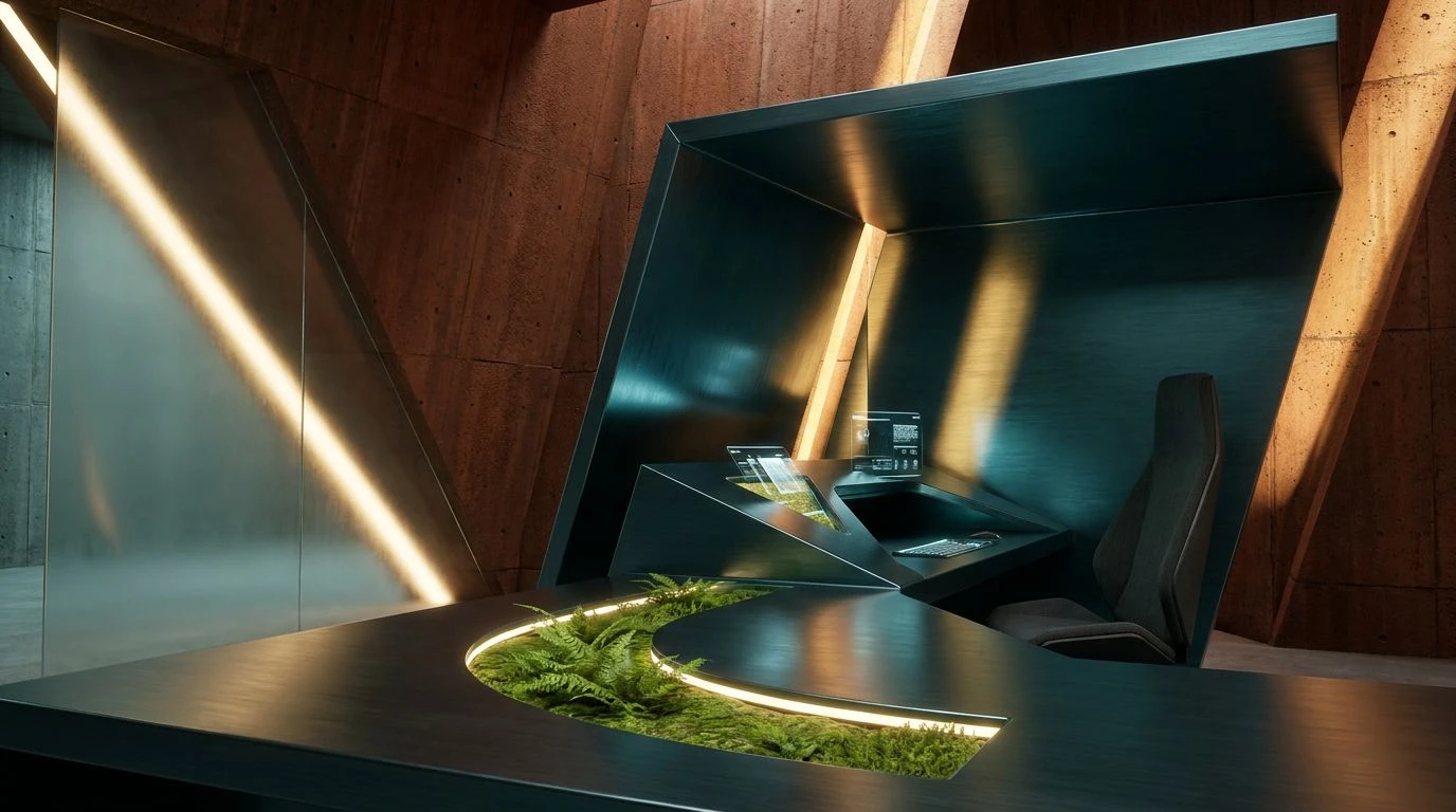
Grounded Abstract 🏔️
A digital workspace relying on Midnight Void and Lunar Ash strips away the chaotic visual debris of standard software, plunging the mind into a state of stark clarity. Within this structured void, broad planes of Earthen Umber and Equilibrium Teal serve to ground the central visual field, creating boundaries that are firm but not glaring. The psychological weight of these darker shades reduces the light emitted by the screen, protecting the circadian rhythm during intense, prolonged periods of labor. Striking elements of Golden Hour and Kinetic Ultramarine provide vital contrast markers. These markers stimulate the visual cortex just enough to prevent monotony, keeping alertness high. Blank Canvas and Slate Amethyst offer soft transitions between the heavier visual blocks, ensuring the user moves through the interface with frictionless ease. The resulting environment feels like an architecturally sound sanctuary built specifically for deep thought.
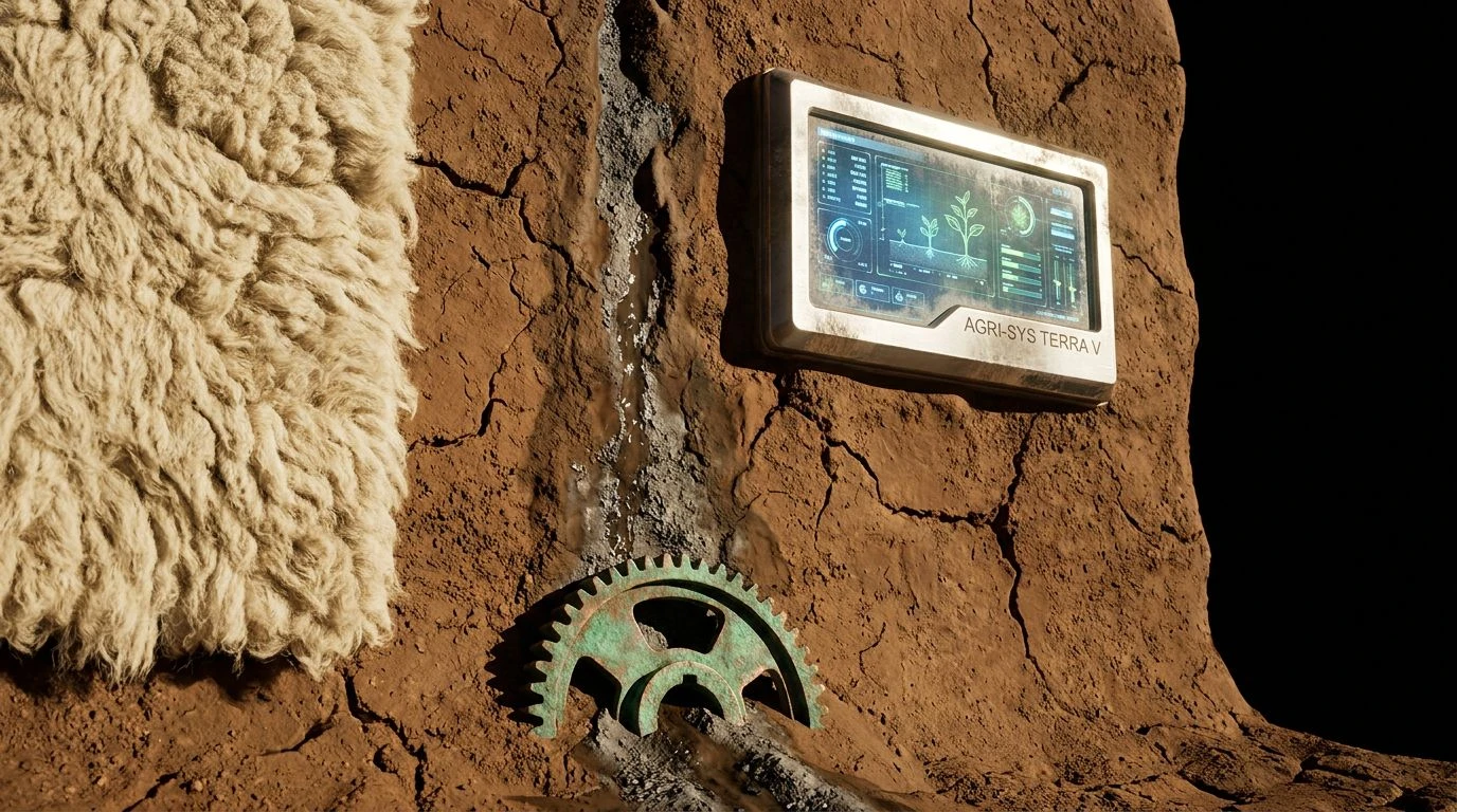
Biophilic Focus 🌲
The human visual system has spent millions of years adapting to natural landscapes, making the vast geometric application of Nocturnal Forest and Canopy Sage highly effective for mental stamina. These expansive organic tones reduce the rapid, involuntary eye movements that typically occur in cluttered digital spaces, allowing the pupil to relax. When an interface surrounds a user with Horizon Indigo and Deep Tundra Blue, it creates a calming auditory-visual crossover effect, mimicking the quiet stretch of dusk. Vital Chlorophyll and Solar Flare act as biological signals for waking energy, perfectly calibrated to draw focus toward primary tools or essential data points. Terrestrial Bark and Atmospheric Ice provide the necessary structural background, framing the workspace with grounded realism. This specific arrangement of hues supports long-duration concentration by translating the restorative properties of a natural landscape into a flat, accessible interface.
Stimulus Control 🎨
Concentrated work requires an environment that strictly manages sensory input, a principle perfectly demonstrated by pairing immense fields of Mariana Teal with Fogged Glass. The cooling, expansive nature of this deep blue-green absorbs stray attention, creating a professional enclosure that feels far removed from the frantic pace of the internet. Against this expansive calming boundary, Oxidized Iron grounds the layout, providing a solid, immovable base that anchors the visual hierarchy. When absolute alertness is required, precise injections of Marigold Beam and Vibrant Fern activate the foveal vision, instantly snapping higher-level cognitive processes to attention. Because the background remains overwhelmingly muted and undisturbed, these bright strikes of color do not overwhelm the nervous system. Instead, they act as clear, unambiguous signals within a mathematically organized system, sustaining prolonged psychological absorption in the task.
Retinal Shift 👁️
Immersing the viewer in prolonged exposure to Deepest Trench and Shaded Olive radically alters the perception of screen space, making flat monitors feel endlessly deep. This dramatic reduction in light forces the eye to dilate slightly, a resting biological state associated with calm, measured breathing. Against these expansive, shadow-like regions, Concrete Neutral builds organized structural grids that clearly separate information without demanding immediate recognition. The true operational power of this visual arrangement lies in the sharp, deliberate use of Retinal Orange and Luminescent Moss. Because the surrounding landscape is so visually quiet and dark, even microscopic slivers of Coral Ember or Spring Sprout possess immense signaling weight. Bio-Teal bridges the gap between the resting dark zones and the active bright zones, guiding the user smoothly through critical pathways. The optic nerve reads these highly controlled energetic spikes precisely, minimizing fatigue and preserving mental bandwidth.
Understanding how vast planes of carefully selected pigments alter human cognition allows designers to build tools that actively fight distraction. By strategically manipulating visual boundaries with deep forest greens, profound grays, and precise energetic strikes, interfaces transform from chaotic dashboards into instruments of mental clarity. The psychology of perception dictates that visual silence is just as critical as visual stimulation when attempting to maintain long-term alertness. Restricting the optical diet to these carefully balanced distributions of light and shadow directly reduces cognitive strain. Ultimately, creating these vast visual spaces ensures that the human mind can operate at its highest capacity, undisturbed by the unnecessary noise of the modern digital condition.