'%3e%3cpath%20fill-rule='evenodd'%20clip-rule='evenodd'%20d='M51.1303%2019.2492C50.7278%2019.913%2050.1346%2020.4426%2049.3508%2020.838C48.5669%2021.2335%2047.6172%2021.4312%2046.5014%2021.4312C44.8208%2021.4312%2043.4367%2021.0216%2042.3492%2020.2025C41.2617%2019.3833%2040.6686%2018.2394%2040.5697%2016.7706H44.4253C44.4818%2017.3355%2044.6831%2017.7804%2045.0291%2018.1052C45.3751%2018.43%2045.8164%2018.5924%2046.3531%2018.5924C46.8192%2018.5924%2047.1864%2018.4653%2047.4547%2018.2111C47.7231%2017.9569%2047.8572%2017.618%2047.8572%2017.1943C47.8572%2016.8129%2047.7337%2016.4952%2047.4865%2016.241C47.2393%2015.9867%2046.9322%2015.7784%2046.565%2015.616C46.1978%2015.4536%2045.6893%2015.2594%2045.0397%2015.0334C44.0934%2014.7086%2043.3202%2014.3944%2042.72%2014.0907C42.1197%2013.7871%2041.6042%2013.3351%2041.1735%2012.7349C40.7427%2012.1347%2040.5273%2011.3544%2040.5273%2010.394C40.5273%209.50418%2040.7533%208.73448%2041.2053%208.08481C41.6572%207.43515%2042.2821%206.93731%2043.0801%206.5913C43.8781%206.24528%2044.7925%206.07227%2045.8235%206.07227C47.49%206.07227%2048.8141%206.46771%2049.7956%207.25861C50.7772%208.04951%2051.3315%209.13698%2051.4586%2010.5211H47.5395C47.4689%2010.0268%2047.2888%209.63483%2046.9993%209.3453C46.7097%209.05578%2046.3178%208.91102%2045.8235%208.91102C45.3998%208.91102%2045.0573%209.024%2044.7961%209.24997C44.5348%209.47594%2044.4041%209.80783%2044.4041%2010.2457C44.4041%2010.5988%2044.5207%2010.8989%2044.7537%2011.146C44.9867%2011.3932%2045.2798%2011.5944%2045.6328%2011.7498C45.9859%2011.9052%2046.4944%2012.1029%2047.1581%2012.343C48.1185%2012.6678%2048.9023%2012.9891%2049.5096%2013.3069C50.1169%2013.6246%2050.6395%2014.0872%2051.0773%2014.6945C51.5151%2015.3018%2051.734%2016.0927%2051.734%2017.0672C51.734%2017.8581%2051.5328%2018.5854%2051.1303%2019.2492ZM59.0242%206.3053V21.2829H55.4016V6.3053H59.0242ZM73.9409%206.3053V9.18642H69.8734V21.2829H66.2296V9.18642H62.2046V6.3053H73.9409ZM80.7438%209.18642V12.3218H85.8069V15.0546H80.7438V18.3806H86.4425V21.2829H77.1212V6.3053H86.4425V9.18642H80.7438ZM99.667%2016.0291V21.2829H96.0444V6.3053H101.913C103.692%206.3053%20105.048%206.74665%20105.98%207.62934C106.912%208.51204%20107.378%209.7019%20107.378%2011.199C107.378%2012.1311%20107.17%2012.9609%20106.753%2013.6882C106.337%2014.4155%20105.719%2014.9875%20104.9%2015.4042C104.08%2015.8208%20103.085%2016.0291%20101.913%2016.0291H99.667ZM103.692%2011.199C103.692%209.8855%20102.965%209.22879%20101.51%209.22879H99.667V13.1268H101.51C102.965%2013.1268%20103.692%2012.4842%20103.692%2011.199ZM120.092%2018.5501H114.478L113.546%2021.2829H109.732L115.219%206.41123H119.393L124.879%2021.2829H121.024L120.092%2018.5501ZM119.16%2015.7961L117.295%2010.2881L115.41%2015.7961H119.16ZM131.555%2018.5077H136.385V21.2829H127.933V6.3053H131.555V18.5077ZM143.337%209.18642V12.3218H148.4V15.0546H143.337V18.3806H149.035V21.2829H139.714V6.3053H149.035V9.18642H143.337ZM163.507%206.3053V9.18642H159.44V21.2829H155.796V9.18642H151.771V6.3053H163.507ZM177.449%206.3053V9.18642H173.382V21.2829H169.738V9.18642H165.713V6.3053H177.449ZM184.252%209.18642V12.3218H189.315V15.0546H184.252V18.3806H189.951V21.2829H180.629V6.3053H189.951V9.18642H184.252Z'%20fill='%23EEF0ED'/%3e%3cmask%20id='mask0_3101_7327'%20style='mask-type:alpha'%20maskUnits='userSpaceOnUse'%20x='0'%20y='0'%20width='27'%20height='28'%3e%3cpath%20d='M23.8328%200.759766H2.64808C1.18559%200.759766%200%201.94535%200%203.40785V24.5925C0%2026.055%201.18559%2027.2406%202.64808%2027.2406H23.8328C25.2952%2027.2406%2026.4808%2026.055%2026.4808%2024.5925V3.40785C26.4808%201.94535%2025.2952%200.759766%2023.8328%200.759766Z'%20fill='white'/%3e%3c/mask%3e%3cg%20mask='url(%23mask0_3101_7327)'%3e%3cpath%20d='M23.8328%200.759766H2.64808C1.18559%200.759766%200%201.94535%200%203.40785V24.5925C0%2026.055%201.18559%2027.2406%202.64808%2027.2406H23.8328C25.2952%2027.2406%2026.4808%2026.055%2026.4808%2024.5925V3.40785C26.4808%201.94535%2025.2952%200.759766%2023.8328%200.759766Z'%20fill='%23D8D8D8'/%3e%3cpath%20d='M13.2404%200.759766H0V14.0001H13.2404V0.759766Z'%20fill='%238C61FF'/%3e%3cpath%20d='M13.2404%2014H0V27.2404H13.2404V14Z'%20fill='%2336C3FE'/%3e%3cpath%20d='M26.4806%2014H13.2402V27.2404H26.4806V14Z'%20fill='%236592FE'/%3e%3cpath%20d='M26.4806%200.759766H13.2402V14.0002H26.4806V0.759766Z'%20fill='%236059F7'/%3e%3c/g%3e%3c/g%3e%3cdefs%3e%3cclipPath%20id='clip0_3101_7327'%3e%3crect%20width='190'%20height='28'%20fill='white'/%3e%3c/clipPath%3e%3c/defs%3e%3c/svg%3e)
'%3e%3cpath%20d='M23.8328%200.759521H2.64808C1.18559%200.759521%200%201.94511%200%203.40761V24.5923C0%2026.0548%201.18559%2027.2404%202.64808%2027.2404H23.8328C25.2952%2027.2404%2026.4808%2026.0548%2026.4808%2024.5923V3.40761C26.4808%201.94511%2025.2952%200.759521%2023.8328%200.759521Z'%20fill='%23D8D8D8'/%3e%3cpath%20d='M13.2404%200.759521H0V13.9999H13.2404V0.759521Z'%20fill='%238C61FF'/%3e%3cpath%20d='M13.2404%2013.9998H0V27.2402H13.2404V13.9998Z'%20fill='%2336C3FE'/%3e%3cpath%20d='M26.4809%2013.9998H13.2405V27.2402H26.4809V13.9998Z'%20fill='%236592FE'/%3e%3cpath%20d='M26.4809%200.759277H13.2405V13.9997H26.4809V0.759277Z'%20fill='%236059F7'/%3e%3c/g%3e%3c/svg%3e)
Mixing 19th Century Art Colors with Modern Plastic Design
· 6 min readImagine crossing the threshold of an ancestral estate, where the air smells of linseed oil and heavy, centuries old dust, only to find the grand dining table set with neon green acrylic tumblers and glossy synthetic fruit. There is a strange, breathless beauty in shocking the quiet solemnity of nineteenth century portraiture and landscape painting with the unabashed loudness of modern petrochemical marvels. This collision between the dignified weight of carved mahogany and the featherlight audacity of manufactured plastics creates a visual playground that thrills the eye. We are pulled into a world where serious, varnished shadows suddenly snap against high gloss, candy colored surfaces. By placing these contrasting spirits side by side, we awake dormant senses, asking the viewer to feel the cold, rigid perfection of molded polymer resting upon the warm, irregular grain of historic timber. It is a rebellion dressed in velvet and vinyl, a feast for the eyes that turns austere galleries into scenes of wild, unexpected joy.
Parlor Polypropylene 🛋️
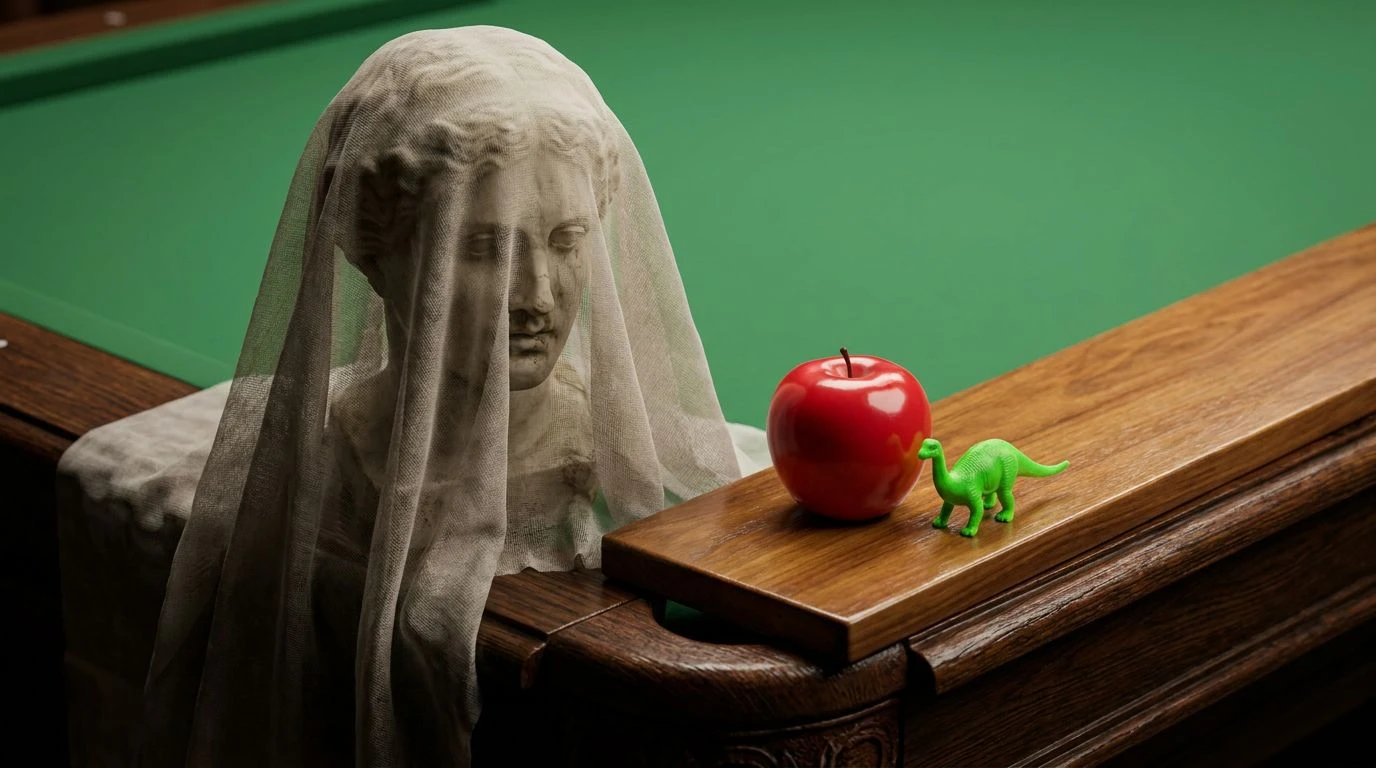
The visual shock of Parlor Polypropylene lies in its masterful dance between the solemn and the manufactured. Here, the deep richness of Varnished Walnut and Carved Oak builds a somber, traditional foundation, whispering of gentlemen's clubs and heavy woolen drapery. Yet, this quiet dignity is immediately disrupted by the fierce, artificial pop of Vinyl Apple and Toy Dinosaur Green. It transforms a classical still life into an arena of playful vandalism, where an Alabaster Bust might be adorned with cheap, brightly colored novelty sunglasses. Velvet Shadow deepens the contrast, making the synthetic hues scream with life against the muted grace of Dust Sheet. Pool Table Felt introduces a bridge between the gentlemanly and the leisure class, tying the natural wood tones to the audacious plastic brights. This paints a room where history does not merely sit still; it actively flirts with cheerful, mass produced absurdity, breathing fresh, electric air into a dusty antique narrative.
Gallery Synthetic 🖼️
Within the story of Gallery Synthetic, we find a curious conversation between the organic decay of old oils and the eternal youth of modern polymers. The heavy, earthy depths of Patina Bronze and Absinthe Shadow ground the scene in the moody realism of a nineteenth century academy masterwork, full of brooding, romantic melancholy. Then, slicing through the darkness, Slime Green and Inflatable Pool introduce an alien, liquid brightness that feels entirely of the twentieth century. These are colors of bouncy balls and extruded tubing, completely devoid of nature yet overflowing with energy. Gesso White serves as the clean gallery wall, an empty space waiting to be compromised, while Violet Resin adds a slick, reflective finish to the composition. To interact with these shades is to imagine a classical bronze statue wrapped in brightly colored swimming noodles. The somber past meets the disposable present, creating a delicious tension that makes the classical elements feel suddenly, wildly alive.
Gilded Acrylic 🍋
Gilded Acrylic frames a moment of sharp, sculptural contrast, where the luxurious weight of heritage materials meets the squeaky clean surface of modern consumer goods. The noble, sweeping warmth of Gilded Frame and the icy snap of Oxidized Copper build an atmosphere of a nineteenth century salon, complete with heavy mirrors and muted, intellectual debates. But then, Lego Yellow crashes into the room, a shade so relentlessly optimistic and flat that it completely shatters the academic seriousness. Stucco Glaze and Obsidian Ink act as sharp, high contrast moderators, pushing the yellow into the absolute foreground like a neon sign in a dark library. Graphite Dust and Tin Toy Grey soften the transition, offering a quiet, matte counterpoint to the glossy shouts of color. The result is a delightfully confusing interior where priceless antique consoles become display stands for cheap, brilliant yellow plastic icons, making us smile at the sheer irreverence of the pairing.
Celluloid Still Life 🍒
A walk through Celluloid Still Life feels like stumbling upon a forgotten Dutch master painting that has been magically restored with candy wrappers and glossy enamel. Antique Teak provides a sturdy, deeply grained wooden backdrop, the kind of surface built to last for generations, smelling of wax and time. Bursting forth from this rich dark ground are the unapologetic, sugary tones of Maraschino Gloss and Sunlit Post-it, colors that refuse to take themselves seriously. Formica Turquoise adds a mid century diner slickness, a perfectly smooth, unblemished surface that rubs up against the textured reality of the wood. Indigo Velvet anchors the scene in aristocratic luxury, ensuring the brights do not completely run away with the composition. The eye bounces rapidly between the painted shadow and the artificial light, tasting the tartness of cherry red plastic against the bitter warmth of old timber. It is a visual banquet that celebrates the cheap, the cheerful, and the historically profound all at once.
Kitsch Cabinet 🪞
Kitsch Cabinet opens a whimsical theater of the absurd, where antique restraint is deliciously corrupted by the pastel fever dreams of a toy store. The delicate, weeping romanticism of Faded Damask and the sturdy, heirloom quality of Burl Walnut set a scene ripe for a tragic heroine. Instead, we are met with the brazen, sour punch of Chartreuse Acrylic and the loud, synthetic joy of Grape Bubblegum. Lemon Tupperware sits squarely in the middle, a sunny, utilitarian plastic that feels entirely out of place in a Victorian parlor, which is exactly why it works so beautifully. These colors interact like misbehaving children in a museum, bringing a loud, tactile, gummy texture to the flat, dusty reality of the nineteenth century aesthetic. The tension is almost palpable, asking you to run your fingers over soft, centuries old fabric before touching cold, injection molded plastic shapes. This collection thrills precisely because it breaks all the rules of good taste, leaving something remarkably fresh in its wake.
Stepping back from these wildly contrasting palettes reveals a powerful truth about our relationship with beauty. By forcing the dignified, heavily textured realism of the nineteenth century to share space with the glossy, flat vibrancy of plastics, we discover a totally new visual language. The old materials offer a grounding weight and an undeniable sense of history, allowing the neon greens, bright yellows, and shiny reds to act as irreverent punctuation marks. This is an exercise in rule breaking that brings joy back to interior and artistic composition. The marriage of organic wood and synthetic polymer proves that there is nothing more delightful than a well placed contradiction, inviting us to look closer, smile wider, and rethink the boundaries of traditional taste.