'%3e%3cpath%20fill-rule='evenodd'%20clip-rule='evenodd'%20d='M51.1303%2019.2492C50.7278%2019.913%2050.1346%2020.4426%2049.3508%2020.838C48.5669%2021.2335%2047.6172%2021.4312%2046.5014%2021.4312C44.8208%2021.4312%2043.4367%2021.0216%2042.3492%2020.2025C41.2617%2019.3833%2040.6686%2018.2394%2040.5697%2016.7706H44.4253C44.4818%2017.3355%2044.6831%2017.7804%2045.0291%2018.1052C45.3751%2018.43%2045.8164%2018.5924%2046.3531%2018.5924C46.8192%2018.5924%2047.1864%2018.4653%2047.4547%2018.2111C47.7231%2017.9569%2047.8572%2017.618%2047.8572%2017.1943C47.8572%2016.8129%2047.7337%2016.4952%2047.4865%2016.241C47.2393%2015.9867%2046.9322%2015.7784%2046.565%2015.616C46.1978%2015.4536%2045.6893%2015.2594%2045.0397%2015.0334C44.0934%2014.7086%2043.3202%2014.3944%2042.72%2014.0907C42.1197%2013.7871%2041.6042%2013.3351%2041.1735%2012.7349C40.7427%2012.1347%2040.5273%2011.3544%2040.5273%2010.394C40.5273%209.50418%2040.7533%208.73448%2041.2053%208.08481C41.6572%207.43515%2042.2821%206.93731%2043.0801%206.5913C43.8781%206.24528%2044.7925%206.07227%2045.8235%206.07227C47.49%206.07227%2048.8141%206.46771%2049.7956%207.25861C50.7772%208.04951%2051.3315%209.13698%2051.4586%2010.5211H47.5395C47.4689%2010.0268%2047.2888%209.63483%2046.9993%209.3453C46.7097%209.05578%2046.3178%208.91102%2045.8235%208.91102C45.3998%208.91102%2045.0573%209.024%2044.7961%209.24997C44.5348%209.47594%2044.4041%209.80783%2044.4041%2010.2457C44.4041%2010.5988%2044.5207%2010.8989%2044.7537%2011.146C44.9867%2011.3932%2045.2798%2011.5944%2045.6328%2011.7498C45.9859%2011.9052%2046.4944%2012.1029%2047.1581%2012.343C48.1185%2012.6678%2048.9023%2012.9891%2049.5096%2013.3069C50.1169%2013.6246%2050.6395%2014.0872%2051.0773%2014.6945C51.5151%2015.3018%2051.734%2016.0927%2051.734%2017.0672C51.734%2017.8581%2051.5328%2018.5854%2051.1303%2019.2492ZM59.0242%206.3053V21.2829H55.4016V6.3053H59.0242ZM73.9409%206.3053V9.18642H69.8734V21.2829H66.2296V9.18642H62.2046V6.3053H73.9409ZM80.7438%209.18642V12.3218H85.8069V15.0546H80.7438V18.3806H86.4425V21.2829H77.1212V6.3053H86.4425V9.18642H80.7438ZM99.667%2016.0291V21.2829H96.0444V6.3053H101.913C103.692%206.3053%20105.048%206.74665%20105.98%207.62934C106.912%208.51204%20107.378%209.7019%20107.378%2011.199C107.378%2012.1311%20107.17%2012.9609%20106.753%2013.6882C106.337%2014.4155%20105.719%2014.9875%20104.9%2015.4042C104.08%2015.8208%20103.085%2016.0291%20101.913%2016.0291H99.667ZM103.692%2011.199C103.692%209.8855%20102.965%209.22879%20101.51%209.22879H99.667V13.1268H101.51C102.965%2013.1268%20103.692%2012.4842%20103.692%2011.199ZM120.092%2018.5501H114.478L113.546%2021.2829H109.732L115.219%206.41123H119.393L124.879%2021.2829H121.024L120.092%2018.5501ZM119.16%2015.7961L117.295%2010.2881L115.41%2015.7961H119.16ZM131.555%2018.5077H136.385V21.2829H127.933V6.3053H131.555V18.5077ZM143.337%209.18642V12.3218H148.4V15.0546H143.337V18.3806H149.035V21.2829H139.714V6.3053H149.035V9.18642H143.337ZM163.507%206.3053V9.18642H159.44V21.2829H155.796V9.18642H151.771V6.3053H163.507ZM177.449%206.3053V9.18642H173.382V21.2829H169.738V9.18642H165.713V6.3053H177.449ZM184.252%209.18642V12.3218H189.315V15.0546H184.252V18.3806H189.951V21.2829H180.629V6.3053H189.951V9.18642H184.252Z'%20fill='%23EEF0ED'/%3e%3cmask%20id='mask0_3101_7327'%20style='mask-type:alpha'%20maskUnits='userSpaceOnUse'%20x='0'%20y='0'%20width='27'%20height='28'%3e%3cpath%20d='M23.8328%200.759766H2.64808C1.18559%200.759766%200%201.94535%200%203.40785V24.5925C0%2026.055%201.18559%2027.2406%202.64808%2027.2406H23.8328C25.2952%2027.2406%2026.4808%2026.055%2026.4808%2024.5925V3.40785C26.4808%201.94535%2025.2952%200.759766%2023.8328%200.759766Z'%20fill='white'/%3e%3c/mask%3e%3cg%20mask='url(%23mask0_3101_7327)'%3e%3cpath%20d='M23.8328%200.759766H2.64808C1.18559%200.759766%200%201.94535%200%203.40785V24.5925C0%2026.055%201.18559%2027.2406%202.64808%2027.2406H23.8328C25.2952%2027.2406%2026.4808%2026.055%2026.4808%2024.5925V3.40785C26.4808%201.94535%2025.2952%200.759766%2023.8328%200.759766Z'%20fill='%23D8D8D8'/%3e%3cpath%20d='M13.2404%200.759766H0V14.0001H13.2404V0.759766Z'%20fill='%238C61FF'/%3e%3cpath%20d='M13.2404%2014H0V27.2404H13.2404V14Z'%20fill='%2336C3FE'/%3e%3cpath%20d='M26.4806%2014H13.2402V27.2404H26.4806V14Z'%20fill='%236592FE'/%3e%3cpath%20d='M26.4806%200.759766H13.2402V14.0002H26.4806V0.759766Z'%20fill='%236059F7'/%3e%3c/g%3e%3c/g%3e%3cdefs%3e%3cclipPath%20id='clip0_3101_7327'%3e%3crect%20width='190'%20height='28'%20fill='white'/%3e%3c/clipPath%3e%3c/defs%3e%3c/svg%3e)
'%3e%3cpath%20d='M23.8328%200.759521H2.64808C1.18559%200.759521%200%201.94511%200%203.40761V24.5923C0%2026.0548%201.18559%2027.2404%202.64808%2027.2404H23.8328C25.2952%2027.2404%2026.4808%2026.0548%2026.4808%2024.5923V3.40761C26.4808%201.94511%2025.2952%200.759521%2023.8328%200.759521Z'%20fill='%23D8D8D8'/%3e%3cpath%20d='M13.2404%200.759521H0V13.9999H13.2404V0.759521Z'%20fill='%238C61FF'/%3e%3cpath%20d='M13.2404%2013.9998H0V27.2402H13.2404V13.9998Z'%20fill='%2336C3FE'/%3e%3cpath%20d='M26.4809%2013.9998H13.2405V27.2402H26.4809V13.9998Z'%20fill='%236592FE'/%3e%3cpath%20d='M26.4809%200.759277H13.2405V13.9997H26.4809V0.759277Z'%20fill='%236059F7'/%3e%3c/g%3e%3c/svg%3e)
Deep Berry Color Palette: Disrupting Logistics Brand Design
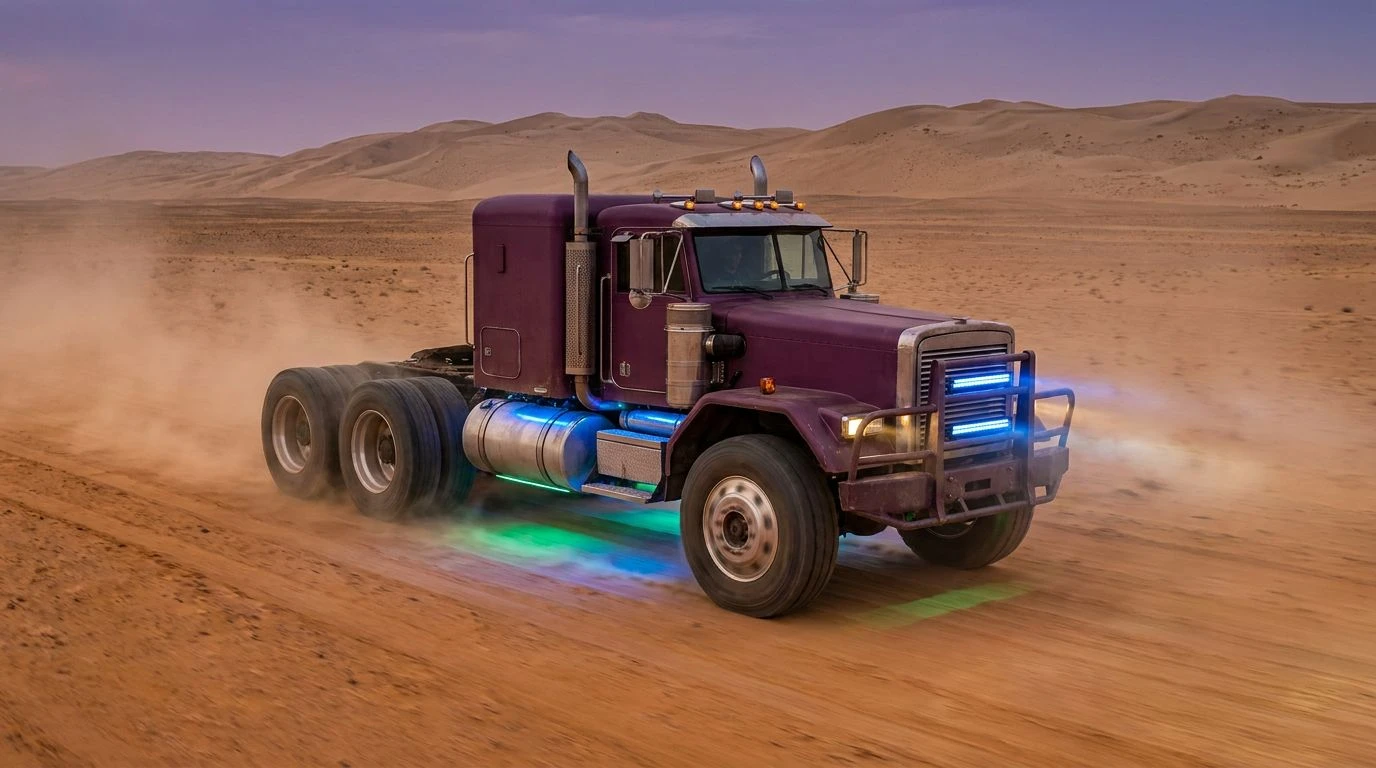
· 6 min readThe logistics sector is famously rigid when it comes to visual identity. Fleets of trucks and shipping containers stretch across highways wrapped entirely in clinical blues and stark whites. This chromatic safety net communicates basic reliability but fails to capture the physical reality of moving goods across harsh environments. When one desert based supply chain firm decided to break ranks, they ignored the industry standard entirely. By wrapping their heavy machinery in rich organic purple tones grounded by earthy neutrals, they cut through the visual noise of a saturated market. The bold departure from corporate norms reimagined what dependability looks like, proving that trust does not require cold precision. The resulting visual identity feels rooted in the arid terrain it traverses, offering a striking counterpoint to the endless azure sea of competing rigs.
Industry Standard 🧊
Industry Standard represents the exact chromatic trap that contemporary transport brands fall into over and over. Frosted Aqua and Corporate Cyan dominate the visual landscape of modern supply chains, wrapping container ships and delivery vans uniformly worldwide. It is a strictly functional approach to visual identity, leaning completely into the expectation that cold Transit Blue means efficiency and safety. Aerodynamic Azure alongside Sky Route creates an undeniably clean aesthetic, while the darker base of Fleet Navy provides necessary contrast for bold white typography. However, this specific sequence of marine tones creates absolute visual anonymity in a competitive desert market. When every single truck rolling down the highway flashes the exact same shades of crisp water and sky, the messaging turns into background noise. The reliance on this icy spectrum guarantees the brand will fade into the dusty horizon rather than command attention on the open road.
Arid Terrain 🏜️
Arid Terrain shifts the focus away from the vehicles themselves and downward toward the very ground they travel across. Midnight Asphalt provides a dense, unforgiving baseline that mimics the heat soaked highways of southern transit routes. Against this intense dark background, Baked Clay brings a sharp blast of thermal energy, capturing the intense heat radiating off metal siding at high noon. Sunlit Ochre and Pale Dune act as the grounding forces here, recalling the endless stretches of sand that define the operational territory for these rugged fleets. Deep Silt anchors the warmer tones, creating a grounded visual weight that screams durability. A logistics brand moving through this environment needs an identity that understands the harsh geography rather than ignoring it completely. Using these baked earth tones communicates a rugged readiness, preparing the viewer for the unforgiving conditions of cross country hauling rather than hiding behind a sanitized corporate facade.
Cold Transit 🚛
Cold Transit doubles down on the expected aesthetics of global shipping conglomerates, emphasizing exactly what the disruptive desert firm was desperate to avoid. Frostbite Cyan and Cool Courier strike the eye with immediate, aggressive cleanliness. This exact combination of Synthetic Azure and Muted Glaze reflects a sterile, almost medical approach to moving cargo, prioritizing a completely sanitized outward appearance. Oceanic Haul and Abyss Blue provide the necessary dark anchoring for heavy machinery, but the temperature remains definitively freezing. When a competitor views this exact sequence, they see business as usual. The visual communication relies entirely on projecting absolute, emotionless precision. While a frozen blue palette might look sharp on a pristine website promoting next day air freight, it looks completely out of place plastered on a dusty rig roaring through an arid canyon. The striking disconnect between this icy branding and the scorching reality of overland transport makes the disruptive shift toward warmer, heavier styling so violently effective.
Highway Mirage 🌬️
Highway Mirage expands the standard corporate transport look to its absolute breaking point, adding jarringly bright highlights to an already sterile lineup. Glacial Glint strikes first with a high visibility flash, intended to catch the eye on crowded thoroughfares alongside Neon Aqua. Plastic Blue and Stratosphere Cool strip away any remaining natural warmth, cementing the identity firmly in the realm of artificially calculated logistics. Electric Cerulean and Dustless Sky serve as the primary midtones, intended for massive trailer tarpaulins and metallic cab casings. The heavy Nautical Anchor and Depth Charge finishes try to secure the wildly bright upper registry, but the overall feeling remains decidedly superficial. When an entire fleet adopts these aggressive, synthetic water tones, they simply become another indistinct blur on the interstate. The total absence of organic grounding makes the brand feel lightweight and easily forgotten, completely lacking the physical presence required to dominate a crowded sector.
Desert Berry Disruptor 🍇
Desert Berry Disruptor is the exact formula that allowed one regional hauling outfit to completely rewrite the rules of visual trust in freight. The radical introduction of Crushed Mulberry acts as a heavy, organic anchor, violently contrasting the typical lightweight aquas of the transport industry. This dark, rich tone instantly communicates human warmth and grounded reliability, a stark departure from cold perfection. Surrounding this bold anchor, Desert Peach and Golden Grit tie the brand directly to the sun scorched environment, rooting the heavy trucks in the actual dirt they navigate daily. Machined Steel and Canvas Taupe bridge the gap between industrial necessity and earthy naturalism, providing a neutral resting space for the eye. The brilliant inclusion of Electric Oasis and Signal Cyan as minor accent highlights ensures the brand maintains high visibility safety features without sacrificing the dominant rich aesthetic. This calculated risk trades clinical distance for earthy confidence, immediately identifying their fleet as something uniquely attuned to the environment.
Escaping the visual trap of an entire industry requires more than simply adjusting a logo mark. The deliberate shift away from sterile, watery tones reveals how stagnant corporate aesthetics become when brands prioritize assumed safety over environmental context. Allowing heavy, fruit inspired darks like crushed mulberry to take the lead fundamentally changes the conversation about dependability on the road. The warmer, dust coated styling respects the sheer physical reality of moving tonnages across arid expanses, choosing raw, natural reliability over artificial, cold precision. This chromatic rebellion proves that stepping completely away from accepted conventions is often the only way to build instant brand recognition on the open highway.