'%3e%3cpath%20fill-rule='evenodd'%20clip-rule='evenodd'%20d='M51.1303%2019.2492C50.7278%2019.913%2050.1346%2020.4426%2049.3508%2020.838C48.5669%2021.2335%2047.6172%2021.4312%2046.5014%2021.4312C44.8208%2021.4312%2043.4367%2021.0216%2042.3492%2020.2025C41.2617%2019.3833%2040.6686%2018.2394%2040.5697%2016.7706H44.4253C44.4818%2017.3355%2044.6831%2017.7804%2045.0291%2018.1052C45.3751%2018.43%2045.8164%2018.5924%2046.3531%2018.5924C46.8192%2018.5924%2047.1864%2018.4653%2047.4547%2018.2111C47.7231%2017.9569%2047.8572%2017.618%2047.8572%2017.1943C47.8572%2016.8129%2047.7337%2016.4952%2047.4865%2016.241C47.2393%2015.9867%2046.9322%2015.7784%2046.565%2015.616C46.1978%2015.4536%2045.6893%2015.2594%2045.0397%2015.0334C44.0934%2014.7086%2043.3202%2014.3944%2042.72%2014.0907C42.1197%2013.7871%2041.6042%2013.3351%2041.1735%2012.7349C40.7427%2012.1347%2040.5273%2011.3544%2040.5273%2010.394C40.5273%209.50418%2040.7533%208.73448%2041.2053%208.08481C41.6572%207.43515%2042.2821%206.93731%2043.0801%206.5913C43.8781%206.24528%2044.7925%206.07227%2045.8235%206.07227C47.49%206.07227%2048.8141%206.46771%2049.7956%207.25861C50.7772%208.04951%2051.3315%209.13698%2051.4586%2010.5211H47.5395C47.4689%2010.0268%2047.2888%209.63483%2046.9993%209.3453C46.7097%209.05578%2046.3178%208.91102%2045.8235%208.91102C45.3998%208.91102%2045.0573%209.024%2044.7961%209.24997C44.5348%209.47594%2044.4041%209.80783%2044.4041%2010.2457C44.4041%2010.5988%2044.5207%2010.8989%2044.7537%2011.146C44.9867%2011.3932%2045.2798%2011.5944%2045.6328%2011.7498C45.9859%2011.9052%2046.4944%2012.1029%2047.1581%2012.343C48.1185%2012.6678%2048.9023%2012.9891%2049.5096%2013.3069C50.1169%2013.6246%2050.6395%2014.0872%2051.0773%2014.6945C51.5151%2015.3018%2051.734%2016.0927%2051.734%2017.0672C51.734%2017.8581%2051.5328%2018.5854%2051.1303%2019.2492ZM59.0242%206.3053V21.2829H55.4016V6.3053H59.0242ZM73.9409%206.3053V9.18642H69.8734V21.2829H66.2296V9.18642H62.2046V6.3053H73.9409ZM80.7438%209.18642V12.3218H85.8069V15.0546H80.7438V18.3806H86.4425V21.2829H77.1212V6.3053H86.4425V9.18642H80.7438ZM99.667%2016.0291V21.2829H96.0444V6.3053H101.913C103.692%206.3053%20105.048%206.74665%20105.98%207.62934C106.912%208.51204%20107.378%209.7019%20107.378%2011.199C107.378%2012.1311%20107.17%2012.9609%20106.753%2013.6882C106.337%2014.4155%20105.719%2014.9875%20104.9%2015.4042C104.08%2015.8208%20103.085%2016.0291%20101.913%2016.0291H99.667ZM103.692%2011.199C103.692%209.8855%20102.965%209.22879%20101.51%209.22879H99.667V13.1268H101.51C102.965%2013.1268%20103.692%2012.4842%20103.692%2011.199ZM120.092%2018.5501H114.478L113.546%2021.2829H109.732L115.219%206.41123H119.393L124.879%2021.2829H121.024L120.092%2018.5501ZM119.16%2015.7961L117.295%2010.2881L115.41%2015.7961H119.16ZM131.555%2018.5077H136.385V21.2829H127.933V6.3053H131.555V18.5077ZM143.337%209.18642V12.3218H148.4V15.0546H143.337V18.3806H149.035V21.2829H139.714V6.3053H149.035V9.18642H143.337ZM163.507%206.3053V9.18642H159.44V21.2829H155.796V9.18642H151.771V6.3053H163.507ZM177.449%206.3053V9.18642H173.382V21.2829H169.738V9.18642H165.713V6.3053H177.449ZM184.252%209.18642V12.3218H189.315V15.0546H184.252V18.3806H189.951V21.2829H180.629V6.3053H189.951V9.18642H184.252Z'%20fill='%23EEF0ED'/%3e%3cmask%20id='mask0_3101_7327'%20style='mask-type:alpha'%20maskUnits='userSpaceOnUse'%20x='0'%20y='0'%20width='27'%20height='28'%3e%3cpath%20d='M23.8328%200.759766H2.64808C1.18559%200.759766%200%201.94535%200%203.40785V24.5925C0%2026.055%201.18559%2027.2406%202.64808%2027.2406H23.8328C25.2952%2027.2406%2026.4808%2026.055%2026.4808%2024.5925V3.40785C26.4808%201.94535%2025.2952%200.759766%2023.8328%200.759766Z'%20fill='white'/%3e%3c/mask%3e%3cg%20mask='url(%23mask0_3101_7327)'%3e%3cpath%20d='M23.8328%200.759766H2.64808C1.18559%200.759766%200%201.94535%200%203.40785V24.5925C0%2026.055%201.18559%2027.2406%202.64808%2027.2406H23.8328C25.2952%2027.2406%2026.4808%2026.055%2026.4808%2024.5925V3.40785C26.4808%201.94535%2025.2952%200.759766%2023.8328%200.759766Z'%20fill='%23D8D8D8'/%3e%3cpath%20d='M13.2404%200.759766H0V14.0001H13.2404V0.759766Z'%20fill='%238C61FF'/%3e%3cpath%20d='M13.2404%2014H0V27.2404H13.2404V14Z'%20fill='%2336C3FE'/%3e%3cpath%20d='M26.4806%2014H13.2402V27.2404H26.4806V14Z'%20fill='%236592FE'/%3e%3cpath%20d='M26.4806%200.759766H13.2402V14.0002H26.4806V0.759766Z'%20fill='%236059F7'/%3e%3c/g%3e%3c/g%3e%3cdefs%3e%3cclipPath%20id='clip0_3101_7327'%3e%3crect%20width='190'%20height='28'%20fill='white'/%3e%3c/clipPath%3e%3c/defs%3e%3c/svg%3e)
'%3e%3cpath%20d='M23.8328%200.759521H2.64808C1.18559%200.759521%200%201.94511%200%203.40761V24.5923C0%2026.0548%201.18559%2027.2404%202.64808%2027.2404H23.8328C25.2952%2027.2404%2026.4808%2026.0548%2026.4808%2024.5923V3.40761C26.4808%201.94511%2025.2952%200.759521%2023.8328%200.759521Z'%20fill='%23D8D8D8'/%3e%3cpath%20d='M13.2404%200.759521H0V13.9999H13.2404V0.759521Z'%20fill='%238C61FF'/%3e%3cpath%20d='M13.2404%2013.9998H0V27.2402H13.2404V13.9998Z'%20fill='%2336C3FE'/%3e%3cpath%20d='M26.4809%2013.9998H13.2405V27.2402H26.4809V13.9998Z'%20fill='%236592FE'/%3e%3cpath%20d='M26.4809%200.759277H13.2405V13.9997H26.4809V0.759277Z'%20fill='%236059F7'/%3e%3c/g%3e%3c/svg%3e)
Warm Color Palettes for Luxury Watch Design Trends
· 6 min readTimekeeping has long been trapped in a deep freeze of polished steel, rhodium, and severe monochromes. While silver tones possess a certain architectural purity, they often project an icy detachment that feels increasingly out of touch with modern luxury. As the crisp chill of November settles into the air, there is a profound craving for warmth, for objects that feel lived-in, storied, and intimately tied to the wearer. The true future of premium watchmaking lies not in clinical sterility, but in an embrace of earthy, soulful materials. Introducing hues of burnt orange, baked terracotta, and aged brass shifts the entire narrative from mere machine to beloved heirloom. These shades carry a tactile weight, whispering of worn leather club chairs and afternoon sunlight slanting across antique wooden desks. Discarding the frosty glare of traditional horology for these rich, sun-baked tones creates a deeply personal visual experience, transforming the wrist into a canvas of quiet, undeniable sophistication.
Autumnal Heritage 🍂
The Autumnal Heritage collection of hues reads like a love letter to a neglected aristocratic estate slowly being reclaimed by nature. Picture a watch dial bathed in Patina Terracotta, framed by an elegant bezel of Tarnished Brass. This unexpected pairing completely shatters the expected norms of luxury, trading cold perfection for something deeply human and wonderfully flawed. Midnight Espresso forms a grounding anchor, much like a well-oiled alligator strap that has rested gently against the skin for decades. The lighter whisper of Soft Calfskin provides a creamy counterpart, allowing the richer reds and browns to sing without overwhelming the eye. Unexpected moments of Frosted Sage and Deep Adriatic recall the moody, atmospheric depth of a November sky painted just before twilight, bringing a quiet breath of cool air to the sweeping warmth. When applied to horology, these shades strip away the stiff formality of the boardroom, inviting a sense of relaxed indulgence. It is a palette meant to be worn near a crackling fireplace, a glass of rare scotch in hand, calculating time not by the second, but by the fading and shifting light.
The Gentleman's Study 🥃
Stepping into The Gentleman's Study offers a masterful lesson in tension and visual drama. Here, the traditional framework of Crisp Linen, Wrought Iron, and Obsidian Slate pays homage to classic watchmaking, yet it is boldly interrupted by flashes of unapologetic warmth. Burnished Saddle and Aged Cognac sweep across the composition like a sudden pour of aged spirits over ice, rescuing the greyscale landscape from predictability. These earthy, luxurious tones suggest thick, hand-stitched leather bands and dials that catch the ambient light with surprising depth. The sudden, startling appearance of Emerald Velvet acts as a vivid gemstone accent, reminiscent of a felt-lined display box briefly opened to reveal a hidden treasure. The interplay between the industrial chill of Polished Steel and the intoxicating heat of the amber tones creates a sophisticated dialogue on the wrist. It proves that one does not need to abandon the sleekness of modern design to invite a little fire into the conversation. The result feels expensive, considered, and incredibly charismatic without having to shout for attention.
Minimalist Heat 🔥
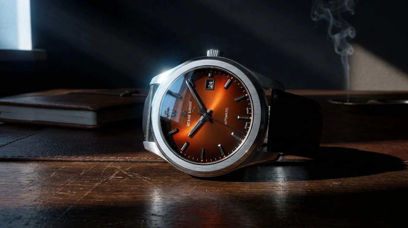
Minimalist Heat is an exercise in extreme restraint punctured by a singular, breathtaking gasp of color. In this arrangement, the vast expanses of Arctic Glaze and Cast Shadow establish a stark, almost gallery-like purity. Jet Carbon pulls the eye downward, offering a deep, void-like contrast that frames the true star of the show, Smoldering Hearth. This striking shock of burnt orange acts as a visual siren, entirely redefining the sterile luxury usually associated with Brushed Platinum. Imagine a sleek, ultra-thin timepiece where the only detail is a single hand or a recessed sub-dial painted in this raw, fiery terracotta tone. It is a rebellion against the monotonous sea of silver and black that dominates the current market, proving that premium minimalism need not be devoid of passion. The fiery undertones suggest the glow of a setting sun caught briefly on a metallic surface, arresting the gaze and holding it captive. Such a deliberate use of color speaks to a wearer who values sharp tailoring and pristine architecture, yet harbors a fiercely independent spirit.
Tuscan Horology 🕰️
The quiet beauty of Tuscan Horology lies in its ability to transport the mind straight to rolling hills bathed in the fading amber light of early evening. Sunbaked Clay replaces the expected starkness of a watch face with a gentle, porous warmth, recalling ancient earthen vases resting upon marble ledges. This dusty, romantic hue finds perfect companionship against the strict, masculine lines of Gunmetal Casing and Heirloom Silver. The resulting aesthetic balances delicate artistry with substantial weight, creating a timepiece that feels historically significant right out of the box. A Porcelain Dial finish keeps the overall presentation immaculately clean, ensuring the rustic colors never lose their high-end polish. Anchoring the entire arrangement is Midnight Navy, offering a softer, more poetic alternative to harsh black bands or numerals. This collection of shades challenges the notion that watches must look like scientific instruments, presenting them instead as wearable poetry. It wraps the wrist in soft romance and old-world charm, proving that true luxury often murmurs rather than roars.
Amber Hourglass ⏳
Completely forsaking the metallic frost of standard watchmaking, Amber Hourglass proposes a totally different definition of opulence. It is a feast of roasted, organic shades that feel thick, tactile, and irresistibly inviting. Rich Ochre and Roasted Espresso lay down a foundation of dark, decadent woods, immediately recalling the luxurious interiors of vintage sports cars or the polished veneer of antique humidors. These are colors you can almost smell, carrying phantom notes of cedar and dry tea leaves. Cashmere Cream and Weathered Parchment soften the mood, providing a pale, buttery background that allows complications to be read with effortless grace. A sudden spark of Blazing Clementine injects a modern, energetic pulse into an otherwise classic arrangement, perhaps applied to the tip of a sweeping second hand or the neat stitching on a strap. By relying entirely on organic, terrestrial tones rather than cold metals, this approach positions a watch as an extension of the body itself. It hums with earthly magnetism, making the typical silver timepiece feel hopelessly robotic and distant by comparison.
Shifting the visual vocabulary of watchmaking from icy metals to terrestrial warmth fundamentally alters our relationship with the objects we wear. Exchanging stark silver for baked earth, patinated brass, and rich leathers creates a tactile intimacy that cold steel simply cannot achieve. These tones carry the weight of memory, the fragrance of autumn, and the quiet dignity of objects well-loved over generations. They invite the eye to linger, offering a deep, soul-stirring alternative to clinical perfection. Ultimately, the wrist deserves more than just a ticking machine; it deserves a beautifully crafted narrative. Leaving behind the safety of monochrome opens the door to a richer, more passionate expression of personal style, allowing timepieces to finally capture the true depth of the human experience.